
Are you a business owner or entrepreneur looking to get into eCommerce but don’t know where to start? Shopify stores are quickly becoming the go-to choice for entrepreneurs and business owners who want to launch their products online.
With 1 product Shopify stores, you can easily buy and sell individual items, whether they be digital downloads, physical goods like clothing or jewelry, services like web development, and marketing consulting—the possibilities are endless!
In this blog post, we will discuss some of the best single-product Shopify store examples setups, as well as show you how easy it is to set up your own without requiring intensive technical knowledge. Keep reading for an in-depth breakdown of starting your own one-product Shopify store!
Table of Contents
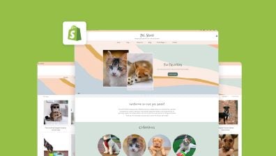
What is one product Shopify store?
The name pretty much says it all – one product store Shopify. You create a Shopify-based website to offer a single product and encourage online sales.
There is no set guideline for what sort of goods to offer, however, the following are some of the most specific examples of where retailers may make the most of a single product Shopify store:
- Digital offerings: include teaching resources like courses and ebooks as well as services like yoga video classes and meditation sessions; or arts & music, software tools.
- Niche products: successful branding by concentrating on a certain clientele. Some great examples are presented for vegan food, pet accessories, and gaming seats.
- General merchandise: such as water-resistant phone covers or backpacks, may satisfy a wide range of buyers.
Additionally, you may provide variations in your products like different sizes, colors, or materials to give customers more options.
18 one-product Shopify store examples
Although the 18 Shopify one-product store examples have quite varied offerings and designs, they however have a few things in common. They all have effective branding because the tone and aesthetics reflect their ideals and help to establish identity.
These best one-product Shopify stores all make use of the appropriate Shopify themes, which offer sufficient modification options to help them create pages that are more distinctive and relevant for their messages.
Easy navigation with intuitive design, social proof sections, high-quality photos, brief explanations, and giving benefits priority over features are some of the most prevalent components.
Seattle Cider Co
Seattle Cider Company, established in 2012, stands as a beacon of innovation in the craft cider industry, located in the heart of Seattle, Washington. Known for breaking the mold of overly sweet, mass-produced ciders, Seattle Cider has embraced the diverse and adventurous palate of its Pacific Northwest roots, offering a range of ciders that span from classic dry varieties to innovative flavors infused with local ingredients. Their mission to bring a new level of complexity and sophistication to cider is evident through their use of hand-selected Washington apple varieties and a careful fermentation process. This dedication to quality and innovation has not only garnered a loyal following but has also expanded the appreciation for craft cider across the U.S. and beyond.
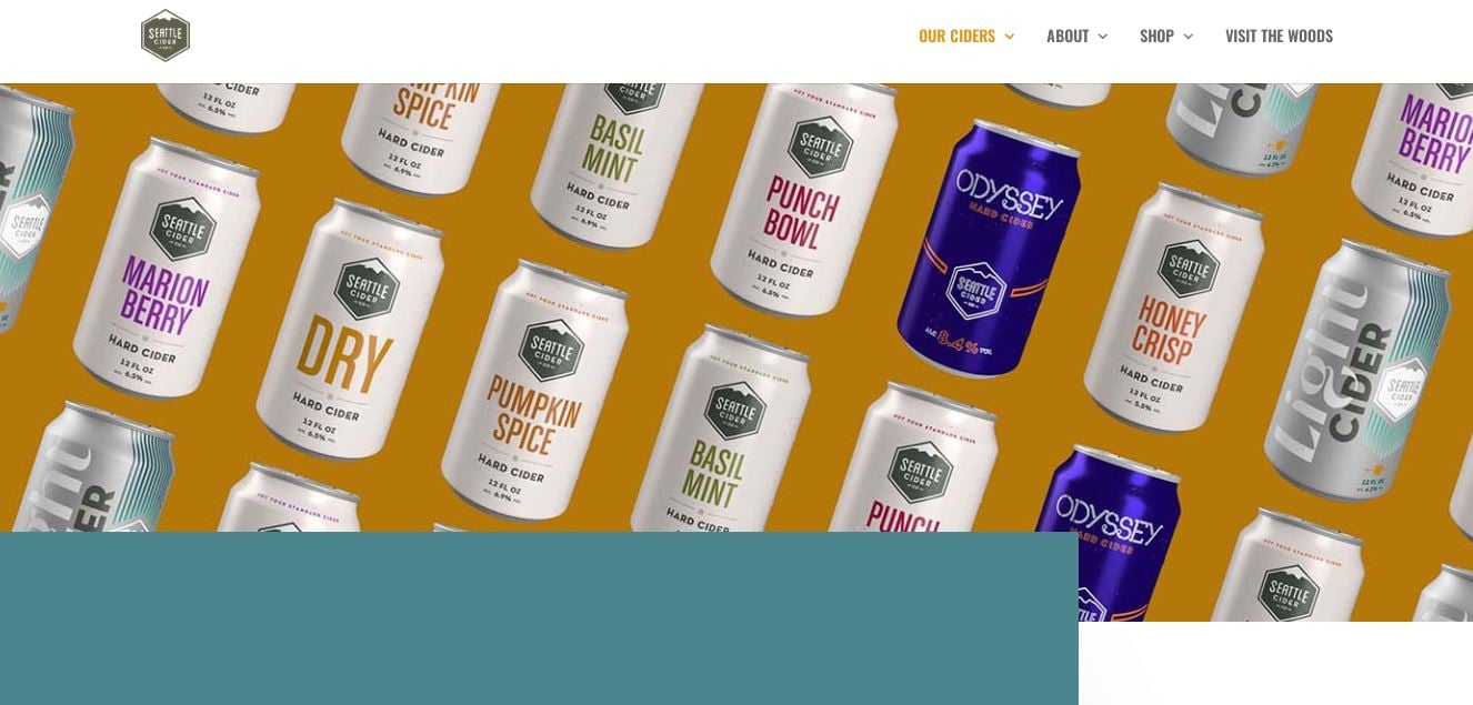
The Seattle Cider website focuses on offering five different flavors of small-batch ciders made from Washington apples that are farmed nearby. The page starts with a full-page illustration of Seattle’s natural beauty, a retro-style logo, and the claim that this won’t be your typical cider. The online Shopify store of Seattle Cider enhances this ethos of quality and innovation, providing a seamless and engaging shopping experience for cider enthusiasts.
What we love
- Sticky Navigation Menu: As users scroll, the menu sticks to the top of the page, ensuring easy access to different sections at any time. This feature enhances user navigation, making the overall browsing experience more convenient and enjoyable.
- Innovative Menu Design: Unlike traditional menus that link to separate pages, Seattle Cider’s menu cleverly indicates different sections of the same page. This unique approach streamlines the shopping experience and keeps users engaged on a single, cohesive page.
- Focus on the Ciders Section: The highlight of the website is the Ciders section, which showcases high-quality product photography, draws attention, and encourages users to explore each cider in more detail by clicking on the images.
- Educational Graphic Scroll: Following the product showcase, the website features an impressive graphic scroll illustrating the cider-making process, which adds tremendous value for potential customers, enhancing their understanding and appreciation of the craftsmanship involved in creating each batch of cider.
What we can learn from Seattle Cider
- The Value of Sticky Navigation: Seattle Cider’s use of a sticky navigation menu teaches us the importance of ease of access in web design. Keeping the menu visible as users scroll can significantly enhance the user experience by making navigation effortless and keeping essential links within reach at all times.
- Redefining Menu Design: The innovative approach to menu design, where the menu highlights different sections on the same page rather than linking to separate pages, demonstrates how breaking from tradition can streamline the user experience. This strategy can keep users engaged and encourage them to explore more content without the disruption of loading new pages.
- Highlighting Product Features Visually: The focus on showcasing products through high-quality photography in the Ciders section underscores the power of visual appeal in online retail. By drawing users in with compelling images, businesses can encourage deeper exploration of their products and enhance the likelihood of conversion.
- Integrating Educational Content: The inclusion of an educational graphic scroll detailing the cider-making process after the product showcase exemplifies how adding educational elements can enrich the customer’s journey. This approach not only informs customers but also builds appreciation for the brand’s craft, potentially fostering a deeper connection with the product.
Palmpress
Palmpress is a revolutionary coffee press designed for coffee aficionados who appreciate the art of a perfectly handcrafted cup of coffee. Born out of a passion for simple, yet exceptionally effective coffee brewing techniques, Palmpress combines the traditional elements of French press brewing with a modern, portable design. This innovative coffee press is specifically crafted for individual servings, ensuring that each cup of coffee retains its unique flavors and aromas. The device’s compact and durable construction makes it an ideal companion for coffee lovers on the go, whether they’re at home, in the office, or traveling.
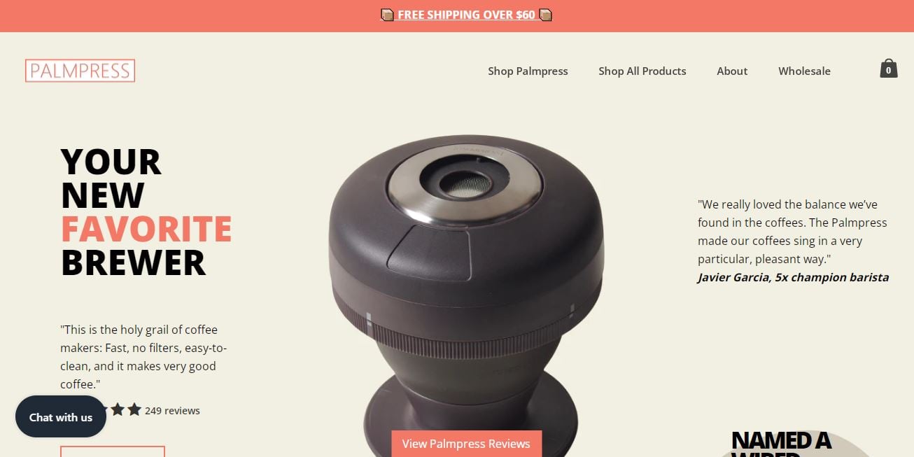
What sets Palmpress apart is its commitment to sustainability and convenience without compromising on the quality of the coffee brewed. It is designed for easy cleaning and zero waste, with no need for disposable filters or pods, thus appealing to environmentally conscious consumers. The simplicity of its design belies the sophistication of the brewing process, which is engineered to extract the fullest flavor from coffee grounds. Palmpress has quickly become a favorite among coffee enthusiasts who value purity, taste, and environmental responsibility in their coffee brewing experience.
What we love
- Use of Product Badges: The store cleverly utilizes product badges to highlight key characteristics of their items. These small icons paired with concise text immediately grab attention, making it easy for customers to understand the unique selling points at a glance.
- Eye-Catching and Professional Design: The badges not only serve an informational purpose but also contribute to the overall aesthetic of the page. Their professional design enhances the site’s credibility and visually communicates the quality of the products on offer.
- Enhanced Product Descriptions: By incorporating these badges into product descriptions, Palmpress effectively communicates important product features in a manner that is both quick to comprehend and visually appealing.
What we can learn from Palmpress
- Strategic Use of Visual Cues: Palmpress’s deployment of product badges teaches us the effectiveness of using visual cues to quickly communicate key product features. This strategy highlights how small, visual elements can significantly enhance customer understanding and interest at a glance, making it an effective tool for highlighting unique selling points.
- Importance of Aesthetic Cohesion: The integration of eye-catching and professionally designed badges not only serves a functional purpose but also contributes to the aesthetic appeal and credibility of the site. This approach underlines the value of ensuring that informational elements are also in harmony with the site’s design ethos, thereby reinforcing brand quality and trustworthiness.
- Enriching Product Descriptions Visually: Incorporating visual badges into product descriptions exemplifies a method of enriching textual content with visual elements to convey important information efficiently. This technique can make product descriptions more engaging and accessible, facilitating quicker customer comprehension and decision-making.
Ratio Coffee
Ratio Coffee is a brand that transcends the traditional boundaries of coffee brewing by merging sophisticated technology with the artistry of manual brewing. At the heart of Ratio Coffee’s ethos is the belief that everyone deserves a perfect cup of coffee, and their innovative machines are designed to deliver just that, replicating the precision of a skilled barista with the simplicity of a push-button operation. Their coffee makers are celebrated for their precision in water temperature, flow rate, and ratio, ensuring each cup of coffee is brewed to its fullest potential.
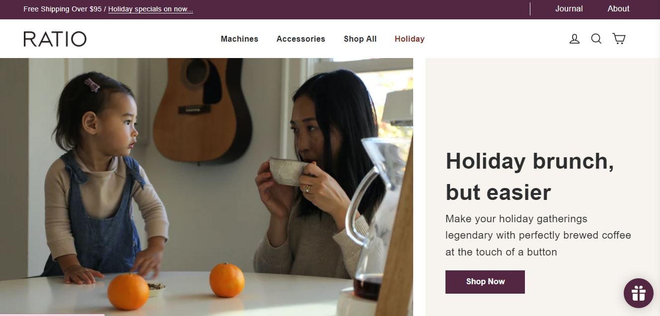
Crafted for coffee connoisseurs who seek the convenience of automatic brewing without sacrificing the quality of a carefully crafted pour-over, Ratio Coffee machines embody a fusion of design elegance and outstanding functionality, making them a distinguished presence in any kitchen or office. The online Shopify store of Ratio Coffee mirrors the brand’s commitment to quality and aesthetics, offering a seamless and engaging shopping experience.
What we love
- Elegant Design and User Experience: The store reflects the sleek design of Ratio Coffee machines, with a clean layout and intuitive navigation that makes browsing products a pleasure.
- High-Quality Imagery and Videos: The use of high-resolution images and videos gives customers a close-up look at the craftsmanship of Ratio Coffee machines, highlighting their design and functionality.
- Educational Content: The site offers valuable content, such as brewing guides and coffee recipes, enhancing the customer experience by providing resources to improve their coffee brewing skills.
What we can learn from Ratio Coffee
- Prioritizing Design and Usability: Ratio Coffee’s commitment to elegant design and a seamless user experience underscores the importance of aesthetics and functionality in e-commerce. Their approach demonstrates how a clean layout and intuitive navigation can significantly enhance the pleasure of browsing, making it easier for customers to explore and engage with products.
- Leveraging Visuals to Showcase Quality: The strategic use of high-quality imagery and videos highlights the craftsmanship of Ratio Coffee machines, emphasizing the value of visual storytelling. This teaches us that giving customers a close-up look at products can effectively communicate their quality, design, and functionality, fostering a deeper appreciation and understanding of the items.
- Enhancing Customer Engagement Through Education: By providing educational content such as brewing guides and coffee recipes, Ratio Coffee enriches the shopping experience beyond the transaction. This approach illustrates the benefits of offering value-added content that helps customers improve their skills and enjoy their purchases to the fullest. It not only supports customer satisfaction but also builds brand loyalty and authority in the field.
Truff
Truff is a culinary brand that has carved a niche for itself in the gourmet food industry with its luxurious truffle-infused hot sauces. Born out of a desire to infuse the exquisite taste of truffles with the fiery kick of hot sauce, Truff has created a unique product line that appeals to both food enthusiasts and those seeking to elevate their culinary experiences. Their hot sauces blend the rich, earthy flavors of truffles with the perfect amount of heat, creating a sophisticated balance that has garnered a loyal following. The brand’s commitment to quality is evident in every bottle, using carefully selected ingredients to ensure a premium taste that stands out in the crowded hot sauce market.
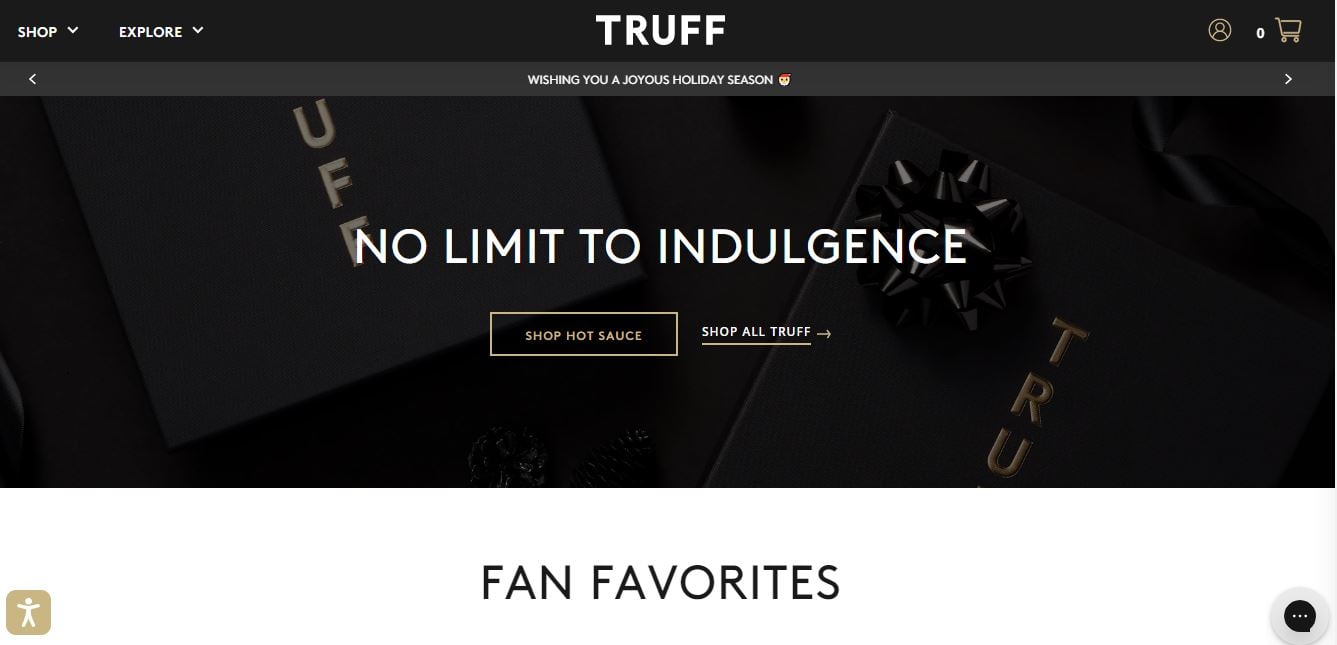
Truff’s success is not just in its innovative flavor profiles but also in its branding and presentation. Each bottle of Truff hot sauce is designed to look as good as it tastes, with elegant packaging that reflects the luxury within. This attention to detail has made Truff not just a condiment, but a statement piece in kitchens and dining tables around the world. The brand has effectively utilized social media and online marketing to reach a wide audience, creating a buzz that transcends the traditional food industry boundaries. As a result, Truff has established itself as a symbol of culinary luxury, appealing to those who appreciate the finer things in life, both in terms of flavor and style.
What we love
- Stunning Homepage Design: Truff’s homepage is a fantastic example of design excellence, setting the stage for the entire shopping experience with its compelling and aesthetically pleasing layout.
- Incorporation of Video Content: Truff enhances the product display with engaging video content, giving visitors a closer look at their products in action and adding an interactive element to the shopping experience.
- Focus on Premium Composition: The use of stunning product compositions in their imagery not only showcases their products in the best light but also communicates the luxury and quality of the brand.
- Engaging Scrolling Experience: Understanding that most visitors won’t immediately click the call-to-action (CTA), Truff ensures that the journey down the page is just as captivating, with beautifully designed sections that keep users engaged.
What we can learn from Truff
- Emphasizing Design in First Impressions: Truff’s homepage demonstrates the powerful impact of first impressions through design excellence. A compelling and aesthetically pleasing layout not only captivates visitors but also sets a positive tone for their entire shopping experience. This teaches us the importance of investing in stunning homepage design to engage visitors from the moment they land on the site.
- Utilizing Video for Product Showcasing: The strategic incorporation of video content to give visitors a closer look at products highlights the effectiveness of multimedia in e-commerce. Engaging video content adds an interactive element that can bring products to life, offering customers a dynamic way to see products in action and understand their value.
- Highlighting Product Quality Through Visual Composition: Truff’s use of premium visual compositions in their product imagery serves as a lesson in how to effectively communicate the luxury and quality of a brand. High-quality, well-composed images can significantly enhance product presentation, making it crucial for brands to focus on visual storytelling that aligns with their brand identity.
- Creating an Engaging Scrolling Experience: Recognizing that not all visitors will respond to the initial call-to-action, Truff’s engaging scrolling experience provides a valuable lesson in web design. By making the journey down the page captivating with beautifully designed sections, Truff maintains user engagement, encouraging visitors to explore more deeply. This approach underscores the importance of thoughtful design in every aspect of a website to keep users interested and engaged throughout their visit.
Pipcorn
Pipcorn is a revolutionary snack brand that has redefined the way we think about popcorn and snack foods. By focusing on heirloom seeds, Pipcorn has created a line of snacks that not only tastes better but also offers a more sustainable and heritage-rich alternative to traditional snack options. Their snacks, ranging from popcorn to corn chips, are known for their unique flavors, smaller kernels, and better digestibility. The brand prides itself on using non-GMO, gluten-free, and whole-grain ingredients, making its products not just delicious but also healthier and more inclusive to various dietary needs.
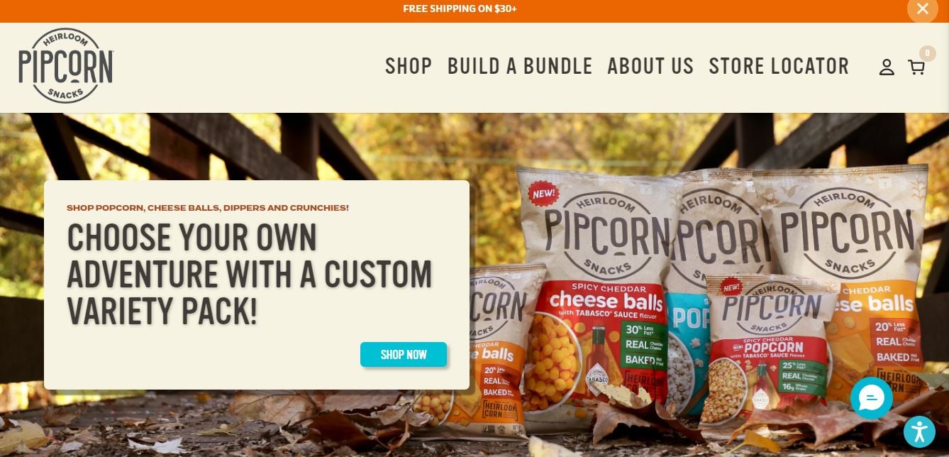
Beyond its innovative products, Pipcorn is celebrated for its commitment to sustainability and positive social impact. The brand’s use of heirloom seeds preserves agricultural diversity and supports sustainable farming practices. Moreover, Pipcorn’s dedication to environmental stewardship and community involvement, such as partnering with charitable organizations, reflects a business model that goes beyond profit. This commitment to quality, innovation, and social responsibility has not only garnered a loyal customer base but has also positioned Pipcorn as a leader in the modern food movement, challenging conventional snack food norms and setting new standards for the industry.
What we love
- Vibrant and Attractive Color Scheme: The use of high-contrast colors throughout the site grabs attention and makes browsing the site a visually stimulating experience.
- Engaging Flat Cartoon Animations: Pipcorn’s website is adorned with beautifully crafted flat cartoon animations that bring the brand and its products to life, enhancing the overall user experience.
- Storytelling and Charitable Causes: Pipcorn’s online store does an excellent job of telling the brand’s story and highlighting how customers can contribute to charitable causes with their purchases, adding a layer of purpose to shopping.
What we can learn from Pipcorn
- The Power of Color in Web Design: Pipcorn’s vibrant and attractive color scheme demonstrates the significant impact color choices can have on a website’s appeal. The use of high-contrast colors not only grabs attention but also contributes to a visually stimulating browsing experience. This teaches us the importance of carefully selecting a color palette that reflects the brand’s personality and enhances user engagement.
- Animating the User Experience: The incorporation of engaging flat cartoon animations into Pipcorn’s site underlines the value of adding animated elements to web design. These animations bring the brand and its products to life, providing a dynamic and engaging user experience.
- Integrating Storytelling and Social Responsibility: Pipcorn’s approach to combining storytelling with support for charitable causes offers valuable insights into building brand loyalty and enhancing customer engagement. By effectively telling the brand’s story and showing how purchases contribute to charitable efforts, Pipcorn adds a meaningful layer to the shopping experience.
Madsen Bicycles
Madsen Bicycles has carved a niche in the bicycle market with its distinctively designed bikes that blend functionality with a touch of nostalgia. The company’s innovative approach to bike design has led to the creation of the Madsen Bucket Bike, a versatile and stylish family bike that includes a rear cargo bucket capable of seating children and hauling cargo. This unique feature, combined with the bicycles’ vintage aesthetic, sets Madsen Bicycles apart from conventional bike manufacturers and caters to families looking for a fun, practical, and environmentally friendly mode of transportation.
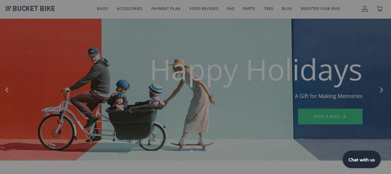
In addition to their flagship bucket bikes, Madsen Bicycles has embraced the growing trend towards electrification with the introduction of electric models. These e-bikes offer the same distinctive style and practicality as their traditional counterparts but with the added convenience and ease of electric propulsion. This expansion into electric bikes demonstrates Madsen Bicycles’ commitment to innovation and its ability to adapt to changing consumer preferences, ensuring that the brand remains at the forefront of the family biking movement.
What we love
- Unique Vintage Aesthetic: Madsen Bicycles stands out with a vintage design that immediately catches the eye, appealing to customers looking for unique, stylish bicycles.
- Engaging Homepage Video: A humorous and engaging video on the homepage effectively showcases the bikes’ features and the joy they can bring to families, making a strong first impression.
- Functional Badges Highlight Features: The use of badges to highlight key features and functionalities of the bikes adds a visual element that makes it easy for shoppers to quickly grasp what makes these bicycles special.
What we can learn from Madsen Bicycles
- Embracing Brand Uniqueness Through Design: Madsen Bicycles’ unique vintage aesthetic teaches us the importance of distinguishing a brand through design. By embracing a distinct style that resonates with its target audience, Madsen Bicycles showcases how effective it is to appeal to customers’ desires for unique and stylish products. This approach highlights the value of integrating brand identity into every aspect of design to stand out in a crowded market.
- Leveraging Video for Effective Storytelling: The engaging and humorous video featured on the homepage underscores the power of video content in making a strong first impression. Madsen Bicycles demonstrates that using video to showcase product features and the joy they can bring not only captivates visitors but also communicates brand values in a dynamic and memorable way.
- Visual Communication of Product Features: The strategic use of functional badges to highlight key features and functionalities shows the importance of visual communication in e-commerce. By adding visual elements that summarize the unique selling points of their bicycles, Madsen Bicycles makes it easy for shoppers to quickly understand what sets their products apart.
Death Wish Coffee
Death Wish Coffee has made a significant impact in the coffee industry with its bold claim of being the world’s strongest coffee. Established with the aim of providing coffee enthusiasts with a brew that not only wakes them up but also gives an unprecedented level of alertness, Death Wish Coffee has carved out a niche for those who demand the most potent coffee available. The brand leverages a unique blend of beans and a specialized roasting process to achieve a high caffeine content without sacrificing flavor. This daring approach has garnered a dedicated following among coffee lovers seeking intensity in their cups.
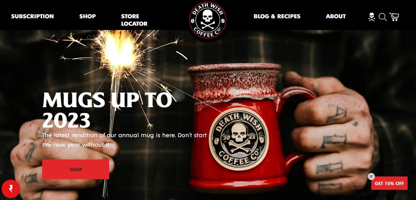
The online presence of Death Wish Coffee mirrors the brand’s audacious personality. The Shopify store is a direct reflection of their marketing strategy, focusing on their singular product with clear, powerful messaging that emphasizes the coffee’s strength and distinctive character. The simplicity of the site design underscores the product’s straightforward appeal, inviting curiosity and simplifying the decision-making process for potential buyers. Through effective use of branding, Death Wish Coffee has created not just a product, but a coffee experience that promises both unmatched strength and quality.
What we love
- Powerful Brand Messaging: The compelling message and unique identity of Death Wish Coffee, featuring its memorable skull and bones logo, immediately grab attention.
- Simplicity and Focus: The store’s simplicity, centered around a single product, makes for an uncluttered and focused shopping experience that highlights the uniqueness of its offering.
- Claim to Fame: Promoting itself as the world’s strongest coffee, Death Wish Coffee creates an intriguing proposition for customers seeking an unparalleled caffeine kick.
- Invites Curiosity: The straightforward and bold branding, combined with its claim, piques curiosity and encourages coffee enthusiasts to try out this exceptional product.
What we can learn from Death Wish Coffee
- Crafting a Strong Brand Identity: Death Wish Coffee’s powerful brand messaging and unique identity, exemplified by its skull and bones logo, illustrate the impact of a strong brand identity in capturing customer attention. This teaches us the importance of creating a memorable brand image that communicates the essence of the product effectively, making it stand out in a crowded market.
- The Value of Simplicity in Design: The focused and uncluttered design of Death Wish Coffee’s store emphasizes the product’s uniqueness without overwhelming the customer. This approach highlights the benefits of simplicity and focus in web design, demonstrating how a minimalistic layout can enhance the product’s appeal by making the shopping experience more straightforward and enjoyable.
- Leveraging Unique Selling Propositions: By promoting itself as the world’s strongest coffee, Death Wish Coffee leverages its unique selling proposition to create an intriguing offer for its target audience. This strategy underlines the importance of identifying and highlighting what makes your product unique, using it as a key differentiator to attract and retain customers.
- Stimulating Customer Curiosity: The combination of straightforward, bold branding with a compelling claim effectively piques curiosity, driving interest and engagement. This demonstrates the power of curiosity in marketing, showing that creating intrigue around your product can motivate potential customers to learn more and ultimately make a purchase.
Heraldic Jewelry
Heraldic Jewelry is a brand that specializes in creating custom and handcrafted jewelry with a focus on heraldic designs. The brand prides itself on reviving the ancient art of heraldry through its exquisite pieces, offering customers a unique way to connect with their heritage and personal history. Each piece of jewelry is meticulously crafted to include symbols and motifs that are meaningful to the wearer, from family crests and coats of arms to symbols representing personal achievements or milestones. Heraldic Jewelry’s commitment to craftsmanship and attention to detail is evident in every ring, necklace, and bracelet they produce, making their pieces not just accessories but treasured keepsakes.
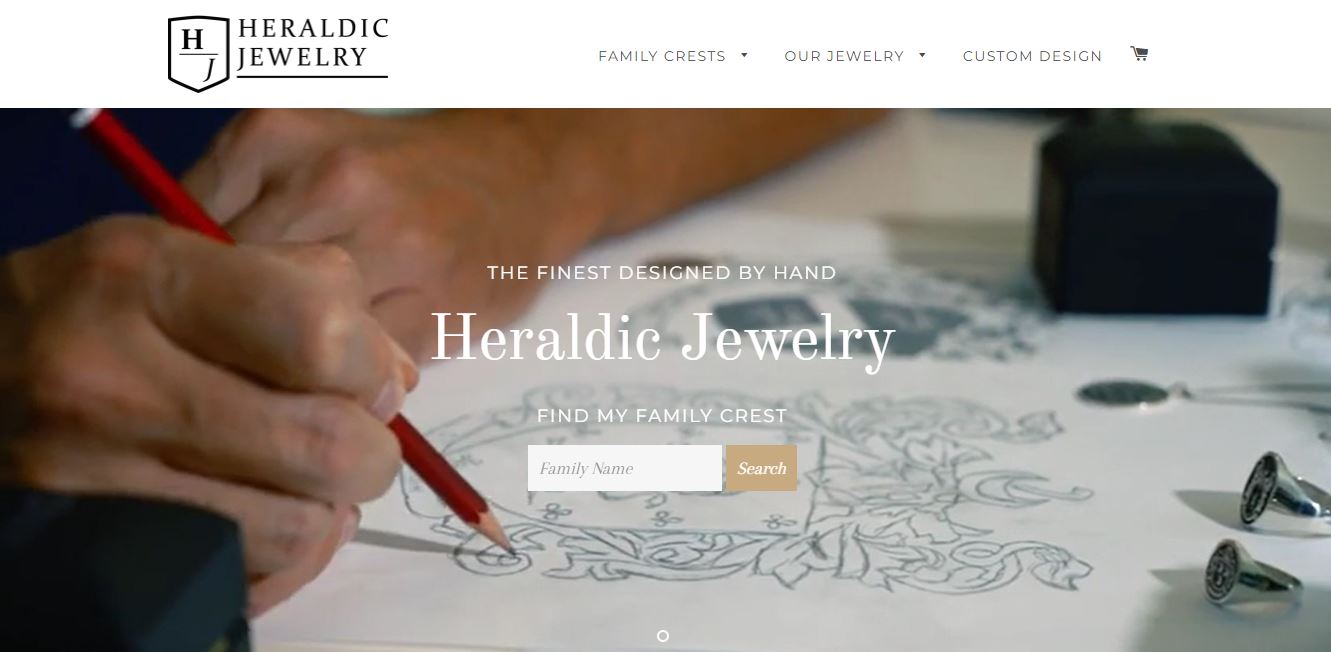
The online presence of Heraldic Jewelry reflects the brand’s dedication to quality and heritage. The Shopify store is elegantly designed, with a focus on showcasing the beauty and intricacy of their heraldic designs. High-resolution photographs allow customers to appreciate the fine details of the engravings, while the magazine-like layout of the homepage invites visitors to explore the range of products in a visually engaging way. This combination of sophisticated design and meaningful, personalized jewelry makes Heraldic Jewelry’s online store a standout destination for those looking to invest in pieces that celebrate their personal history and legacy.
What we love
- Sophisticated Website Design: The site boasts a sophisticated design, featuring a well-balanced color palette that creates a luxurious shopping environment.
- High-Resolution Photos: The store showcases high-resolution images of their rings, emphasizing the exquisite detail and quality of the engravings.
- Magazine-Style Layout: The homepage features a magazine-style grid of connected banners, making the browsing experience engaging and visually appealing.
- Well-Organized Content: Content on the site is well-organized, allowing visitors to easily navigate through the different sections and find what they’re looking for without any hassle.
What we can learn from Heraldic Jewelry
- Implementing Sophisticated Design Elements: Heraldic Jewelry’s sophisticated website design, with its well-balanced color palette, showcases the importance of creating a luxurious shopping environment. This approach demonstrates how design aesthetics can significantly enhance the perceived value of the products and the brand, making it essential for businesses to invest in high-quality, thoughtful design to attract and retain customers.
- Utilizing High-Quality Visuals: The emphasis on high-resolution photos to showcase the intricate details of their products underlines the critical role of visuals in online retail. This strategy highlights the necessity of using high-quality images to accurately represent the quality and craftsmanship of the products, providing customers with a clear and detailed view that can influence their purchasing decisions.
- Creating an Engaging Layout: The magazine-style layout of the homepage illustrates the effectiveness of engaging and visually appealing design layouts in capturing visitor interest. This layout makes the browsing experience more enjoyable and dynamic, encouraging visitors to explore more content. It serves as a reminder that creative presentation of content can significantly impact user engagement and the overall attractiveness of the site.
- Organizing Content for Easy Navigation: The well-organized content on Heraldic Jewelry’s site teaches us the value of clear and intuitive site navigation. By making it easy for visitors to navigate through different sections and find what they’re looking for, businesses can enhance user experience, reduce frustration, and increase the likelihood of conversion.
Bullies and Co.
Bullies and Co. distinguishes itself in the market with its innovative approach to a single-product offering. The brand, focusing on enhancing the lives of pet owners and their beloved pets, has meticulously designed a product that addresses specific needs with a blend of functionality and style. This single-product strategy allows Bullies and Co. to concentrate on quality, usability, and customer satisfaction, ensuring that every aspect of the product, from design to delivery, is perfected to meet the high standards expected by its customers.
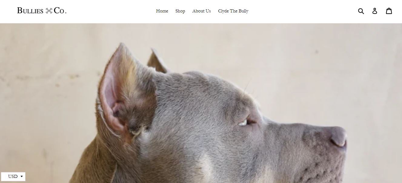
The online presence of Bullies and Co. mirrors the brand’s commitment to quality and customer engagement. The Shopify store is intuitively designed, making extensive use of stunning visuals to highlight the product’s unique features and benefits. This focus on visual storytelling, coupled with a clean and straightforward user interface, not only captivates the visitor’s attention but also significantly enhances the online shopping experience. By providing a detailed and engaging overview of their product, Bullies and Co. not only educates potential buyers about its value but also fosters a strong brand connection, setting a high bar for single-product e-commerce platforms.
What we love
- Stunning Photo Galleries: The store leverages beautiful photo galleries that effectively showcase the product, highlighting its features and usability in a visually compelling manner.
- Emphasis on Usability and Functionality: Through carefully curated images and descriptions, Bullies and Co. effectively communicates the usability and functionality of their product, making it easier for customers to understand its value.
- Clean and Intuitive Design: The store’s design is not only aesthetically pleasing but also user-friendly, ensuring a smooth browsing and shopping experience for visitors.
What we can learn from Bullies and Co.
- Maximizing Impact with Photo Galleries: Bullies and Co.’s use of stunning photo galleries to showcase their product emphasizes the power of visual storytelling in eCommerce. High-quality images are not just decorative elements but crucial tools for highlighting product features, usability, and overall appeal. It’s a reminder that investing in professional photography can significantly enhance how products are perceived by potential customers.
- Highlighting Product Usability and Functionality: The emphasis Bullies and Co. places on usability and functionality through their product descriptions and images underscores the importance of clear communication in online retail. This strategy demonstrates how effectively presenting the practical benefits of a product can make it more relatable and valuable to customers, suggesting that businesses should always strive to articulate how their products can solve problems or improve users’ lives.
- The Importance of Design and Usability: The clean and intuitive design of Bullies and Co.’s online store highlights the critical role of user experience in eCommerce success. By providing a seamless browsing and shopping experience, they show that aesthetic appeal and functionality go hand in hand.
TUSHY
TUSHY is a brand that has revolutionized bathroom hygiene with its innovative bidet attachments. The brand’s ethos is centered around the belief that everyone deserves a clean, more environmentally friendly, and enhanced bathroom experience. TUSHY’s bidet attachments are designed to be easily installed on existing toilets, reducing the need for toilet paper and thus having a positive environmental impact.
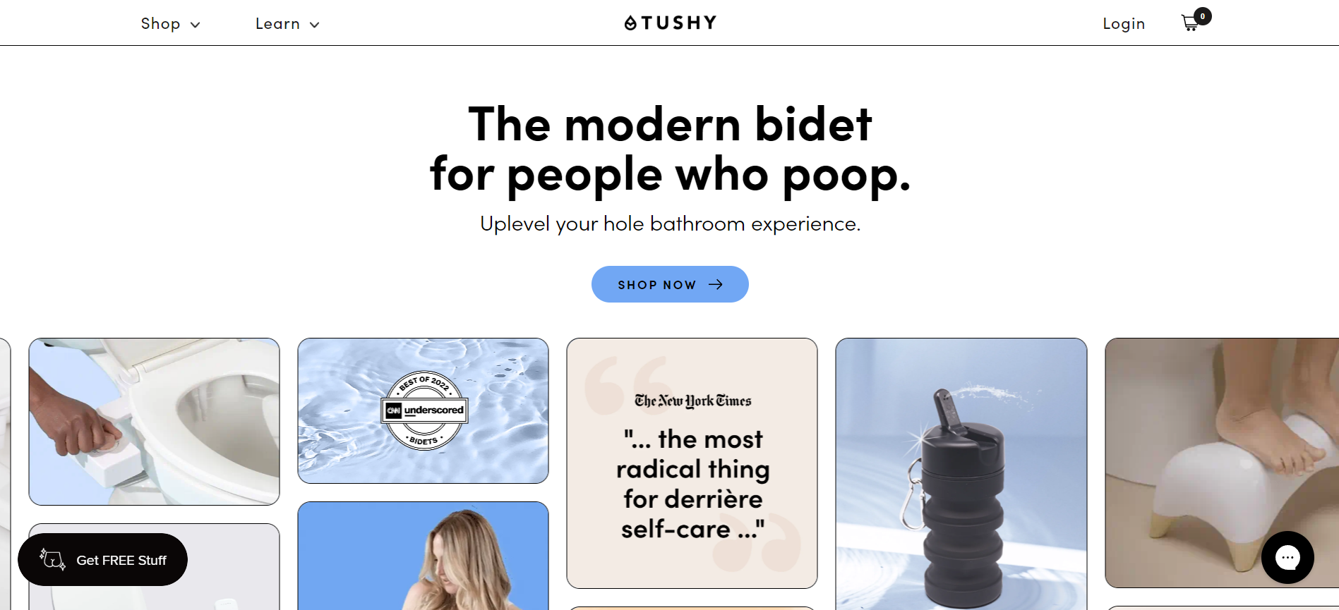
Their online Shopify store showcases the TUSHY Classic 3.0, among other versions, as the primary product, emphasizing its ease of installation, hygienic benefits, and sustainability. The product pages are rich with detailed descriptions, professional photos, and videos demonstrating the bidet’s features and installation process. This approach not only educates visitors about the product but also addresses common concerns, such as installation complexity and hygiene.
What we love
- Brand Personality: TUSHY’s brand voice is unique, blending humor with informative content. This approach makes the topic of bidets more approachable and breaks down barriers for new users who might be hesitant about trying the product.
- Educational Content: Beyond just selling a product, TUSHY provides valuable educational resources about bidet use and hygiene. This content positions the brand as a thought leader in the space and helps to inform and convert curious visitors.
- Engaging Visuals and Videos: TUSHY utilizes professional photography and informative videos throughout the site. These visuals not only demonstrate the product’s features and installation process but also engage the visitor, making the content more relatable and easier to understand
What we can learn from TUSHY
- Crafting a Unique Brand Voice: TUSHY’s approach to blending humor with informative content teaches us the importance of developing a unique brand personality. This strategy not only makes the brand more memorable but also helps in making the product—something new or unfamiliar to many consumers—much more approachable. It’s a powerful reminder that how you communicate can significantly affect your brand’s perception and customer’s willingness to engage with your product.
- The Value of Educational Content: Providing valuable educational resources, as TUSHY does, highlights the role of content in not just selling a product but in building a relationship with customers. By positioning itself as a thought leader in bidet use and hygiene, TUSHY demonstrates how offering insightful and helpful information can help break down barriers for potential customers and build trust.
- Leveraging Engaging Visuals and Videos: TUSHY’s use of professional photography and informative videos across their site exemplifies the importance of high-quality visuals in online marketing. These elements are crucial in demonstrating product features, simplifying the installation process, and making the overall message more relatable. This approach reinforces the idea that engaging and well-produced visuals and videos can greatly enhance the user experience on a website, making complex information more accessible and boosting the potential for customer conversion.
BALLS
BALLS is a men’s grooming brand that stands out in the market for its focused product line and clever marketing. Primarily known for its flagship product, a ball trimmer designed for the specific needs of male grooming, BALLS has carved out a niche in the grooming industry. Their approach combines functionality with a light-hearted and humorous brand voice, making the often-taboo topic of men’s grooming more approachable and less awkward for consumers.
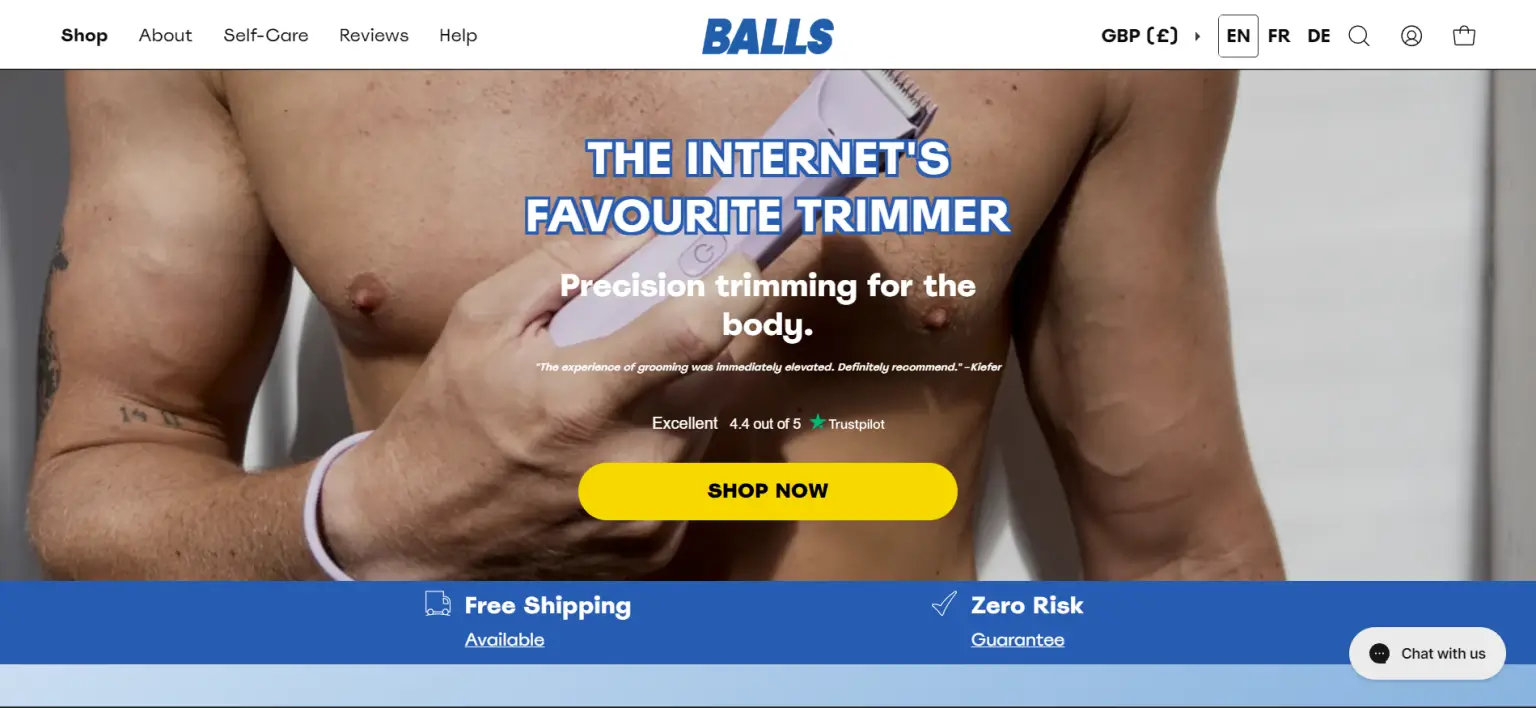
The brand leverages a direct-to-consumer model through its Shopify store, emphasizing user-friendly design, quality products, and engaging content to connect with its audience. BALLS’ Shopify store exemplifies how a focused product offering, combined with a distinctive brand voice and a commitment to quality, can create a compelling online presence.
What we love
- Quirky Brand Voice: The brand’s unique and humorous tone is consistently applied across the site, making the shopping experience enjoyable and memorable. This voice helps demystify and destigmatize men’s grooming.
- Clear Product Focus: The store clearly highlights its flagship product, ensuring visitors understand the primary offering without distraction. This focus helps streamline the customer journey toward making a purchase decision.
- High-Quality Product Imagery: BALLS uses fantastic photographs that showcase the product from various angles, providing customers with a clear understanding of what they’re purchasing.
What we can learn from BALLS
- Embracing a Quirky Brand Voice: BALLS’s use of a unique and humorous brand voice demonstrates the power of distinct branding in creating an enjoyable and memorable shopping experience. This approach not only sets the brand apart in a crowded market but also effectively demystifies and destigmatizes the product category; showcasing the importance of embracing a unique voice that resonates with your target audience and aligns with your brand values, making your message more relatable and engaging.
- The Importance of Clear Product Focus: The store’s strategy of clearly highlighting its flagship product exemplifies the benefits of having a focused product presentation. This clarity ensures that visitors are immediately aware of the brand’s primary offering, simplifying their decision-making process; and underscores the value of streamlining the customer journey by minimizing distractions and clearly guiding customers towards understanding and purchasing the core product.
- Investing in High-Quality Product Imagery: BALLS’s commitment to high-quality product photography underlines the crucial role visuals play in eCommerce. By showcasing their product from various angles with fantastic photographs, they provide customers with a comprehensive understanding of what they are buying. Investing in professional, high-quality imagery is essential for effectively communicating the value of your product, enhancing the online shopping experience, and ultimately encouraging purchase decisions.
Bokksu
Bokksu is a unique online marketplace that brings the rich and diverse flavors of Japan directly to consumers worldwide through its meticulously curated subscription boxes. Each box is a gateway to a culinary journey, featuring a selection of premium Japanese snacks and teas that are often hard to find outside of Japan. The company prides itself on its direct partnerships with centuries-old snack makers, enabling them to deliver authentic and high-quality Japanese treats.
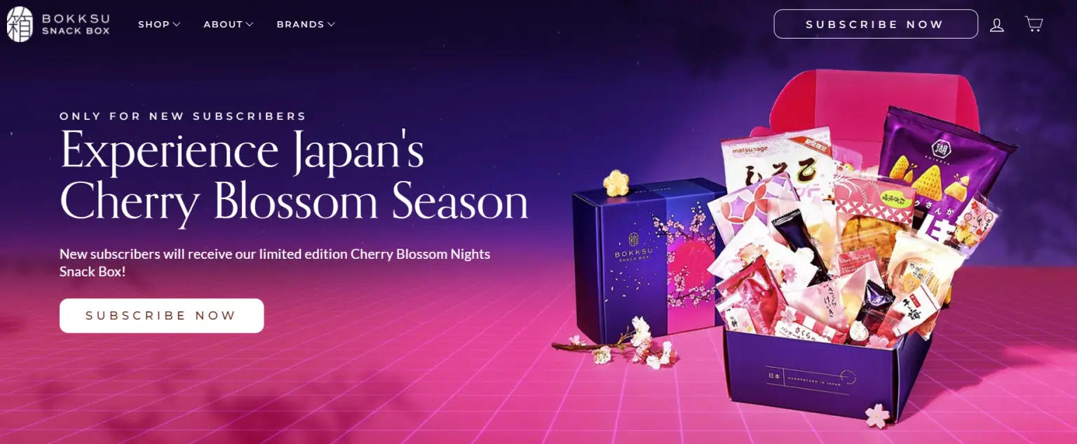
Beyond just offering snacks, Bokksu aims to deepen the cultural experience by providing detailed information about the snack’s origins, flavors, and the artisans who make them. This approach not only enriches the tasting experience but also fosters a greater appreciation for Japanese culture among its subscribers. Bokksu’s Shopify store enhances this cultural journey with an engaging and user-friendly online shopping experience. From the moment visitors land on the site, they’re immersed in a visually appealing interface that reflects the elegance and subtlety of Japanese aesthetics.
What we love
- Cultural Immersion: The store does an excellent job of not just selling products but offering an immersive cultural experience. Each product listing is accompanied by stories about its origin and the artisans behind it, connecting customers with the Japanese traditions and regions they come from.
- Visual Consistency: The use of the branded color orange and thematic imagery across the site creates a memorable brand identity. This visual consistency helps customers to instantly recognize and associate the warm, inviting colors with the Bokksu brand.
- Exceptional Storytelling: Each snack is a story, and Bokksu tells it beautifully. The website’s storytelling approach captivates customers, making each snack and box feel like a personal discovery.
What we can learn from Bokksu
- Prioritizing Cultural Immersion: Bokksu’s focus on offering an immersive cultural experience teaches us the value of going beyond mere product sales and providing customers with a deeper connection to the brand’s origins and heritage. By accompanying each product listing with stories about its origin and the artisans behind it, Bokksu effectively engages customers and creates a sense of cultural discovery.
- Harnessing Visual Consistency: The use of consistent branding elements, such as the branded color orange and thematic imagery, underscores the importance of visual consistency in building a memorable brand identity. Bokksu’s visual approach allows customers to instantly recognize and associate the warm, inviting colors with the brand, strengthening brand recognition and trust.
- Mastering the Art of Storytelling: Bokksu’s exceptional storytelling approach transforms each snack into a captivating narrative, enriching the customer experience and making each product feel like a personal discovery. This demonstrates the power of storytelling in creating emotional connections with customers and elevating the perceived value of products; emphasizing the importance of crafting compelling narratives that resonate with customers’ emotions and interests.
Brew Blue
Brew Blue has established itself as a noteworthy presence in the wellness market, particularly targeting women’s health with its flagship product, Hormone Balance Bliss™. This Australian brand focuses on offering a natural solution for relieving symptoms associated with hormonal imbalances, such as menopause symptoms, mood swings, stress, bloating, and indigestion. Brew Blue’s commitment to natural health solutions is reflected in its product formulation, which emphasizes 100% natural ingredients, promising a gentle yet effective approach to hormonal balance.
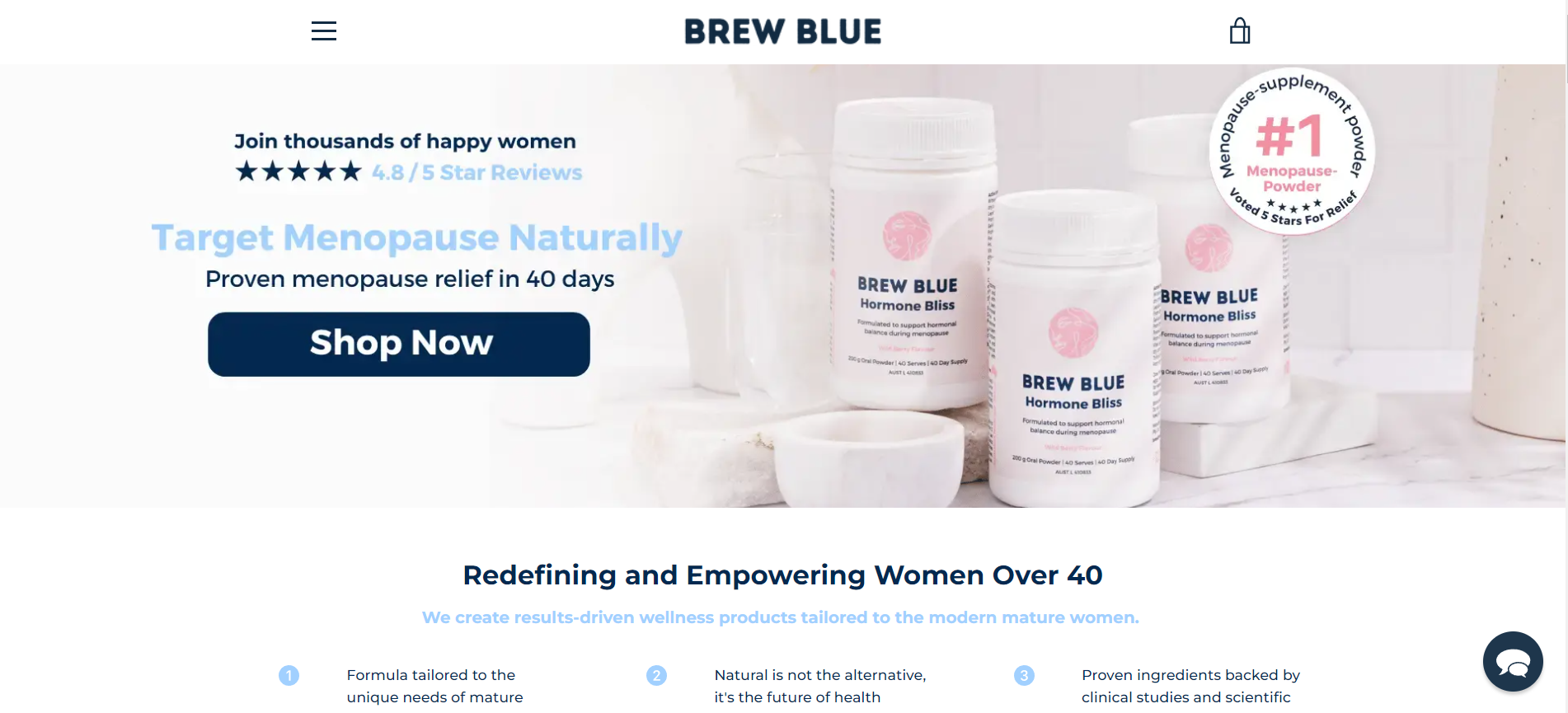
The Brew Blue Shopify store is a testament to thoughtful design and customer-centric presentation, making it a stellar example of how to engage and educate potential customers in the health and wellness sector. Their online Shopify store serves as a portal not only to their products but also to their philosophy of empowering women through natural health support, offering detailed information about the benefits and ingredients of their product.
What we love
- Educational Content: Brew Blue excels in providing detailed information about their product’s ingredients and benefits, educating visitors on not just what the product is, but how it can make a difference in their lives.
- Engaging Design: The use of soft color schemes mirrors the product’s gentle approach to health and wellness, creating a calming and welcoming online environment that reflects the brand’s ethos.
- Health-Focused Blog: Beyond the storefront, Brew Blue offers a blog filled with health tips, ingredient spotlights, and wellness advice, adding value for their customers and building a community around their brand.
What we can learn from Brew Blue
- Harnessing the Power of Education: Brew Blue sets an example in providing valuable educational content about its products, emphasizing the importance of informing and empowering customers. By offering detailed information about ingredients and benefits, Brew Blue educates visitors on how their products can positively impact their lives. This approach not only builds trust and credibility but also helps customers make informed purchasing decisions.
- Creating an Engaging Design: The use of soft color schemes and calming visuals in Brew Blue’s design demonstrates the importance of creating an environment that reflects the brand’s ethos. By mirroring the gentle approach to health and wellness, Brew Blue creates a welcoming and calming online atmosphere that resonates with its target audience. This teaches us the value of aligning design elements with brand values to evoke specific emotions and create a memorable user experience that strengthens brand identity.
- Building a Health-Focused Community: Brew Blue’s health-focused blog serves as a valuable resource for customers, offering health tips, ingredient spotlights, and wellness advice. Beyond just selling products, Brew Blue builds a community around its brand by providing ongoing value and fostering engagement with its audience. This strategy highlights the importance of going beyond transactional relationships and nurturing a community of like-minded individuals who share a common interest in health and wellness.
Smoovii
Smoovii presents itself as an innovative brand in the portable blender market, catering to health-conscious individuals and smoothie lovers who value convenience and efficiency. Their flagship product, a compact and rechargeable blender, is designed for those on the go, making it easier than ever to blend fresh fruits, vegetables, and other ingredients into healthy smoothies anywhere, anytime. The emphasis on mobility, ease of use, and the ability to promote a healthy lifestyle resonates with a growing demographic that seeks to integrate nutritious meals into their busy lives seamlessly.
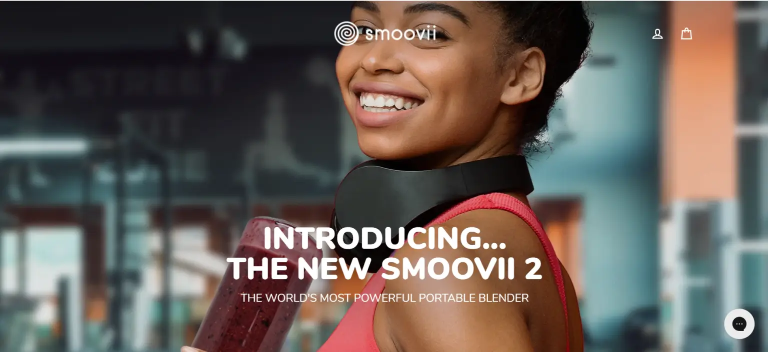
The Smoovii Shopify store showcases several admirable attributes that make it stand out in the e-commerce landscape. Smoovii’s online presence, particularly through its Shopify store, reinforces this message by providing a platform that not only sells a product but also champions a health-conscious, active lifestyle.
What we love
- Vibrant and Engaging Visuals: Utilizing high-quality images and videos, Smoovii demonstrates its blender in action, appealing to the visual nature of its target audience and highlighting the product’s ease of use.
- Health and Lifestyle Focus: Beyond selling a blender, Smoovii promotes a healthy lifestyle, featuring recipes, nutritional tips, and user-generated content that inspires customers to lead healthier lives.
- User-Friendly Interface: The Shopify store is designed for easy navigation, allowing customers to find product information, testimonials, and purchase options without hassle.
What we can learn from Smoovii
- Harnessing the Power of Visuals: Smoovii’s use of vibrant and engaging visuals, including high-quality images and videos, effectively showcases their blender in action. By appealing to the visual nature of their target audience, Smoovii highlights the product’s ease of use and functionality. This teaches us the importance of utilizing compelling visuals to captivate and engage customers, effectively communicating product features and benefits in a way that resonates with their preferences and interests.
- Promoting Health and Lifestyle: Beyond merely selling a blender, Smoovii prioritizes promoting a healthy lifestyle through its online store. By featuring recipes, nutritional tips, and user-generated content, Smoovii inspires customers to lead healthier lives. This approach not only adds value to the customer experience but also positions Smoovii as a trusted resource in the health and wellness space.
- Prioritizing User-Friendly Design: Smoovii’s Shopify store is designed for easy navigation, ensuring that customers can access product information, testimonials, and purchase options without hassle. This user-friendly interface enhances the overall shopping experience, making it convenient and enjoyable for customers to explore and interact with the brand.
Snooz
Snooz is a brand that has tapped into the essential need for quality sleep with its innovative white noise machines. Designed to improve sleep by creating a soothing auditory environment, Snooz products are ideal for anyone looking to block out disruptive sounds at night or during naps. The company leverages cutting-edge technology to offer a range of sound environments that mimic natural airflow, providing a more natural and calming alternative to digital soundtracks.
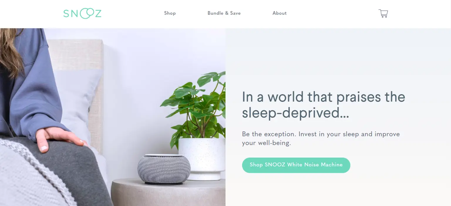
Snooz’s commitment to sleep health is evident not only in their product design but also in their educational efforts to raise awareness about the importance of sound environments for sleep. Their online Shopify store serves as a central hub for customers to discover and purchase their sleep solutions, as well as to learn more about achieving optimal sleep quality.
What we love
- Clean and Calming Design: Reflecting the essence of their product, the store features a clean and minimalist design that evokes a sense of calm and relaxation, inviting users to explore their offerings in a peaceful online environment.
- Engaging Visuals: High-quality images and videos on the site effectively demonstrate the product in use, showcasing its design and functionality in various settings, which helps potential buyers visualize the product in their own space.
- Educational Content: Beyond selling products, the store offers valuable insights into sleep science and tips for improving sleep quality, positioning Snooz as a thought leader in the sleep wellness space.
What we can learn from Snooz
- Embracing a Tranquil Design Aesthetic: Snooz’s clean and calming design mirrors the essence of its product, creating a serene online environment that resonates with its target audience. This approach demonstrates the power of design in shaping the overall user experience and evoking specific emotions. By prioritizing simplicity and minimalism, Snooz invites users to explore their offerings in a peaceful and welcoming atmosphere.
- Utilizing Compelling Visuals: The use of high-quality images and videos effectively showcases Snooz’s product in various settings, allowing potential buyers to visualize how it would fit into their own space and lifestyle. This visual storytelling approach enhances the product’s appeal and functionality, making it more tangible and relatable to customers.
- Providing Value Through Educational Content: Snooz goes beyond merely selling products by offering valuable insights into sleep science and tips for improving sleep quality. By positioning themselves as a thought leader in the sleep wellness space, Snooz adds value to the customer experience and builds trust with their audience. This strategy not only enhances brand credibility but also fosters long-term relationships with customers.
BlendJet
BlendJet has revolutionized the way we think about on-the-go nutrition with its innovative portable blender. Designed for individuals leading a busy lifestyle, health enthusiasts, and anyone looking to integrate more fruits and vegetables into their diet effortlessly, BlendJet offers a convenient solution. Its compact, USB-rechargeable blender allows users to make fresh smoothies, shakes, and blended drinks anywhere — from the office to the gym to outdoor adventures.
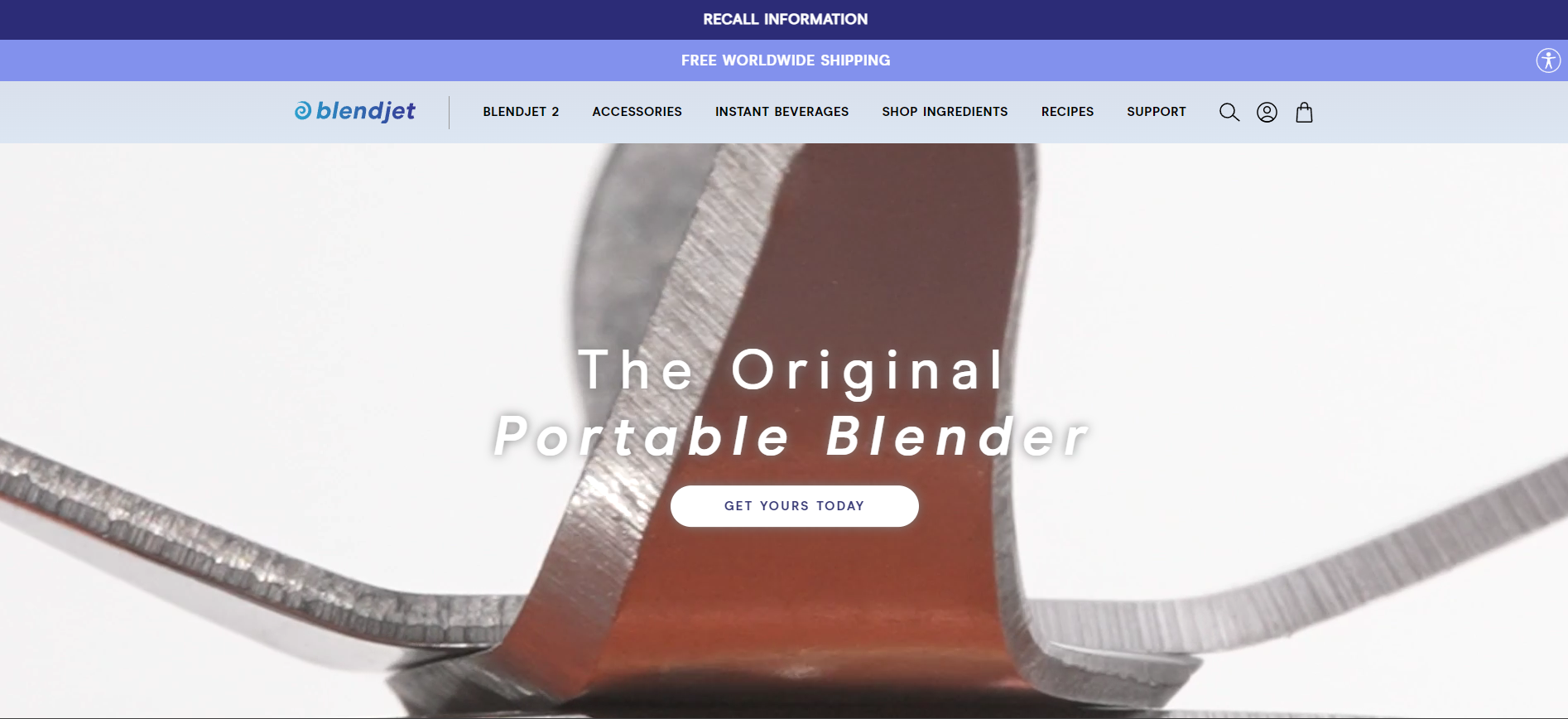
The company has built a strong presence not only through its high-quality product but also by fostering a community of health-conscious consumers who value convenience without compromising on nutritional benefits. BlendJet’s commitment to convenience, health, and innovation is reflected in its dynamic online Shopify store, which serves as the primary platform for showcasing its range of portable blenders and engaging with its customer base.
What we love
- Vibrant and Engaging Design: The site uses vibrant colors and dynamic imagery that reflect the energy and health focus of the brand, making it visually appealing and engaging for visitors.
- Product Demonstrations: Through the use of video content and high-quality images, BlendJet effectively demonstrates the versatility and ease of use of its portable blenders, helping customers visualize the product in action.
- Health and Wellness Content: BlendJet goes beyond selling a product by offering recipes, nutritional advice, and wellness tips, reinforcing its brand as a partner in its customers’ health and wellness journeys.
What we can learn from BlendJet
- Harnessing Visual Appeal: BlendJet’s vibrant and engaging design, characterized by lively colors and dynamic imagery, effectively reflects the energy and health focus of the brand. This approach demonstrates the power of visual elements in capturing visitors’ attention and conveying the brand’s identity and values. By prioritizing visual appeal, BlendJet creates a visually stimulating and memorable online experience that resonates with its target audience.
- Utilizing Product Demonstrations: BlendJet effectively utilizes video content and high-quality images to demonstrate the versatility and ease of use of its portable blenders. These product demonstrations help potential customers visualize how the product can fit into their lifestyle and solve their needs. By showcasing the product in action, BlendJet builds confidence and trust in their product’s functionality, ultimately driving conversions.
- Providing Value Through Health and Wellness Content: BlendJet goes beyond selling a product by offering valuable health and wellness content, including recipes, nutritional advice, and wellness tips. By positioning themselves as a partner in their customers’ health and wellness journeys, BlendJet adds value to the customer experience and strengthens brand loyalty. This strategy demonstrates the importance of building a holistic brand ecosystem that goes beyond product sales to provide ongoing support and guidance to customers.
Thinx
Thinx has revolutionized the feminine hygiene market with its innovative period underwear, offering a sustainable and comfortable alternative to traditional disposable products. Designed with absorbent and moisture-wicking fabrics, Thinx underwear is engineered to provide leak-proof protection, making it an eco-friendly solution for menstruators seeking convenience and reliability. The brand’s commitment to challenging societal norms and promoting period positivity has garnered a loyal customer base and widespread acclaim.
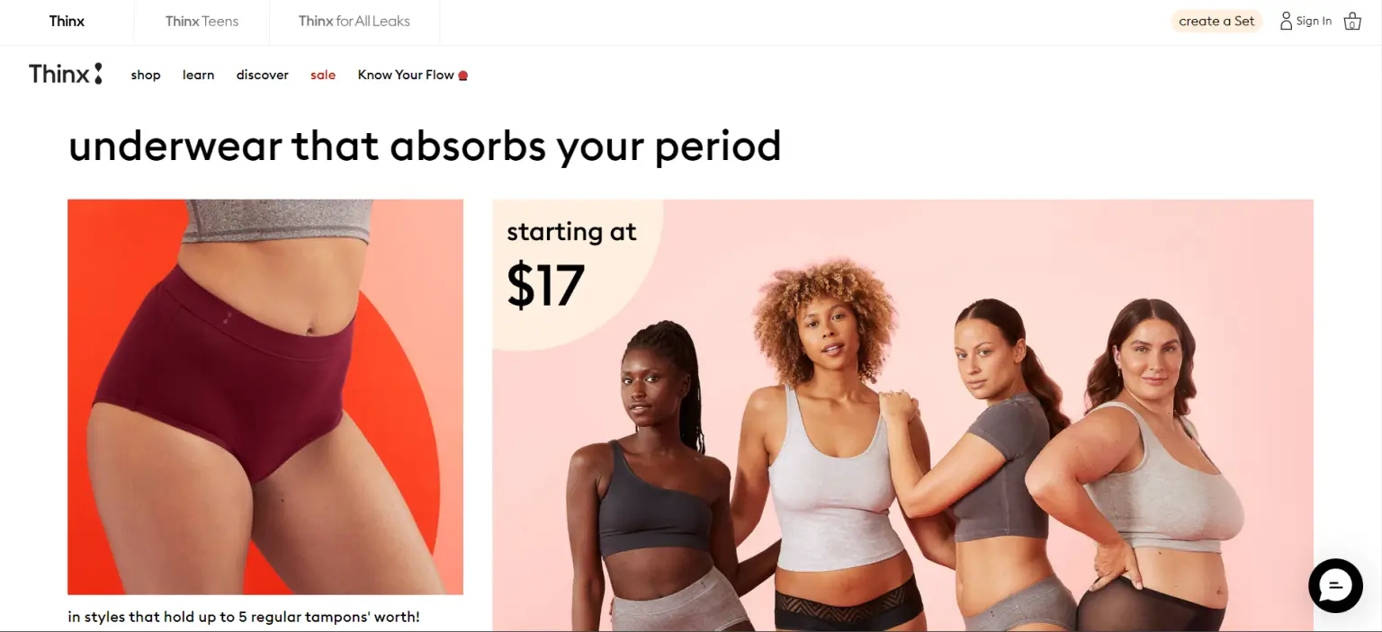
Thinx’s online Shopify store not only serves as a platform for purchasing its products but also functions as an educational resource, empowering customers with knowledge about menstrual health and sustainability practices. Thinx’s Shopify store excellently mirrors the brand’s innovative approach to menstrual care, offering a seamless and enriching online shopping experience that extends beyond mere transactions to educate and empower its customer base.
What we love
- Educational Content: Thinx provides valuable information on menstrual health and product care, fostering an informed community of users and promoting menstrual education.
- Inclusive Imagery: The use of diverse models across a range of body types and ethnicities reflects Thinx’s commitment to inclusivity, making customers feel represented and welcome.
- Product Variety: Even if Thinx only sells period underwear, the store still embraces variety by featuring a wide selection of styles, sizes, and absorbency levels, ensuring there’s a Thinx product to meet the needs of every customer.
What we can learn from Thinx
- Empowering Through Education: Thinx’s commitment to providing valuable information on menstrual health and product care showcases the importance of educational content in fostering an informed community of users. By offering resources that go beyond product sales, Thinx positions itself as a trusted source of menstrual education and advocacy. This approach not only adds value to the customer experience but also helps destigmatize menstruation and promote open dialogue around menstrual health.
- Celebrating Diversity and Inclusivity: Thinx’s use of diverse models representing a range of body types and ethnicities underscores the brand’s commitment to inclusivity and representation. By showcasing a variety of individuals in their marketing imagery, Thinx makes customers feel seen, valued, and welcomed. This inclusive approach demonstrates the importance of diversity in brand representation and highlights the need for businesses to prioritize inclusivity in their marketing efforts.
- Meeting Varied Customer Needs: Despite specializing in period underwear, Thinx embraces variety by offering a wide selection of styles, sizes, and absorbency levels. This commitment to product variety ensures that there’s a Thinx product to meet the diverse needs of every customer. By catering to different preferences and requirements, Thinx maximizes its appeal and accessibility to a broader audience.
Kulala Land
Kulala Land stands out as an enchanting online destination, offering a collection of whimsically designed products that aim to inject joy and color into everyday life. With a focus on vibrant and creative designs, Kulala Land’s offerings range from unique home decor items to fashion accessories, all adorned with distinctive patterns and bright colors that promise to uplift any space or outfit. The brand’s ethos revolves around creating products that are not just functional but also serve as little beacons of happiness and inspiration.
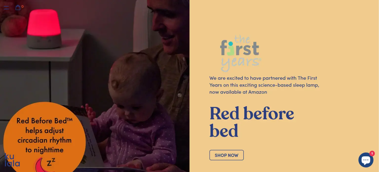
Through its Shopify store, Kulala Land has created a delightful shopping experience, effectively conveying its brand identity and connecting with customers who value creativity and cheerfulness in their purchases. Kulala Land’s Shopify store successfully embodies the brand’s vibrant and creative spirit, offering a seamless and engaging shopping experience that mirrors the joyfulness of its product line.
What we love
- Vibrant Color Scheme: The use of bright and cheerful colors throughout the site perfectly reflects the brand’s ethos, creating an inviting and joyful online environment.
- Engaging Product Imagery: High-quality images showcase the products’ unique designs and vivid colors, making it easy for customers to visualize them in their own spaces.
- Creative Content: The inclusion of blog posts and styling tips not only adds depth to the brand’s online presence but also offers customers ideas on how to integrate Kulala Land’s products into their lives.
What we can learn from Kulala Land
- Harnessing Vibrant Branding: Kulala Land’s use of bright and cheerful colors throughout the site exemplifies the power of vibrant branding in creating an inviting and joyful online environment. By aligning the color scheme with the brand’s ethos, Kulala Land effectively communicates its unique personality and values to visitors. This approach demonstrates the importance of cohesive branding across all touchpoints to evoke specific emotions and create a memorable brand experience.
- Showcasing Product Appeal: The inclusion of high-quality images showcasing the products’ unique designs and vivid colors demonstrates Kulala Land’s commitment to engaging product imagery. By providing customers with clear and visually appealing representations of their products, Kulala Land makes it easy for customers to visualize how the items would look in their own spaces.
- Adding Value Through Creative Content: Kulala Land’s incorporation of blog posts and styling tips adds depth to the brand’s online presence and offers customers ideas on how to integrate the products into their lives. By providing creative and informative content, Kulala Land enhances the overall customer experience and fosters a deeper connection with its audience.
The benefits of one product online store
Let’s examine in further detail the benefits you may have from a Shopify store that sells a single item:
- Optimize the use of time and resources: By concentrating on creating your one and only product, also known as the flagship. Simply sell one product and do it well. You may use the internet shop as a way to deliver your goods to clients who have the highest standards.
- Enlarge your audience: The internet is a huge platform that you can use to reach a sizable audience with your goods. Sellers don’t want to pass up the chance to expand their business and launch an online store because of this, even if their physical store is doing well.
- Aid in developing a powerful brand: As previously noted, it will be simpler to develop brand recognition and develop an advertising strategy because you have time to concentrate on only one product. After viewing your website, people will be aware of what your company does and the benefits they may expect. It would be more productive to invest time and energy in a website that actively engages with the targeted market segments rather than attempting to appeal to everyone, especially in specialized sectors.
- Create less work with a simpler workflow: Only need to design and improve one product page will reduce the amount of work you have to do, as opposed to establishing several collections and catalogs as you would with a multi-product store. Additionally, it is much easier to implement and saves a lot more time to manage orders and supplies for only one item.
How to create a one-product Shopify store in 6 steps
A one-product Shopify store focuses on selling a single product, rather than a wide range of items. This allows you to craft a more tailored and compelling shopping experience for your customers. Here’s a step-by-step guide on how to create a one-product Shopify store. However, please keep in mind that building and configuring a one-product Shopify store on your own may be a daunting task and there’re some technical aspects that are hard for you to handle. Thus, you can always visit our Shopify website development services to discover and select the most optimal solution for your online store.
Step 1: Start with store ideas
If you don’t have any ideas, you can’t construct a business! Therefore, the first step is to start being creative and to start writing down some thoughts.
There are countless methods to study potential product ideas.
Take what you have first. Have you been carrying around thoughts in the back of your mind for a long time? Perhaps you regularly experience problems that a product might help with. Do you possess a product that you think you might make better?
Otherwise, you can try to research Amazon bestsellers, get Inspired by Kickstarter, or go trend-hunting on Google Trends.
Step 2: Select a theme
Your theme is where your Shopify store’s single-product structure begins. Choose a theme that is specially made to help your main product stand out if you want to increase conversions.
Additionally, you want easy navigation so that customers can quickly navigate your website with few interruptions.
Here, you have a few choices to consider:
- Debut is a fantastic free theme with the qualifications to present your product in the best possible way. It is ideal for a single-product store.
- Another free Shopify theme, Boundless, emphasizes your photographs and provides you with lots of room to visually engage buyers.
- Streamline works effectively as a Shopify store theme for a single product. Your conversion rates will soar because of its dynamic content, story-focused product pages, and mobile-first design.
Step 3: Brand your store
Your brand identity consists of all the components that make up your shops, such as your logo, copy, photos, and color scheme.
Since branding is such a broad topic, it is impossible for us to turn you into a branding expert by the conclusion of this blog article. But we can provide some fast, practical advice to get you started:
- First, ask yourself: Who are we? Try to sum up who you are in three words.
- Determine your ideal customer profile: Without knowing who your ideal customer is, it is impossible to create a shop that would appeal to them. Find out who you are building your brand for by using the free persona generator from HubSpot.
- Pick Your Colors: Create your business with simply two main hues that your target customer would find appealing. Use Canva’s color palette maker to find inspiration if you’re stuck.
- Adjust your tone: Appeal to your target audience while writing copy. Use their language, humor, and slang to make yourself more relatable. Make sure to maintain consistency throughout the whole website.
- Make a distinctive logo: Your logo serves as the public face of your online store. Visit Fiverr and hire a skilled designer to make one for you. Alternatively, you may make one for nothing with Hatchful.
Step 4: Construct an impressive homepage
Your homepage and product page will be the two pages that you can focus all of your energy on constructing because there won’t be more than 30 pages to optimize.
Because just need to sell one item, the best Shopify one-product stores often create a homepage that looks like an eCommerce landing page.
Here are a few components that successful homepages have to increase conversions:
- Stunning images and several expert product images
- A headline that summarizes your product’s major selling point
- More simple language that outlines the possibilities of supplementary benefits
- A strong request for action
- One offer with the fewest potential interruptions
- Customer comments that increase social proof
Step 5: Optimize the product page
For a Shopify business with just one item, an engaging product page is essential. To obtain amazing conversion rates and reduce your cost per acquisition, it is important for these simple Shopify stores to invest time in testing and perfectly alright various components of your website.
Step 6: Create a post-purchase funnel
Offering buyers one or two related items after they make a purchase is a genius method to boost your one-product store’s earnings.
Offering extra items early in the purchasing process may also be effective. But you could discover that doing so takes attention away consumers’ attention from your main offering. Or prompts them to wonder if they really need to purchase them, which can lead to hesitancy.
Because of this, adding upsells and cross-sells to a one-product business on the thank-you page is one of the finest methods to do so.
Your primary product has already been sold on the checkout page. So you can now securely offer clients additional things without running the risk of losing the transaction.
To wrap up,
Now that we’ve gone over some typical one-product Shopify store examples, you should have a good idea of what works and what doesn’t. Keep these principles in mind as you build your own one-product Shopify store, and feel free to contact us if you need any help along the way. We’re always happy to lend a helping hand!