In this comprehensive guide, we delve into the world of baby stores on Shopify, showcasing 15 outstanding examples that have set themselves apart through exemplary web design and user-focused features. These stores not only meet the basic expectations of shoppers but exceed them, offering insights into the elements that make a baby product store successful online. Whether it’s the ease of navigation, aesthetic appeal, or the quality of customer interaction, each of these stores offers lessons on crafting a user experience that resonates with young families looking for the best for their little ones.
Table of Contents
15 Baby Shopify Stores with the Best Design
From adorable clothing and innovative gadgets to eco-friendly toys and health essentials, these top 15 baby Shopify stores exemplify excellence in quality, safety, and style, setting the standard for excellence in the baby product industry.
Posh Peanut
Posh Peanut is a popular online baby and children’s clothing brand that offers a range of high-quality and stylish clothing, accessories, and gifts for babies and children. The brand was founded in 2011 by Fiona Sahakian, a mother of two who was looking for stylish and comfortable clothing for her own children.
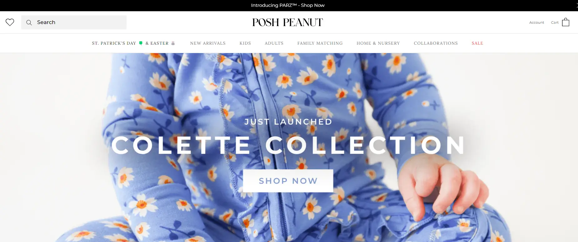
Posh Peanut operates entirely online through social media and its Shopify store. Therefore, Posh Peanut’s Shopify store design is well-executed and reflects the brand’s commitment to quality, style, and sustainability. The website’s user-friendly design and emphasis on user-generated content help to create a personalized and engaging shopping experience for customers.
What we love
- Elegant and User-Friendly Design: Posh Peanut’s Shopify store excels with its clean, stylish, and intuitive design. The layout is elegant, incorporating soft colors and refined fonts that align with the brand’s sophisticated and adorable product offerings.
- High-Quality Visuals and Imagery: A key strength of the Posh Peanut Shopify store is its use of high-quality, professionally taken photographs that showcase the products in real-life settings. The vivid, detailed photos are complemented by engaging product descriptions that provide clear information about the items, including fabric content, care instructions, and sizing.
- Community Building and Engagement: Posh Peanut actively fosters a strong community around its brand. The store features a section encouraging customers to join The #1 Mom Community, where they can receive special discounts, participate in brand-related discussions, and become loyal brand advocates.
What we can learn from Posh Peanut
- Importance of Elegant and User-Friendly Design: Posh Peanut’s success with its Shopify store underscores the importance of an elegant and user-friendly design. The use of clean layouts, soft colors, and refined fonts that reflect the brand’s sophisticated yet adorable product offerings creates a pleasant browsing experience for customers. This design strategy not only enhances the aesthetic appeal but also simplifies navigation, making it easier for customers to find and purchase products. Other businesses can learn from this by ensuring that their website design aligns with their brand identity and meets the expectations of their target audience, thereby improving user engagement and sales conversions.
- Leveraging High-Quality Visuals and Imagery: The store’s use of high-quality, professionally taken photographs in real-life settings allows customers to see the products in use, adding a layer of realism and trust. Vivid and detailed product photos, combined with engaging and informative descriptions, help bridge the gap between online shopping and physical product experience. This teaches businesses the value of investing in professional photography and detailed product descriptions that clearly communicate the key attributes and benefits of their products, helping customers make informed purchasing decisions.
- Building Community and Engagement: Posh Peanut’s strategy of building a community around its brand, exemplified by the creation of The #1 Mom Community, highlights the effectiveness of engaging customers beyond the transactional level. By offering special discounts, fostering brand-related discussions, and encouraging customers to become brand advocates, Posh Peanut creates a loyal customer base that is more likely to engage in repeat business and word-of-mouth promotion. Businesses can emulate this approach by developing platforms and initiatives that engage their customers, fostering a sense of community and loyalty, and turning customers into active participants in the brand’s ecosystem.
Sleeping Baby
Sleepingbaby.com is an online retailer that specializes in swaddles and other products designed to help babies and young children sleep comfortably and safely. The brand was founded by a mother of four who was looking for a solution to help her fussy and colicky baby sleep better. This brand’s signature product is the Zipadee-Zip, a wearable blanket that allows babies to move and roll over while still providing a secure and cozy sleeping environment.
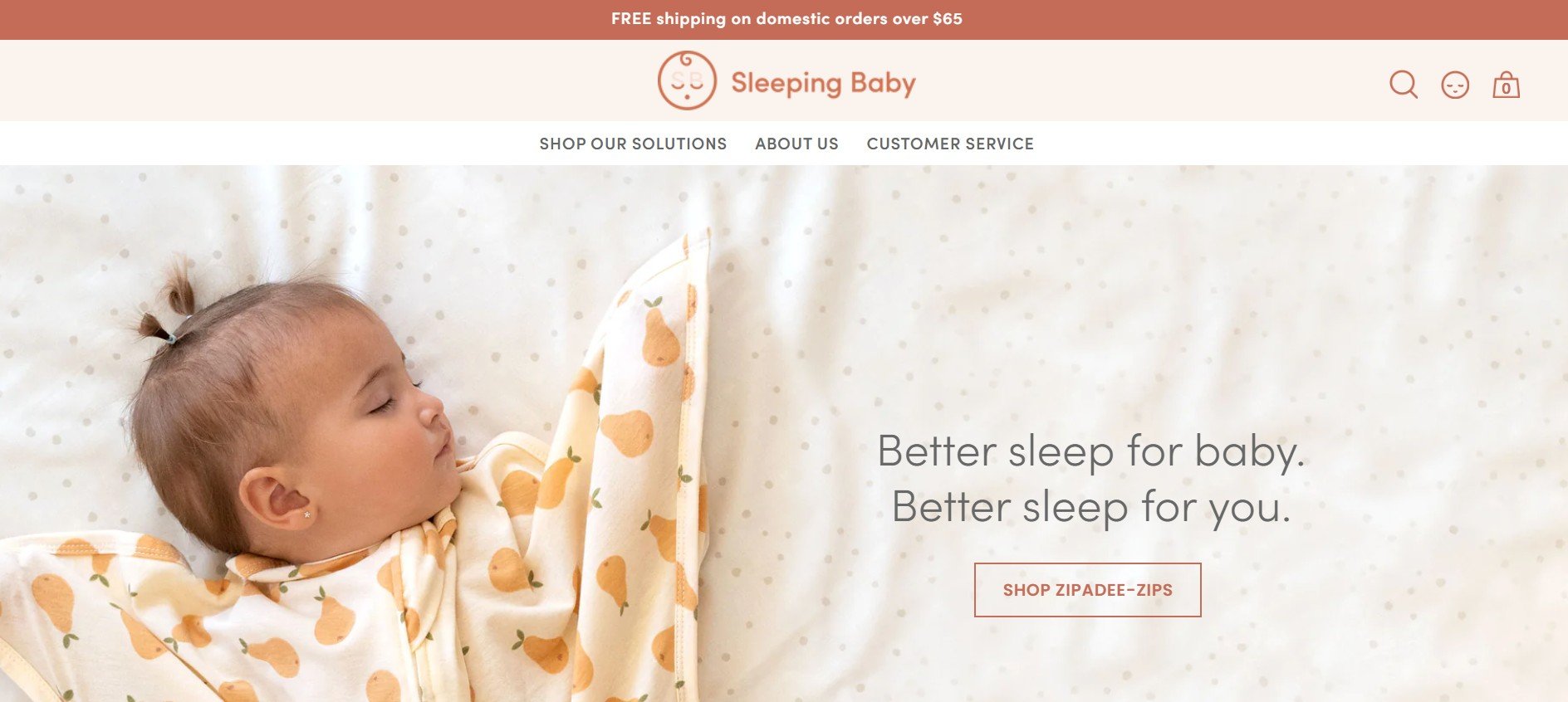
Sleepingbaby.com is also a fully online store, powered by Shopify. Sleepingbaby.com’s website features a clean and modern design that is easy to navigate. The homepage features large, high-quality images showcasing the brand’s products, as well as a section featuring customer reviews and recommendations. This emphasis on customer feedback helps to build trust with potential customers and provides valuable information for customers who are considering purchasing the brand’s products.
What we love
- Specialized Product Focus: Sleeping Baby is particularly known for its innovative product, the Zipadee-Zip, a swaddle transition that helps babies sleep better by providing snugness and warmth, mimicking the security of the womb.
- Engaging and Trustworthy Design: The design of the Sleeping Baby store leverages soft, soothing colors that resonate with the brand’s focus on sleep and calmness. The website layout is user-friendly, with well-organized sections that allow customers to easily navigate through different product categories and informational resources.
- Strong Social Proof and Media Recognition: The store highlights reviews and testimonials prominently, providing new visitors with reassurance about the quality and effectiveness of their products. Moreover, the brand has been featured on major platforms like Shark Tank, Good Morning America, and Forbes, which are prominently displayed on the site, further affirming its reputation and boosting customer confidence.
What we can learn from Sleeping Baby
- Capitalizing on Specialized Product Focus: Sleeping Baby’s success with the Zipadee-Zip highlights the power of having a specialized product focus that addresses a specific customer need—in this case, improving baby sleep. This focus allows the brand to target marketing efforts and refine product development to meet consumer demands effectively. Businesses can learn from this by identifying a niche market or a particular customer pain point and developing products that offer a unique solution, thereby setting themselves apart in a crowded marketplace.
- Implementing Engaging and Trustworthy Design: The use of soft, soothing colors and a user-friendly website layout at Sleeping Baby aligns perfectly with the brand’s focus on products that promote sleep and calmness. This thoughtful design not only makes the site appealing but also ensures that customers can easily navigate and find the information they need quickly and efficiently. Companies should consider how their website’s design and color scheme can reflect their product’s benefits, which enhances the overall user experience and supports the brand’s messaging.
- Leveraging Strong Social Proof and Media Recognition: Sleeping Baby effectively uses social proof by prominently displaying customer reviews and testimonials on their site, which helps to reassure new visitors of the product’s quality and effectiveness. Additionally, leveraging media recognition from appearances on shows like Shark Tank and mentions in Good Morning America and Forbes greatly boosts the brand’s credibility. Businesses can adopt similar strategies by actively seeking media opportunities and showcasing any positive coverage or customer testimonials prominently on their platforms to build trust and enhance their reputation.
Gerber Childrenswear
Gerber Childrenswear is a leading manufacturer and distributor of infant and toddler clothing and accessories. The company was founded in the late 1920s and is known for its famous Gerber Baby. Gerber Childrenswear focuses on offering a wide range of products for babies and young children, including basic essentials such as onesies, sleepwear, and bibs, as well as trendy and fashionable clothing items. The products are designed to be both practical and stylish, with a focus on comfort and functionality. This is strongly reflected in its website design.
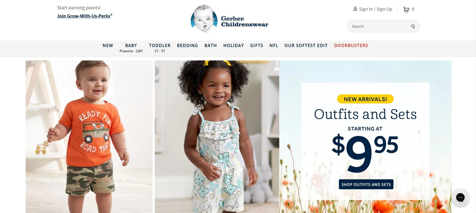
Gerber Childrenswear’s website is a popular choice for parents looking for reliable and fashionable clothing options for their children. Powered by Shopify, the website is extremely vivid with eye-catching images of babies and toddlers. Gerberchildrenswear.com also offers a variety of trendy seasonal or event-related collections. These collections add a unique and trendy twist to the brand’s products, making them even more appealing to fashion-conscious parents.
What we love
- Strong Brand Recognition: As a long-standing and trusted brand in baby products, Gerber Childrenswear leverages its brand recognition to instill trust and confidence among shoppers. This is reflected in the store’s design and marketing strategies, which emphasize the brand’s legacy of quality and commitment to child care.
- Engaging Customer Interaction: Gerber Childrenswear engages with its customers through various channels integrated into its Shopify store. This includes offering subscription services, loyalty rewards, and regular promotions, which enhance customer engagement and encourage repeat business. Their use of email marketing to provide offers and updates keeps the brand in regular contact with its consumer base.
- Focus on Educational Content: The store provides valuable information to parents through its blog, which covers topics related to baby care, parenting tips, and product usage. This not only helps in building a relationship with customers but also positions Gerber Childrenswear as an expert in the field of child care, further enhancing customer trust in the brand.
What we can learn from Gerber Childrenswear
- Leveraging Brand Recognition: Gerber Childrenswear effectively utilizes its long-standing reputation and brand recognition to instill trust and confidence among consumers. By emphasizing its legacy of quality and commitment to childcare in both its store design and marketing strategies, Gerber demonstrates how well-established brands can leverage their history to maintain customer loyalty and attract new shoppers. This approach teaches other businesses the importance of consistently communicating their brand’s strengths and historical reliability in their marketing efforts to reinforce consumer trust.
- Engaging Customer Interaction Strategies: The brand’s approach to engaging customers through integrated channels such as subscription services, loyalty rewards, and regular promotions within its Shopify store is a stellar example of how to keep customers returning. Additionally, the use of email marketing to provide offers and updates keeps Gerber Childrenswear in constant communication with its consumer base, enhancing the relationship and engagement levels. Businesses can learn from Gerber’s strategy by integrating similar engagement tools and communication tactics to maintain an active and engaged customer base.
- Focus on Educational Content: Gerber Childrenswear provides added value to its customers through educational content on its blog, covering topics from baby care to parenting tips and product usage. This not only helps build deeper relationships with customers but also establishes the brand as an authority in the field of childcare. Offering valuable content can enhance customer trust and loyalty, and businesses should consider how their expertise can be translated into content that not only informs but also enriches their customers’ lives.
Kyte Baby
Kyte Baby is an online retailer that specializes in baby clothing made from bamboo fiber. The brand was founded in 2014 by Ying Liu – a mother who was looking for a soft, comfortable, and sustainable fabric for her baby’s clothing. Kyte Baby is committed to sustainability and ethical production practices. The brand’s products are made from natural and sustainable materials, and the company works with suppliers who share its values and standards. The brand’s packaging is also eco-friendly, with a focus on reducing waste and minimizing its environmental impact.
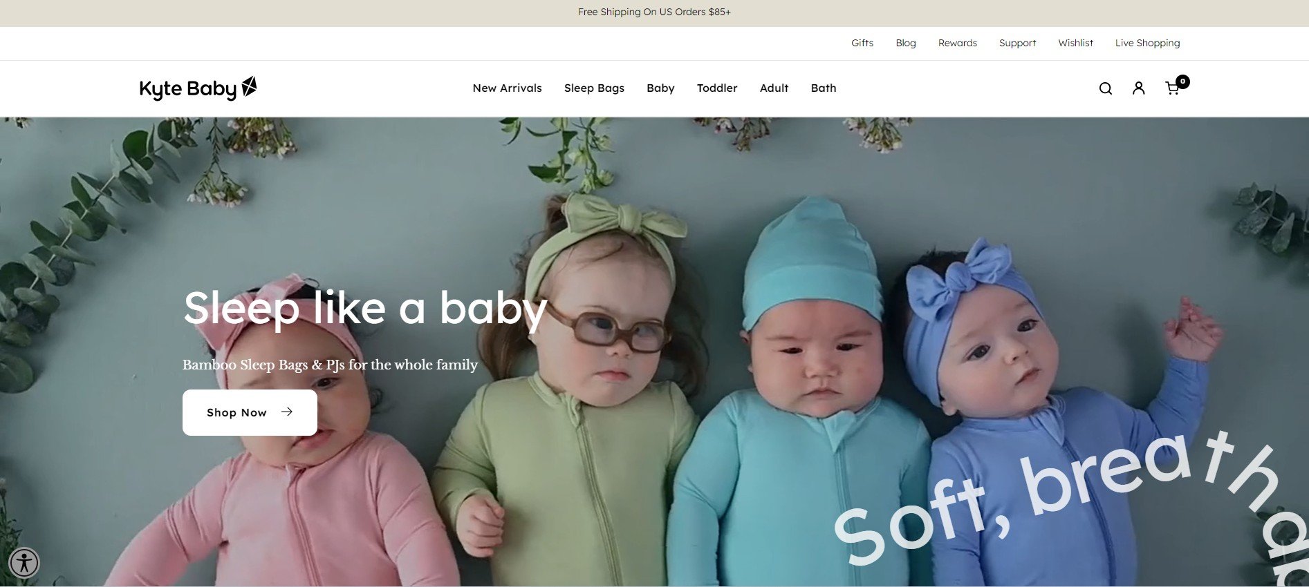
Kyte Baby’s web design is radiant with color and outstanding moving words along the site. This helps to highlight Kyte Baby’s products and their functionalities. One of the brand’s signature products is the Sleep Bag – a wearable blanket that allows babies to move and roll over while still providing a secure and cozy sleeping environment. The brand also offers a wide range of other baby clothing items, including onesies, sleepwear, hats, and swaddles. The brand’s products are available online in a variety of colors and patterns, with a focus on gender-neutral and classic designs that can be mixed and matched.
What we love
- Commitment to Sustainability: Kyte Baby is known for its use of bamboo fabric, which is both eco-friendly and gentle on babies’ skin. This commitment to sustainability is a central theme of their brand and is emphasized throughout their Shopify store.
- Engaging and Informative Product Descriptions: The store features detailed and thoughtful product descriptions that go beyond just listing features. Each description provides insights into the benefits of bamboo fabric, including its breathability, softness, and thermal-regulating properties. This helps educate consumers on why choosing Kyte Baby’s products is beneficial beyond just their sustainability.
- Strong Visual Appeal: The store utilizes high-quality images that accurately represent the products in a variety of settings, which helps customers envision how they might use the items. The use of soft, soothing colors in the website’s palette also mirrors the comfort and calmness associated with their products, further appealing to the target audience of new parents.
What we can learn from Kyte Baby
- Emphasizing Sustainability in Brand Identity: Kyte Baby’s commitment to using eco-friendly bamboo fabric is a core aspect of their brand identity, prominently featured throughout their Shopify store. This dedication not only caters to the increasing consumer demand for sustainable products but also differentiates the brand in the competitive baby product market. Businesses can learn from this approach by integrating sustainable practices into their products and clearly communicating this commitment to their customers, thereby enhancing brand loyalty and attracting a market segment that values environmental responsibility.
- Crafting Engaging and Educational Product Descriptions: Kyte Baby’s product descriptions go beyond typical features and delve into the benefits of bamboo fabric, such as its breathability, softness, and thermal-regulating properties. This level of detail educates consumers about the distinctive advantages of their products, helping them understand why these items might be superior to others on the market. Businesses should consider how their product descriptions can also educate customers, not just inform them, turning basic features into compelling selling points that resonate with the needs and values of their audience.
- Enhancing Online Experience with Strong Visual Appeal: The use of high-quality images and a soothing color palette in Kyte Baby’s Shopify store effectively conveys the quality and comfort of the products, aligning with the needs and preferences of new parents, and their target audience. This strong visual strategy aids customers in envisioning the products in use, which can be particularly persuasive in online shopping where the tactile experience is absent. Companies can take note of this approach by ensuring their online visuals accurately reflect and enhance their product’s best qualities, making the items as attractive and desirable as possible through professional photography and thoughtful design aesthetics.
Happiest Baby
Happiest Baby is an online retailer that specializes in products designed to help parents and babies sleep better. The brand was founded by Dr. Harvey Karp, a pediatrician and child development expert, who is known for his bestselling book The Happiest Baby on the Block.
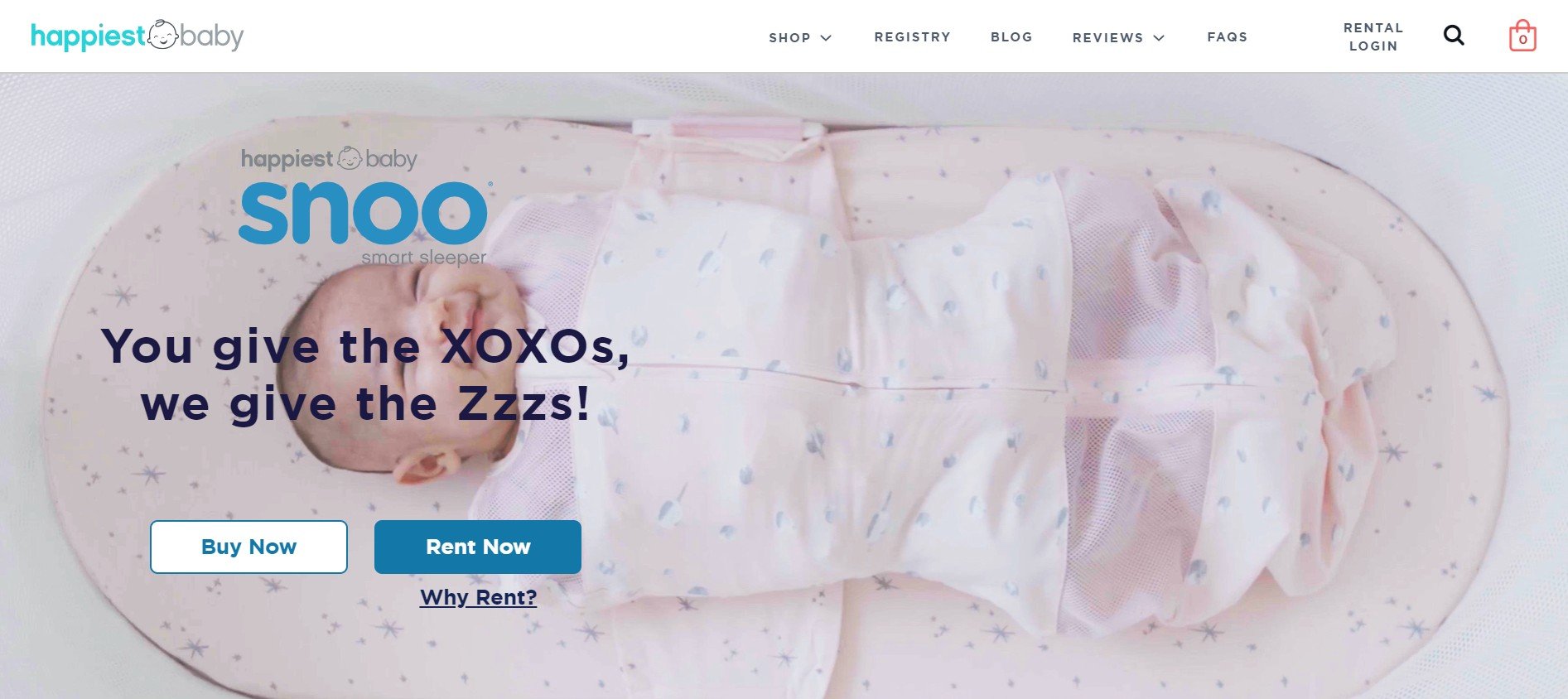
The brand’s signature products include Snoo Smart Sleeper is highly promoted on the website and on its own app. It’s a responsive bassinet that uses advanced technology to provide a safe and comfortable sleeping environment for babies. The Snoo is designed to mimic the gentle rocking and swaying motion that babies experience in the womb, which can help soothe them to sleep and reduce fussiness. The website happiestbaby.com also offers a variety of other sleep-related products, including swaddles, sleep sacks, and white noise machines. The website homepage features large, high-quality images showcasing the brand’s products, as well as a section featuring Dr. Karp’s latest tips and advice for new parents. More than that, happiestbaby.com offers a variety of resources for new parents, including articles, videos, and webinars on topics such as sleep training, breastfeeding, and infant development. The brand’s focus on education and support for parents is reflected in its products and website design, making it a popular choice for new parents who are looking for guidance and practical solutions to common challenges.
What we love
- Innovative Product Offering: Happiest Baby is perhaps best known for the SNOO Smart Sleeper, an automated baby bed designed by Dr. Harvey Karp that uses advanced technology to improve baby sleep patterns. This product stands out in the baby market for its unique approach to enhancing sleep safety and efficiency, appealing strongly to tech-savvy and modern parents.
- Strong Use of Educational Content: The store doesn’t just sell products; it educates. Happiest Baby provides a wealth of information related to baby sleep, health, and development. This content, available through blogs and FAQs, not only helps to position the brand as a thought leader in infant care but also aids in building trust with consumers by providing them with valuable resources that can assist in their parenting journey.
- Engaging Design and User Experience: The design of the Happiest Baby Shopify store is clean and modern, which aligns with the innovative nature of its products. The site is easy to navigate, making it simple for users to find products, read detailed descriptions, and view high-quality images that enhance the buying experience. The strategic placement of calls-to-action (CTAs) such as Rent Now and Buy Now is also effective in guiding consumers through the purchasing process.
What we can learn from Happiest Baby
- Emphasizing Innovation in Product Development: Happiest Baby’s introduction of the SNOO Smart Sleeper, an automated baby bed designed to improve sleep safety and efficiency, showcases the impact of innovation in capturing market attention and differentiating from competitors. This product meets a critical need with advanced technology, appealing especially to modern, tech-savvy parents. Companies can learn from this by focusing on developing unique products that solve real problems in ways that current market offerings do not, thereby creating a strong value proposition.
- Leveraging Educational Content to Build Brand Authority: The comprehensive educational content provided by Happiest Baby, including blogs and FAQs about baby sleep, health, and development, plays a crucial role in establishing the brand as a thought leader in the field of infant care. This strategy not only enriches the customer’s knowledge but also builds trust and credibility, enhancing customer loyalty and encouraging repeat visits. Businesses should consider investing in quality content that educates and engages their audience, thereby deepening relationships and supporting the sales process.
- Prioritizing Engaging Design and User Experience: The clean, modern design of the Happiest Baby Shopify store, aligned with its innovative products, makes the shopping experience inviting and efficient. The site’s easy navigation, detailed product descriptions, and high-quality images facilitate the buying process, while strategically placed calls-to-action guide consumers smoothly through the purchase journey. This approach highlights the importance of aligning store design with product offerings and ensuring that all elements of the website support an easy and informative shopping experience.
Owlet Care
Owletcare.com is an online retailer that specializes in baby monitors and sleep-related products designed to give parents peace of mind while their babies sleep. The brand was founded in 2013 by a group of dads who wanted to create a safer and smarter way to monitor their babies’ breathing and sleep patterns.
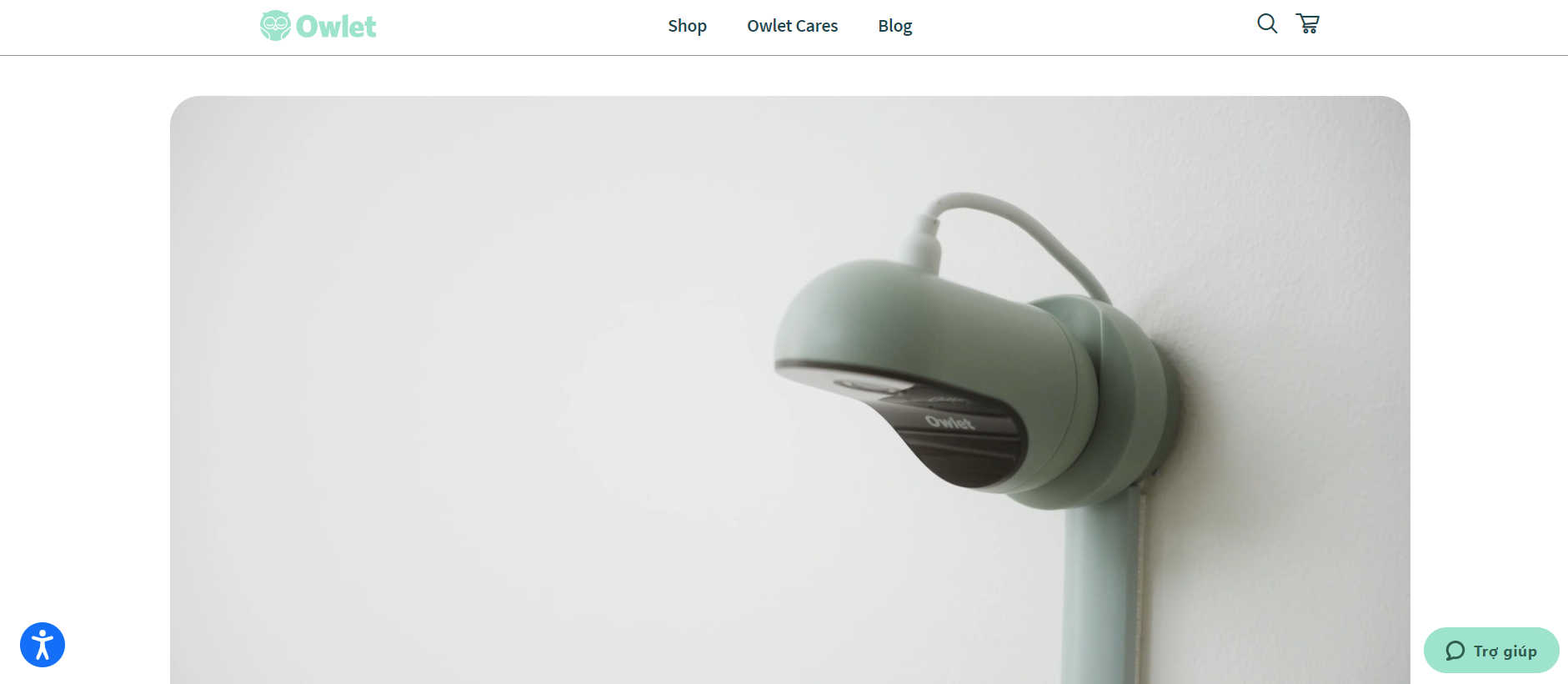
One of the website’s signature products is the Owlet Smart Sock, a wearable device that tracks a baby’s heart rate, oxygen levels, and sleep patterns. The Smart Sock uses advanced technology to provide real-time monitoring and alerts parents if their baby’s vital signs fall outside the normal range.
Besides focusing on introducing the Owlet Smart Sock, Owlet Care’s online store also has a variety of other sleep-related products, including baby monitors, cameras, and sound machines. These products are designed to provide parents with a greater sense of security and confidence while their babies sleep, with a focus on safety, reliability, and ease of use.
What we love
- Focus on Innovative Products: Owlet Care is renowned for its groundbreaking products like the Smart Sock and Owlet Cam which monitor a baby’s vital signs and provide parents with real-time insights via their smartphones. This innovative approach addresses a critical need for parents wanting to ensure their baby’s safety and health, making the products highly appealing and setting the store apart from traditional baby gear retailers.
- User-Friendly Design: The Shopify store features a clean, intuitive design that makes navigating the site straightforward and stress-free. This is crucial for attracting and retaining customers who may be new parents seeking quick and easy solutions. The site’s layout ensures that information about each product is easily accessible, along with clear instructions on how to use the products effectively.
- Strong Visuals and Media: The store utilizes high-quality images and videos to showcase its products in action, which is especially important for technology-focused items. Demonstrating how the products work in a real-life setting helps bridge the gap between online shopping and physical product experience, enhancing consumer trust and engagement.
What we can learn from Owlet Care
- Prioritizing Product Innovation: Owlet Care’s focus on innovative products like the Smart Sock and Owlet Cam, which monitor a baby’s vital signs, highlights the importance of addressing specific, critical needs through technology. This approach not only sets the store apart from competitors but also significantly enhances its appeal to target customers—new parents concerned about their baby’s health. Businesses can learn from Owlet’s success by investing in research and development to create products that meet underserved needs, thereby carving out a unique position in the market.
- Emphasizing User-Friendly Design: The clean and intuitive design of Owlet’s Shopify store exemplifies how crucial a user-friendly website is for attracting and retaining customers. Especially for new parents, who are often pressed for time and managing high stress, the ability to navigate a website easily and find essential information quickly is invaluable. Companies should consider simplifying their site’s layout, improving navigational cues, and streamlining the user journey to enhance the overall customer experience.
- Leveraging Strong Visuals and Media: Owlet’s use of high-quality images and videos to demonstrate their products in action shows the power of visual media in online retail, particularly for technological products. Seeing a product in use can significantly reduce buyer hesitancy by providing a clearer understanding of how it works and the value it offers. Businesses should aim to incorporate similar visual elements into their marketing strategy to bridge the gap between an online store and a physical product experience, thus building stronger customer trust and engagement.
Hello Bello
Hellobello.com is an online retailer that specializes in eco-friendly and affordable baby products. The brand was founded by actress/entrepreneur couple Kristen Bell and Dax Shepard in 2019, with a mission to create high-quality and accessible baby products that are safe for babies and the planet. Besides retail through its partner, Walmart, Hellobello also sells its products directly through an online store at: Hellobello.com
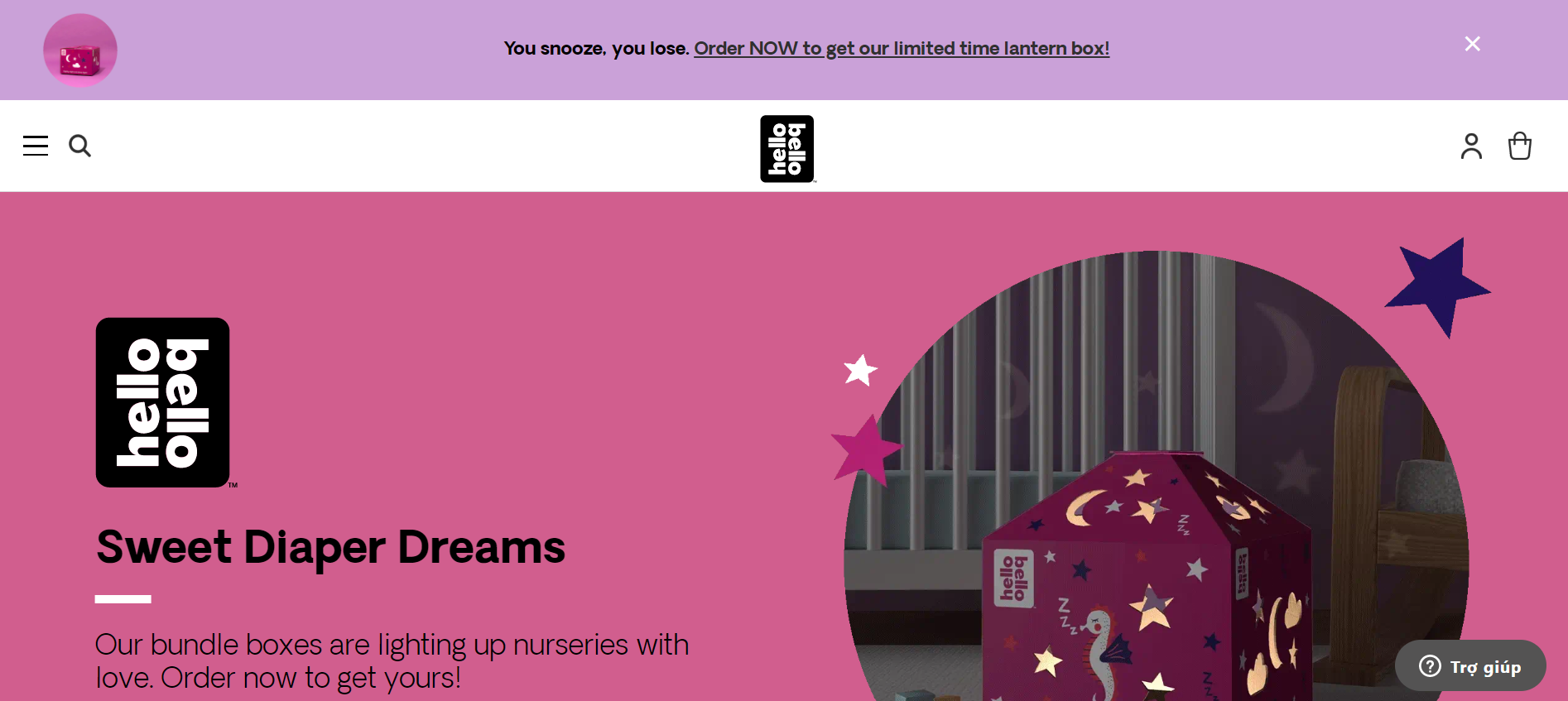
The website has fun and playful designs and features bright and colorful images. One of the website’s signature products is the Hello Bello Diapers, which are made with a plant-based core and are free from harsh chemicals and fragrances. More than that, hellobello.com also offers a variety of other baby products, including wipes, baby lotion, shampoo, and bubble baths. All the brand’s products are made with plant-based and organic ingredients and are free from harsh chemicals and toxins.
Hellobello.com offers a subscription service for its diapers and other baby products, which allows parents to save money and receive regular deliveries of their favorite products. The brand’s focus on affordability and sustainability is reflected in its products and website design, making it a popular choice for parents who are looking for high-quality and eco-friendly baby products at affordable prices.
What we love
- Affordable Pricing and Transparency: Hello Bello positions itself as offering premium products at non-premium prices, which is an attractive proposition for many parents. The store includes clear pricing, subscription options, and bundle deals that provide additional savings, making it easier for families to stock up on essentials.
- Strong Brand Identity: Hello Bello leverages the star power of its founders to create a strong, relatable brand identity. The store reflects this identity through its playful and colorful design, which is appealing and welcoming, effectively communicating the brand’s commitment to fun, safe, and eco-friendly baby products.
- Customer Reviews and Social Proof: Hello Bello’s Shopify store effectively utilizes customer reviews and ratings to provide social proof, fostering trust and credibility among potential buyers. Highlighting these testimonials helps reassure customers about the quality and effectiveness of their products.
What we can learn from Hello Bello
- Balancing Affordability with Quality: Hello Bello’s strategy of offering premium products at affordable prices addresses a critical consumer need—balancing cost with quality, especially in the baby products market where safety and reliability are paramount. By incorporating clear pricing, subscription options, and bundle deals, the store makes it financially easier for families to purchase essential items. This approach not only attracts cost-conscious buyers but also encourages bulk purchases and repeat business. Businesses can learn from this model to develop pricing strategies that appeal to their target demographics while providing genuine value.
- Leveraging Brand Identity: Hello Bello effectively utilizes the star power of its founders to forge a strong, relatable brand identity that resonates with its target audience. The store’s playful and colorful design communicates the brand’s values of fun, safety, and eco-friendliness, making it appealing and accessible. This teaches other businesses the importance of a coherent brand identity that aligns with the product offerings and the values of the company, using design elements that reflect these principles to strengthen brand recognition and emotional connection with customers.
- Utilizing Customer Reviews for Social Proof: The effective use of customer reviews and ratings on Hello Bello’s Shopify store provides valuable social proof, enhancing trust and credibility among prospective customers. Showcasing positive testimonials directly on product pages can significantly influence purchasing decisions by alleviating concerns about product effectiveness and quality. Companies should consider integrating similar strategies into their eCommerce platforms to leverage social proof as a powerful tool for building consumer confidence and driving sales.
Newton Baby
Newton Baby is an online retailer that specializes in baby mattresses and sleep-related products designed to promote safe and healthy sleep for babies. The brand was founded by Michael Rothbard, a father who was inspired to create a safer and more breathable baby mattress after his daughter was born.
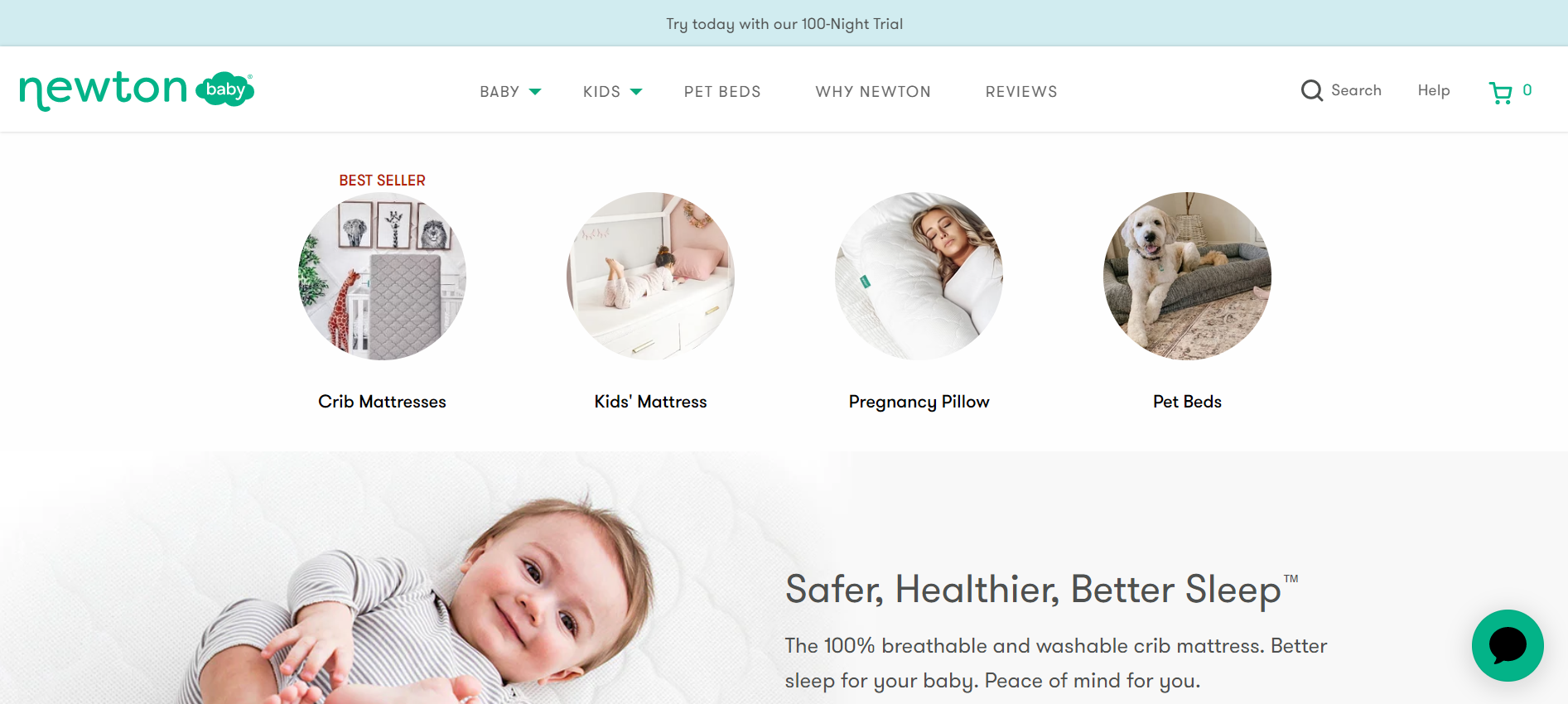
Newtonbaby.com provides a variety of other sleep-related products, including crib sheets, crib skirts, and swaddles. One of the brand’s signature products is the Newton Crib Mattress, made with a patented Wovenaire core, which helps to provide maximum breathability and airflow, to reduce the risk of suffocation and overheating while babies sleep. All the brand’s products are made with high-quality materials and are designed to promote safe and healthy sleep for babies. Along with that, Newton Baby’s 100-night free trial policy really helps the brand to stand out the most among competitors.
What we love
- Transparency and Assurance: Newton Baby offers a risk-free trial for their mattresses, providing customers with a 100-night sleep trial. This offer reflects the brand’s confidence in its products and helps alleviate the apprehension that often comes with online purchases of high-value items like baby mattresses.
- Interactive and User-Friendly Features: Newton Baby’s Shopify store includes interactive elements like detailed images, videos showing the breathability of the mattresses, and easy access to customer service. These features enhance the user experience, making it more engaging and informative.
- Clean and Clear Website Design: The Shopify store of Newton Baby is designed with clarity and simplicity in mind. It features a clean aesthetic with plenty of white space that helps highlight its products effectively. This design approach not only makes the site visually appealing but also makes it easier for customers to navigate and find information quickly.
What we can learn from Newton Baby
- Enhancing Customer Confidence with Transparency and Assurance: Newton Baby’s offer of a 100-night sleep trial on their mattresses exemplifies how businesses can effectively alleviate customer apprehensions associated with online purchases of high-value items. This generous trial period reflects the brand’s confidence in its products and is a powerful tool for converting potential buyers into satisfied customers. Businesses can learn from this approach by considering similar satisfaction guarantees or extended trial periods, which can significantly lower the perceived risk for customers and enhance the attractiveness of high-stakes purchases.
- Utilizing Interactive and User-Friendly Features: The inclusion of interactive elements such as detailed images, videos demonstrating product features like breathability, and easy access to customer service on Newton Baby’s Shopify store greatly enhances the user experience. These elements make the shopping process more engaging and informative, helping customers make educated decisions about their purchases. Businesses looking to improve their online stores can incorporate similar interactive features, focusing on multimedia content that highlights their products’ unique attributes and ease of use.
- Prioritizing Clean and Clear Website Design: Newton Baby’s focus on a clean and clear website design with plenty of white space not only makes the site visually appealing but also simplifies the navigation process for customers. This design strategy is crucial for reducing customer frustration and enhancing the ease with which users can find information and make purchases. Other businesses can adopt this approach by minimizing clutter on their websites, using white space effectively to highlight products, and organizing information in a straightforward manner that aids quick decision-making.
Happ Brand
Happ Brand is a popular diaper bag brand that offers a range of stylish and functional diaper bags for modern parents. The company was founded with the goal of creating a diaper bag that not only looks great but also makes life easier for parents on the go. Their bags feature a variety of thoughtful design elements, such as easy-access pockets, wipeable interiors, and insulated bottle holders.
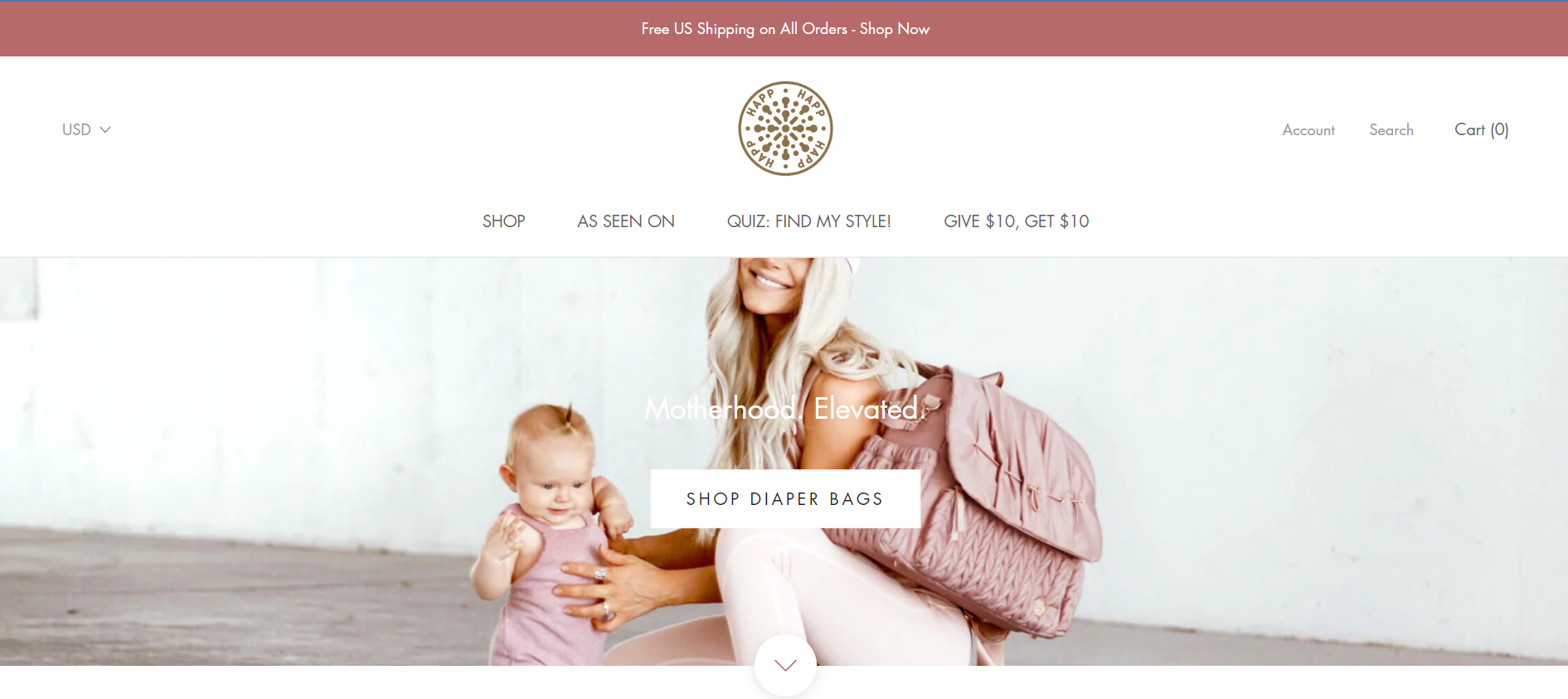
In terms of website design, Happbrand.com is elegant, modern, and user-oriented. The homepage features large-scale, high-quality images of their products, along with a clean and minimalistic design that puts the focus on the bags themselves. The site also includes detailed descriptions and measurements of each bag, as well as reviews and ratings from the previous to help shoppers make informed purchase decisions.
What we love
- Marketing and Promotions: Happ Brand utilizes its Shopify platform to run promotions and marketing campaigns effectively. They offer newsletter sign-ups with first-purchase discounts, and their marketing strategies are integrated into the store’s layout, such as featuring limited-time offers or highlighting bestsellers.
- Product Information and Customization Options: Each product page on Happ Brand’s site provides detailed descriptions, including the materials used, dimensions, weight, and specific features like pockets, straps, and waterproof capabilities. This level of detail helps customers make informed decisions. Additionally, the store often features options for customizing products, such as choosing different colors or adding accessories, which enhances the shopping experience.
- Design and Aesthetics: Happ Brand’s Shopify store features a clean, modern design that aligns with the sleek and stylish nature of its products. The use of high-quality images that showcase the bags in various scenarios helps potential buyers visualize the product in use. The overall aesthetic of the website mirrors the sophisticated and fashionable design of the bags, appealing to a contemporary, style-conscious audience.
What we can learn from Happ Brand
- Effective Marketing and Promotions: Happ Brand’s use of its Shopify platform to run promotions and integrated marketing campaigns offers valuable lessons in eCommerce strategy. The brand’s approach to including newsletter sign-ups with first-purchase discounts and featuring limited-time offers directly within the store’s layout is a tactical move that can drive sales and build a customer base quickly. This shows the importance of integrating promotional activities seamlessly into the website design to catch the customer’s attention without navigating away from their shopping experience.
- Comprehensive Product Information and Customization: Providing detailed product descriptions and customization options on each product page is an effective way to enhance customer satisfaction and reduce return rates. By detailing the materials, dimensions, weight, and specific features like pockets and straps, Happ Brand ensures that customers can make well-informed decisions. Offering customization like color choices or additional accessories can significantly enhance the shopping experience by giving customers a sense of personalization and ownership over their purchases.
- Design and Aesthetic Alignment: The clean and modern design of Happ Brand’s Shopify store, combined with high-quality images that showcase the products in use, not only enhances the visual appeal but also aids in customer purchase decisions by allowing them to better visualize the product. This aesthetic consistency ensures that the store’s design aligns with the sleek and stylish nature of its products, appealing to a fashion-conscious demographic. This approach underlines the importance of having a visually appealing eCommerce site that reflects the brand’s identity and meets the expectations of its target audience.
Treasurie
Treasurie is an online retailer that specializes in sewing patterns, tutorials, and fabric for a variety of crafts, including baby clothing, accessories, and decor. The brand was founded by a mother of two, who started designing and creating her own baby clothes after struggling to find high-quality and affordable options in stores.
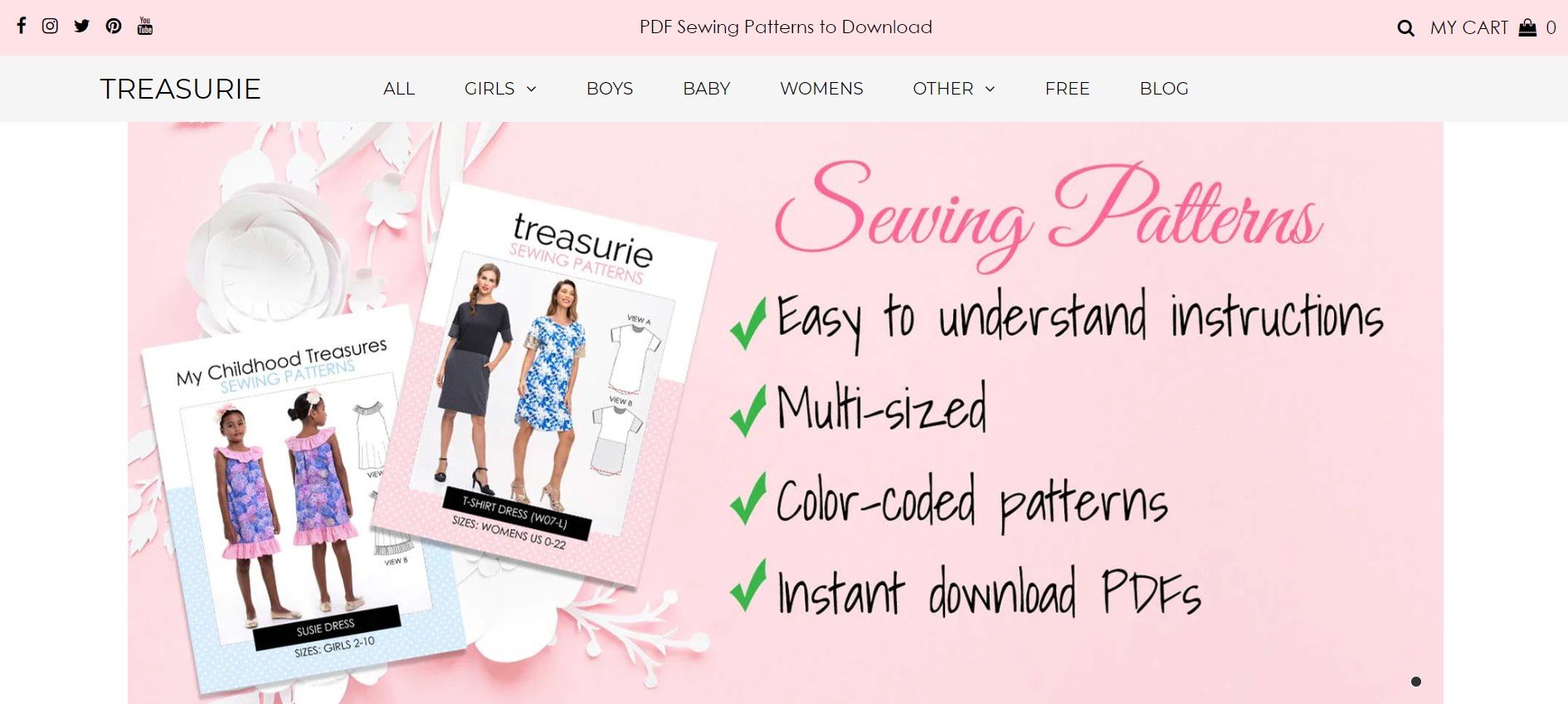
One of the brand’s signature products is its collection of baby clothing patterns, which includes a wide range of styles and designs for both boys and girls. The patterns are available for purchase as downloadable PDF files and come with step-by-step instructions and helpful tips for beginners.
Treasurie.com also offers a variety of resources for beginner sewers, including tutorials and articles on topics such as fabric selection, pattern reading, and basic sewing techniques. The brand’s focus on education and support for new sewers is reflected in its products and website design, making it a popular choice for both experienced and novice craftsmen.
What we love
- Educational Resources: Treasurie doesn’t just sell patterns; it also provides valuable resources to help customers improve their sewing skills. The site includes tutorials, tips, and articles about sewing techniques and project ideas, which are great for building a community around the brand and assisting customers in their sewing endeavors.
- Engaging Visual Content: The store uses high-quality images and sometimes video tutorials that show the finished products made using the patterns. This visual content is not only inspiring but also gives potential buyers a clear idea of what they can achieve with the patterns, adding an extra layer of encouragement to purchase.
- User-Friendly Design: The store is well-organized with a clean, navigable design that enhances the shopping experience. Categories and products are easy to browse, and there’s a search function that helps users quickly find specific patterns or types of projects. The layout is visually appealing and straightforward, which minimizes customer frustration and aids in efficient navigation.
What we can learn from Treasurie
- Value of Educational Resources: Treasurie exemplifies how providing educational content can enhance a brand’s value and deepen customer engagement. By offering tutorials, tips, and articles related to sewing, Treasurie does more than just sell products—it educates its audience. This approach not only helps build a loyal community around the brand but also positions the company as a thought leader in its niche. Businesses can adopt this strategy by incorporating educational resources that align with their products, thereby enhancing customer experience and increasing retention.
- Importance of Engaging Visual Content: The use of high-quality images and video tutorials in Treasurie’s store underscores the power of visual content in online retail. Such visuals not only inspire but also provide clarity on what customers can achieve with the products, thereby reducing uncertainty and motivating purchases. Companies can learn from this by investing in top-notch photography and video production that showcases their products in use, which can help bridge the gap between customer expectations and product reality.
- Benefits of a User-Friendly Website Design: Treasurie’s well-organized and navigable website design highlights the importance of user experience in eCommerce. A clean layout with easy-to-browse categories and an effective search function minimizes user frustration and aids in seamless navigation, ultimately leading to a better conversion rate. Businesses should prioritize website design that facilitates an effortless browsing experience, ensuring that customers can find what they need quickly and without hassle.
Monica and Andy
Monica and Andy is an online retailer that specializes in organic and sustainably made baby and children’s clothing. The brand was founded by Andy’s mother, Monica Royer, who was inspired to create a line of baby clothes that was both stylish and eco-friendly.
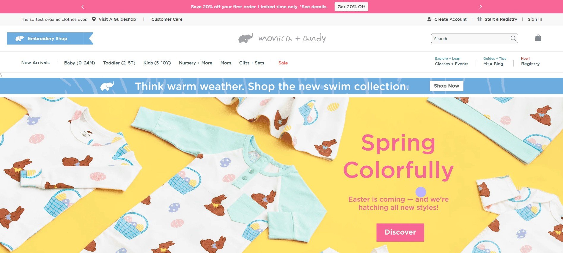
Monicaandandy.com’s product includes everything from bodysuits and rompers to leggings and dresses, including blankets, toys, and accessories. All the products are designed to be gentle on baby’s sensitive skin, with colorful and cute prints. Monicaandandy’s website really showcases all of that with a trendy design that is super easy to navigate. Customers can search for a specific product with the print they like, or even customize it with an embroidered name or monogram. This made the product become so personalized.
What we love
- Commitment to Organic Materials: Monica + Andy places a strong emphasis on using organic and safe materials for its products, which is particularly appealing to parents concerned about the materials in contact with their baby’s skin. The use of GOTS (Global Organic Textile Standard) certified cotton ensures that the products are not only safe and soft but also sustainable, aligning with the growing consumer demand for environmentally responsible products.
- Personalized Shopping Experience: Monica + Andy offers a unique feature called the Cuddle Box, which allows customers to create personalized gift boxes filled with items of their choosing. This level of customization adds a personal touch to the shopping experience, making it ideal for gifts and special occasions.
- Educational Content: Monica + Andy leverages its platform to provide value beyond just selling products by offering a range of workshops and classes that cover topics relevant to new parents, such as prenatal yoga and infant CPR. These classes help to build a community around the brand and serve as an additional resource for parents visiting the site.
What we can learn from Monica and Andy
- Prioritizing Eco-Friendly and Safe Materials: Monica + Andy’s commitment to using organic and GOTS-certified materials highlights the importance of catering to consumer values, particularly in markets sensitive to product origins and manufacturing processes. This approach not only meets the demands of parents looking for safe and sustainable products for their children but also strengthens the brand’s position in a competitive marketplace where consumers increasingly favor environmentally responsible businesses. Other companies can take a page from this playbook by emphasizing eco-friendly practices and certifications in their product lines, thereby appealing to a growing demographic concerned with sustainability.
- Enhancing Customer Engagement with Personalization: The introduction of personalized products, such as the Cuddle Box, illustrates how offering customization can significantly enhance the consumer shopping experience. This feature allows customers to feel more connected to the brand, as they can create products that are uniquely tailored to their preferences or needs, making them particularly appealing for gifts and special occasions. Businesses can learn from this strategy by incorporating personalization options where feasible, thereby increasing the perceived value and distinctiveness of their offerings.
- Building Community through Educational Content: Monica + Andy’s strategy of providing workshops and classes on topics relevant to their target audience serves dual purposes. It enhances customer loyalty and brand trust by offering value beyond just products, and it helps build a community of engaged users who are likely to return to the platform not only for purchases but also for support and information. This approach can be particularly effective for brands looking to deepen relationships with their customer base, fostering a sense of community and ongoing engagement through valuable content and shared learning experiences.
PatPat Wholesale
PatPat Wholesale is an online retailer that offers a wide range of wholesale baby clothing and accessories for retailers, resellers, and businesses. The brand was founded in 2014 and has since become a popular destination for retailers who are looking for fashionable and functional options for baby clothing and accessories.
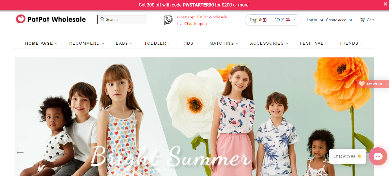
One of the brand’s signature products is its collection of wholesale baby clothing, which includes everything from bodysuits and rompers to dresses and jackets. The clothing is available in a variety of sizes and styles and is designed to be both comfortable and affordable.
PatPat Wholesale’s Shopify baby store stands out for introducing high-quality products at a competitive price. Besides high-quality images, the clothes come with a highlighted discount price, which helps customers to see what a deal the products are.
What we love
- Multilingual and Multi-currency Support: Understanding the global nature of eCommerce, PatPat Wholesale supports multiple languages and currencies, making it accessible to a global audience. This inclusivity enhances the customer experience by making the site more user-friendly for non-English speakers and allowing for transactions in various local currencies.
- Strong Focus on Visuals: PatPat Wholesale uses high-quality images and detailed product descriptions to effectively showcase its products. This visual approach helps in reducing the ambiguity often associated with online shopping, allowing customers to get a better sense of the product details, such as fabric quality and design features, before making a purchase.
- User-Friendly Website Design: The Shopify store is designed to be intuitive and easy to navigate, enhancing the customer shopping experience. Product categories are clearly defined, and the site features search and filter functions that help customers find specific items quickly. The clean layout and responsive design of the website ensure that it is accessible on both desktop and mobile devices.
What we can learn from PatPat Wholesale
- Embracing Global Accessibility: PatPat Wholesale’s implementation of multilingual and multi-currency support is a prime example of how eCommerce businesses can enhance their global reach. By accommodating multiple languages and currencies, PatPat makes its online store accessible and welcoming to a diverse international audience. This inclusivity not only broadens their market but also improves the user experience for customers worldwide, reducing barriers to entry. Businesses looking to expand their online presence globally can learn from this approach by incorporating similar features to cater to various cultural and regional preferences.
- Leveraging High-Quality Visuals and Descriptions: The use of high-quality images and detailed product descriptions in PatPat Wholesale’s Shopify store plays a crucial role in mitigating the inherent limitations of online shopping, such as the inability to touch and feel products. By providing clear, detailed visuals and comprehensive descriptions, PatPat helps customers understand the quality and features of the products, which can lead to more confident purchasing decisions. This strategy is particularly effective in reducing return rates and increasing customer satisfaction. Other eCommerce platforms can adopt this approach to improve their product presentations and enhance transparency.
- Prioritizing User-Friendly Design: PatPat’s focus on creating an intuitive and easy-to-navigate website exemplifies the importance of user-friendly design in eCommerce. With clearly defined product categories, effective search and filter functionalities, and a clean layout that is responsive across all devices, PatPat ensures that customers can find what they need quickly and with ease. This attention to user experience is critical in maintaining low bounce rates and encouraging repeat visits. Businesses can take cues from PatPat’s design philosophy to optimize their own eCommerce sites for better navigation and overall customer experience.
Mother Sparsh
Mother Sparsh is an Indian brand that specializes in natural and eco-friendly baby care products. The brand was founded in 2016 by Dr. Himanshu Gandhi and Rishu Gandhi, who were looking for safe and natural products for their own babies.
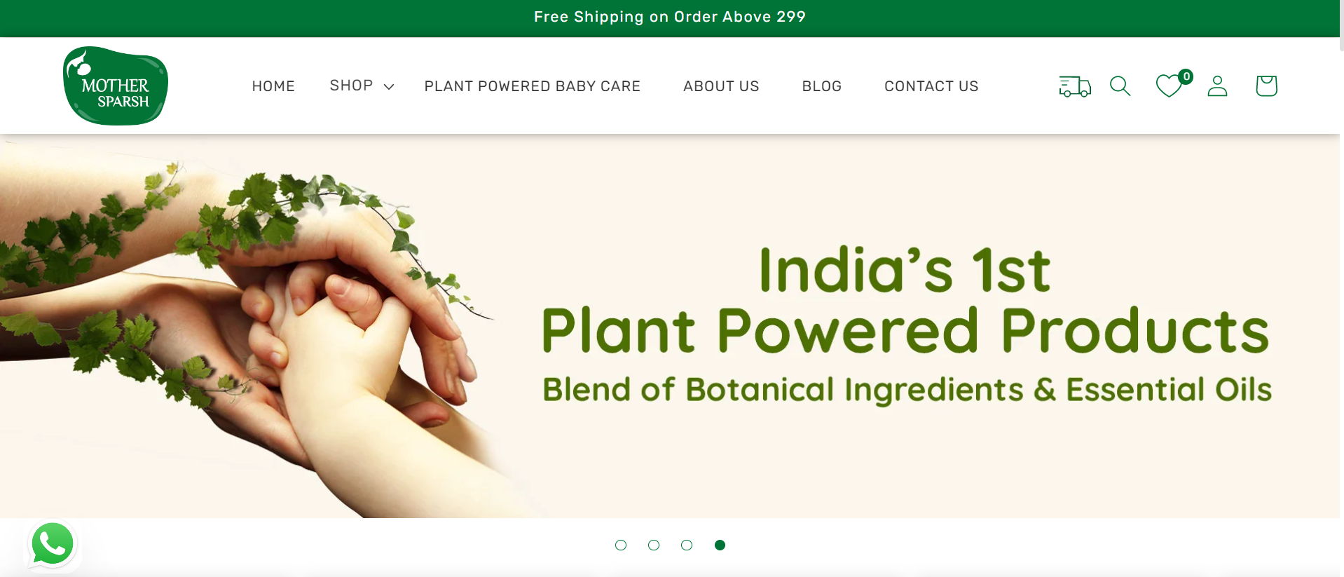
One of the brand’s signature products is its collection of baby wipes, which are made with 99% water and plant-based ingredients. The wipes are free from harsh chemicals, fragrances, and alcohol, and are designed to be gentle on a baby’s delicate skin. The brand also offers a variety of other baby care products, including diapers, massage oil, baby lotion, and baby powder, all made with natural and safe ingredients.
With a white and green color palette, the Mother Sparsh website presents itself to be safe and nature-focused. The homepage features large, high-quality images showcasing the brand’s products, as well as a section featuring customer ratings and videos, proving it’s a well-loved choice for parents who are looking for natural and safe baby care products.
What we love
- Focus on Natural and Ayurvedic Products: Mother Sparsh is well-known for its commitment to natural and Ayurvedic products, which is a significant draw for parents looking for safe, chemical-free options for their children. The store features products like plant-powered baby wipes, natural oils, and organic skincare items, which are prominently highlighted across the site.
- Clean and Informative Product Descriptions: Each product on the Mother Sparsh Shopify store is accompanied by detailed descriptions that include ingredients, benefits, usage instructions, and age recommendations. This level of detail helps customers make informed decisions and increases the transparency of the brand, fostering trust and credibility.
- Engaging and Educational Content: Mother Sparsh utilizes its Shopify platform to engage with customers beyond just selling products. The site includes a blog that offers valuable content related to parenting, baby care tips, and detailed guides on choosing the right products for babies.
What we can learn from Mother Sparsh
- Emphasizing Product Purity and Safety: Mother Sparsh’s focus on natural and Ayurvedic products effectively taps into the growing consumer trend towards organic and chemical-free options, especially for products used on children. By prominently featuring these attributes across their site, they align with the values of health-conscious consumers, enhancing market appeal. Brands can learn from this approach by clearly communicating their commitment to safety and natural ingredients, which is particularly compelling in sectors like baby care where parents are exceedingly careful about product choices.
- Providing Detailed and Transparent Product Information: The comprehensive product descriptions on the Mother Sparsh Shopify store serve a dual purpose. They educate consumers on the benefits and applications of the products while also building trust through transparency about ingredients and usage. This detailed level of information helps mitigate online shopping uncertainties and fosters a higher level of consumer confidence in the brand. Businesses should consider adopting this strategy to enhance credibility and assist customers in making informed purchasing decisions.
- Leveraging Content Marketing: Mother Sparsh’s use of its blog to provide educational content that extends beyond their product offerings exemplifies effective content marketing. By covering topics relevant to their audience, such as parenting tips and baby care advice, they not only increase site traffic but also build a community around their brand. This approach enhances customer engagement and loyalty, positioning the brand as a trusted resource in the parenting community. Companies can emulate this strategy to deepen connections with their customers and broaden their brand’s appeal.
Woolino
Woolino is a Canadian company that specializes in natural and sustainable baby and toddler sleepwear. The brand was founded in 2009 by Mimi or Mirjana Dzodzo, a mother who was looking for a safer and more comfortable sleep solution for her baby.
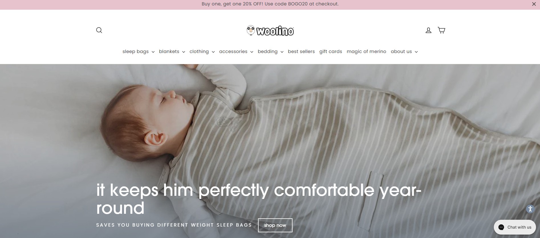
One of the brand’s signature products is its collection of merino wool sleep bags, blankets, and pajamas. Merino wool is a natural and breathable fabric that helps regulate body temperature, making it an ideal material for baby sleepwear. The sleep bags are also designed to be safe and comfortable, with features such as a two-way zipper for easy diaper changes, and adjustable shoulder snaps & underarm wrap for a custom fit.
The Woolino website has a white and pink palette with a clear and consistent design. The homepage features large, high-quality images showcasing the brand’s products, as well as a section featuring customer testimonials. The brand also put an Instagram post embedded near the end of the page to showcase more community posts from this platform.
What we love
- Specialization in Merino Wool Products: Woolino focuses exclusively on merino wool sleepwear, which sets it apart in a niche market. Merino wool is renowned for its natural temperature-regulating properties, making it ideal for baby sleepwear. This specialization helps Woolino to target a specific audience effectively, providing a product that meets a clear need with distinguished benefits such as improved sleep comfort and suitability for all seasons.
- Responsive Customer Service: Woolino provides excellent customer service, with clear communication channels for support and a strong focus on customer satisfaction. This responsiveness is critical in building long-term relationships with customers and encouraging positive word-of-mouth referrals.
- High-Quality Product Imagery and Descriptions: The Woolino Shopify store uses high-quality images and detailed product descriptions that clearly communicate the benefits of merino wool, such as being hypoallergenic, natural, and capable of managing moisture better than other fabrics. Each product page includes comprehensive details about the care instructions, material benefits, and sizing information, helping customers make informed purchasing decisions.
What we can learn from Woolino
- Leveraging Product Specialization: Woolino’s strategy to specialize in merino wool sleepwear highlights the benefits of focusing on a niche market. This specialization allows them to target a specific audience effectively by addressing unique needs with a product that stands out due to its inherent benefits, such as temperature regulation and comfort. Businesses can learn from this approach by identifying a niche product or service that meets specific customer needs and differentiating themselves in a crowded market.
- Importance of Responsive Customer Service: Woolino’s commitment to excellent customer service demonstrates how vital responsiveness is in building customer loyalty and fostering positive word-of-mouth. By ensuring clear communication channels and focusing on customer satisfaction, businesses can develop strong relationships with their customers, which are crucial for long-term success. This approach not only helps in retaining customers but also in attracting new ones through referrals.
- Utilizing High-Quality Visuals and Detailed Product Descriptions: The use of high-quality images and comprehensive product descriptions in Woolino’s Shopify store plays a crucial role in their online success. Detailed visuals and informative descriptions help bridge the gap between online shopping and in-store experiences, allowing customers to gain a thorough understanding of products. This transparency is key to helping customers make informed decisions and reducing purchase hesitations, particularly important in the online sale of apparel where touch and feel are absent.
Huxbaby
Huxbaby distinguishes itself in the children’s fashion market with a minimalist and sophisticated style, seamlessly incorporating the sleek aesthetic sensibilities of adult fashion into children’s apparel. Their clothing line is known for its contemporary designs that prioritize not only style but also practicality, catering to the everyday needs of growing children. This makes their collection highly appealing to parents who value fashion-forward, versatile garments that are both stylish and functional.
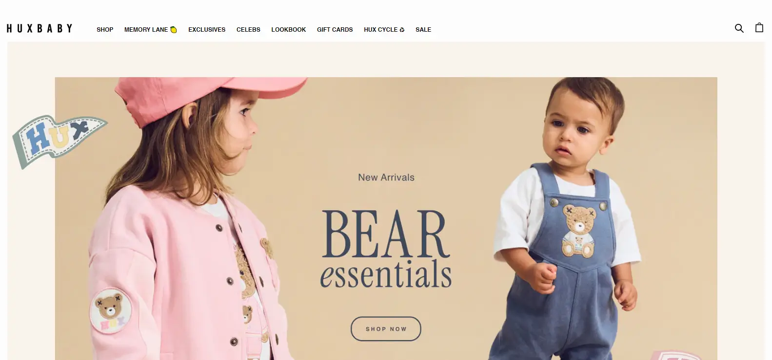
Moreover, Huxbaby places a strong emphasis on environmental responsibility, utilizing organic and sustainable materials in their products. This commitment not only ensures the safety and comfort of the clothing against children’s sensitive skin but also aligns with the values of eco-conscious consumers. The brand effectively merges style with sustainability, creating pieces that are safe, durable, and less impactful on the environment, thus appealing to modern parents who are increasingly looking for ethical and eco-friendly children’s wear options.
What we love
- Professional and Minimalist Design: Huxbaby’s Shopify store features a clean and minimalist design that reflects the brand’s modern and fashionable ethos. The use of a simple color palette and sleek typography helps create an upscale and accessible online shopping environment.
- Engagement with Interactive Elements: Huxbaby adds an engaging touch with interactive elements like a changing mouse icon when hovering over products. This small but clever feature enriches the user experience and can make the shopping process more enjoyable.
- Focus on Sustainability: Reflecting a growing trend in consumer preferences, Huxbaby emphasizes its commitment to sustainability. The use of organic materials is a key selling point, appealing to environmentally conscious consumers who are also looking for style and substance in children’s wear.
What we can learn from Huxbaby
- The Importance of Professional and Minimalist Design: Huxbaby’s approach to design demonstrates the power of a professional and minimalist aesthetic in creating an appealing online store. Businesses can learn from Huxbaby’s use of a simple color palette and sleek typography, which help in creating an upscale yet accessible shopping environment. This design philosophy can effectively draw customers in and keep their focus on the products rather than on distracting elements.
- Enhancing User Experience with Interactive Elements: The integration of interactive elements like a changing mouse icon when hovering over products is a small but significant touch that enhances user engagement. This strategy can make the online shopping experience more interactive and enjoyable, potentially increasing the time customers spend on the site and positively impacting their likelihood of making a purchase. Other eCommerce businesses could consider incorporating subtle interactive features to enrich the user experience.
- Emphasizing Sustainability: Huxbaby’s focus on sustainability is a critical lesson for modern businesses. With increasing consumer awareness and demand for environmentally friendly products, highlighting a brand’s commitment to sustainability can be a strong market differentiator. Using organic materials not only appeals to environmentally conscious consumers but also adds a layer of trust and value to the brand. Companies should consider how their commitment to sustainability can be integrated into their product lines and marketing strategies to appeal to this growing demographic.
What users look for in a baby Shopify store
- User-friendly design
When it comes to all websites, baby Shopify stores included, user-friendly design is essential for providing a positive shopping experience for customers. Users are looking for a website that is eye-catching, visually appealing and provides all the necessary information they need to make a purchase.
- High-quality product images and detailed descriptions
High-quality product images and detailed descriptions are significant factors that users look for when shopping at a Shopify store. These elements not only help to build a professional brand image but also provide users with a clear understanding of the product, helping them make informed purchasing decisions and increasing the likelihood of a successful sale.
- Simple navigation
Navigation is also a critical aspect that users look for when shopping online. A clear and easy-to-use navigation menu with search functionality is essential for providing users with a positive shopping experience and ensuring they can find what they are looking for quickly and easily.
- Social proof and customer reviews
Social proof and customer reviews are important factors that users look for when shopping at Shopify baby stores. This is a powerful psychological phenomenon where people tend to trust the opinions and recommendations of others when making purchasing decisions. Customer reviews are a form of social proof that can help build trust and confidence in the brand.
- Fast shipping and a great return policy
Shipping and return policies are essential factors that users look for when shopping for babies. Babies grow fast, that’s why customers who are parents or parents’ relatives expect their purchases to be delivered quickly and in ready-to-use condition. Fast and quality shipment can help ensure that customers are satisfied with their purchase and are more likely to return for future purchases. Having a great return policy helps to gain customers’ trust and decrease the likelihood of order cancellation.
6 tips for building a successful baby Shopify store
- Conduct market research
Conducting market research is an important first step in building a successful baby store on Shopify. This involves identifying your target market, understanding their needs and preferences, and also researching the competition.
- Choose the right niche market
After doing market research, the next step is choosing the right niche market. Having a small enough market with high demand and potential for your business to grow will make your life way easier. This can include analyzing online search trends, surveying potential customers, and researching competitors.
- Focus on SEO optimization
SEO (or search engine optimization) is crucial for driving organic traffic to your store. Optimizing SEO includes conducting keyword research, optimizing product pages, creating valuable content, creating a clear site structure, and building quality backlinks.
- Build a strong brand identity
Building a strong brand identity is important for creating a memorable and trustworthy image for your Shopify baby store. At this step, you need to define your brand values, develop a unique brand voice, create a recognizable visual identity, and so much more.
- Utilize social media
Utilizing social media can help you increase brand awareness, engage with your target audience, and drive traffic to your baby Shopify store. To use social media effectively, first thing first, baby brand owners need to choose the right platform by identifying which social media platforms the brand’s target audience is most active on and focusing the efforts on those platforms. Instagram and Facebook are the two most popular among Shopify baby stores.
After that, all the things brand managers need to do is engage, engage, and engage. From creating engaging content to interacting with your audience through comments, messages and so much more. This will help to create a community of customers
- Build a parent-support community
Being a parent is hard and challenging, that’s why having a supportive community will make your customer’s life so much easier. Especially, when attaching that community to your brand will help create a bond between customers and your products, hence more loyal customers. This community can share a lot of things baby-related, from how to use your product, to how to collectively buy for a cheaper price, and which products they like or dislike. This helps you understand more about your customers and make improvements along the way.
In conclusion,
To sell baby-related products, you need more than just a good product, you need a user-friendly and easy-to-navigate website with products displayed by high-quality images with detailed descriptions, customer reviews & ratings. Don’t forget about providing fast shipping and a great return policy. Because parents are already busy and frustrated, they don’t want to go to such a hustle to shop at your website when there are a lot of competitors out there who can do much better than you. More than that, to have a successful baby Shopify store, you also need to conduct market research, choose the right niche market, focus on SEO optimization, build a strong brand identity, utilize social media, and build a parent-support community.
Currently in need of a top-notch baby Shopify store? Our expert team is more than happy to assist. Please, feel free to discover how we can help you thrive.


