Do you experience high traffic and clicks but need more sales on your Shopify store? It’s not uncommon for online stores to attract hundreds or even thousands of visitors in their early days, yet fail to generate any sales. However, assuming that you’re driving the right traffic, identifying the specific reasons why potential customers aren’t making purchases can feel like solving a mystery with few clues. A customer’s decision to make a purchase is influenced by numerous factors. Similar to any medical diagnosis, it’s crucial to objectively evaluate all possible causes before identifying the actual problems and taking the necessary steps to fix them. Our SEO and copywriting experts have compiled a list of actionable practices to help you escape the situation of your Shopify store getting traffic no sales.
Table of Contents
Data Analysis
The very first step, it’s important to closely analyze your existing website data to know the place where you’re losing your customers. Since each online store is unique, reviewing your analytics can highlight specific areas where users may be struggling. You can find this data in your Shopify dashboard or through Google Analytics. Below are some key metrics that you should consider in the process of analyzing your website status to find out reasons why your Shopify store getting traffic, clicks, but no sales.
Analyzing Whether Shoppers Are Adding Products To Their Cart
Analyzing whether shoppers are adding products to their cart is a great way to assess whether changes need to be made to your online store. To do this, check your online store conversion rate in your Shopify analytics dashboard to determine how many visitors are adding your products to their cart.
To view your conversion rate, simply navigate to the Overview tab in your Shopify analytics dashboard. Here, you will see a graph that displays your conversion rate over time. You can adjust the timeframe for this graph to view your conversion rate over a specific period.
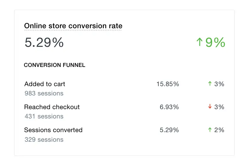
It’s important to note that your overall conversion rate is just one piece of the puzzle. To get a more detailed understanding of where you may be losing potential customers, it’s recommended that you break down your conversion rate into purchasing milestones such as added to cart and reached checkout. This will help you identify specific areas of your website where visitors may be dropping off.
If visitors are not adding products to their cart, there are a few things you can do to remedy this situation.
- Firstly, consider offering multiple photos for visitors to browse through.
- Additionally, increasing the size or changing the color of your Add to Cart button could also make a difference.
- Make sure that your Add to Cart button is easy to locate on both the desktop and mobile versions of your site.
- It may also be worth removing unnecessary or lengthy product copy that pushes your Add to Cart button too far down the page.
- Lastly, use bullet points, bolding, and other formatting options to make your product page easier to scan.
Do Shoppers Abandon Their Carts?
Cart abandonment is a common issue for online retailers. It occurs when a shopper adds items to their cart but does not complete the checkout process. This can happen for a variety of reasons, from unexpected shipping costs to a confusing checkout process.
According to research, the average cart abandonment rate is about 70%. This means that for every 10 shoppers who add items to their cart, only 3 end up making a purchase. This is a significant loss of potential revenue for online businesses.
So why do shoppers abandon their carts? There are many reasons, but some of the most common include:
- Unexpected shipping costs: Shipping costs are often the biggest reason for cart abandonment. If a shopper sees high shipping costs at checkout, they may abandon their cart and look for a better deal elsewhere.
- Complicated checkout process: If the checkout process is too complicated or takes too long, shoppers may get frustrated and abandon their cart.
- Lack of payment options: If a shopper does not see their preferred payment option at checkout, they may abandon their cart.
- Security concerns: If a shopper does not trust the website’s security or payment processing, they may abandon their cart.
- Comparison shopping: Shoppers may add items to their cart to compare prices, but then abandon the cart and purchase elsewhere.
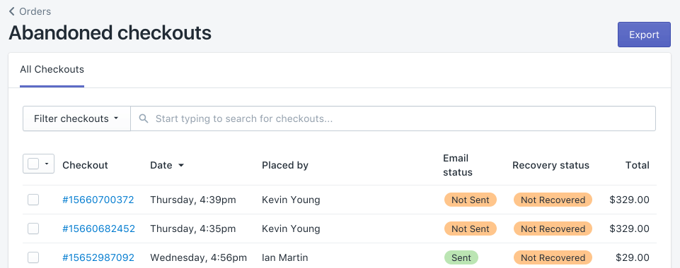
Below are some effective ways to decrease the rate of abandoned carts in your online store:
- You can offer free or low-cost shipping. This can help reduce sticker shock at checkout and encourage shoppers to complete their purchases.
- Make sure your checkout process is straightforward to follow. Consider using a progress bar to show shoppers how close they are to completing their purchase. Eliminate the Review Your Cart page and instead use a slide-out cart with a button that takes customers straight to checkout after adding items to their cart. In addition, you can use dynamic checkout to add a Buy Now button to your product page, allowing customers to go straight to checkout if they’re ready to buy.
- Ensure to offer a variety of payment options to accommodate different preferences.
- Personalize your abandoned cart email and provide a discount code in your abandoned cart email to encourage customers to complete their purchases and boost your conversion rate.
- If a shopper is comparison shopping, consider offering a price match or other incentives to encourage them to complete their purchase with you.
The Affection Of Pricing And Payment Options To Customer’s Checkout Decisions
As we mentioned in the previous part, additional prices or a lack of suitable payment options are the biggest reasons why customers abandon their carts in the last step. If your website has a strong conversion rate from the product page to the checkout stage, but you are still losing customers at the final step of the purchasing journey, consider implementing the following strategies:
- Transparent prices: The way customers perceive the price of a product can greatly impact their decision to make a purchase. This is why businesses need to display clear and transparent pricing information. Any hidden fees or charges can lead to customer frustration and cart abandonment.
- Discounts and promotions: Offering discounts and promotions can be a powerful motivator for customers to complete their purchases. Limited-time offers or free shipping can encourage customers to act quickly and make a purchase.
- Payment options: Providing a variety of payment options can make checkout easier and more convenient for customers. This includes options like credit cards, PayPal, and digital wallets such as Apple Pay or Google Pay. If a customer is unable to pay with their preferred method, they may be more likely to abandon their cart.
- Trust and security: Customers need to feel confident that their payment information is safe and secure. Displaying trust symbols and secure payment badges can help build trust with customers and reduce cart abandonment.
- Transparency in the payment process: Providing clear information about the payment process can help customers feel more comfortable and confident about making a purchase. This includes displaying the total cost of the purchase, including taxes and shipping fees before the customer enters their payment information.
- Shipping prices and options: Re-evaluate your pricing and shipping costs to make them more appealing to shoppers. Additionally, you should create a free shipping threshold to encourage customers to purchase more items. Provide a range of shipping rates, from affordable standard shipping to more expensive express options to provide more diverse shipping options for customers.
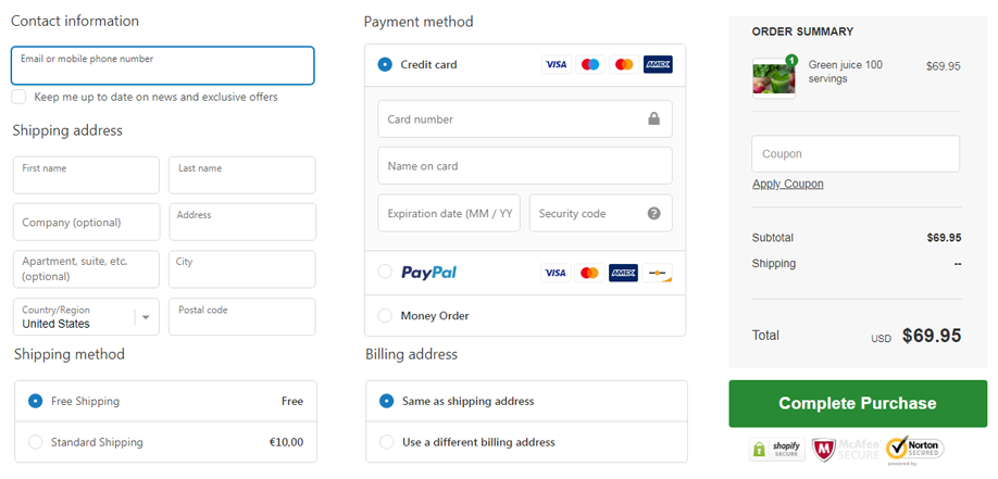
The smoother and more effortless the checkout process is, the greater your likelihood of boosting your conversion rate. Once shoppers have reached this last stage in their purchasing journey, it’s your responsibility to ensure the checkout experience is seamless.
How Are Visitors Searching, Clicking, And Scrolling Your Website?
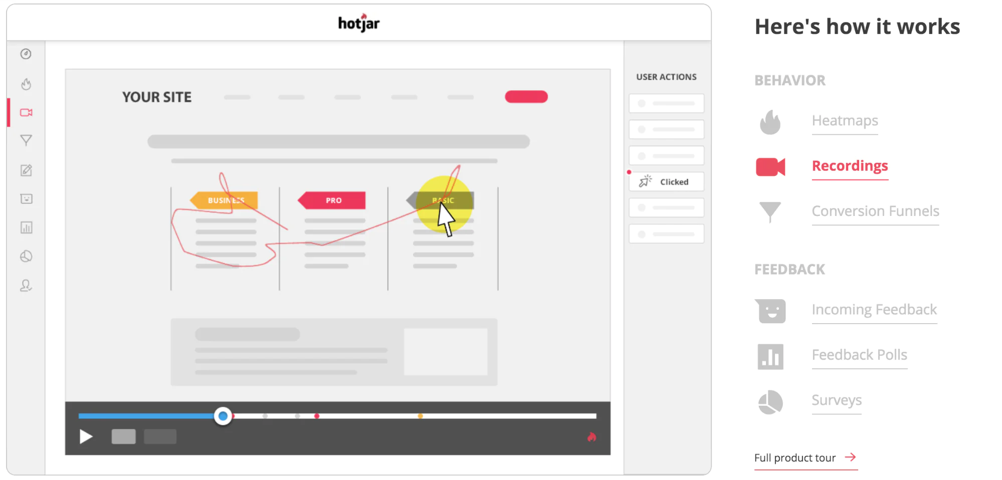
Consider watching recordings of actual users’ sessions, there are several tools you can use to analyze how visitors are interacting with your website to identify where customers may be struggling to understand your brand or product. Some of the most popular tools are:
- Google Analytics: This free tool can provide insights into visitor behavior, including how they are finding your website, what pages they are visiting, and how long they are staying on each page.
- Hotjar: This tool allows you to track visitor behavior, including where they click and how far they scroll on your website. It also offers heat maps to visually show where visitors are clicking the most.
- Crazy Egg: Similar to Hotjar, Crazy Egg provides heatmaps and click tracking to help you understand how visitors are interacting with your website.
Watching someone struggle to find what they’re looking for or navigate your website can provide insights into the user experience. Hotjar also creates heat maps that show where customers are clicking and dropping off, helping you improve their journey to checkout.
To further understand where users may be getting lost and identify gaps in your main navigation, enable the search function on your site and check out the top online store searches in your Shopify reports. This report provides insights into your shoppers’ minds and what they may be struggling to find on your website. Adding popular search terms to your main menu can improve store navigation and increase your conversion rate.
Analyze What Your Competitors Are Doing
To gain a competitive edge in your market, it’s important to keep an eye on what your competitors are doing. Here are some ways to analyze your competitors:
- Conduct a competitive analysis: Identify your top competitors and analyze their strengths and weaknesses. Look at their pricing, product offerings, marketing strategies, and customer service.
- Monitor their social media: Follow your competitors on social media platforms and monitor their posts, engagement rates, and customer interactions. This will give you insight into what kind of content they are producing and how they are engaging with their customers.
- Sign up for their newsletters: Sign up for your competitors’ newsletters to stay informed about their promotions, new product releases, and other updates. This will help you keep track of their marketing strategies and stay up to date on industry trends.
- Analyze their website: Take a look at your competitors’ websites and evaluate their design, user experience, and overall functionality. Pay attention to how they organize their products and how they present information to their customers.
- Check their reviews: Look at your competitors’ online reviews to see what customers are saying about them. This will help you identify areas where your competitors are excelling and where they may be falling short.
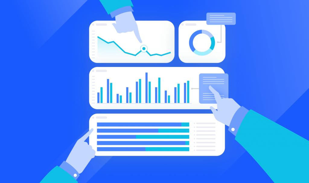
By analyzing what your competitors are doing, you can gain valuable insights that will help you improve your business strategy and stay ahead in your market.
Building Business Trustworthy
Establishing trust with potential customers can be difficult when you have no prior sales, but it is an essential step toward converting website visitors into customers. As your visitors cannot meet you in person, your website must be welcoming and provide a sense of security to all visitors. There are numerous effective practices to achieve this.
Add A Live Chat to Your Store
One way to build a personal connection with every visitor on your online store is through live chat, even though you can’t physically be there. Apps like Shopify Chat, Tidio, or Facebook Messenger can help you add this function to your website. Research shows that 46% of online customers prefer using live chat to contact businesses. By offering this feature, you can connect with customers in real-time, which can lead to more sales.
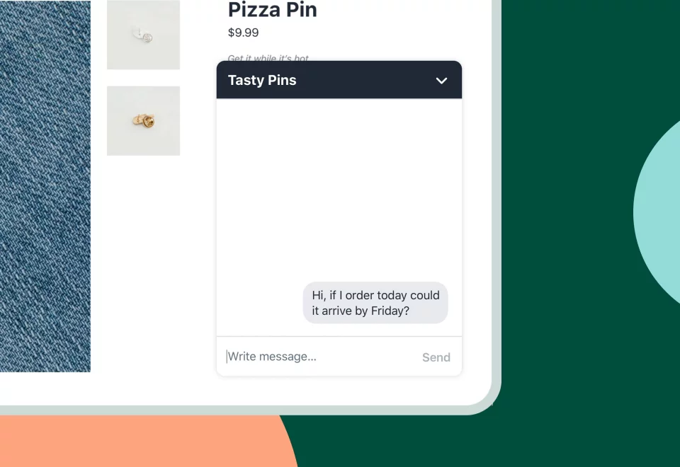
Live chat works like this: A visitor clicks on a live chat widget, which opens a conversation with the store manager, who can respond immediately. This feature allows you to be available 24/7, so visitors can ask questions about your products, delivery, or returns at any time. Without a live chat, your store may receive a lot of traffic but no sales.
When choosing a Shopify live chat, make sure it includes real-time visitor lists, quick responses with pre-written answers, and the ability to collect emails from visitors to start a chat and build a subscriber list. With these features, you can quickly respond to potential customers and build a relationship with them.
Send Welcome Push Notifications
Sending welcome push notifications can be a great way to engage with new users and make a positive first impression. When someone visits your website for the first time, a personalized push notification can greet them and encourage them to explore further. To encourage customers to make purchases even when they are not actively seeking a product, There are several ways you can utilize:
- Get subscribers: Request your website visitors to subscribe to push notifications. This will help create a pool of subscribers, encouraging not just one-time sales, but repeated ones as well.
- Share discount coupons and perks: Send the first push notification with a discount code to incentivize the first purchase. Offering additional perks can also be effective in encouraging customers to buy.
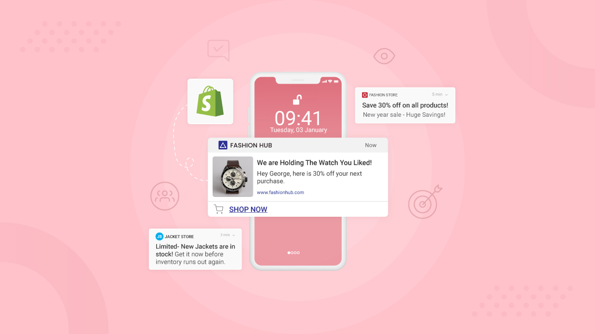
With push notifications, you can welcome new users with a message that’s tailored to their interests or behavior. To send welcome push notifications, you’ll need to use a push notification platform like OneSignal, Pusher, or Firebase. These platforms allow you to segment your users and send targeted messages based on their behavior, location, or other attributes.
Keep in mind that push notifications should be personalized and relevant to each user. Avoid sending generic messages or bombarding users with too many notifications. With the right approach, welcome push notifications can be an effective tool for driving engagement and conversions.
Utilize Social Media To Build Relationships
Having social media accounts is a crucial aspect of establishing a brand’s online presence. Even if visitors didn’t initially find you on Instagram, Facebook, or Tiktok, they’ll probably browse your brand’s social media profiles at some point during their decision-making process.
While it’s not necessary to have a presence on every social media platform, it’s important to maintain an active presence on the ones your customers use. This means regularly posting content on your social profiles to demonstrate that your business is active, as well as engaging with customers through comments and direct messages. Here are some notes for utilizing social media to build relationships:
- Be consistent: Make sure you are posting regularly and responding to comments and messages in a timely manner. This shows your customers that you are engaged and interested in what they have to say.
- Share valuable content: Share content that is relevant and valuable to your customers, such as product updates, industry news, and helpful tips. This will keep them engaged and coming back for more.
- Engage with your followers: Respond to comments and messages, ask questions, and encourage discussion. This will create a dialogue between you and your customers, and help to build a sense of community.
- Offer exclusive deals: Offer exclusive deals and promotions to your social media followers. This will make them feel special and encourage them to continue engaging with your brand.
- Show your personality: Don’t be afraid to show your personality and inject some humor or lightheartedness into your posts. This will help to humanize your brand and make it more relatable to your customers.
If you have a thriving Instagram, Facebook, Tiktok, or any social media account, you may want to consider embedding a gallery onto your website to integrate your social media presence with your online store. That can help to boost your online presence a lot.
Encourage User-Generated Content (UGC)
Encouraging user-generated content (UGC) is a great way to increase engagement and build brand awareness. UGC is any content created by customers, such as product reviews, social media posts featuring your products, or even blog articles about your brand.

If you don’t have any customer photos or reviews to showcase on your store or in your marketing, you can consider providing your product to friends, family, or influencers in exchange for user-generated photos or reviews. Another option is that you can create a branded hashtag for customers to use when posting about your products on social media. You can also run contests or giveaways that require customers to share UGC as part of the entry requirements.
These user-generated photos and reviews can be used in paid ads, on your website, or your social media profiles, making them essential in building trust with potential customers.
Add Customer Reviews On All Platforms
Adding customer reviews to all your platforms, including your website, social media, and third-party review sites, can be a powerful way to build trust and encourage potential customers to make a purchase. By doing so, you can boost customer trust, which is a critical factor since 35% of customers purchase products based on reviews. If a visitor sees positive reviews from other customers, they’re more likely to make a purchase. Therefore, if you’re receiving website traffic but no sales on Shopify, this strategy is essential.

Make it easy for customers to leave a review by sending a follow-up email after purchase or adding a review section on your website. Respond to all reviews, whether positive or negative, to show that you value your customers’ feedback and are committed to improving their experience.
The ideal locations to display these reviews are on product pages and checkout pages. These pages attract visitors who are highly interested in buying, making them more likely to assist with Shopify sales.
Consider using third-party review platforms like Yelp, Google My Business, or Trustpilot to showcase your reviews and ratings. These platforms can also help increase your visibility in search results and provide additional social proof to potential customers.
Craft Your Brand Story And Share It With Customers
Customers tend to prefer purchasing from businesses that they feel a personal connection with, which gives small businesses an advantage over larger corporations. Therefore, crafting your brand story is an essential part of building a loyal customer base. Your brand story should encompass your company’s mission, values, and unique selling proposition.
Sharing your brand story with your customers can create an emotional connection that goes beyond just selling a product. You can do this through various channels such as your website, social media, and email marketing campaigns, and the most common way to do so is through incorporating your brand’s story or mission on your homepage or creating an About Us page.
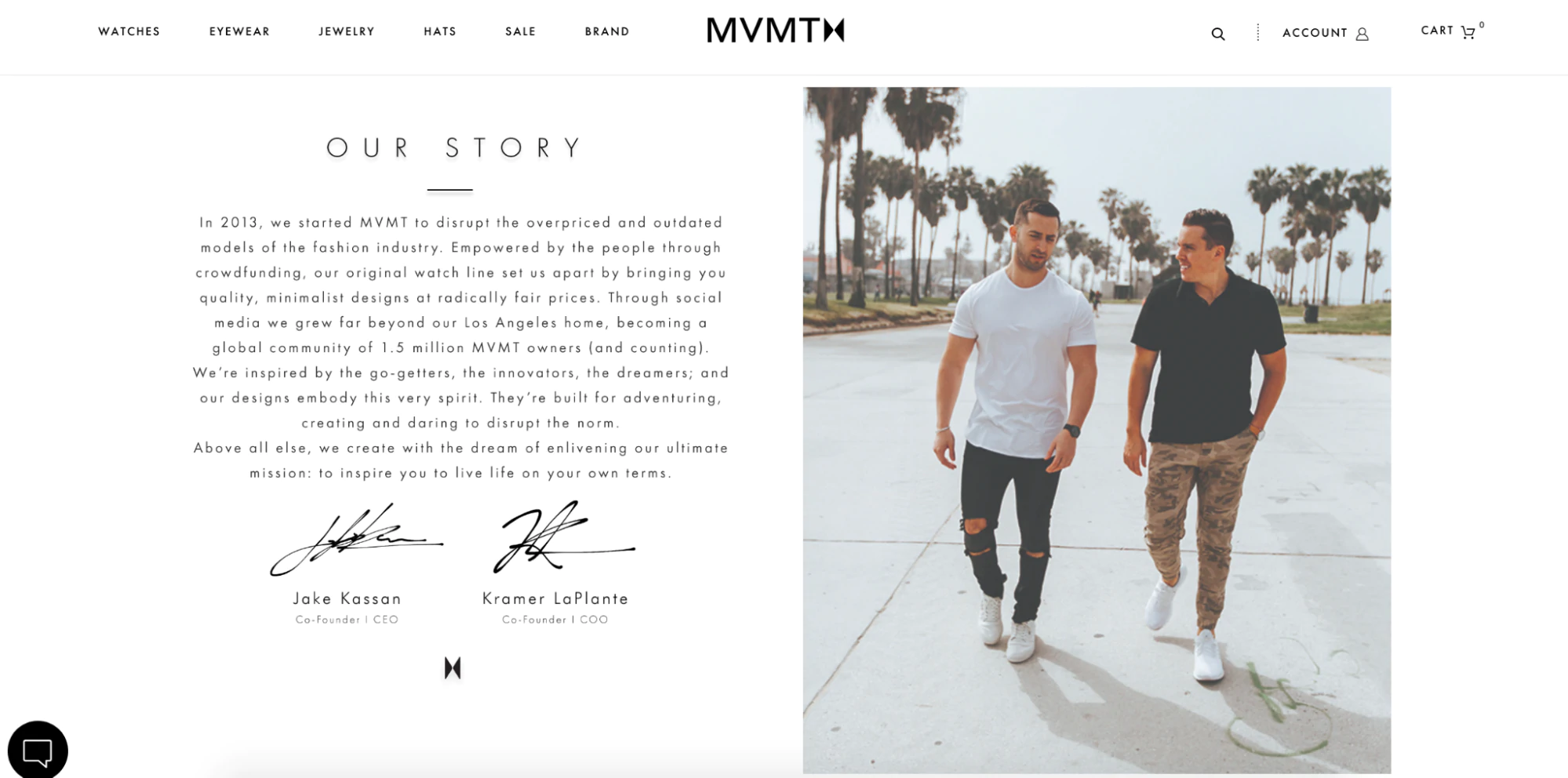
When crafting your brand story, consider your target audience and what will resonate with them. Use storytelling techniques to bring your brand to life and showcase how your products or services can solve their pain points.
By sharing your brand story, you are building a relationship with your customers that can lead to long-term loyalty and advocacy. Make sure to keep your brand story consistent across all channels and touchpoints to create a cohesive brand identity that resonates with your customers.
Store Navigation
Your potential customers have likely had previous experiences with online shopping before they visit your website. Similar to how fitting rooms are usually located at the back of a physical clothing store, there are certain expectations that users have for website design. Failing to follow these conventions can lead to lost sales, even for seemingly obvious elements.
Easy To Navigate Main Menu
In most cases, users rely on navigation menus to move from your homepage to your product page and eventually to the checkout. These menus are usually located at the top (header navigation) and bottom (footer navigation) of your website. Thus, having an easy-to-navigate main menu is crucial for providing a seamless user experience on your website. This means organizing your menu items logically and making it easy for users to find what they’re looking for.
You can take cues from large online retailers like Bailey Nelson, Knixwear, and Kylie Cosmetics, who all share common elements that customers expect. For instance, header navigation menus usually feature a Shop button that directs customers to a collection page featuring all of the brand’s products or a drop-down menu to sort products into further categories such as sweaters, t-shirts, and shorts.
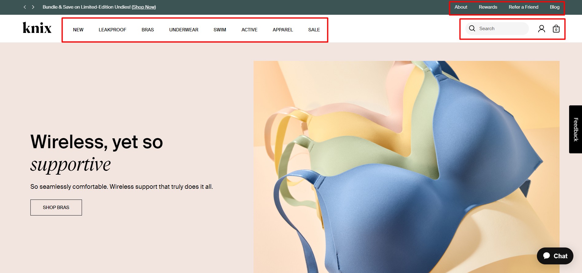
Additionally, depending on your business, you can also include links to other pages that customers might want to visit before making a purchase. These pages include:
- About Us for customers who want to learn more about your business or founder story.
- Contact Us so customers can reach out with questions or concerns.
- FAQ to answer common questions.
- Shipping to provide information on shipping costs.
- Size Guide to help customers confidently order the right size and reduce returns.
Moving Unneccesary Pages To Footer Navigation
To simplify your website’s main menu and improve its usability, consider moving unnecessary pages to the footer navigation. The footer navigation is typically located at the bottom of your website, and it’s a good place to house pages that are important but not necessarily critical for customers to see upfront.
However, it’s still essential to follow the best practices for footer navigation menus, which should contain links to secondary information such as returns and exchange policies, customer reviews, privacy policies, and terms and conditions.
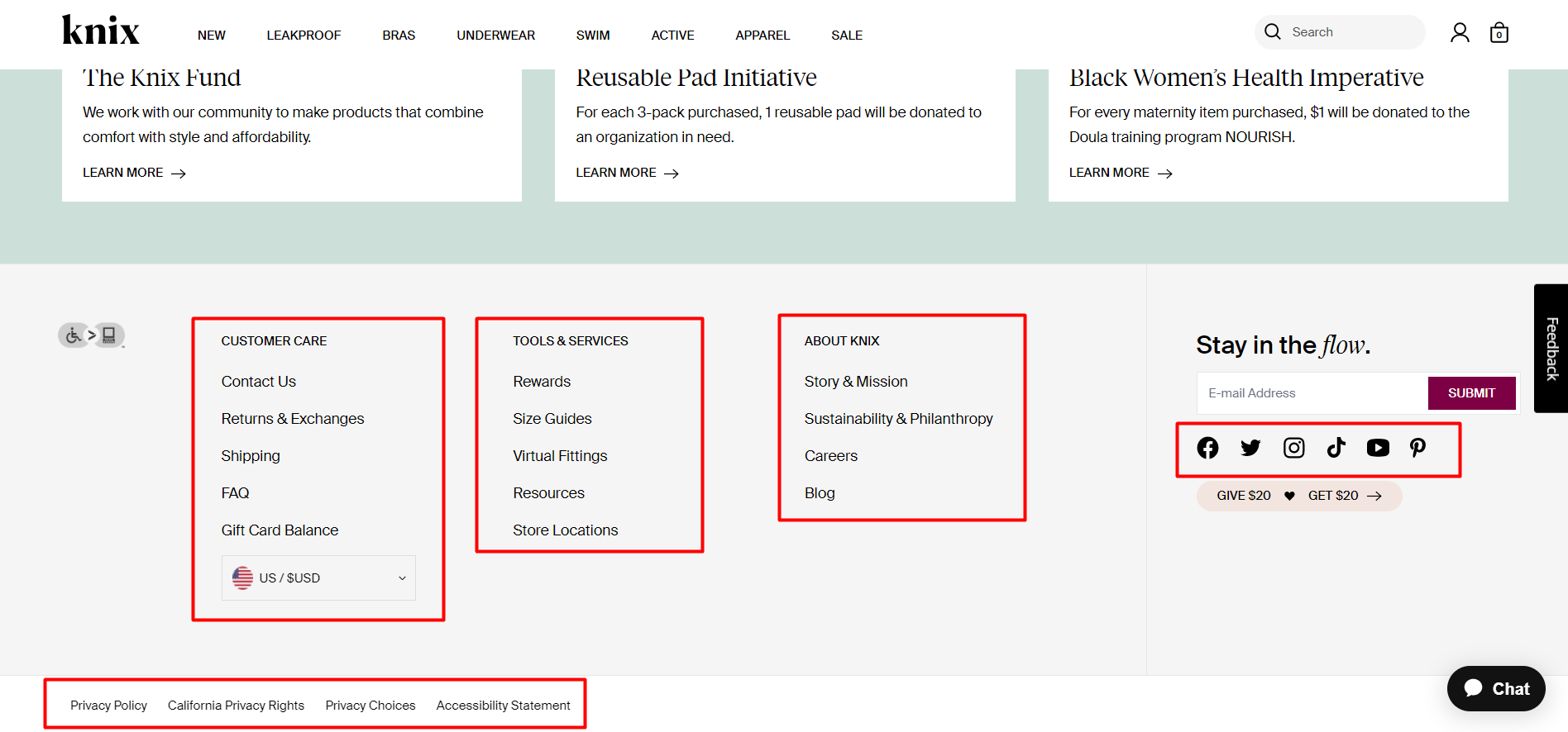
It’s crucial to ensure that both your header and footer links are functional and lead to the appropriate pages. Test each link to ensure that the page it links to matches its title. Broken or incorrect links can be a quick and easy mistake to fix, but they can have a significant impact on your sales.
Homepage Design
The homepage of your online store is comparable to the display window of a physical store. It must showcase your brand in the best possible way while also enticing visitors to explore and make purchases. In addition to the Shopify theme you select, there are numerous other factors to take into account when designing your store’s homepage.
Professional Visual Brand
Your website homepage is the showcase of your brand. It’s where potential customers get their first impression of your company and decide whether to shop with you or not. Therefore, it’s important to consider the following questions:
- Do you have a professional logo?
- Do you use consistent colors and fonts to create a strong visual brand identity?
- Are your images high-quality and clear?
- Is your text easy to read and scan?
Investing in professional branding can help you stand out in a crowded online marketplace and make a strong first impression on potential customers. It also helps to establish trust and credibility with your audience.
Fortunately, creating a visually appealing brand is not as complicated as it seems. Even if you already have a logo, you can use Hatchful, Shopify’s free logo maker, to create a visual guideline that you can apply throughout your website.
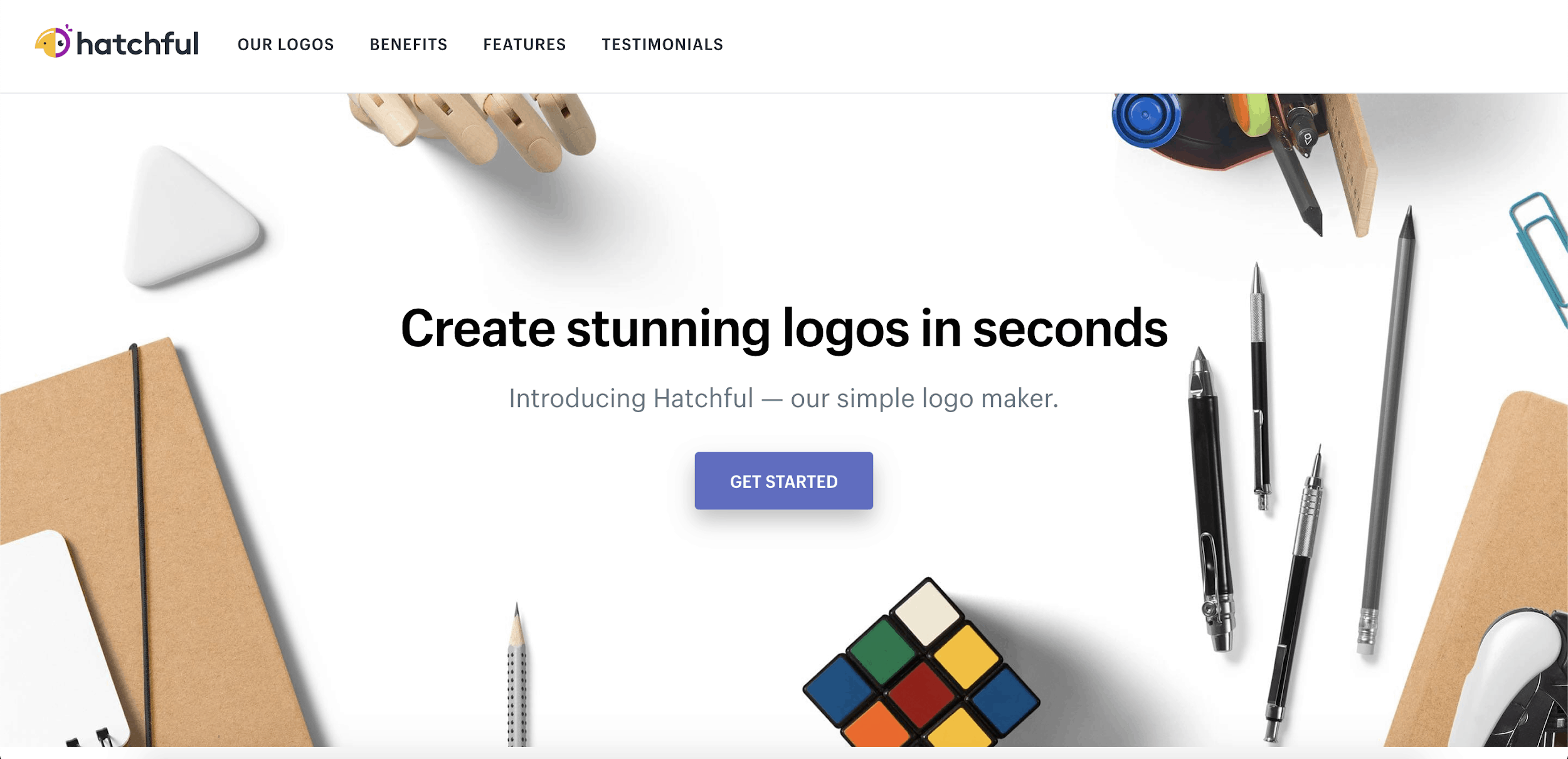
Take the complementary colors of your Hatchful logo and use them in your store template to create a seamless branded look. This will help instill trust in potential customers.
Invest in high-quality product photography, as this will be used by shoppers to judge the quality of your products. For lifestyle photos, you can shoot your own or use the free professional stock images available on Burst.
To create your high-quality product photos, use simple and affordable tools such as a homemade photo studio, Remove.bg to easily remove the background on your product photos, and free photo editing software.
If your current website does not feature professional and clean-looking photography, it could be turning potential customers away.
Remember, consistency is key when it comes to visual branding. Make sure to use the same logo, colors, and fonts across all your marketing materials, including your website, social media, and advertising. This creates a cohesive and recognizable brand identity that customers will associate with your business.
Attractive Homepage With Compelling Call-to-action
Having effective calls to action (CTAs) on your homepage is just as important as having a navigation menu. CTAs are a powerful tool for directing visitors to take action on your website. A compelling call-to-action (CTA) is a great way to encourage visitors to engage with your website. CTAs should be prominently displayed and easily recognizable, with clear and concise language that tells visitors exactly what they can expect when they click on it.
Some examples of effective CTAs include:
- Shop now buttons that take visitors directly to your product page.
- Subscribe buttons that encourage visitors to sign up for your email list.
- Learn more buttons that lead visitors to a page with more detailed information about your products or services.
- Download now buttons that offer visitors a free resource in exchange for their contact information.
On eCommerce websites, the main CTA is often featured on the homepage banner. This banner should showcase your best-selling product or the most compelling collection and grab the customer’s attention. A good example of a strong homepage banner can be seen on the website of the gym apparel brand Gymshark. Their banner has a clear message that speaks directly to their target audience and encourages them to click through to shop.
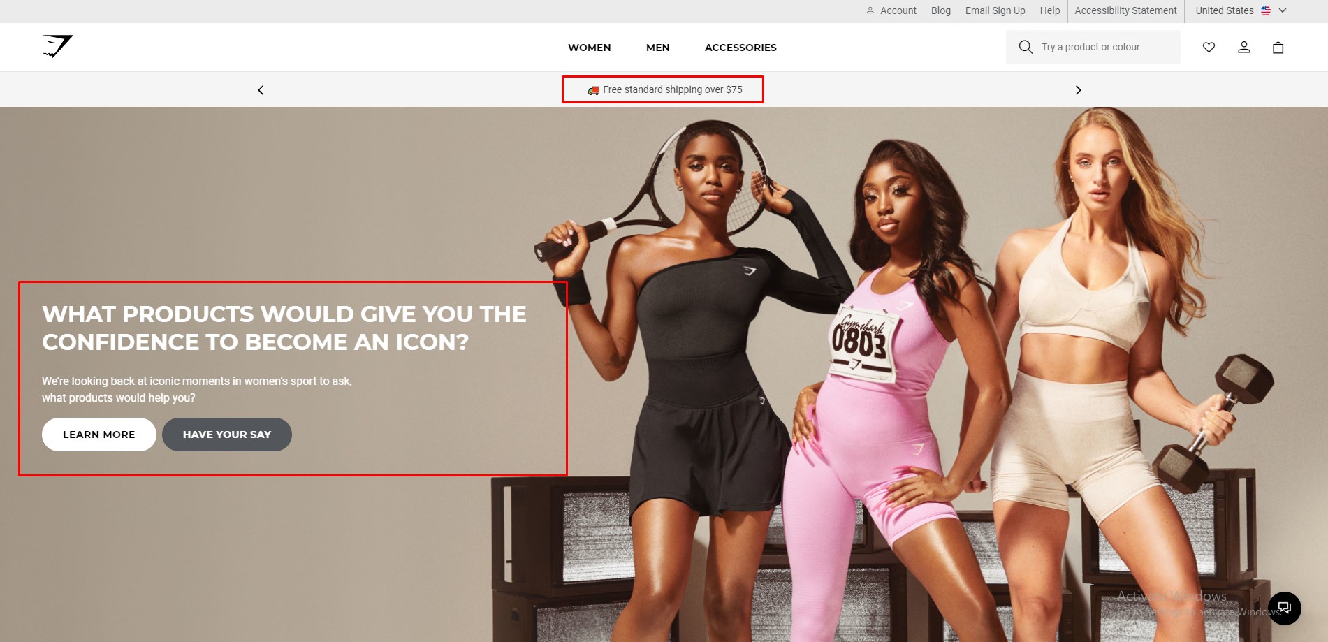
If you have a secondary message to promote, such as free shipping or a discount on certain items, the best way to do this is often with an announcement bar. This bar appears at the very top of your website page and does not compete with your main banner. You can refer directly to the Gymshark examples to know where to put the free shipping announcement. Their bar informs customers about a chance to get free shipping when they spend an amount over $75.
By integrating special promotions like this into your homepage through an announcement bar, you can surface a secondary call to action that caters to price-conscious shoppers. However, be careful not to have too many competing messages on your homepage, as this can be confusing for customers and cause them to leave your site.
Target Audience-Oriented Copy On Homepage
Is your website copy tailored to appeal to your intended audience? Your homepage text should be concise and compelling, avoiding lengthy paragraphs that may lose the reader’s interest. Many major online retailers limit their homepage copy to a minimum.
Mejuri, for example, keeps its copy short and sweet, with only one or two sentences on its homepage. Visitors who want to know more can easily click through to the company’s About Us page.
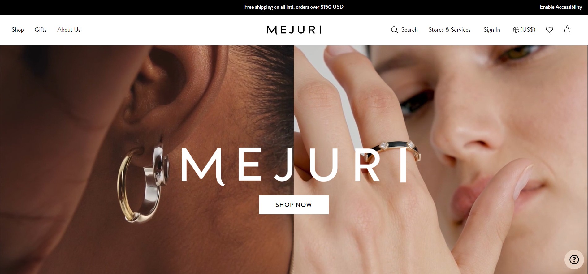
When writing your copy, it’s crucial to keep your target audience in mind. Your homepage should be tailored to speak directly to them and make them feel like your site is designed specifically for them.
One common mistake is trying to speak to everyone, which can result in diluting your message and failing to connect with anyone in particular.
It’s also essential to proofread your copy to avoid errors that can make your site look unprofessional. Consider asking a friend to review your content or hiring a professional copywriter or editor to help elevate your messaging.
Mobile-friendly Homepage
Having a mobile-friendly homepage is crucial in today’s world where more and more people are using their mobile devices to shop online. In fact, studies show that over half of all online purchases are made on mobile devices.
When designing your homepage, it’s important to keep in mind how it will appear on a smaller screen. Make sure that all text is easily readable and that images are optimized for mobile.
A responsive design is key to making sure your homepage looks good on any device. This means that your website will adjust to fit the size of the screen it’s being viewed on, whether that’s a desktop computer, a tablet, or a smartphone.
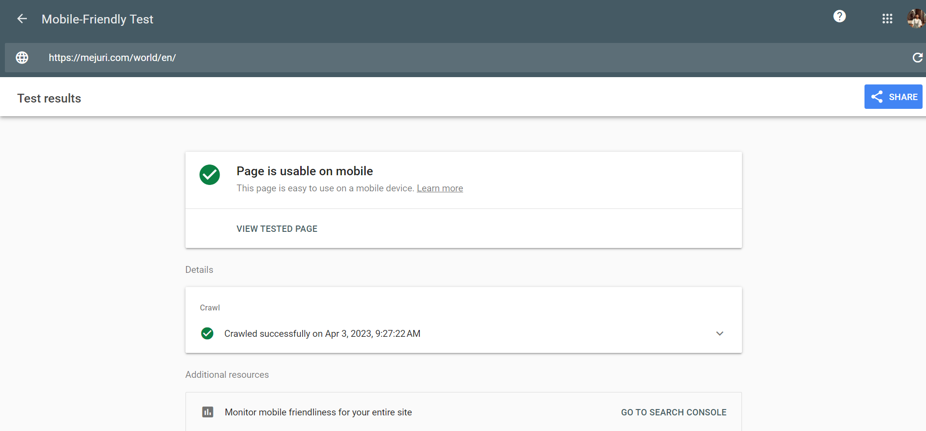
Another important factor to consider when designing a mobile-friendly homepage is load times. Mobile users expect websites to load quickly, and studies show that even a one-second delay can cause a significant drop in conversions. To optimize load times, consider compressing images and using a content delivery network (CDN) to serve your website’s content from a server closer to the user.
To ensure your homepage looks good and works properly on every device, load it on your own mobile phone and any other devices you have access to. If you don’t have access to popular devices such as iPhones or Androids, you can use the Inspect tool on your browser to see how your website would appear on different devices.
Product Page Modification
A product page is the heart of your eCommerce store. It’s the page where customers make the decision to buy or not to buy, so it’s important to make sure it’s as effective as possible.
Optimize Product Page To Convert
As online shopping continues to grow in popularity, it’s becoming increasingly common to find similar products across many different stores. In this highly competitive market, it’s crucial to offer something special and unique that sets your store apart from the rest. Instead of simply focusing on what customers are interested in, strive to be the store that customers are interested in.
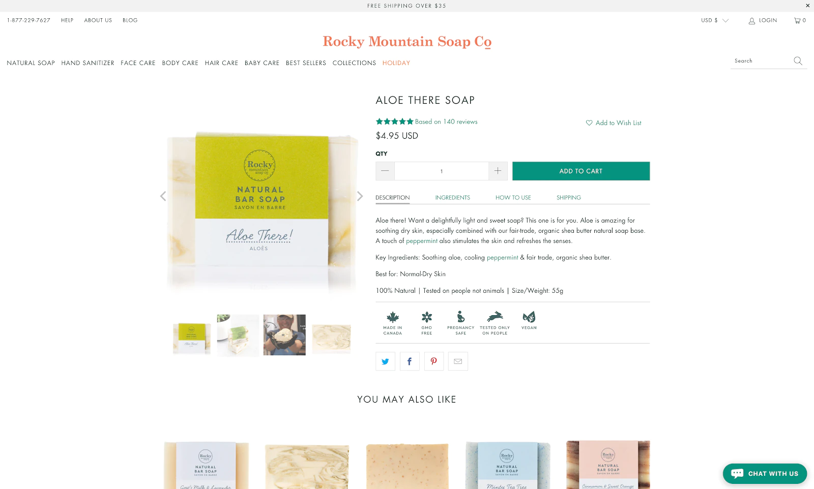
To optimize your product page for conversions, begin with the title. The title is the most important text on the page, so ensure it is straightforward, brief, and direct. After that, review your product description. This is where you can persuade potential customers to make a purchase by presenting your product in a compelling manner. So, basically ensure that your description is well-crafted, convincing, and free of spelling or grammar mistakes, and then you can think about the creative side of product descriptions.
Customers want to feel excited and motivated when they read product descriptions. Generic descriptions won’t cut it because they’ve already seen too many of them while browsing online. To make your product stand out, make sure your descriptions are engaging and captivating. By doing so, you’ll leave a lasting impression and turn your Shopify traffic into sales.
Improve Product Images
The impact of images on your website cannot be underestimated. They not only contribute to faster page loading speeds but also improve the overall user experience while browsing your online store.
It is crucial that the images on your website reflect the qualities of your product and brand, and are of high quality. Low-quality images or images that do not accurately represent the product can turn potential customers away.
To optimize your product page, focus on enhancing the design and accessibility with the user’s perspective in mind. Utilize attractive images, videos, and 3-D visuals and effects. Display your packaging and include review images submitted by buyers. Your product images should showcase how your brand stands out from competitors in the market.
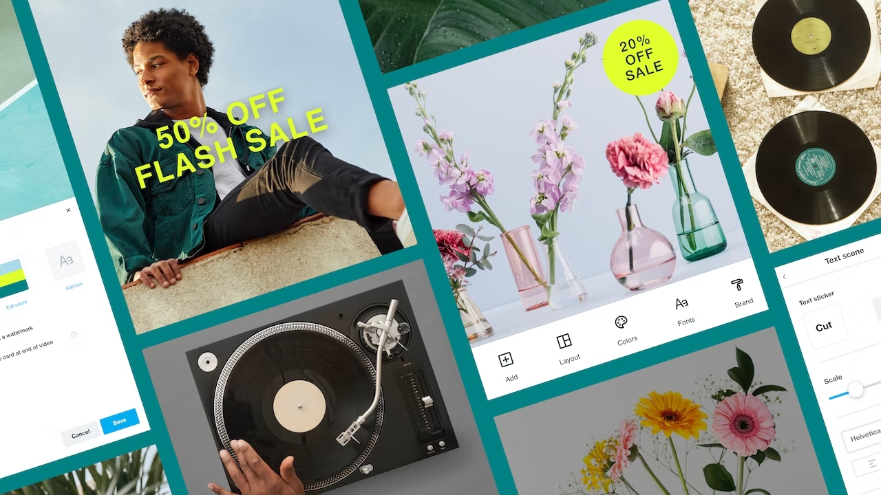
Remember to ensure that your product images are consistent with your overall branding and website design. This can help build trust with customers and make your products look more professional.
Integrate Upselling And Cross-selling Apps
Integrating upselling and cross-selling apps is a great way to boost your eCommerce sales. These apps can suggest related or complementary products to customers during the checkout process, increasing the likelihood of additional purchases. Through upselling and cross-selling, we can increase the average order value (AOV) for each transaction.
Upselling involves encouraging customers to switch to a higher-priced or upgraded version of the product they are interested in or adding more of the same product to their cart. Meanwhile, cross-selling involves recommending complementary accessories or related products to go along with the main product.
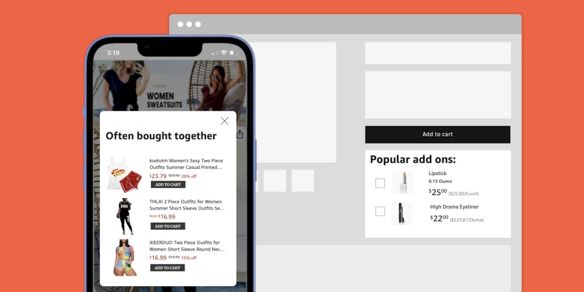
Choose an app that fits your business needs and integrates with your Shopify store. Set up rules and triggers to suggest products that are relevant and valuable to customers. For example, if a customer is purchasing a laptop, suggest a laptop case or additional accessories.
Make sure the app doesn’t come across as too pushy or intrusive. Upselling and cross-selling should feel like a helpful suggestion rather than a sales pitch.
Regularly review and analyze the app’s performance to ensure it’s adding value to your business. With the right integration and strategy, upselling and cross-selling apps can help increase your eCommerce sales and customer satisfaction.
Improve Customer Decision-Making
Improving customer decision-making refers to the process of enhancing the factors that influence a customer’s purchasing decision. This can involve providing customers with relevant information about the product or service, highlighting its unique features and benefits, offering clear pricing and delivery options, and providing excellent customer service.
Optimize Checkout Process
If you have a lot of visitors to your online store but struggle to convert them into buyers, it’s possible that your checkout process is creating friction for customers. In fact, checkout usability can be the main cause of traffic without sales. The average checkout abandonment rate in the eCommerce industry ranges from 25% to 40%. You can calculate your own abandonment rate using a simple formula.
There are several reasons why visitors may leave your website without making a purchase. However, it’s important to consider the checkout process as a potential culprit.
Take a critical look at your checkout process. Is it trustworthy and professional-looking, with designs that match the rest of your website? Is the process streamlined and user-friendly, or are you requiring customers to create an account before making a purchase? Ultimately, the question to ask yourself is this: would you be happy to go through your own checkout process?
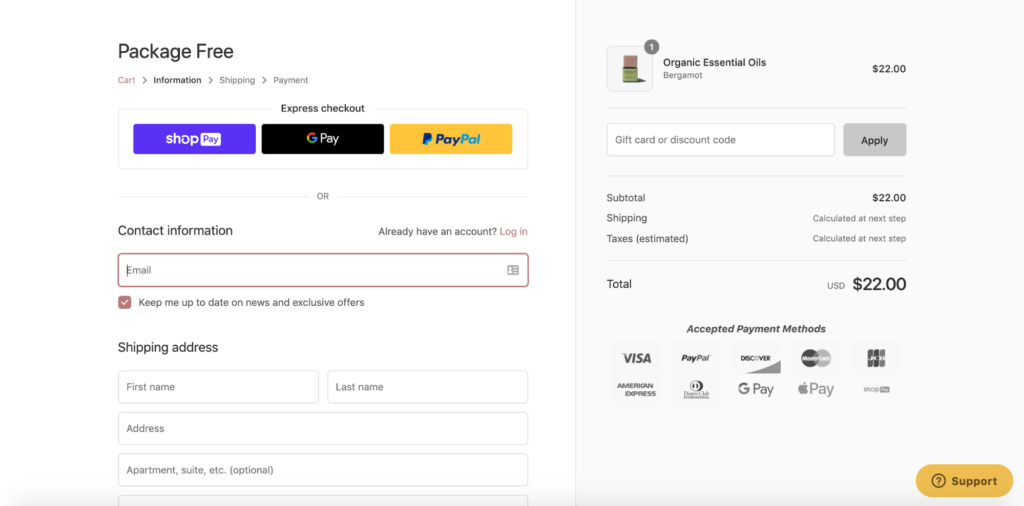
To optimize your checkout process and reduce abandonment, consider the following tips:
- Keep a good balance between product price and shipping fees. Offering free shipping can increase the chances of a customer making a purchase.
- Allow guest checkout and social login options to simplify the checkout flow. Compulsory registration is a leading cause of abandoned carts.
- Enable data validation to auto-complete form fields, speeding up the process by up to 30%.
- Provide a clear and accurate order summary that includes total items, price, discounts, tax, and delivery information. Also, include your contact details, return policies, and warranty program.
- Offer multiple payment methods to cater to your customer’s preferences. Although this may be costly, it’s one of the most effective ways to reduce cart abandonment. Research the payment methods that are popular among your target audience.
- More and more customers are shopping on their mobile devices. Optimize your checkout process for mobile to ensure a smooth and easy checkout experience.
Improve Shipping And Delivery Times
Shipping and delivery times can have a significant impact on the success of your Shopify dropshipping store. Customers want their orders delivered as quickly as possible, usually within a few days to a week, with two weeks being the maximum acceptable time frame.

Slow shipping policies that take longer than three weeks to arrive will not only decrease your sales but can also result in negative feedback from customers who are dissatisfied with the extended wait times. To improve your shipping and delivery times, there are a few things you can do:
- Offer multiple shipping options: Customers love having choices, and offering multiple shipping options can give them the flexibility they need to choose a shipping speed that works for them.
- Be transparent about shipping times: Clearly state the estimated shipping times on your website, so customers know what to expect before they place an order. Consider offering real-time updates on the status of the order as well.
- Use reliable shipping carriers: Choose shipping carriers that are known for their reliability and fast delivery times. Consider offering expedited shipping options for customers who need their orders quickly.
- Optimize your order fulfillment process: Streamline your order fulfillment process to ensure that orders are processed and shipped out as quickly as possible. This could involve optimizing your warehouse layout, investing in automation tools, or improving communication between your team members.
- Offer free shipping: As mentioned earlier, customers love free shipping. Consider offering free shipping for orders above a certain amount, or for customers who sign up for your loyalty program.
Create Transparent Terms And Policies Page
As previously mentioned in this article, trust is crucial in the relationship between an eCommerce business and its shoppers. One effective way to establish trust and increase conversions is through transparency.
Be upfront, sincere, and truthful with your customers. Ensure that essential information, such as your return policy and shipping times, is easily accessible to potential customers. This information is crucial for some shoppers when considering a purchase.
Moreover, you have nothing to hide, so there’s no need to be secretive. It’s also crucial to keep your terms and policies page up to date with any changes or updates to your policies. This will help prevent any confusion or misunderstandings between you and your customers.
If you want to see a good example of transparency, take a look at Tropic Skincare.
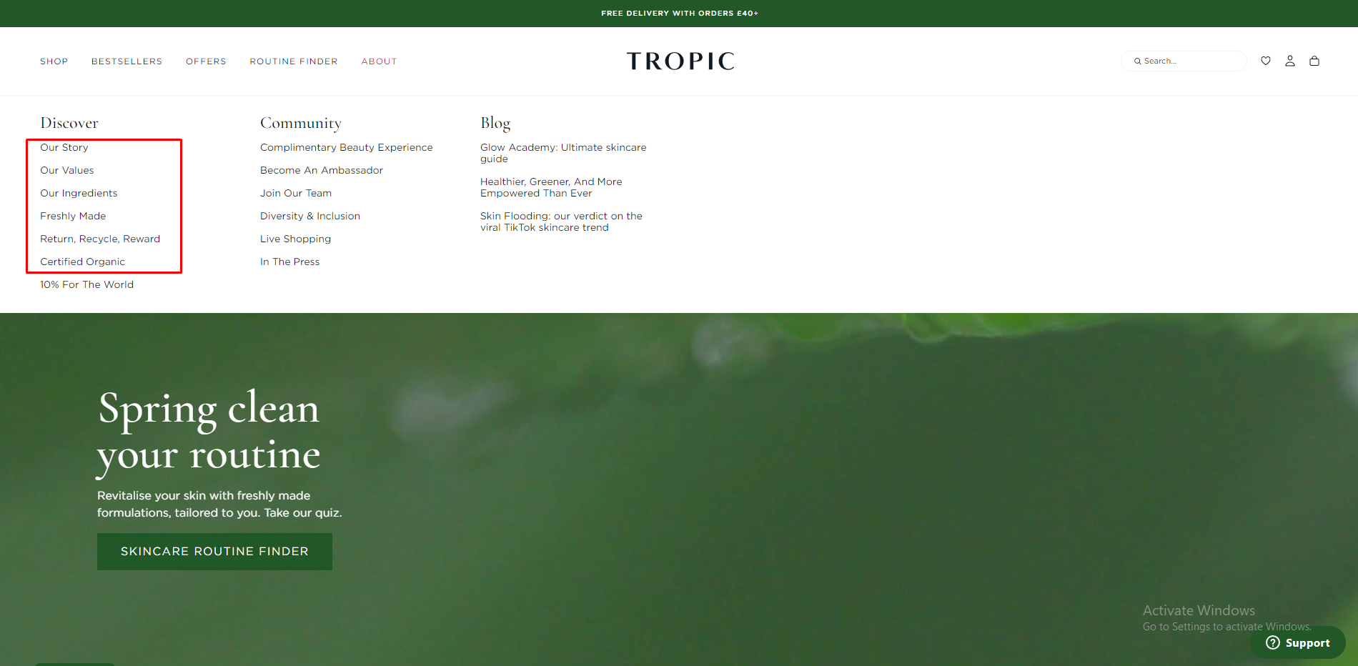
They have very prominent pages on their website that explain the ingredients they use and provide information about their brand and values. The pages are clear and straightforward to find, you just need to hover your mouse over the section About on the main menu, and every essential piece of information is shown in the part Discover.
But what about their privacy policy? How do we know they’ll keep our private information safe after making a purchase?
Let’s scroll to the bottom of the page, where companies typically place this information. We can see that Tropic Skincare has included its privacy policy, terms and conditions, and additional skincare philosophy information. They also have social media buttons for users to check out their social channels and content for further validation.
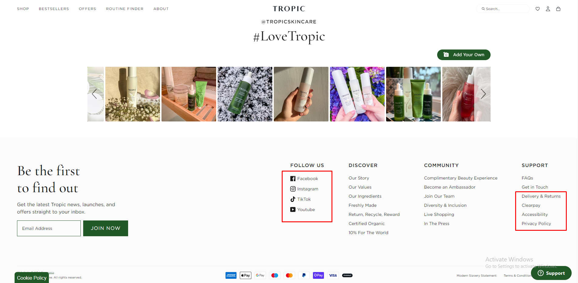
While these may seem like minor additions, they’re intentional and can help convert traffic into sales.
Now, what about your store? Are you transparent with your policies? If not, it’s time to make a change. A lack of transparency could be what’s preventing your traffic from converting into sales.
Send Shopify Abandoned Cart Recovery Emails
One effective way to recover lost sales in your Shopify dropshipping store is by sending abandoned cart recovery emails.
Abandoned carts occur when a customer adds products to their cart but leaves the website without making a purchase. By sending recovery emails, you can remind customers of the items they left behind and encourage them to complete their purchases.
To recover an abandoned cart effectively, it’s important to send a quick and automatic link to the customer. This link will allow them to return to the cart and complete their purchase if they still want the product. Fortunately, Shopify offers an email marketing tool that enables you to automatically send these recovery emails. This feature automatically sends follow-up emails to customers who leave items in their cart without completing the purchase.
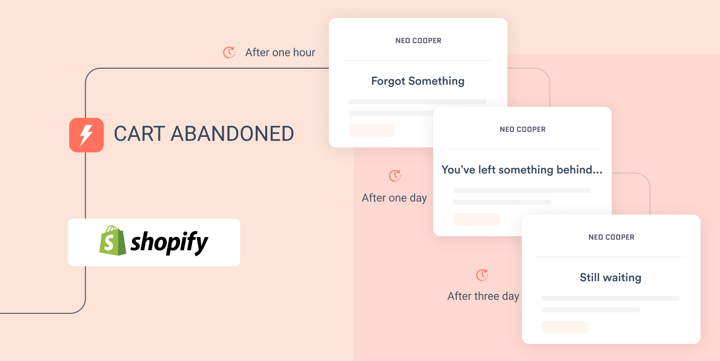
In your recovery email, be sure to include a clear call-to-action and a sense of urgency to encourage the customer to complete their purchase. You can also offer a discount or promotion to incentivize the customer to complete their purchase.
Offer Free Gifts Or Discounts
With free gifts or discounts offered, you provide an incentive for customers to make a purchase, and it can also create a sense of urgency that motivates them to buy now rather than later.
Free gifts can be a small but thoughtful gesture that shows your customers that you value their business. For example, you could offer a free sample of a product, a sticker, or a small accessory with each purchase. These types of gifts don’t cost much, but they can make a big impact on customer satisfaction and loyalty.
Discounts are also a popular way to encourage customers to make a purchase. According to research by Oberlo, 41% of customers are more likely to make a purchase if they are offered a discount. Therefore, not offering discounts could be a possible reason why you are receiving traffic on your Shopify store but not making any sales.
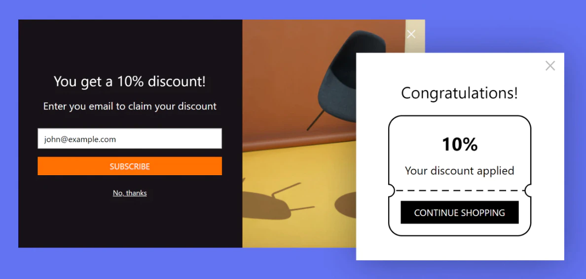
You could offer a percentage off the total order, a discount on a specific product, or even free shipping. Be sure to promote your discounts on your website and through email marketing campaigns to maximize their impact. Shopify suggests offering the following types of discounts to entice customers to make purchases:
- Free shipping: According to Oberlo, 53% of customers are more likely to make a purchase if free delivery is offered.
- Free gift: For example, Get an extra item if you buy X products.
- Percentage-based discount: Discounts ranging from 5% to 50%.
- Dollar value discount: For example, Spend $100, get $20 off.
Just remember to be strategic with your gift and discount offers. You want to provide value to your customers while still maintaining a profitable business. By finding the right balance, you can increase conversions and build a loyal customer base.
In Conclusion,
It’s important to keep in mind that there isn’t a one-size-fits-all solution when it comes to increasing sales as every business is unique. A minor tweak could have a significant impact, so it’s crucial to continuously test and optimize until you find what works best for your online store. The six areas mentioned above are critical in addressing your Shopify store getting traffic, and clicks but no sales, so if you devote time to enhancing each one of them, you’ll be on your way to boosting your sales.
If you have any questions regarding optimizing your Shopify store conversion, feel free to contact our Shopify specialists. Magenest team consists of many Shopify experts with years of experience in Shopify website development services, we can carefully go through each requirement and provide advanced consultancy to assist you on your entrepreneurial journey.
