Many entrepreneurs start looking for eCommerce solutions when they are tired of having to meet face-to-face with customers or suppliers. According to the U.S. Census Bureau data, international trade totals around $4 trillion per year. However, with everything available online, it’s reasonable to think that number would be much higher if not for distance barriers between buyers and sellers. When building an attractive site as one of the best B2B eCommerce websites, you’ll need to choose an appropriate eCommerce platform, high-quality content on your product pages, well-written copy for your about page, and a memorable domain and attractive design.
You can always fall back on a platform like Magento and Shopify to help you with the basics. But what if you want an engaging eCommerce site? Here are the top 10 best B2B eCommerce Websites that will inspire your next project.
Table of Contents
The 10 Best B2B eCommerce Websites
# Quill
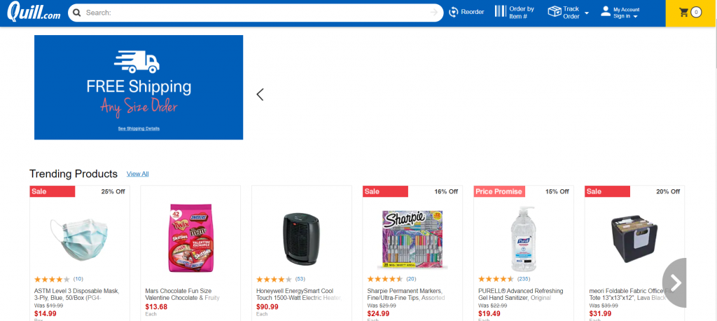
Quill, which Staples own, is the largest office supplier. Its B2B eCommerce website stands out for its straightforward, user-friendly style and extensive educational and office products.
Businesses of all sizes appreciate Quill’s extensive assortment of general office and cleaning supplies, gadgets, and furnishings. Their B2B website provides adequate customer care, which is available if assistance is required. However, there is one thing you should do before you go shopping: enroll to get emails with special deals, offers, and discounts.
What’s great about Quill is that it always improves the shopping experience for corporate customers. Comprehensive categorization, guided navigation, and search results that may be filtered make the buying experience considerably more pleasurable.
# Kekselias
This is a financial services firm that focuses on interest rates, investment research, and policy analysis. Financial B2B organizations, like this one, often create a standard, uninspiring website. Kekselias, on the other hand, chose a well-thought-out, simple website. It made navigating the website more enjoyable.
The left side of the screen is static and the list of all of the important links and categories. The right side moves and does not bombard you with needless information. You only get the information you need. Customers are also given more value by the company’s emphasis on the articles section. The highest priority is engagement. If you’ve ever wanted to learn how to build an internet store, this is the one to look into.
# Polycom
Polycom has been developing cutting-edge video, audio, and collaboration solutions for more than two decades. However, as the industry evolves, Polycom must deal with a diverse set of rivals. Rather than competing on price, they focus on providing high-quality solutions.
This firm develops content that both fits the demands of its target clientele and provides important information to the general public. Their strategy was effective because they prioritized their consumers’ requirements over the needs of their product.
# Grainger
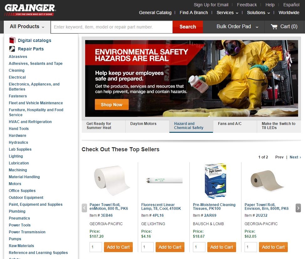
A solid online B2B eCommerce website’s main purpose is to make it simple for customers to work with a vendor. Grainger, a major distributor of industrial supplies, places a premium on ease of ordering.
Users may utilize the mobile app to submit photographs, talk with agents, and scan a barcode to quickly reorder the same goods. In terms of order accuracy, this is unrivaled. It simplifies and expedites the purchase process, minimizing the time required for re-orders of the same product.
The components are intuitively linked together; for example, the simplicity of navigation, easy access to categories, and the product list. The search is straightforward and draws the reader’s attention. That is why Grainger is considered as one of the best B2B eCommerce websites.
# 3DXTech
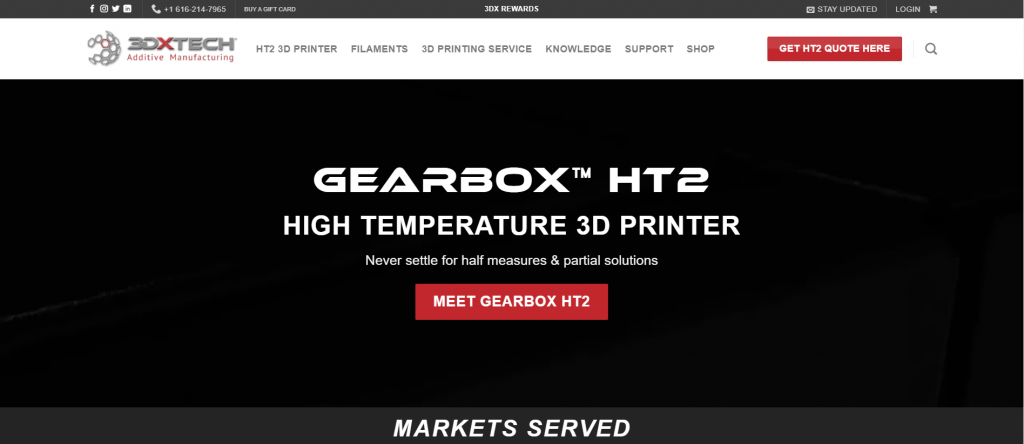
The 3DXTech is an excellent example of a B2B eCommerce website that’s invasive yet successful. Many eCommerce websites use popups and banners, but they are usually annoying and counterproductive. However, that’s not the case with 3DXTech. The popups on this website aren’t intrusive or distracting because they look like notifications that can be tapped for more information instead of banners that take up space on the page.
The images used in the background and product descriptions make it very easy to see what you’re buying. It has an eye-catching color scheme which is also very pleasing to the viewers. The best thing about 3DXTech’s website is its ability to make it easy for customers to find what they are looking for without being distracted by popups or banners. Its privacy policy page also helps ease any fears that users may have about uploading their personal information online, which is never wrong.
# ACME
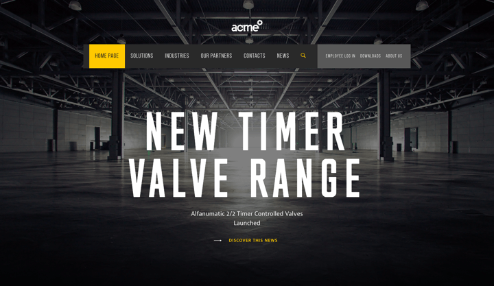
ACME (opens in new tab) is a major packaging supplier to logistics companies and shippers. It features a basic website that has been meticulously created. The one-of-a-kind B2B eCommerce site was created with great care and attention to detail.
Every image, piece of material, and clickable place has been meticulously created to delight visitors. However, it’s not all about appearance. ACME also provides a wealth of high-quality information on its goods and services. The material and photographs are all designed to deliver only the potential consumer’s information.
# The Home Depot
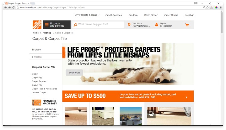
The best thing about The Home Depot’s website is that the copy matches their fantastic image. Colors on the eCommerce Library are easy on the eyes and compliment each other well. Besides, product descriptions are long enough without being too high maintenance for the user to read, making them seem professional and thorough. The Home Depot has a clean layout with minimal distractions so users can easily find what they’re looking for or get in touch with customer service. Due to white space and images, The Home Depot website is an excellent example of a unique B2B eCommerce website.
This website aims to sell things to those who need them, something The Home Depot specializes in. It displays items in a highly professional manner without going overboard, as other merchants do. Compared to the other sites on our list, this site is one of the most impressive Best B2B eCommerce websites for businesses because of its professionalism and simplicity.
# AIIA
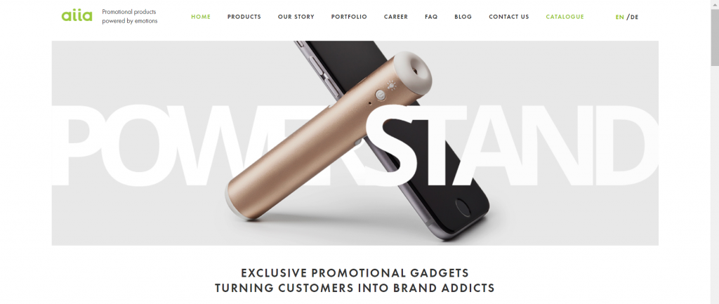
Aiia is a B2B wholesale eCommerce platform that sells branded promotional items to businesses. The basic goal behind this eCommerce website is to show that promotional items may be innovative and not seem cheap.
Given that every client wants an emotionally real online experience, Aiia is one of the greatest B2B examples in Ecommerce to demonstrate how this works. The brand’s vibe is defined by its own aesthetic. Brightly colored backdrops and well-rendered graphics undoubtedly contribute to the overall impression.
A full-screen, background promotional video is played when you click on a certain product. This establishes an emotional bond between a consumer and a corporation. It is possible to provide this experience digitally.
# Blake Envelopes
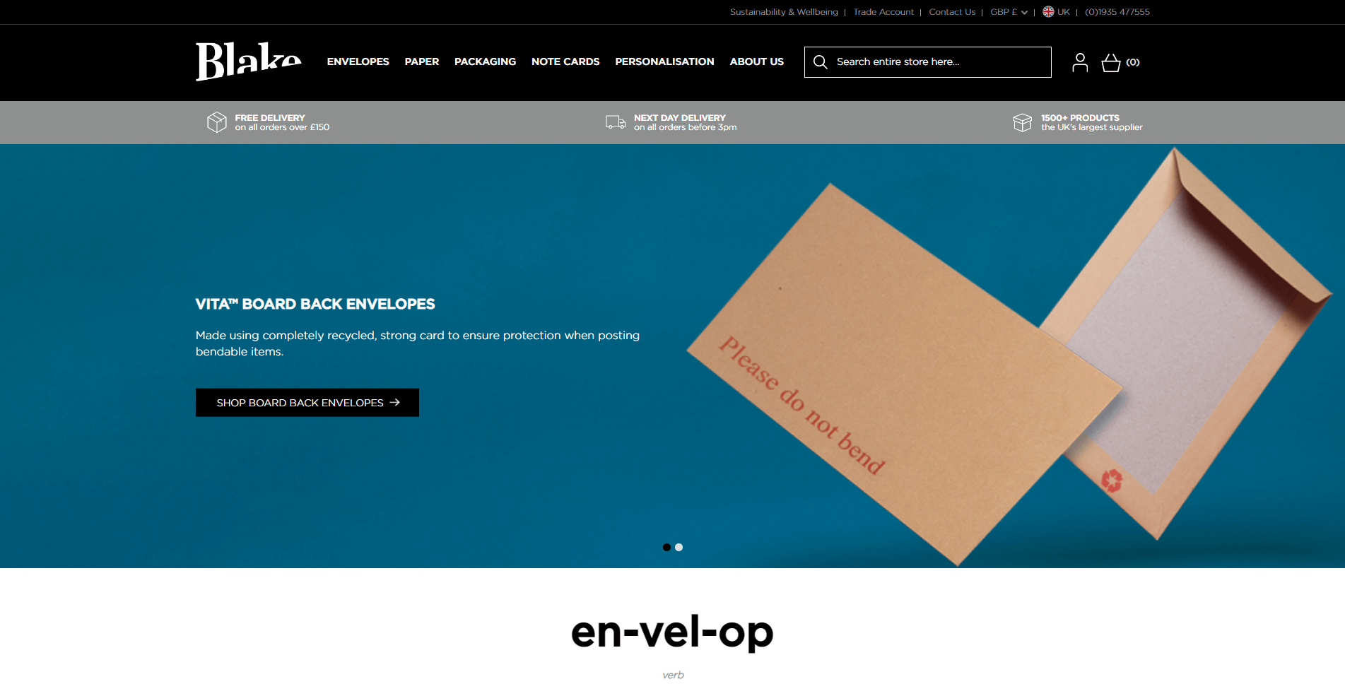
Blake Envelopes is widely recognized as one of the most imaginative and precise examples of B2B eCommerce. It offers a very clean and well-designed eCommerce website with amazing functionality, a straightforward design, and incredible benefits represented by educational and corporate responsibility activities.
A huge product range was shown rationally with restricted navigation and a user-friendly site search. The well-thought-out design allows for product searches by color, content, style and pack sizes, types, and opaques, among other things.
# Massey Ferguson
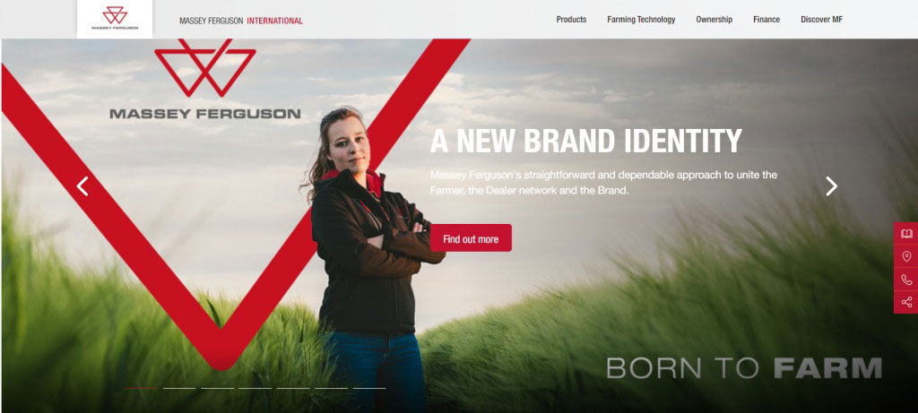
Massey Ferguson is one of the top B2B eCommerce website examples that employ navigation creatively. It has an easy-to-use web design that exposes each function straightforwardly and cleanly. Many homepage menus direct clients’ attention to the available solutions. You can also notice the second navigation bar, which highlights the individual things available from the firm.
Even though the Massey Ferguson B2B eCommerce website has a basic horizontal navigation bar, you can also select from several additional methods to access the material you seek. The well-thought-out categories and product display, as well as the dealer locator, improve the user experience. Meanwhile, the product pages stay sharp and clear, saving time significantly.
Take away from the list of Best B2B eCommerce Websites
B2B eCommerce is an amazing way to attract new customers and profit your business. Before building a website, you must defend your aims and examine your resources! Following that, you will visualize and clarify how your website will appear and which functionalities are important.
If you want to attract more customers, let’s create an impressive online store as one of the top 10 best B2B eCommerce websites with Magenest. With a skillful and seasoned team that has accomplished tons of international projects, we assure you that you will have an engaging website!


