

In recent years, the number of people using their mobile devices to purchase items online has skyrocketed. This trend is often referred to as ‘mobile commerce’ or ‘mCommerce’. As a business, it’s important to be aware of this growing trend and consider whether or not your company should be investing in a mobile eCommerce strategy. In this blog post, we’ll explore some of the top mobile eCommerce examples of mobile commerce success and discuss the benefits of incorporating a mobile strategy into your business plan.
Table of Contents
What is mobile commerce?
Mobile commerce is simply the buying and selling of products and services using wireless mobile devices like smartphones and tablets. Without the need for a desktop computer, customers can access eCommerce platforms using mobile commerce to make their purchasing.
The delivery of data via wireless devices has improved over time in terms of speed, security, and scalability. Mobile commerce has consequently expanded quickly.

For the majority of mCommerce-enabled platforms, online product purchases and other transactions are enabled when the mobile device is linked to a wireless network. There are key performance metrics to keep an eye on for those in charge of creating an m-commerce application, including traffic from all mobile devices, traffic from all applications, average order value, and order value over time.
Different types of mobile commerce
mCommerce is divided into the following three categories based on its primary purposes:
Mobile shopping
Mobile shopping is a type of eCommerce where users purchase goods and services through a mobile device, such as a smartphone or tablet. This model has grown in popularity in recent years, as more and more consumers use their mobile devices to research and purchase products. One of the main benefits of mobile shopping is that it is very convenient and can be done anywhere, at any time.
Mobile banking

Mobile banking is online banking created for handheld devices. Customers can use it to conduct financial activities, pay bills, trade stocks, and access their accounts and brokerage services. Typically, a banking institution will offer a secure, specific app for this purpose. SMS, chatbots, and other conversational app platforms may be used by mobile banking services to send alerts and monitor account activity.
Mobile payments
Alternatives to conventional payment methods like cash, checks, credit cards, and debit cards involve mobile payments. They give customers the option to use a mobile device to make in-person shopping. With the use of digital wallets like Apple Pay, customers may make purchases without using a card or cash.
The same function is served by major mobile payment apps like PayPal, Venmo, and Xoom. Mobile shoppers can utilize QR codes to make purchases using their phones as well. With mobile payments, users can send money straight to a recipient’s bank account or cell phone number.
Advantages and disadvantages of mobile commerce
Advantages of mobile commerce

- Large base of clients: Because mCommerce capabilities are more broadly and easily available, it offers a wider consumer base and higher retention than eCommerce generally.
- Convenience: Customers can compare pricing, read reviews, and make purchases whenever and wherever they want to thanks to mobile commerce.
- Product diversity: In addition to benefiting from reasonable pricing, customers may browse through a vast selection of products.
- Automation: mCommerce uses mobile contactless payment methods like Apple Pay, PayPal One Touch, and Visa Checkout to automate a company’s point of consumer interaction and sales. Numerous eCommerce websites also have one-click checkout capabilities, which enable customers to add their payment information just once and then utilize it for any future purchases.
- Omnichannel experience: mCommerce delivers an omnichannel experience where things may be sold through a variety of channels, including eCommerce websites, Amazon, eBay, and Instagram. Customers will find it simpler to purchase whenever and wherever they like with this method.
Disadvantages of mobile commerce

- Poor performance: Mobile phones and tablets’ tiny screens call for certain navigational features. As a result, designing effective mobile user interfaces is difficult and expensive. Customers may become dissatisfied and stop buying if a mobile customer experience is badly implemented.
- Payment problems: In some areas of the world, mobile payment methods may not be available, and not all digital wallets may be supported.
- Payment of taxes: All tax rules and regulations of the nations to which business ships must be understood and followed. Some companies will get around this by limiting their shipping and buying authorization to just their home country.
- Weaknesses in security: Because of security issues, many people are still reluctant to make transactions using a mobile device. Mobile fraud is increasing even with two-factor authentication. Therefore, many retailers still haven’t adapted fraud prevention strategies for smaller screens.
Top Mobile eCommerce Examples With Smooth Customer experience
Let’s check out some examples of eCommerce that successfully adopt mobile commerce in their business.
Amazon
The first name in the list of the top mobile eCommerce examples is Amazon. The reason why the Amazon mobile eCommerce site functions so effectively are that making a purchase on this site is so simple. Amazon is not the most attractive mobile eCommerce site design available, but it is undoubtedly one of the most powerful.
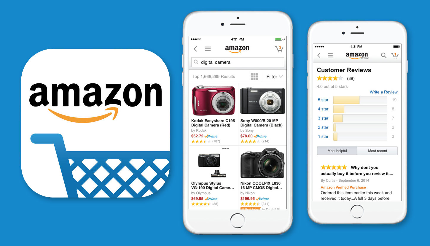
- If you check out the mobile home page for Amazon, you can see all buttons are tap-friendly, and the search bar is really apparent.
- The search procedure is sped up by predictive text entry.
- Logical categories can adjust to events, holidays, and personal tastes for customers who merely want to browse.
- It is impressive how the website content is simply used to convey essential information and persuade visitors to read more. This maintains a straightforward and clear user interface (UI).
- White space that is balanced draws the viewer’s attention and makes the available content stand out.
Last but not least, it’s fantastic how they just utilized arrows to indicate to clients what would happen if they clicked a category. An arrow pointing down will scroll the entire menu down, and an arrow pointing right clearly indicates that the consumer will be taken to another screen.
Etsy
Etsy is a mobile eCommerce platform where vintage and handcrafted items are sold. Because of its simple and minimal design, Etsy truly fits the description of unique with one of the most attractive interfaces.
Etsy is quite responsive in terms of how it interacts with mobile devices. The user interface is really simple to use, and the search autocomplete function is nearly mind-reading.
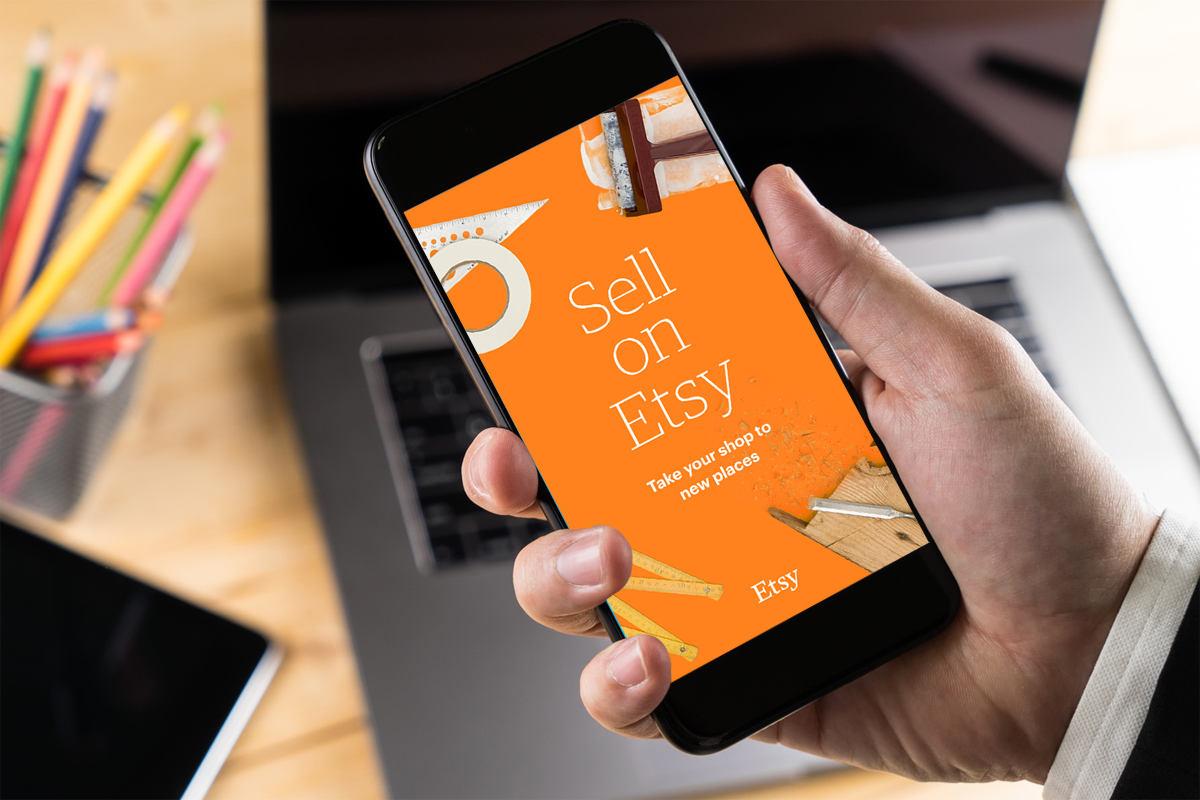
- The thorough search and extensive filtering options on Etsy are two fantastic usability features. Their slogan, “We make it easy to find your thing,” is actually lived by them.
- The best approach to display the best-selling products is with a grid view and expertly taken images.
- Beautifully crafted negative space blends in seamlessly with content dividers.
- Particularly on the product page, where they are most needed, buttons are quite large and tappable.
Hobbycraft
Hobbycraft is one of the mobile eCommerce examples that specializes in arts, crafts, and supplies. An intuitive user interface and the mobile website design are a necessity in such a tightly knit market with many categories and many more products. It takes skill to group those categories of incomprehensible and self-explanatory wholes.
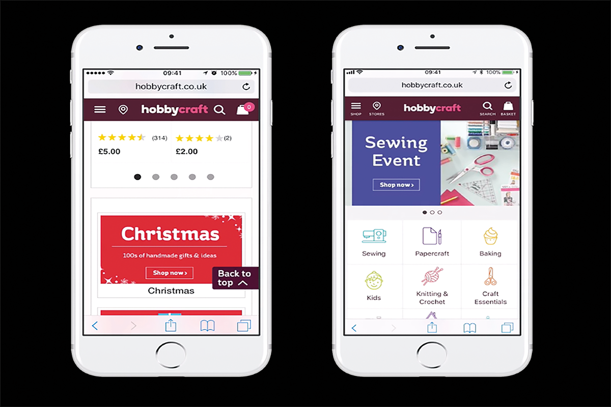
- The stationery division of Hobbycraft is represented by vibrant symbols with thin lines, backed by an equally light typeface that contrasts with the company’s strong, powerful logo.
- The color scheme is also appealing, interacting with shades of pink, brown, and green.
- The product search bar’s predictive text input is effectively optimized, showing important text results you can click on.
- Hobbycraft also makes use of the search process to highlight crucial products with photos in the Top Results area, which is a breakthrough in the mobile eCommerce space.
Walmart
Orange-red is utilized for purchasing buttons, while blue and white go well together. A straightforward yet powerful color scheme that makes good use of negative space, much like the competitors mentioned above.
Grid views of the information are the way to display the results of product searches. A Walmart best deal emblem appears on several products. Performance for filtering and sorting is as expected, and the use of predictive text input makes it easier to find products. On this mobile eCommerce site, the product pictures and descriptions really stand out.
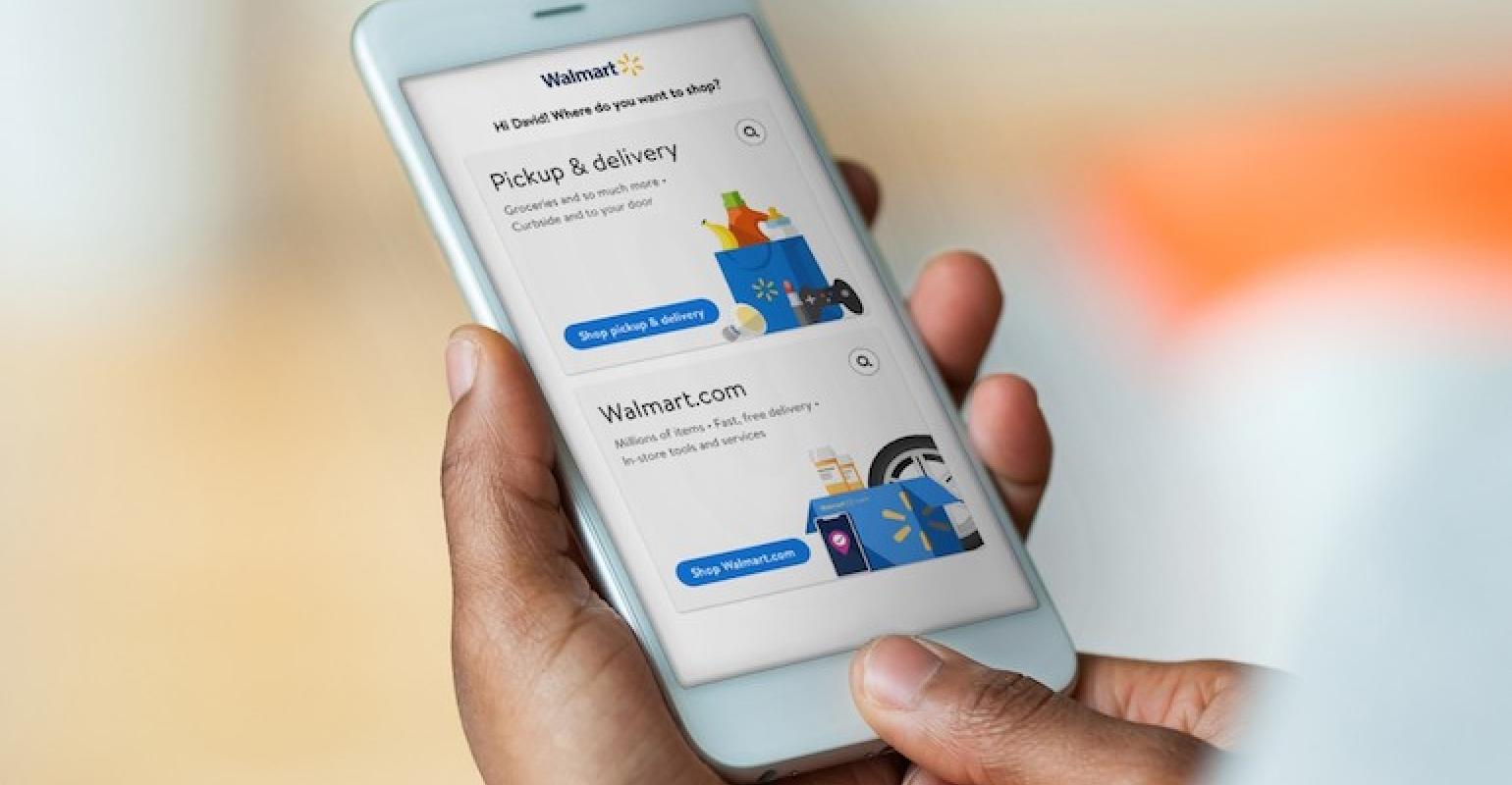
- Although the read more button on the product page is tiny and hardly visible, the product descriptions and the content’s multitude of headers give potential customers sufficient details.
- The Walmart cart is cutting-edge in terms of mobile use and design. An overlay mask notifies you of a new product in the basket whenever a consumer adds goods.
- Shipping costs, pricing, taxes, product quantities, and supplementary services are all clearly visible.
- Walmart doesn’t pass up the chance to promote frequently purchased items at this level either.
- Easy checkout will undoubtedly increase conversion rates for mobile eCommerce.
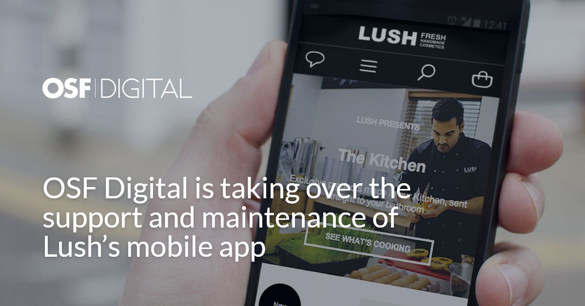
Lush
Lush capitalizes on all things visual with an Instagram-like feed of goods. This mobile site succeeds with its “search” capability in addition to its obvious distinct value proposition.
It’s one of the greatest mobile eCommerce sites for shopping because it’s so simple to categorize, see, and purchase a product when high-intent users search for a certain item. Visitors to Lush will have a good shopping experience because of the website’s simplicity and product-first design.
- Using sliders to break out of the boring and static mobile e-commerce website mold is a well-known trend.
- Including a GIF hero image, videos, and product spotlights on the main page and across the product pages.
- Offers a variety of goods that appeal to customers through its natural hues and scents. So it’s exciting that such a bright brand would choose to employ a black-and-white color scheme.
- Try something novel by showing the product in action, the dollops, or just the primary ingredients.
Lush is one of the excellent mobile eCommerce examples of how unusual and minimalist design is directing customers to purchase and discover more about the company.
Alibaba and AliExpress
The next example of mobile commerce is China’s top mobile and online eCommerce platforms, Alibaba Group and AliExpress, which allow manufacturers to host virtual stores and sell goods to customers and clients around the globe. Alibaba employs over 50,000 people and generated more than $252 billion in revenue in 2017. The B2C marketplace AliExpress alone has 100 million customers in 2017.

It’s important to note that Aliexpress’s English website has undergone design changes over time and now resembles any other Western mobile e-commerce site we have previously shown. Let’s examine AliExpress’s visual appeal and design.
- AliExpress strongly draws attention to the search bar, flash offers, and discounted pricing, by employing a high contrasting color palette with red undertones.
- There is a ton of empty space, so AliExpress did its research thoroughly.
- With sufficient moving sliders, the content is effective in a grid arrangement and not dull or monotonous.
- Popups encourage logging in to AliExpress so the website can track users’ purchasing journeys and recommend products that are appropriate.
- The coupons for joining up stay thoughtfully directly above the fold on the webpage and are always eye-catching with company colors.
It is evident as soon as you arrive at the website, whether on a tablet or a phone, that AliExpress’ main purpose is to get you to sign in so that they may target you with future promotions.
Nike
When there is such a wide variety of products, it is vital to use sophisticated product filters. That can be seen on Nike’s mobile eCommerce site. The absence of website copy merely encourages consumers to browse through products and discover all there is to know about them through the icons, buttons, and shapes.
Learning the product requires more effort, but the journey is still quite pleasant and intuitive and not at all frustrating. Refreshingly, lines rather than dots help symbolize scrolling graphics.
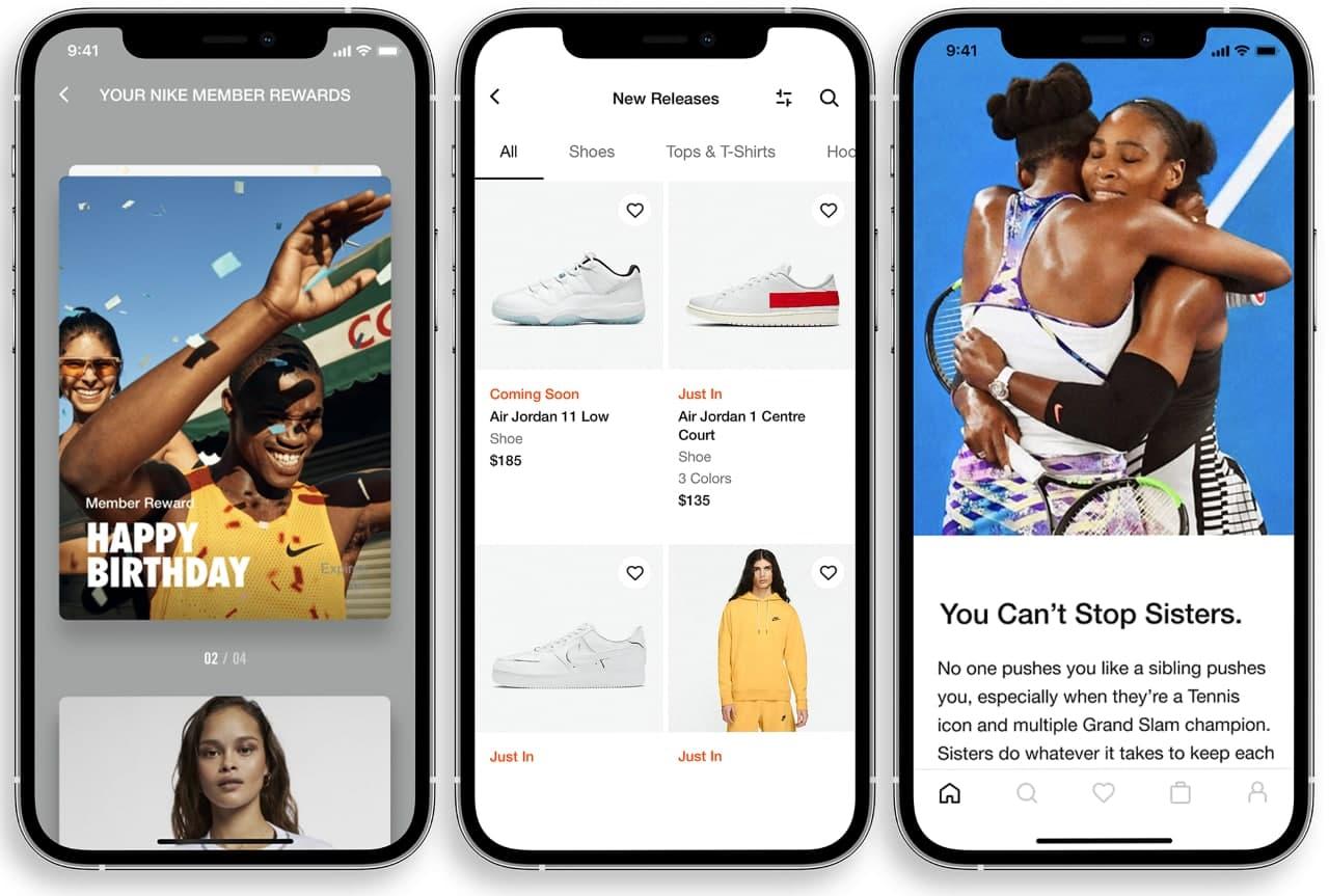
Mike uses various white and off-white negative spaces, a bold and clear typeface, and information with shapes and badges. So its minimalist design captivates consumers and engages them, lengthening their stay on the site. And it also improves the quality of that time.
With this strategy, Nike avoids boring customers with needless facts that are just beneath the surface. They are only shown to those who are interested in learning more. Since people spend more time browsing than reading, more products are visible to each customer. That’s why it has become one of the best examples of mobile e-commerce sites.
Other mobile eCommerce examples:
Cutter & Buck
In order to persuade visitors to browse the sale on polos and tees, Cutter & Buck strategically put their distinctive value proposition at the top of the page and in the middle of the site. Through the use of excellent product photography, they do a fantastic job of presenting a lifestyle-oriented look. From the outset, visitors can see what this brand has to offer.
Nixon Watches
One of the greatest mobile eCommerce examples is Nixon’s desktop site. It also won the Webby award for eCommerce website of the year. With a restricted color scheme, clear images, and helpful buttons, the mobile version is a stunning work of design. Nixon’s brand is strengthened and a Nixon lifestyle is established thanks to the photos.
Panera Bread
Online food ordering is now simpler than ever. Customers may place an order on Panera’s website with ease thanks to its simplicity. The straightforward CTAs and intuitive navigation make it easy for eager visitors to convert right away. Also, even Panera says on its homepage that it is adapting to demands for social isolation.
To sum up,
Mobile commerce is growing rapidly, and businesses that can provide a smooth customer experience will be more successful. We’ve looked at some of the top mobile eCommerce examples, and you can see that each one provides an excellent shopping experience regardless of the device or operating system. If you’re looking to create a thriving mobile eCommerce store, check out our Shopify website development services, or feel free to contact us by clicking the button below, the success of your business is only one message away!