
Anyone looking to create a Shopify store or use a Shopify website development services will want to choose the best font for their site. There are many different fonts to choose from, and each has its own benefits and drawbacks.
In this post, we’ll take a look at some of the best Shopify fonts and discuss why they might be a good choice. We’ll also provide some tips on how to choose the best font for Shopify stores. So, if you’re planning on creating a Shopify store, read on! You may just find the perfect font for your business.
Table of Contents
Why you should take this account into fonts?
Fonts influence how your audience perceives your store since, based on their design, they convey particular thoughts, feelings, and actions. To begin with, we frequently relate shapes to feelings. Round typefaces are good for conveying femininity and gentleness, whereas more angular fonts might represent a more serious and professional tone.
One study discovered that when companies used the same typeface for writing and advertisements, memorability improved. According to an additional study, serif typefaces like Times New Roman and Garamond boost reading speed.
Serif typefaces are frequently used in books and newspapers because they make long blocks of text simpler to read. According to an MIT study, fonts may have the ability to influence your mood and cognitive function. Adopting fonts to generate a positive brand perception, can assist buyers along the buyer journey.
Overall, whether it’s a wise decision to utilize fonts strategically or not, it’s a chance to allow your brand’s personality and messaging stand out. If you don’t carefully select the appropriate typeface for your brand, you could unintentionally harm its trust.
Basics of website typefaces you must know
When choosing the best font to use for Shopify store, business owners need to be aware of the two following factors.
Ranking fonts
The most vital thing for business owners to remember is that a website should only have three primary fonts: one for titles, one for body text, and one for accents.
- Headers, banners, and titles should all use the primary font, which is the one that is the most prominent (large text).
- Used for body text that is smaller, secondary font. The easiest-to-read font should be this one.
- Accent font: This font is used on the website for specific elements like buttons. The brand logo could be in this font.
Three main categories
They also need to be aware that there are just three types of typefaces that can be used for website text.
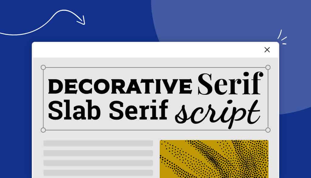
- Serif: Characterized by tiny lines at the tip of each stroke. Good for secondary, accent, or primary.
- Sans-serif: Fonts without serifs that are simple and elegant. Good for all three font rankings as well.
- Scripts: Fonts that resemble human handwriting. Typically, primary and accent fonts work well.
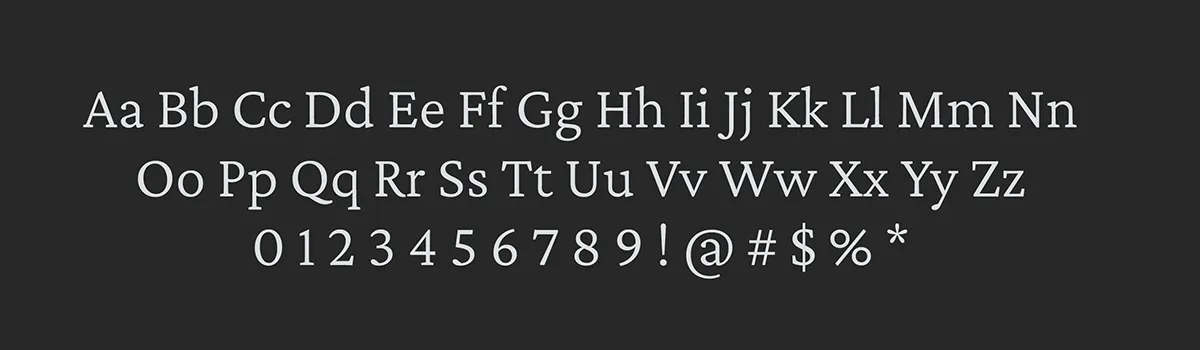
Top 10+ best fonts for Shopify store
Roboto
A modern and clean font that’s easy to read on screens. It’s widely used for its simplicity and versatility.
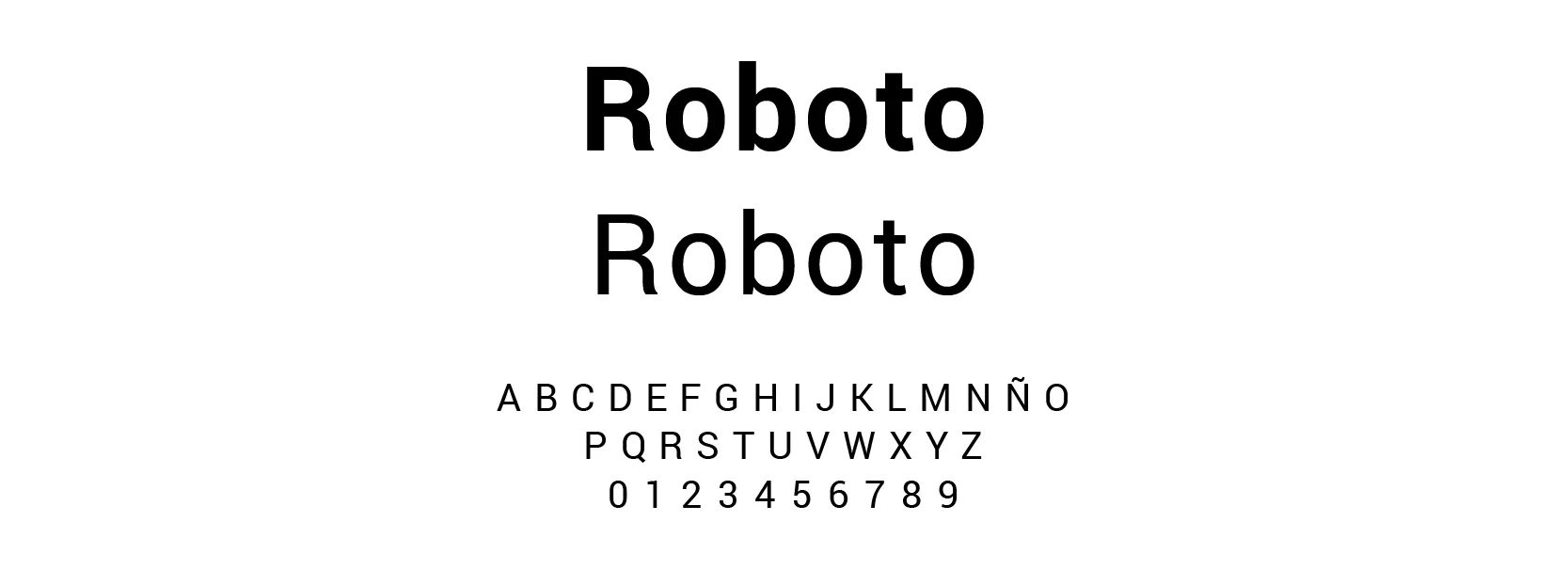
Roboto is a versatile and widely-used typeface designed by Christian Robertson and developed by Google. It was initially released in 2011 as the default font for the Android operating system, and it has since gained popularity for its clean and modern appearance. The font was designed with the intention of being readable on both digital screens and in print, making it suitable for various applications.
Lato
Another clean and legible font that works well across different devices. It has a contemporary look and comes in various weights.
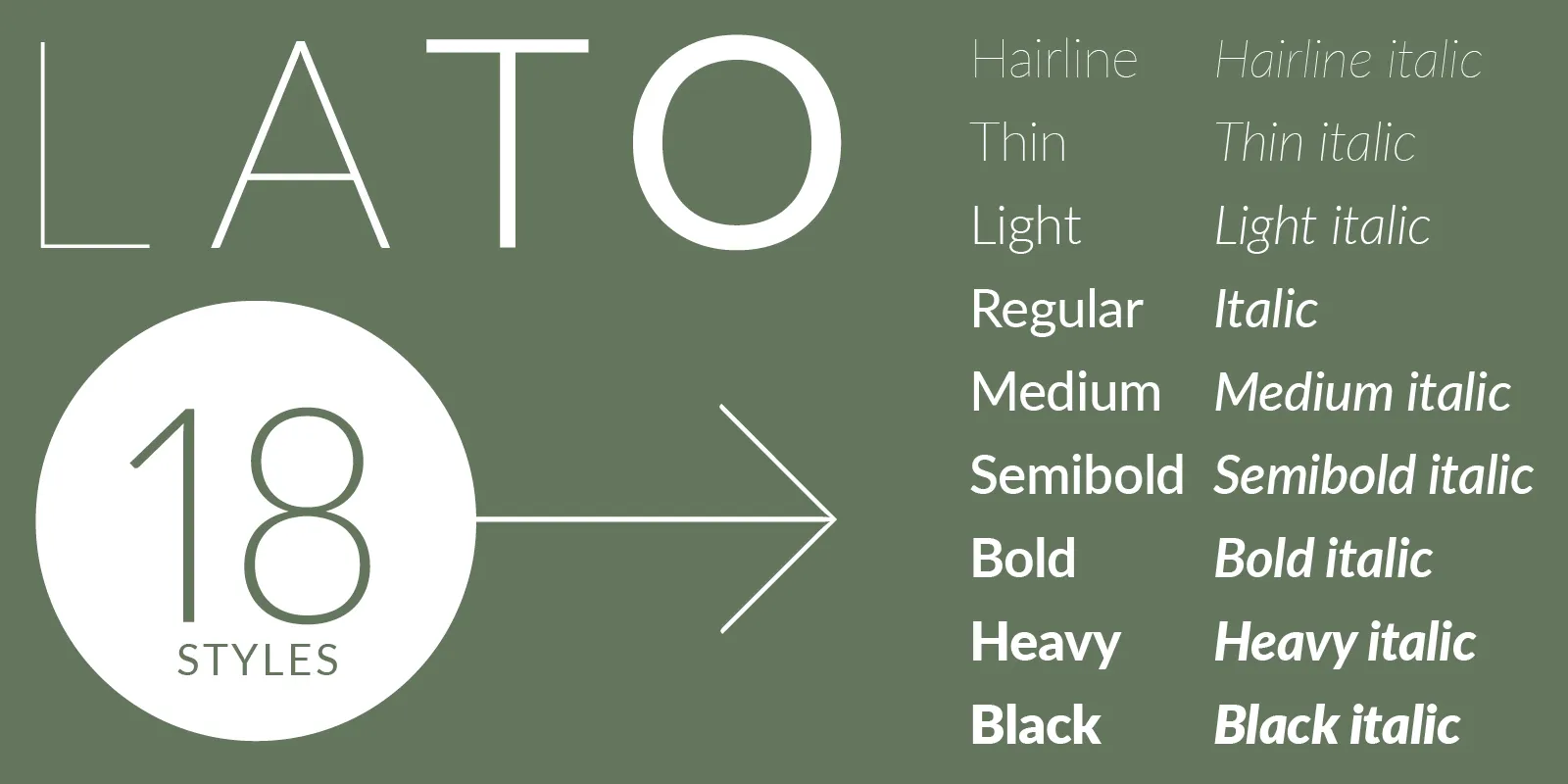
Lato is a widely used and versatile typeface that was designed by Polish designer Łukasz Dziedzic. It was initially released in 2010 and has gained popularity for its clean and modern appearance, making it suitable for a wide range of design applications, including websites, print materials, and branding.
Montserrat
A geometric sans-serif font with a professional and elegant feel. It’s suitable for both headers and body text.
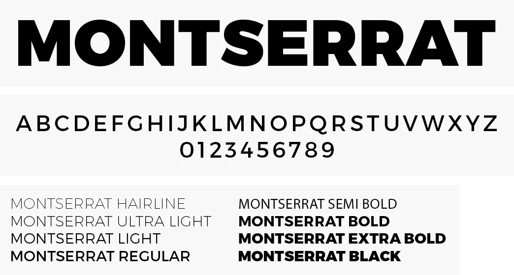
Montserrat is a widely-used typeface that falls under the category of sans-serif fonts. Designed by Argentinian designer Julieta Ulanovsky, Montserrat draws inspiration from the signage and lettering found in the Montserrat neighborhood of Buenos Aires, Argentina. The font was created with the goal of providing a modern and easily legible typeface for a wide range of design applications, particularly those involving digital screens.
Open Sans
A widely used font known for its clarity and readability. It comes in multiple weights and styles, making it adaptable to various design contexts.
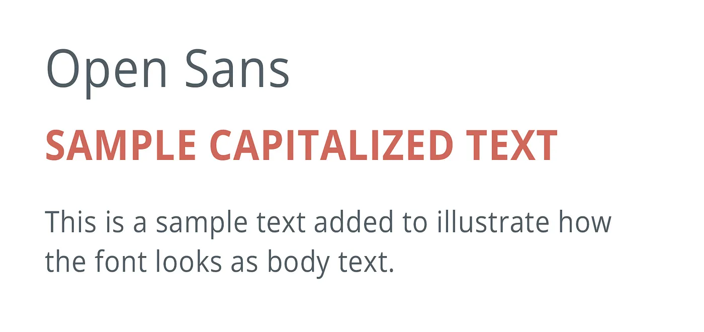
Open Sans is a widely used and highly versatile typeface that was designed with legibility and clarity in mind, especially for digital interfaces. Created by Steve Matteson, a type designer at Google, Open Sans was released in 2011 as an open-source font family. Its design principles were focused on maintaining readability across a range of devices and screen sizes, making it an excellent choice for both web and print design.
Playfair Display
If you’re looking for a more elegant and sophisticated font for headings and titles, Playfair Display’s high contrast and classic appearance might be a good fit.
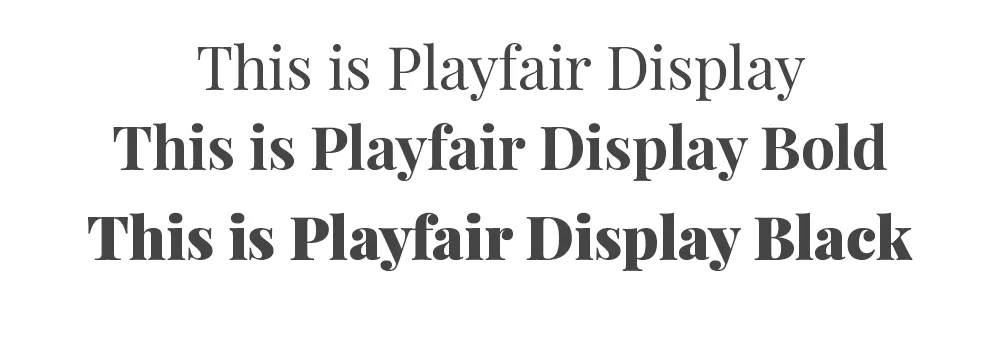
Playfair Display is an elegant and distinctive serif typeface that exudes a sense of sophistication and classic beauty. Designed by Claus Eggers Sørensen, Playfair Display draws its inspiration from traditional typefaces used in the 18th century, particularly those found in classic books and documents.
Nunito
This font offers a harmonious balance between rounded and sharp shapes, making it visually appealing and versatile.
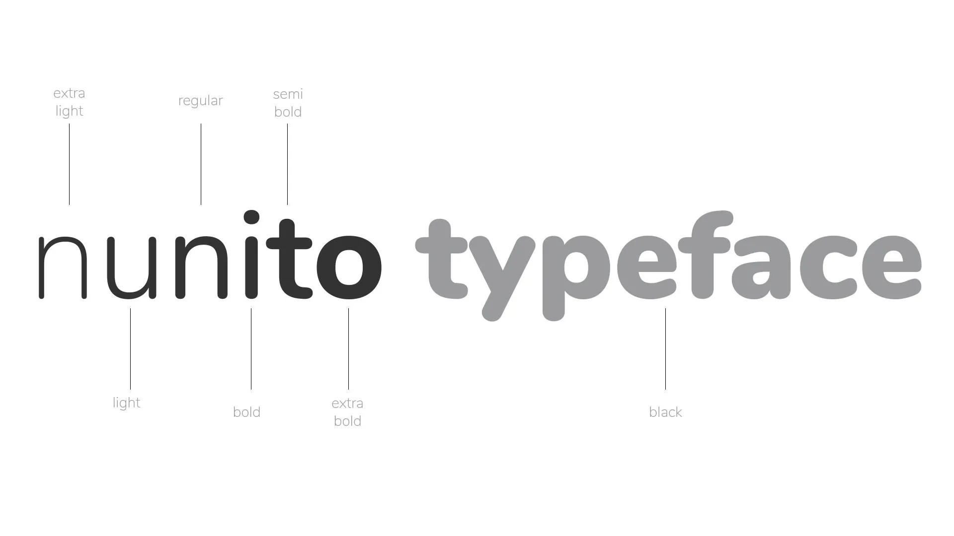
Nunito is a widely used and versatile typeface designed by Vernon Adams. It is a sans-serif font that is known for its harmonious balance between rounded and geometric shapes. Nunito’s design is intended to offer a modern and clean aesthetic while maintaining excellent readability, making it suitable for various design applications, including web design, print materials, branding, and more.
Source Sans Pro
Source Sans Pro is a versatile font that works well in both headings and body text. Source Sans Pro is a widely used typeface that was designed by Paul D. Hunt for Adobe Systems. It is an open-source font family that was specifically created for use in user interfaces, print, and web design.
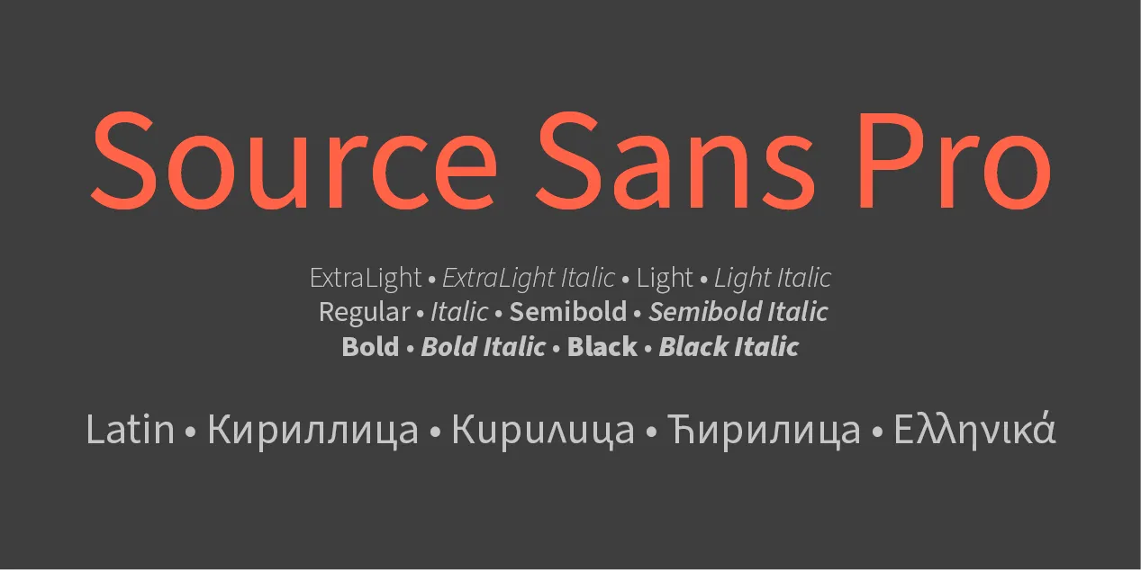
Source Sans Pro was designed to provide excellent readability across various digital and print media while maintaining a clean and modern appearance.
Poppins
Poppins is a versatile and contemporary typeface that has gained popularity in recent years due to its clean and modern design. It was designed by Indian-type designer Jonny Pinhorn and released by the Indian Type Foundry in 2014.
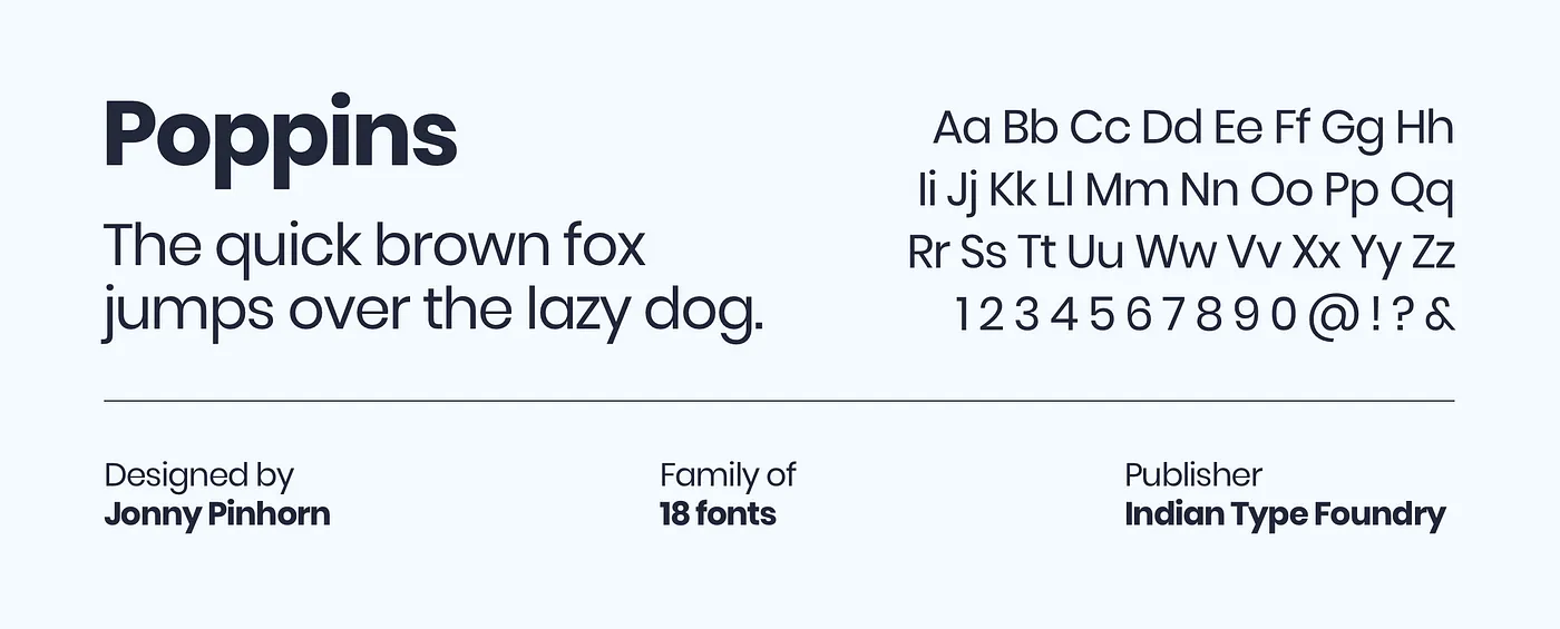
Poppins is characterized by its geometric shapes, open counters, and balanced proportions. It’s suitable for a variety of design styles.
Avenir
A good sans-serif typeface, like Avenir, will work well for websites that require to have a straightforward, contemporary, and minimalist appearance.
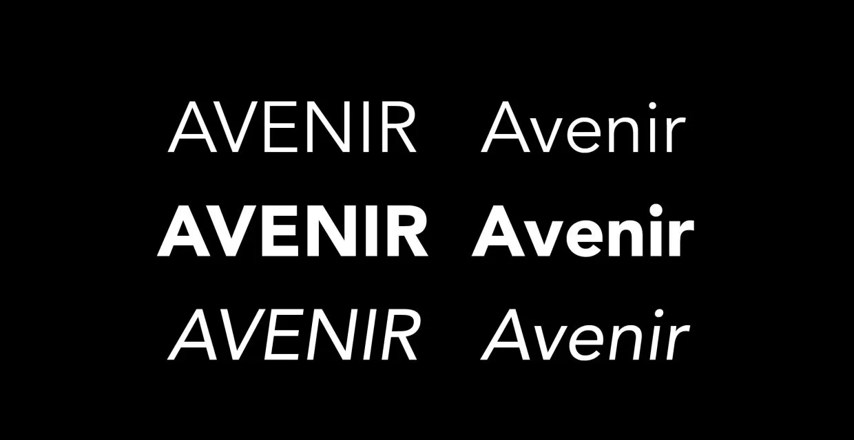
The extremely geometric font Avenir is ideal for primary, secondary, and even accent fonts because it is designed for long blocks of text.
Helvetica Neue
Similar to Avenir, Helvetica Neue is a well-known and versatile font that has been used across various design contexts for decades.
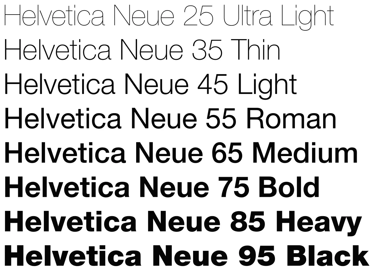
Helvetica Neue is a widely recognized and timeless typeface that belongs to the sans-serif category. The name Helvetica is derived from the Latin word “Helvetica“, which means Switzerland. The typeface was created with the intention of being a clear, neutral, and highly legible font suitable for a wide range of design applications. Helvetica Neue retains these characteristics while incorporating slight refinements and adjustments that enhance its appearance on modern digital displays.
Garamond
A serif typeface like Garamond is perfect for websites that aim to project an air of refinement, sophistication, and elegance.
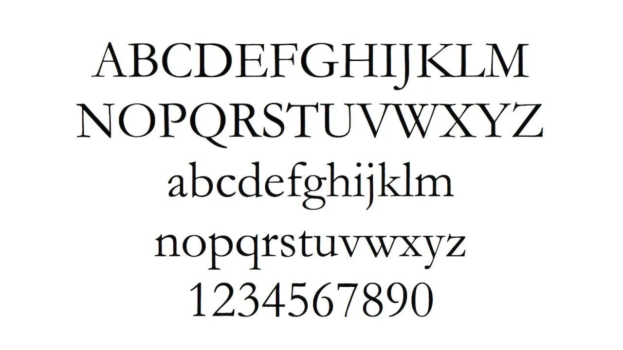
Garamond works well as a primary or secondary font, and Adobe Garamond Pro is installed by default on practically all PCs.
Haettenschweiler
A sturdy typeface like Haettenschweiler is excellent for websites that require a primary font that is reliable for banners and titles.
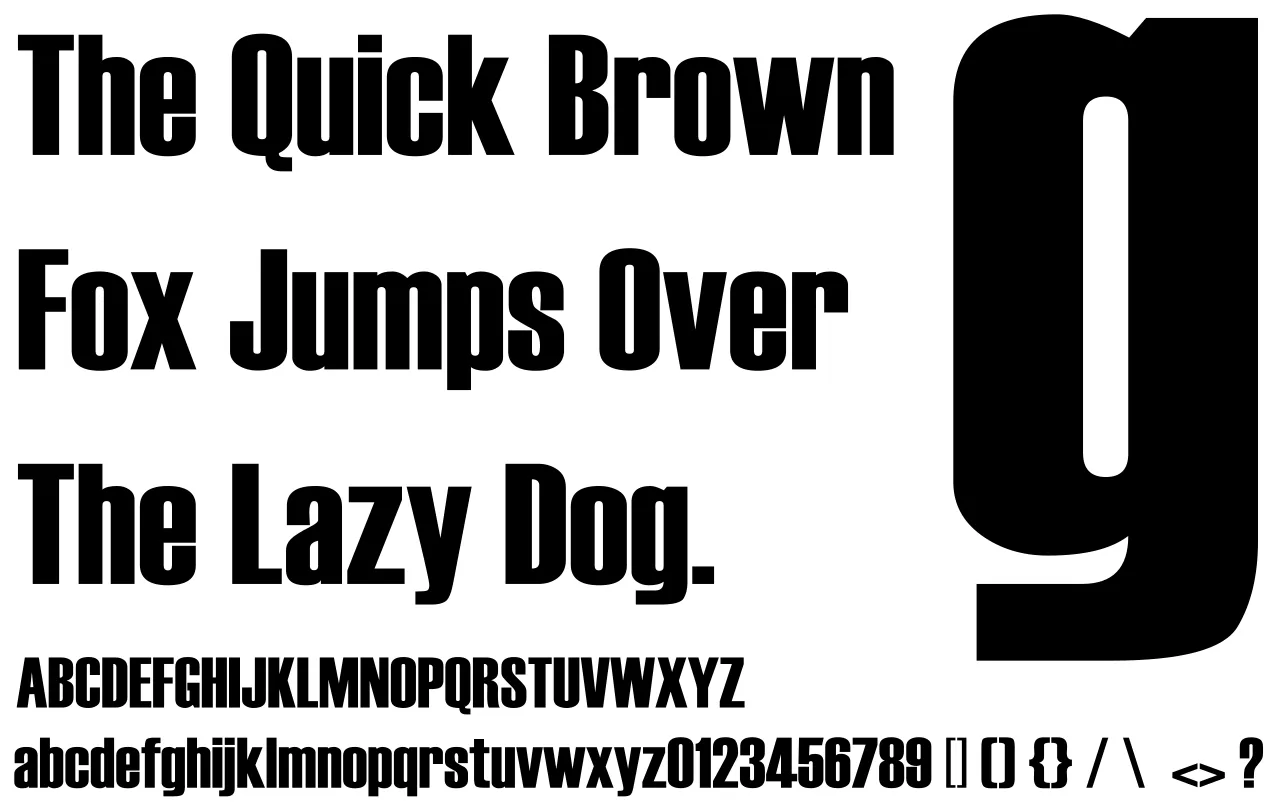
It’s not the ideal option for a secondary font because the longer text is difficult to read while the larger copy stands out on the page.
Bodoni
Use the classical Bodoni typeface, which is frequently used in many periodicals and business logos, if you want your website to have a luxury appearance for your headers, titles, and accents.
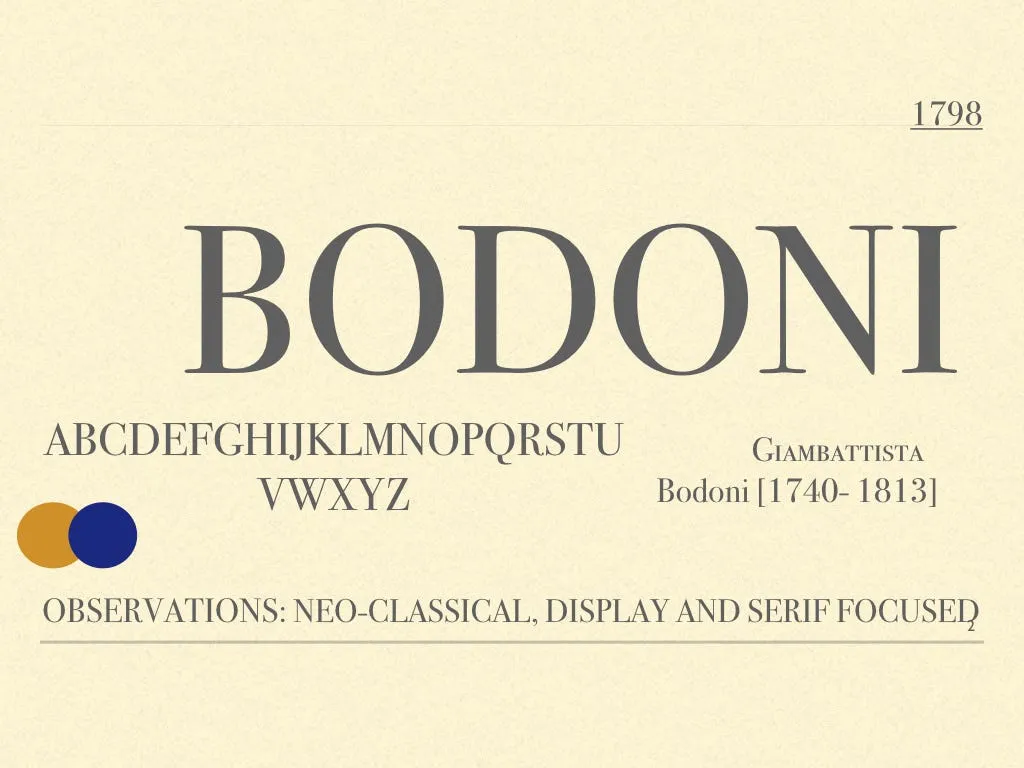
Bodoni has the same aggressive impression as grotesque typefaces and has the extra advantage of being a secondary font. It feels like a serif variant of those styles.
Mistral
A decent script typeface like Mistral is generally accessible for websites that need to add a more distinctive touch to their text.
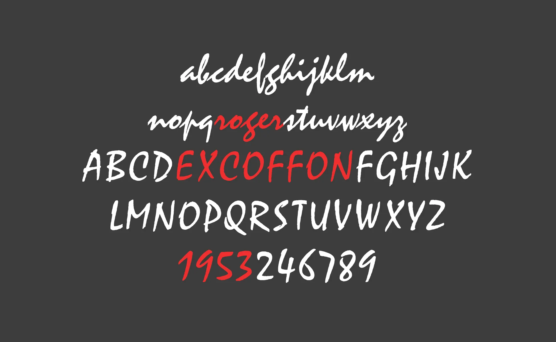
The majority of readers are probably familiar with this classic typeface, which is great for titles and even accent typefaces but not for secondary fonts. If a designer chooses a script typeface, the letters must be clear and readable.
5 best font pairings for your Shopify online shop
Serif, sans serif, slab serif, and script typefaces are just a few of the different font varieties that exist. Serif and script typefaces, as well as sans serif and serif, pair beautifully.
Combining bold decorative types with simple, minimalist typefaces is one of the greatest font pairing advice. Below are some of the suggestions for the pairs like that.
Playfair + Sofia Pro
Sofia Pro is a high-end minimalist serif font that matches any decorative typeface beautifully. As a bold sans-serif font, Playfair Display is a great option for headers and titles. Sofia Pro’s simple, uncomplicated design pairs nicely with the immensely bold Playfair font.
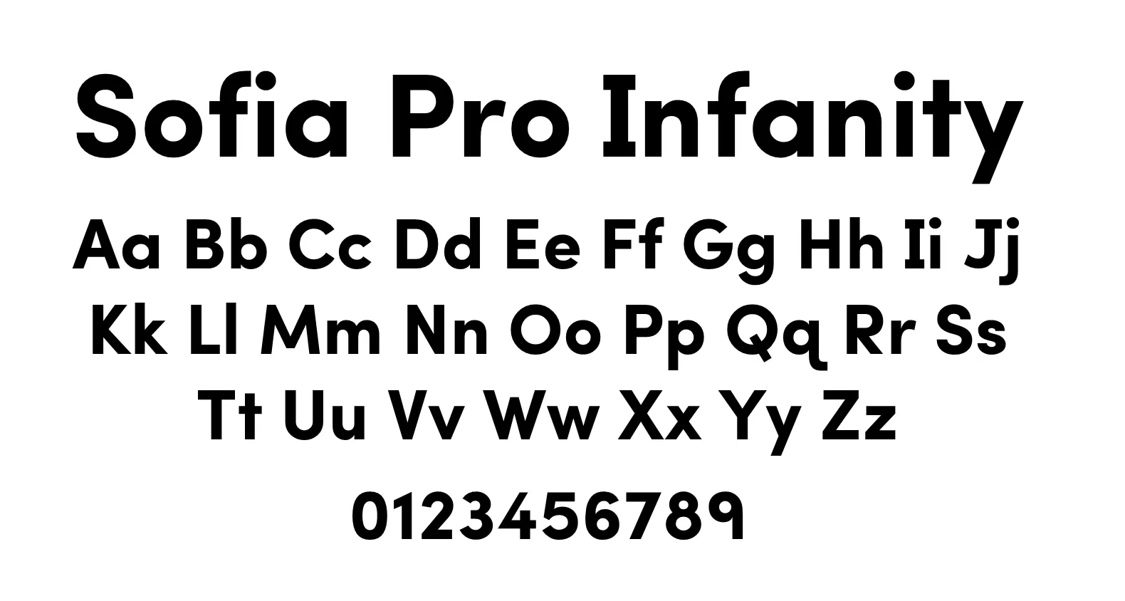
Additionally, Open Sans, Canada Type Gibson, Brandon Grotesque, Proxima Nova, Martel, and Rogliano also work well with Sofia Pro.
Abril Fatface + Open Sans
Elegant posters from 19th-century European advertisements acted as the inspiration for the Abril Fatface typeface.
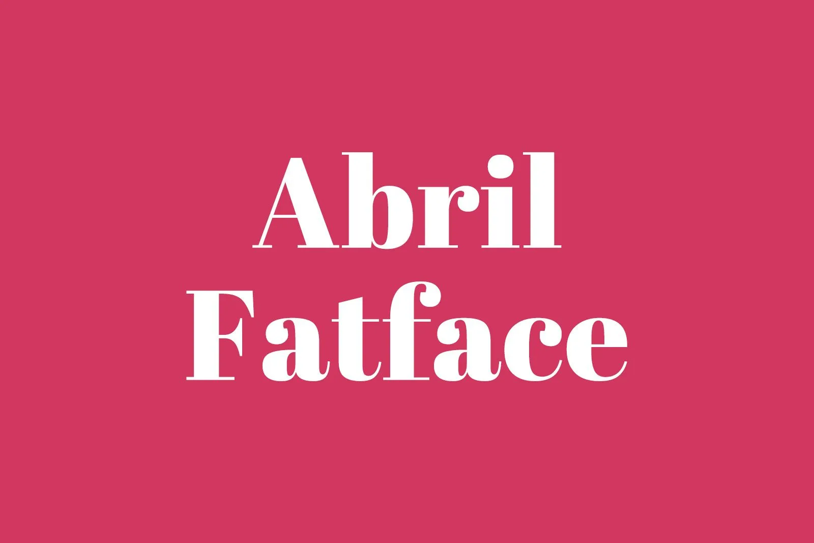
Any online store would benefit greatly from pairing it with Open Sans, which is thin, transparent, and generously spaced.
Crimson Text + Work Sans
Another neat, evenly-spaced font that works nicely for body text is Work Sans.
Crimson Text, a bold serif typeface designed for book manufacturing, was also developed during the same period. If you want elegance and modernity, this combination is made for you.
Canela + Karla
Miguel Reyes created the display font Canela in 2016. It was inspired by William Caslon’s display fonts, which are neither sans serif nor serif.
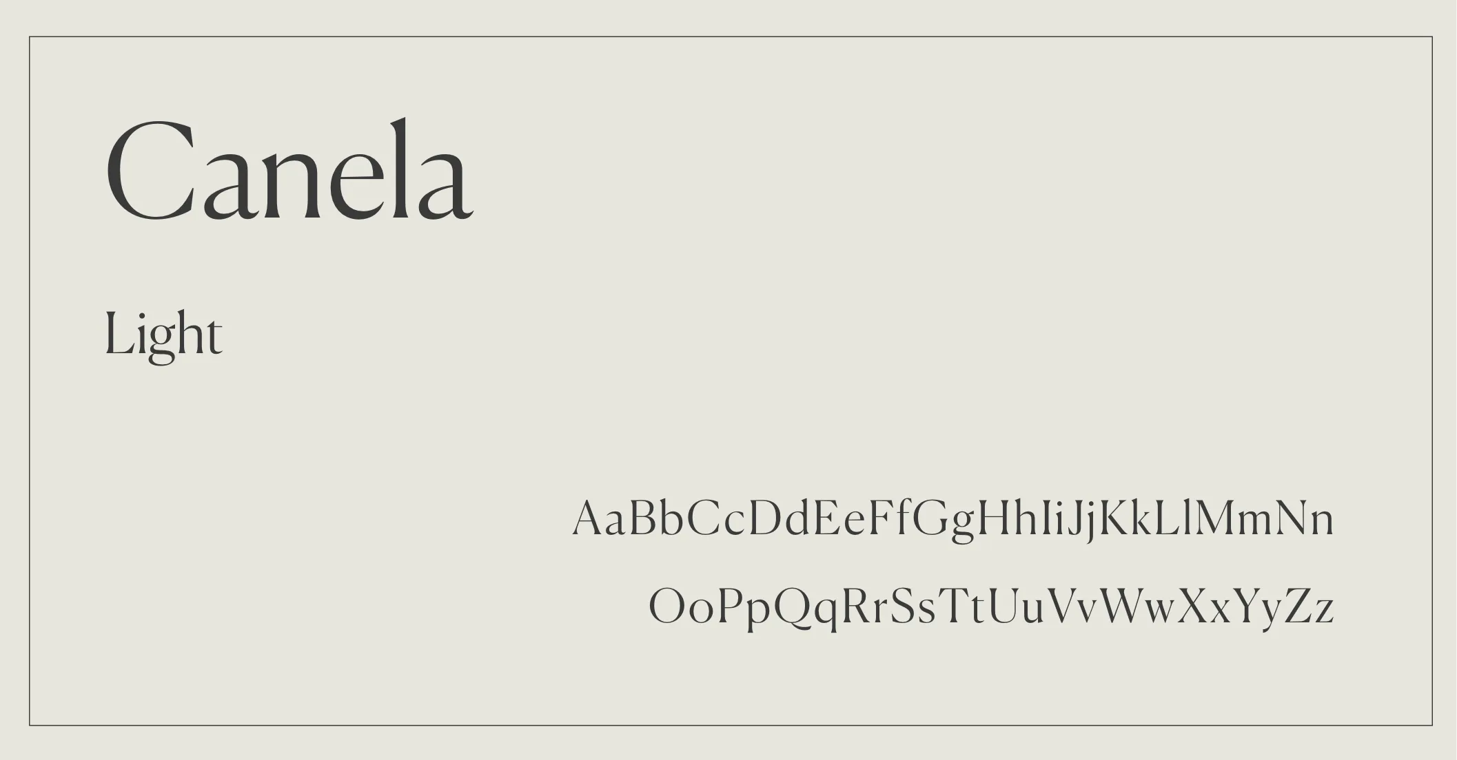
Wide-spaced sans serif typeface Karla is free and open-source. It functions brilliantly for body text.
Centabel Book + Trade Gothic
Here is yet another original font pairing for your Shopify store. The Serif typeface Centabel Book was created by Matthieu Cortat. It starts off with an inscriptional face from the 19th century. Trade Gothic is a 1948 design for a sans-serif font.
Books, periodicals, and brochures all featured it pretty frequently. See for yourself how beautiful they are together on a website.
How to choose the best Shopify fonts?
You might be trying out different Shopify fonts and wondering which ones work best for the pages of your business.
It’s a central question, and the following elements will determine the best font for Shopify stores:
- The main theme and spirit of your brand
- The perception you are trying to create to impress your prospective customers
- Principles guide your brand
- Emotions you want your audience to feel
- These types of concerns can assist and guide you in the proper way.
Serif fonts, for instance, are typically regarded as more “practical” and “mature,” according to surveys.
Here are some additional pointers to assist you in selecting the best font for Shopify stores:
Font weights
Different weights may imply various brand personas. Modernism, minimalism, and elegance are typically associated with fonts that are smaller and more stylized. However, as your typefaces get thicker, you find that they begin to appear a little more casual, noisy, and even extroverted.
Color psychology
Perception of a brand is significantly influenced by color. A strong brand experience can result from the use of the appropriate colors and typefaces. In fact, some firms have even patented their unique signature hues.
According to research, color alone accounts for up to 90% of how we evaluate people or objects. You might be asking which colors you should avoid using. According to a survey, brown, yellow, and orange are the colors that both men and women are least fond of.
Combining color schemes with an effective typeface strategy can result in strong brand memory. So you should take some time to experiment with other font colors as well.

Complementary or contrasting fonts
Pairs of complementary fonts complement one another without creating a lot of conflict or contrast.
As an illustration, you may match a heading typeface in bold format with the same font in standard font-weight. This suggests balance and harmony.
Contrasting font combinations are something to think about, on the other hand. These two typefaces are very different from one another in terms of their shape, thickness, style, and alignment.
Using a sans serif font as your primary typeface and a serif font as your supporting font is a common way to use contrasting fonts.
Frequently asked questions about fonts for websites
What’s the most important thing in choosing a typeface or font?
Readability. Whether choosing a font for a header, a button, or the body of a blog article, readability is always the most significant factor of the best font for Shopify stores. Customers won’t want to purchase the goods or utilize the service if they can’t get the text on the website.
You should think about your brand’s identity and personality after readability. Is it informal or formal? Cheaper or more premium? Different sans-serif and serif typefaces might help you reach your target audience and communicate the identity of your business.
Can I use only free typefaces on my website?
Websites typically don’t require any fancy or unique typefaces, despite the fact that they might extend design options. The most vital thing is to make sure the best font for Shopify stores you pick is readable and suits the image of your brand. Without having to spend money on a custom font, it is likely that you will discover one that satisfies those requirements given the variety of free fonts out there.
Should I purchase a typeface, may I do so?
You might already have a specially created typeface for this job because accent typefaces are frequently the font used in brand logos. However, it is advised to keep that to the accent or even the main fonts because they are usually more stressful to read at tiny sizes and over longer passages of text.
In Conclusion,
The best font for Shopify stores is one that is easy to read and looks professional. While there are many different fonts you could choose from, we recommend opting for a classic typeface like Helvetica or Arial. If you’re looking for something more unique, try a sans-serif font like Roboto or Open Sans.
Whichever font you decide on, make sure it’s legible and looks great on all devices. And if you need help designing your Shopify stores for Christmas and Year End Sales season, we got you covered. Take a look at our Shopify design services to see how we can help you revamp the front end of your Shopify stores. If you require our support with Shopify design services, don’t hesitate to contact us. Our team of Shopify experts is only one click away from making your dream design Shopify store come true.