In today’s digital age, having an online presence is crucial for any business to thrive. Shopify is a popular eCommerce platform that allows businesses to easily set up their online store and sell their products thanks to its intuitive interface and numerous themes and templates. However, simply setting up a Shopify store is not enough. You need to make sure that your website is designed in a way that attracts customers, provides a seamless user experience, and ultimately drives sales. Here, we’ve compiled a list of Shopify website design tips and tricks to help you design your website that not only looks great but also performs well. Whether you’re just starting out or looking to revamp your existing website, these tips will be sure to help you create a website that stands out and drives conversions.
Table of Contents
Basic Principles of Shopify Website Design
So, before we give you all the best Shopify store design tips, we are going to give you a few basic knowledge about Shopify website design. Designing a Shopify website is more than just creating an aesthetically pleasing layout. It’s about creating a website that is easy to navigate, visually appealing, and ultimately drives conversions. By exploring and implementing the basic principles of Shopify website design, which include simplicity, consistency, navigation, responsiveness, and visual hierarchy, you can create a website that is not only visually appealing but also optimized for user experience.
Simplicity
When designing a Shopify website, simplicity is key. A cluttered and complex website can be overwhelming for users and make it difficult for them to navigate and find what they’re looking for. To keep your website simple, use a clean and uncluttered design with plenty of white space. Focus on highlighting your products and key information, while minimizing distractions. Avoid using too many colors, fonts, or graphics, and make sure that your website is easy to navigate and understand.
Consistency
Consistency is also important when designing a Shopify website. Your website should have a consistent look and feel across all pages, with the same colors, fonts, and design elements used throughout. This helps to create a sense of familiarity and professionalism, making your website easier to navigate and use. Consistency also applies to your content and messaging, with a clear and consistent tone of voice used across all pages and communications. This helps to amplify what you want to say and to embark a trustworthy image in your customer’s minds.
Navigation
Navigation is a critical element of Shopify website design. Your website should have a clear and intuitive navigation structure, allowing users to easily find the information and products they’re looking for. Use a simple and organized menu structure, with clear labels and categories that make sense to your users. Consider using breadcrumb trails, search boxes, and other navigation tools to help users find what they need quickly and easily.
Responsiveness
In today’s mobile-first world, responsiveness is essential when designing a Shopify website. Your website should be optimized for all devices, including desktops, tablets, and smartphones. This means using a responsive design that automatically adjusts to the screen size and orientation of the device being used. Your website should also load quickly and have a clear and intuitive layout that is easy to use on smaller screens.
Visual Hierarchy
Visual hierarchy refers to the way that visual elements on your Shopify website are arranged to create a sense of importance and order. Use visual hierarchy to highlight your most important products and information, while de-emphasizing less important elements. This can be achieved through the use of color, size, and placement of design elements. Consider using clear and concise headings, subheadings, and bullet points to break up text and make it easier to read and understand. By using visual hierarchy effectively, you can create a clear and intuitive website that guides users to the information they need.
Detailed Tips for Shopify Website Design
Here are our Shopify website design tips for a better storefront. It comprises theme choosing, multi-device optimizing, and user experience designing.
Choosing A Theme
If you don’t really know how to design and don’t want to outsource a team to customize a design for you, then selecting a theme is one of the most important steps in bettering your Shopify website design. Your theme sets the overall look and feel of your website and can have a big impact on how users perceive your brand. When selecting a theme, consider elements such as your brand identity, target audience, and the products you sell. Look for a theme that aligns with your brand’s style and values, and that is easy to navigate and use.
Factors to consider when choosing a theme
- Color Palette: Color is an important aspect of Shopify website design tips. Your color palette should be consistent with your brand identity and values, while also being visually appealing and easy to read. Use colors to highlight key elements on your website, such as call-to-action buttons and product listings. Consider using a limited color palette to create a cohesive and professional look.
- Typography: Typography plays a crucial role in Shopify website design, as it affects the readability and visual appeal of your website. Choose a font that is easy to read and matches your brand’s style and personality. Use typography to create a hierarchy and emphasis important elements, such as headings and product descriptions.
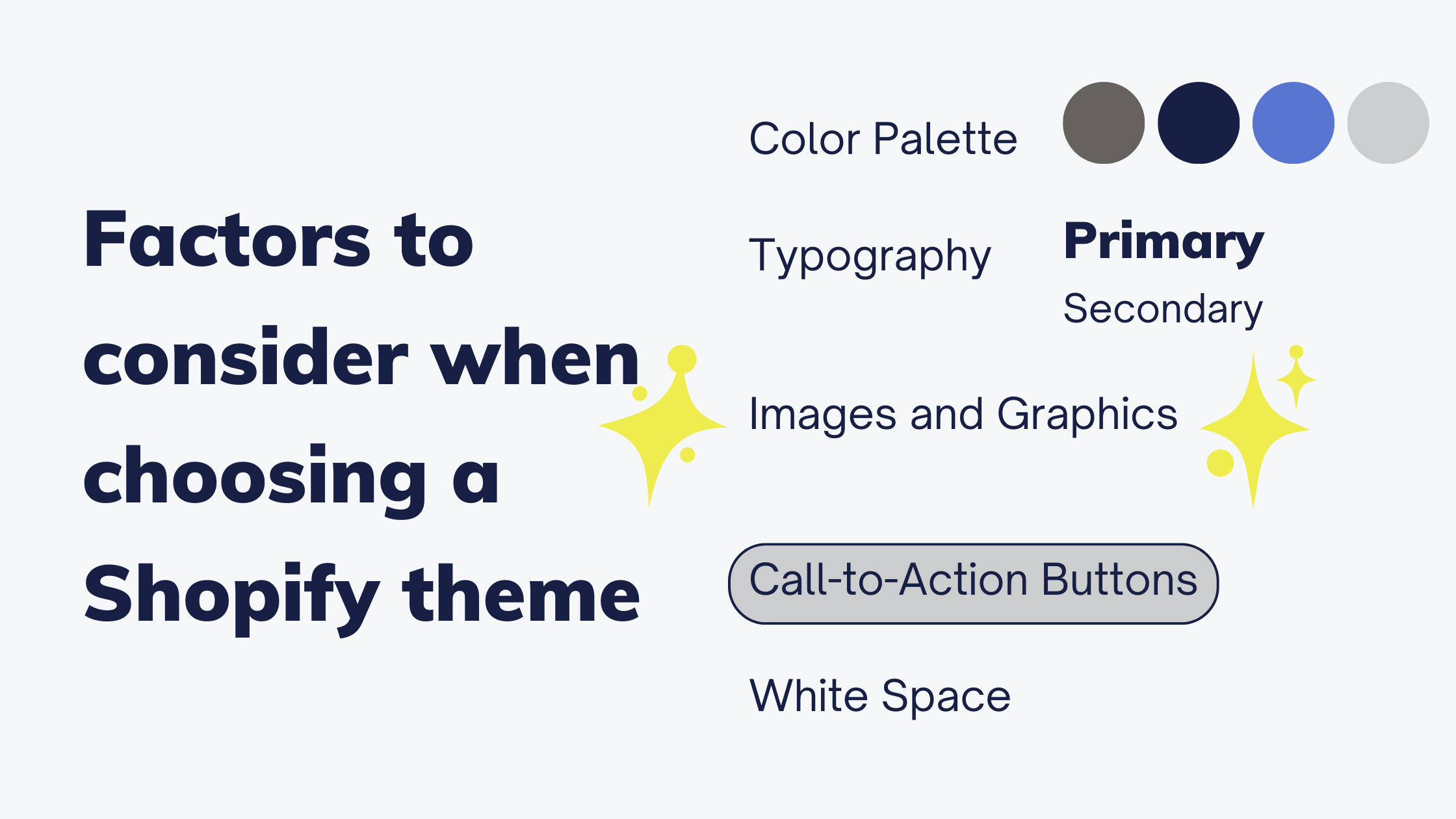
- Images and Graphics: Images and graphics are powerful ways to showcase your products and create an emotional connection with your audience. Use high-quality images and graphics that are consistent with your brand’s style and values. Consider using product images in context, such as lifestyle shots, to help customers visualize how the products can be used.
- White Space: The term White space, or negative space, refers to the empty space between design elements on your website. It is important for creating a clean and uncluttered look and can help to draw attention to key elements on your website. Use white space strategically to create a sense of balance and organization on your website.
- Call-to-Action Buttons: Call-to-action (CTA) buttons are an essential part of Shopify website design tips, as they encourage users to take action and make a purchase. When designing your CTA buttons, use contrasting colors to make them stand out, and use clear and concise language to convey the action you want users to take. Consider placing your CTA buttons strategically throughout your website, such as on product pages and in the shopping cart.
Recommended themes for different types of businesses
Shopify development service provides 12 free and 117 paid themes, suitable for a variety of different styles and industries. A few themes you could consider:
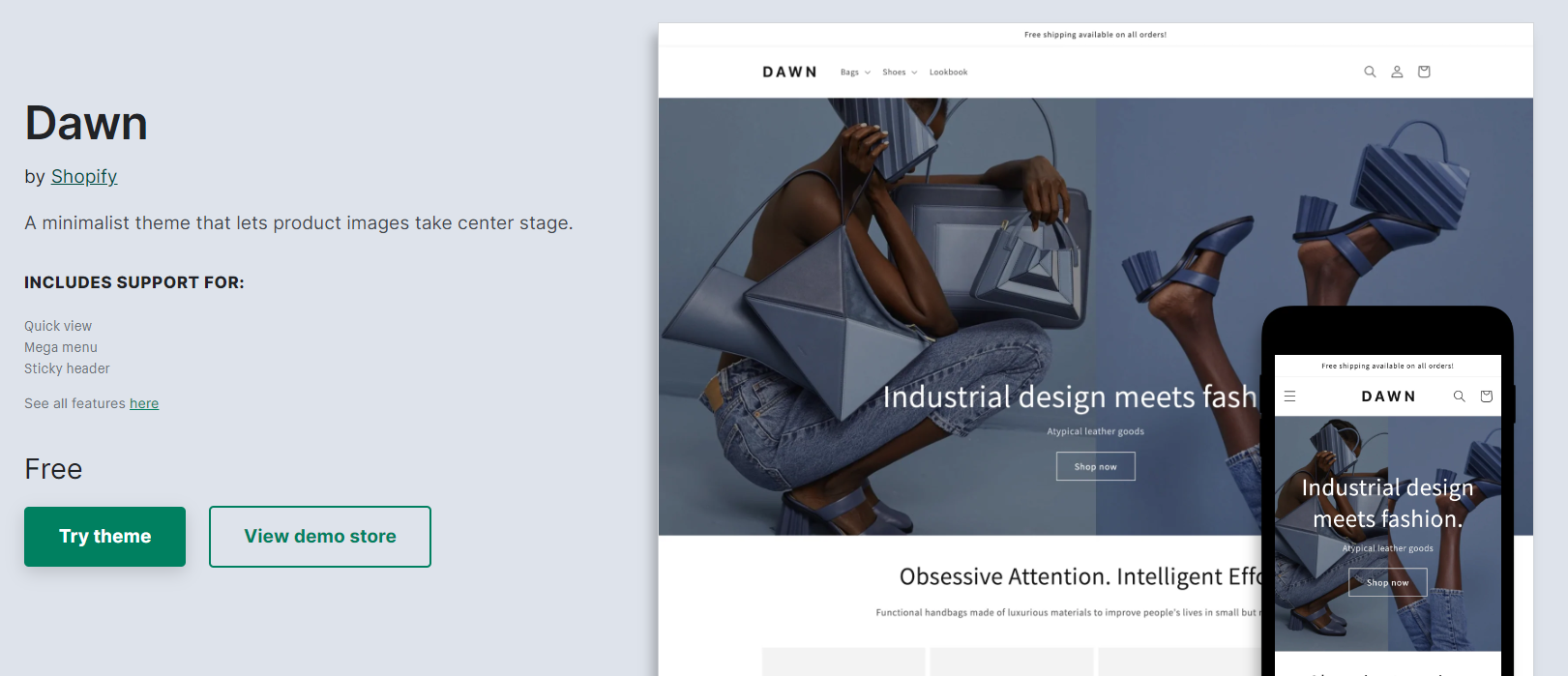
Dawn: Although being a free theme, Dawn has become a top performer in the Shopify theme store. Its chic and minimalist design emphasizes product showcasing with large imagery, sharp lines, and clean fonts, allowing buyers to concentrate on what’s important. The icing on the cake is that Shopify regularly releases updates, ensuring seamless compatibility without any concerns. It is suitable for merchants who are in the fashion industry.
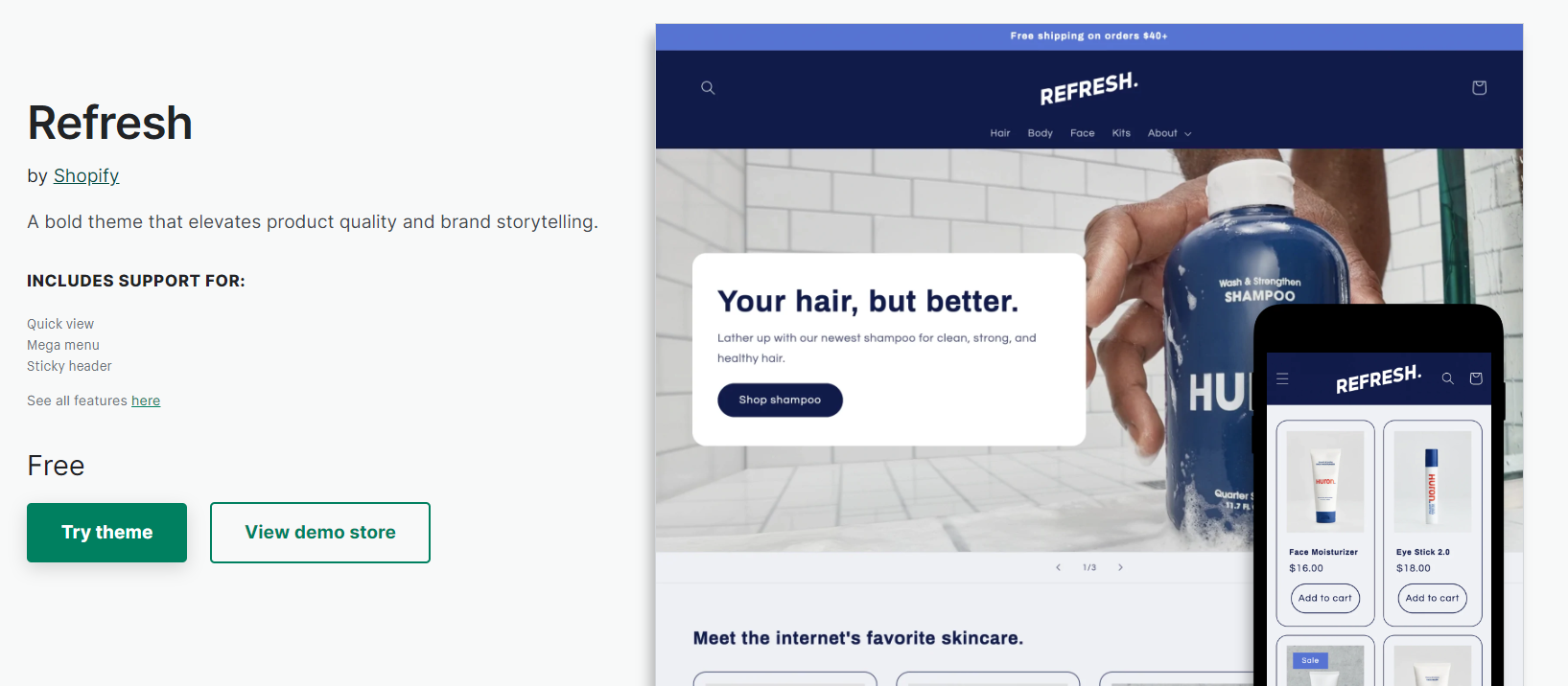
Refresh: It is another beloved free theme available on Shopify. Its modern and sleek design highlights product details, enabling brands to showcase testimonials, ingredients, quality information, special certifications, and more, utilizing adaptive section layouts.
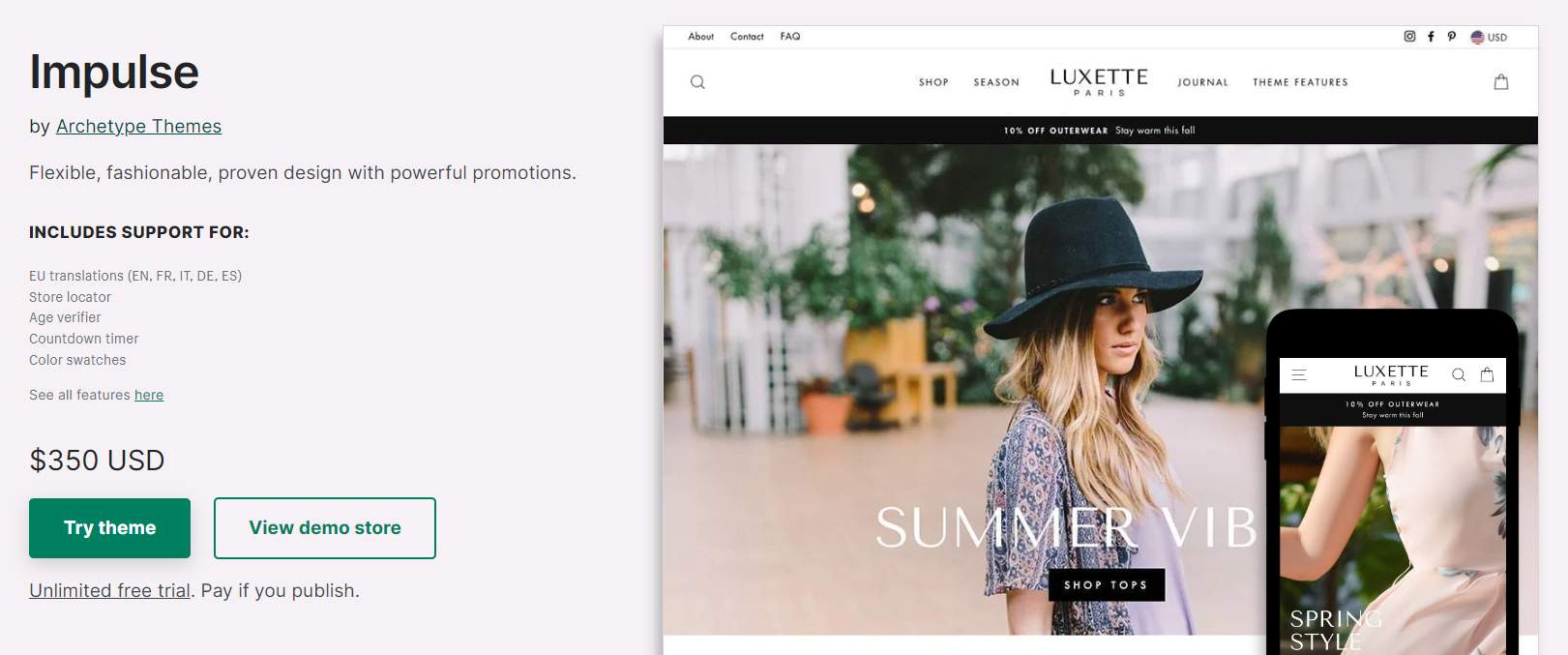
Impulse: As a high-priced theme, Impulse offers ease of configuration and an attractive design. It has all the features required for a seamless shopping experience for customers. However, what sets this theme apart is its exceptional customer support team that is quick and responsive in addressing queries and issues. Merchants who have used the theme appreciate the helpful and friendly nature of the support team. Updating the theme is also straightforward with the aid of video instructions. Thanks to that, the theme and its support team receive high praise and are recommended for use.
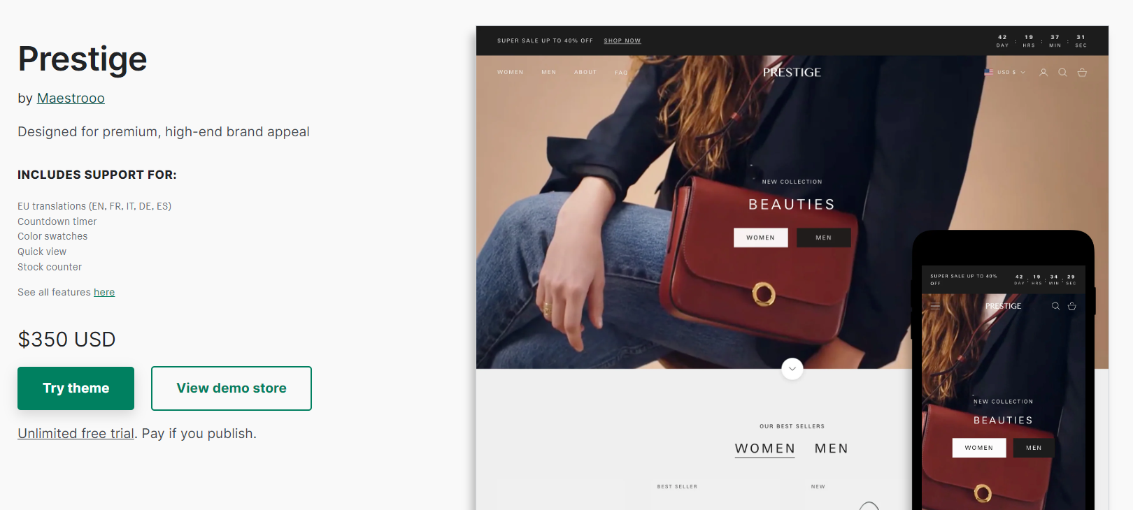
Prestige: Prestige is a theme that recently underwent a significant update, which was long-awaited by customers. This update introduced several new features that have been well-received by users. Some store owners have suggested additional features like breadcrumbs and an empty cart option that could further enhance the theme’s functionality. Despite this, merchants who have been using Prestige for many years appreciate its clean and professional layout, colors, and features. The theme is particularly suitable for luxury or high-end brands. Furthermore, the customer service and support provided by the theme’s creators, Maestrooo, are top-notch and efficient in troubleshooting any issues that may occur. Prestige is a fantastic theme for showcasing fair trade products and is highly recommended.

Symmetry: This is another paid theme that has received high praise from customers. Its minimalist design and font type, combined with customizable options, make it an attractive choice for online stores. Merchants appreciate the ease of use and beauty of the theme and have found customer support to be highly responsive. Some even noted that the Clean Canvas support team has been particularly helpful in troubleshooting any issues that arise. The theme also allows for updates to be easily installed, making it a convenient option for store owners who want to keep their site up-to-date with the latest features. Store owners are happy with their choice of using Symmetry for their online stores.
Customizing a theme
Customizing your Shopify theme is a crucial step in building a unique and effective online store that represents your brand. Once you have chosen a theme that suits your brand’s style and personality, you can use the theme editor to make changes to your theme content and settings directly from your Shopify admin.
The theme editor provides a preview of your website’s appearance and a sidebar or menu where you can add, remove, edit, and rearrange content. This makes it easy to make changes to your theme settings and create a unique design that perfectly represents your brand.
However, if your theme doesn’t have the settings you need to make your desired changes, you can always edit your theme code using HTML, CSS, and Liquid. But before you start customizing your theme, it’s important to duplicate your theme to create a backup copy in case you need to start over.
Additionally, it’s a good idea to familiarize yourself with the requirements and best practices for uploading images to ensure that your website’s images look their best. Finally, if you need help customizing your theme, you can always hire a Shopify Expert to assist you in creating a website that perfectly reflects your brand’s unique identity or refer to our video guidance on how to choose a suitable Shopify theme for your business.
Optimizing for Both Mobile and PC
In today’s digital age, it is more important than ever to optimize your Shopify website for both mobile and PC users. With the increasing use of mobile users, having a mobile-friendly website can make a significant impact on your business’s success. Mobile optimization improves the user experience, increases engagement, and drives more conversions. At the same time, desktop optimization ensures that your website is accessible and user-friendly for PC users. Let’s explore the importance of optimizing your website for both mobile and PC users, tips on how to optimize your Shopify website for both platforms, and discuss the importance of testing for responsiveness. By following these Shopify website design tips, you can ensure that your website is accessible and user-friendly for all users, regardless of the device they use to access it.
Importance of optimizing for both mobile and PC
Optimizing your Shopify website for both mobile and PC is essential for providing a positive user experience and maximizing your online sales. With more and more users browsing and shopping on their mobile devices, it’s crucial to ensure that your website is responsive and easy to use on all devices. Failure to optimize your website for mobile can result in a frustrating and confusing experience for your customers, ultimately leading to lost sales and a damaged reputation.
Tips for optimizing for both mobile and PC
To optimize your Shopify website for both mobile and PC, there are several best practices you can follow. Firstly, it’s important to keep your website design simple and clean, with easy-to-read text and clear navigation. You should also make sure that your website is optimized for speed, with fast loading times for both mobile and PC users.
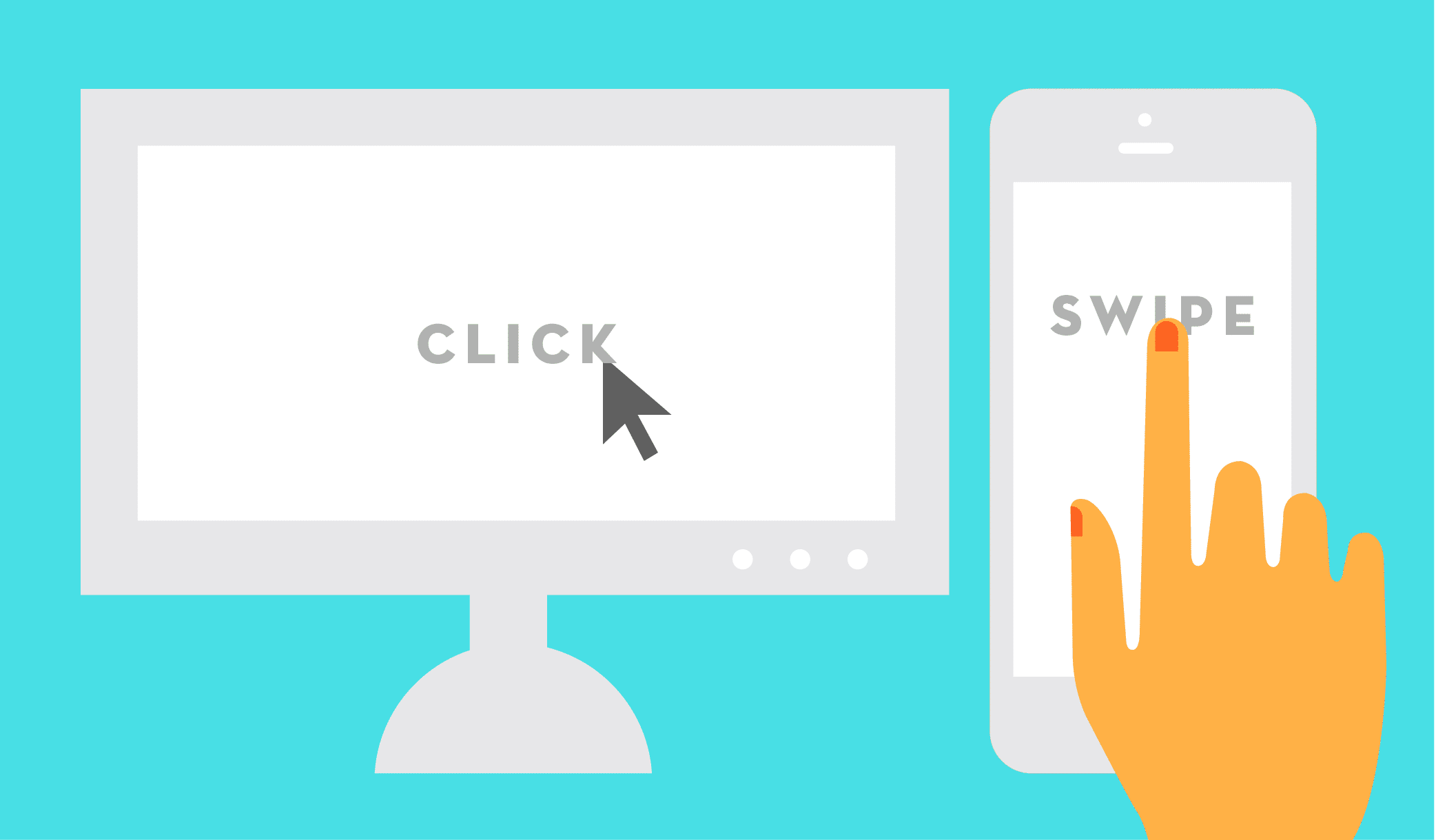
Another key tip is to ensure that your website is fully responsive, meaning that it automatically adjusts its layout and design to fit the screen size of any device it is viewed on. This can be achieved through the use of responsive design techniques, such as flexible layouts and responsive images.
Testing
To ensure that your Shopify website is fully optimized for both mobile and PC, it’s important to test it for responsiveness on a range of different devices and screen sizes. This can be done using a range of tools and techniques, such as browser developer tools and online testing services.
By regularly testing your website for responsiveness and making any necessary adjustments, you can ensure that your customers have a positive and consistent experience, regardless of the device they are using to access your website. This can ultimately lead to increased sales, higher customer satisfaction, and a stronger online reputation for your brand.
User Experience
The user experience (UX) is a crucial element in creating a successful Shopify website. UX design focuses on creating a positive interaction between the user and the website, ensuring that visitors can easily find the information they need and complete their desired actions. In this blog, we will explore the key UX design principles for Shopify websites across various pages such as product pages, blog pages, homepage, and other pages. By optimizing the user experience on these pages, you can increase customer engagement, drive conversions, and build a loyal customer base for your business.
Product pages
First and most important, the user experience in your Shopify product pages can make or break a sale. You need to make sure your product pages are informative, easy to navigate, and visually appealing. One way to achieve this is to use high-quality images and videos that showcase your products from various angles.
Additionally, make sure to include detailed descriptions, product specifications, and customer reviews to help shoppers make informed purchasing decisions. Use a clean and simple layout that directs the user’s attention to the most important elements of the page, such as the Add to Cart button.
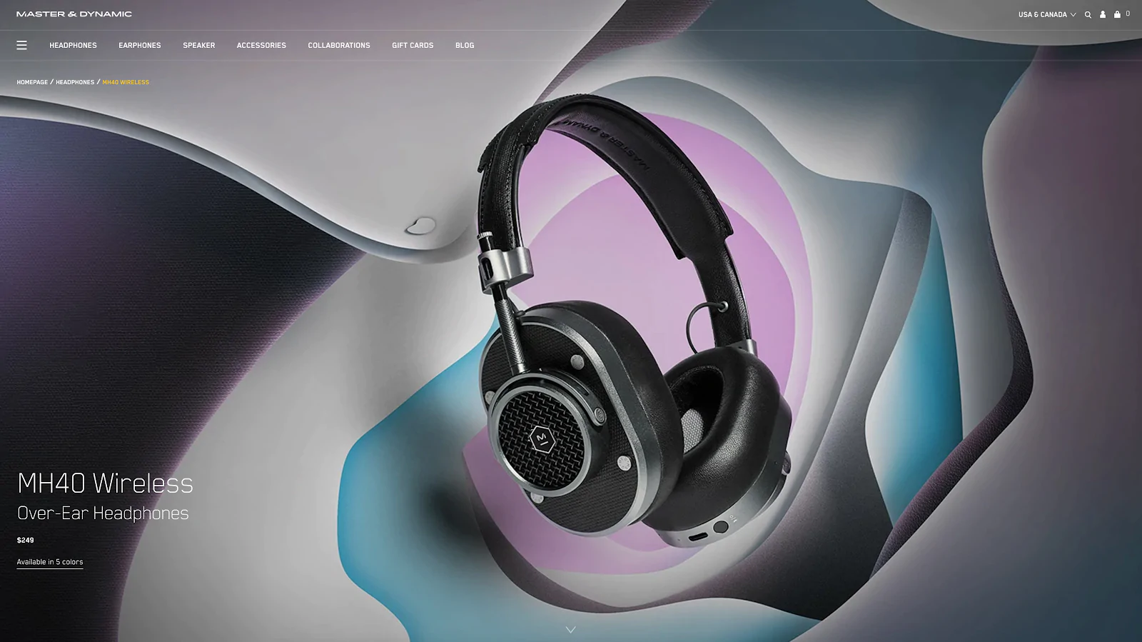
Like our example from Master & Dynamic. Its product pages are designed to showcase the quality and detail of its headphones. The pages prioritize design without sacrificing conversion rates, as an inconspicuous floating Add to Bag bar is always present. The pages offer a scrolling experience where users can learn more about the product’s advanced features and materials before making a purchase.
Blogs pages
The user experience in your Shopify blog pages is equally important to attract and retain visitors. Use clear and concise headlines, formatting, and visual elements to create an easy-to-read and visually appealing blog post. Use images, videos, and other multimedia to break up long blocks of text and keep the reader engaged. Additionally, make sure to include social sharing buttons so that visitors can easily share your blog posts with their networks.
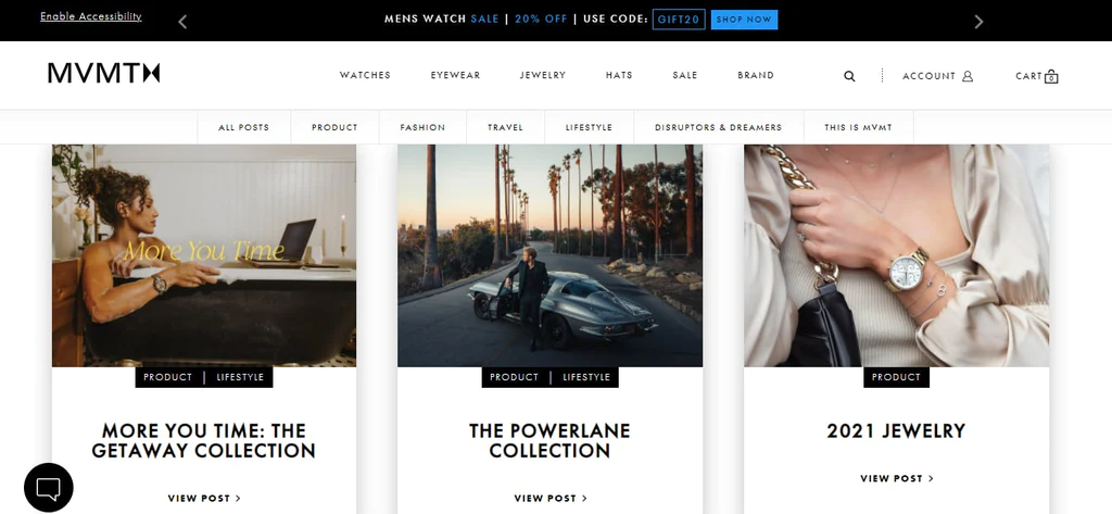
Looking at MVMT Watches’ blog design, we can see that they are trying to showcase their customers’ routines and looks, making it a perfect fit for influencer marketing. This unique approach is complemented by the store’s selection of affordable, fashionable watches, eyewear, and accessories.
Homepage
The user experience on your Shopify homepage is critical in making a great first impression. Use a clean and uncluttered design that showcases your brand and products effectively. Make sure your value proposition is clear and concise, and use high-quality images and videos that reflect your brand identity. Use a strong call-to-action to guide users to the most important pages of your website, such as your product pages or collection pages.
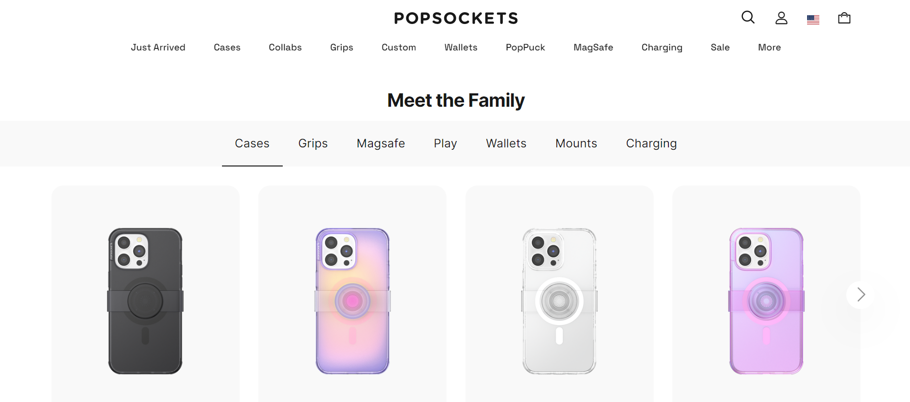
PopSockets’ homepage strikes a balance between eye-catching design and effective conversion rate optimization. The page features stunning product imagery that immediately grabs the attention of the target audience, with multiple calls to action strategically placed throughout. The design effectively guides users toward browsing the latest product line, while additional CTAs are displayed further down the page for other products.
Other pages
The user experience on other pages like the terms & conditions page, checkout page, about us page, and many more of your Shopify website are just as important as your product pages and homepage. Keep the design consistent throughout your website, with a clean and easy-to-navigate layout. Make sure to use headings, subheadings, and bullet points to break up the content and make it easy to scan. Use a clear and visible navigation menu to help users find the information they need quickly and easily. Additionally, use clear and concise language, and avoid using industry jargon or technical terms that may confuse users.
Conclusion
Designing a Shopify website can seem daunting, but with the right tips and tools, it can be a rewarding and profitable experience. By implementing the basic principles of design such as simplicity, consistency, navigation, responsiveness, and visual hierarchy, as well as following the detailed Shopify website design tips for customizing your theme and optimizing for both mobile and PC, you can create a website that not only looks good but also performs well. Remember to always prioritize the user experience, test your website for responsiveness, and seek the help of a Shopify expert if needed. By following these tips, your Shopify website is sure to stand out and drive conversions, helping your business succeed in the competitive eCommerce market.
If you have any questions or want us to help you customize your Shopify store, feel free to reach out to our Shopify Experts by clicking the below button.


