

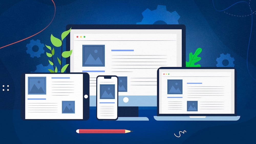
In today’s digital age, businesses and organizations are increasingly shifting their focus toward mobile platforms to enhance their reach and engage their target audience. Progressive web apps (PWA) have emerged as a popular choice for businesses looking to offer a seamless user experience across different devices. With their ability to work on any device with a web browser, PWAs provide a perfect solution for businesses looking to reach a wider audience while also reducing development and maintenance costs. However, a great PWA is not just about functionality. A well-designed PWA also requires an excellent user interface (UI) and user experience (UX) to ensure that users have a seamless and enjoyable experience on your website. In this article, we will explore the key elements of Progressive web app design that can help you create a successful PWA and outrank your competitors.
Table of Contents
Importance Of UX-UI In Progressive Web App Design
Good UX-UI Enhances User Engagement
One of the most important aspects of progressive web app design is to create a user-friendly interface that provides a positive user experience. The design should be intuitive and easy to use, allowing users to quickly and easily find what they’re looking for on your website. A clear and concise menu with a limited number of options can help guide users to the information they need. This results in enhanced user engagement and improves the chances of users returning to your website.
Responsive Design Increases Reach
A responsive design ensures that your website looks and functions seamlessly across different devices, including mobile, desktop, and tablet. A responsive design should include elements such as flexible layouts, images, and text that can adapt to the screen size of different devices. This results in increased reach and user satisfaction, as users can access your website on any device.
Fast Loading Times Improve Search Engine Rankings
A fast-loading PWA will not only enhance the user experience but also improve your search engine rankings. This requires optimizing images, compressing files, and reducing HTTP requests. A PWA that loads quickly, especially on mobile devices where users are likely to have slower internet connections, will improve user satisfaction and improve the website’s rank on SERP.
Personalization Increases Engagement and Conversions
In the digital age, users are more likely to engage with a website that offers personalized experiences. Personalization can be achieved by offering tailored content, user-specific recommendations, and customized user interfaces. By gathering data on users’ preferences and behavior, businesses can provide a more personalized experience that enhances engagement and conversions.
Offline Functionality Provides a Seamless User Experience
Offline functionality is an impressive feature of PWA. By providing offline access to your PWA, users can continue to access your content even when they don’t have an internet connection. This is achieved by caching data on the user’s device, allowing them to access previously viewed content without an internet connection. This can be especially useful for users in areas with limited internet access.
Common Progressive Web App Design Mistakes To Avoid
Progressive web app design is more likely to design a native app than a merely responsive web app. So you have to avoid some common mistakes that web designers usually make when designing a progressive web app because of the conventional web app design bias.
Navigation is a crucial component of any app, but it can be easy to overcomplicate this in Progressive Web App Design. Designers can get carried away with creative navigation solutions, but this can lead to confusion and frustration for users. Users can often feel lost, aimlessly clicking through a website without any direction or too many directions. Whether it be a hamburger menu or tabs for navigation, this is an all-too-common occurrence. To avoid this issue entirely, simply place your navigation bar at the bottom of the page, navigation should be intuitive and easy to use, with clear signposts and a logical hierarchy that users can follow easily.
Transition Is Blocked on The Network
When networks are operating at a sluggish speed, it’s standard for apps to experience hindered screen transitions. Fortunately, this issue can be remedied with the use of skeleton screens.
Incorporating a skeleton screen into your website provides users with information on what they can expect while guiding them toward their next move. When properly implemented, the experience is seamless and users are unaware that they are even viewing one.
Poor Use of Space
Designers can get carried away with cramming too much information onto a small screen, leading to a cluttered and confusing interface. Ensure that there is enough white space to allow the eye to rest and that the most important information is easily accessible. That will create a relaxing experience when scrolling through your PWA.
Infinite Scrolling
Infinite scroll or large feeds on websites can be incredibly frustrating for users, prone to glitching and going blank while scrolling. Fortunately, there is a solution that you can utilize virtualized lists. This technique renders the Dom nodes visible to viewers based on their current scroll position which makes navigation infinitely smoother and faster. Twitter successfully utilized this method with its PWA is known as Twitter Lite, an example of how powerful a virtual list can be.
Forgetting About Accessibility
Failing to design for accessibility can lead to an app that is unusable for some users, which can be a serious issue, especially for users with handicaps such as dyslexia, hearing loss, or blindness. Ensure that the app is designed to be accessible for all users which means you have to account for users of both young ages and old ages, with clear and simple navigation, good color contrast, and compatibility with screen readers and other assistive technologies.

Best Practices For Progressive Web App Design
Progressive Web App Design For Both Desktop, Mobile, And More
If your goal is to create a PWA that works across multiple platforms, fundamentally, you must prioritize excellent UI and UX for both desktop and mobile users. However, when designing the version specifically for smartphone users, exceptional user experience should be at the very top of your priority list.
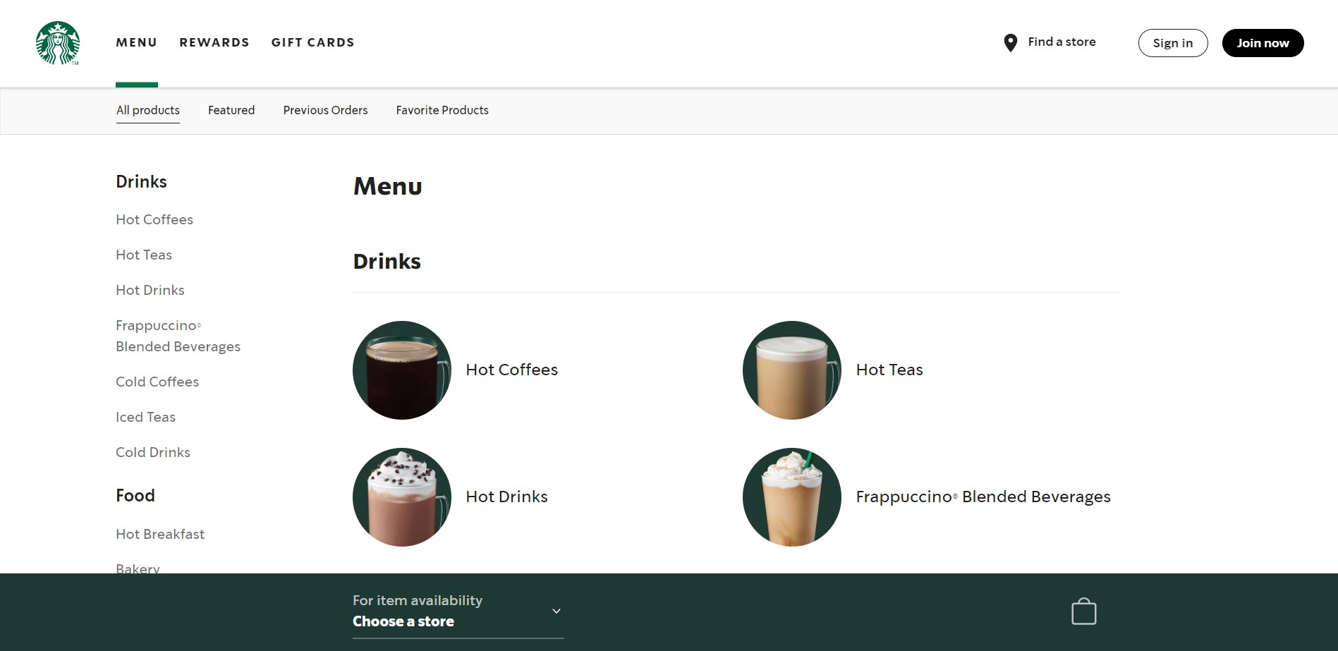
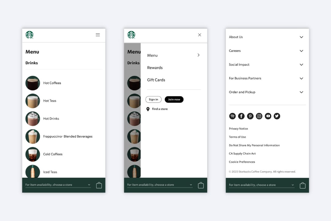
Let us analyze two different Progressive Web App (PWA) designs for Starbucks on both desktop and mobile devices.
Desktop Version
When designing the desktop version of Impact PWA, you can add some extra spacing and incorporate visuals like illustrations or photos (optional). The design is clear-cut yet sophisticated with a minimalistic format. To illustrate how advanced the desktop version of Starbucks PWA is, you can check the image of the menu page below.
Notice the generous use of whitespace, along with a simplified navigation design. This allows viewers to rest their eyes and easily understand how to navigate the website without becoming overwhelmed or lost. Categories are intelligently arranged and accompanied by visual imagery, while additional information is neatly placed at the bottom of each page; this creates a minimalistic approach that helps reduce clutter on-screen.
Mobile Version
When it comes to developing a version of your website for mobile devices, first determine which content is the most popular and needed. Usually, visitors accessing your progressive mobile web page will use several core features, such as wanting to pay their bill and receiving a receipt or looking for accommodation with the best option available.
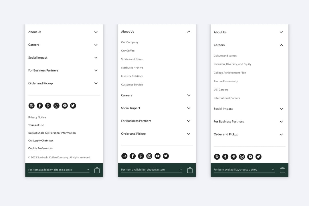
Taking this into account, add the most essential features to the navigation bar. This way, users will always have quick access to their preferred functions with ease. Starbucks PWA provides an excellent example of how to optimize the available space on a smaller screen, like that of a mobile device, this is achieved via their hamburger navigation bar. To enhance user experience further, all additional features and information regarding Starbucks have been strategically placed in the app’s footer. The design itself also exudes attractiveness while remaining highly intuitive and functional for users as well.
Were you to install heatmaps onto your website, the data might shock you, primarily when it comes to mobile users. Unless they have a specific goal in mind and can’t find what they are looking for with navigation, chances are that not many of them make it all the way down to the footer.
Footer is a consistent feature across all pages, where you’ll regularly find copyright notices, website usage terms and conditions, links to social media profiles, and even newsletter subscription forms. This page element can take up too much visual spacing on large desktop screens, but this is especially true when considering the limited space available with mobile devices. It’s no wonder that native apps don’t include a footer, and progressive web apps should follow their lead.
So you need to get rid of your footer. Once more, the goal is to strip away any components from your design that aren’t fully essential. It also involves utilizing an app shell for a much faster and more effective mobile design experience.
Let’s look at the example of Starbucks PWA, where we can see that the footer on the mobile PWA version is brilliantly designed. Every piece of information in the footer appears to be organized intuitively according to its specific category. Furthermore, with just one click on each title or by pointing-down arrow each big category unlocks an array of sub-categories for further exploration.
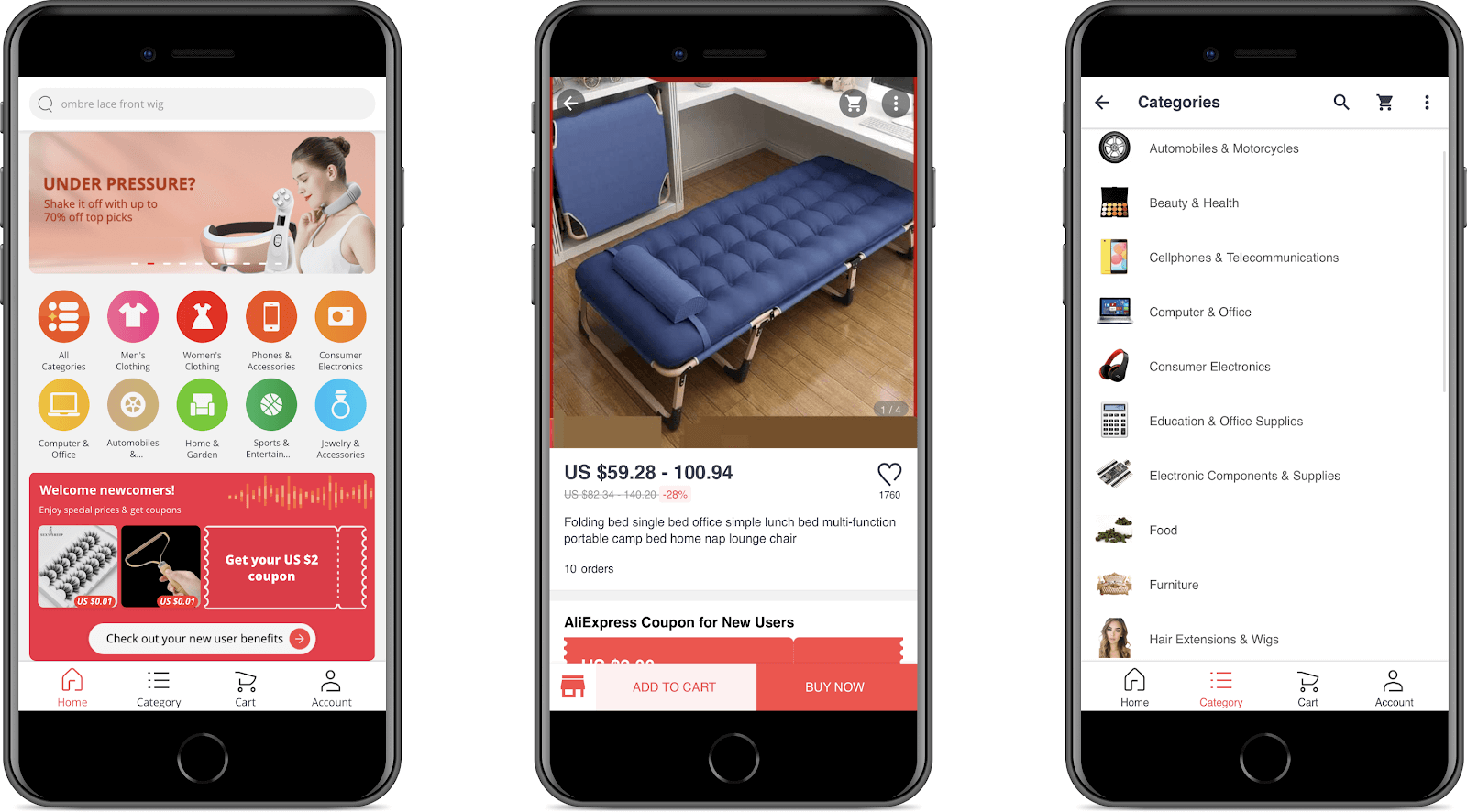
Take a look at AliExpress and how they successfully incorporated this approach. The buttons are sized perfectly, allowing users to quickly access the most significant pages or tasks with ease. As a result of this design optimization, customers can move swiftly throughout their experience without any hassle.
Keep It Simple
When customers are confronted with too many obstacles, it leads to an increased likelihood of them abandoning the process. This is a fact that cannot be denied. So a simple and streamlined design can improve the user experience, making it easier for users to navigate and find what they are looking for.
To ensure a positive user experience, create a design that is tailored to the end user. During PWA development, focus on the essential features and functionality that your users need. Avoid cluttering the interface with unnecessary elements or information that may distract or confuse the user. Instead, prioritize the most critical functions and make them easily accessible and intuitive to use.
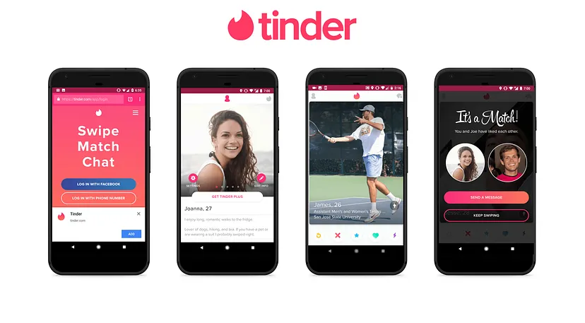
As one of the most popular dating applications, Tinder is renowned for its powerful Progressive Web App. Thanks to this PWA, users have a simple and intuitive experience that encourages them to join, interact with others, and stay more engaged on the platform. With an easy-to-navigate interface, even those who may not be tech-savvy can understand how it works and take advantage of all that Tinder has to offer.
The Tinder PWA experience is lightning-fast and user-friendly. Its bottom banner remains fixed while offering effortless navigation in a very intuitive way, thus, creating an easy platform for anyone to use.
Reduce Advertise Quantity
The Progressive Web App offers a concise experience of web browsing, which unfortunately limits the amount of space available for ads. Of course, ads can be a source of revenue for your app, but too many ads can negatively impact the user experience and even deter users from using your PWA.
When designing a PWA, it is important to strike a balance between generating revenue and providing a positive user experience. Consider limiting the number of ads that are displayed in your app and ensure that they are not intrusive or disruptive to the user’s interaction with your app.
One way to reduce the number of ads is to use targeted advertising. By showing relevant ads that are based on the user’s interests and behavior, you can improve the user experience and increase the likelihood of users engaging with the ads.
Another approach is to use non-intrusive ad formats, such as banners or native ads. These formats are less disruptive than interstitial or pop-up ads, which can be frustrating and negatively impact the user experience.
In addition, it is important to test the placement and frequency of ads to ensure that they are not negatively impacting the user experience. Consider using analytics tools to track user behavior and engagement with ads and make adjustments as necessary.
Finally, consider offering a premium or ad-free version of your PWA for users who are willing to pay a fee. This can provide an additional revenue stream while also offering an improved user experience for users who are willing to pay for it.
Retain The Exact Scroll Position of The List
When a user scrolls through a list, it can be frustrating to lose their place when navigating back to the list from another part of the app or refreshing the page. To retain the exact scroll position of a list, you can use a technique called scroll anchoring. Scroll anchoring ensures that the list remains in the same position, even if the content above or below the list changes. This can be particularly useful in PWAs with dynamic content or frequently updating lists.
One way to implement scroll anchoring is to use the CSS property overflow-anchor. This property ensures that the current scroll position is maintained even if the content above or below the list changes.
Another approach is to use JavaScript to monitor the user’s scroll position and save it in the browser’s session storage. When the user returns to the list, the saved scroll position can be retrieved and set as the new scroll position, allowing the user to resume scrolling where they left off.
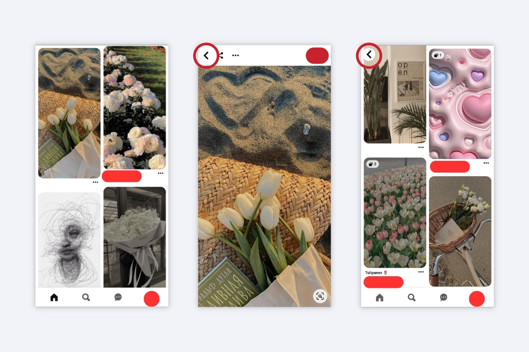
Additionally, as illustrated below, Pinterest has made its back button clearly visible and highly accessible. This ensures that users can effortlessly navigate through webpages by simply clicking on the back button to quickly return wherever they desire.
Use Of Visuals, Animations, and Micro-interactions
Visuals, animations, or micro-interactions are elements that can help enhance the user experience, engage users, and create a more memorable and enjoyable experience. Visuals, such as images, icons, and graphics, can help make your PWA more visually appealing and help convey information more effectively. However, it is important to use visuals judiciously and ensure they are relevant and add value to the user experience.
Animations can help create a more dynamic and engaging experience, drawing attention to important elements or providing feedback to user interactions. Examples of animations in PWAs include page transitions, loading indicators, and hover effects.
Micro-interactions are small animations or interactions that provide feedback to the user and help create a more intuitive and engaging experience. Examples of micro-interactions in PWAs include button hover effects, confirmation messages, and error messages.
When using visuals, animations, and micro-interactions in your PWA, it is important to ensure they do not negatively impact the app’s performance or usability. Use lightweight graphics and animations, and test your app on different devices and network conditions to ensure it performs well across all platforms.
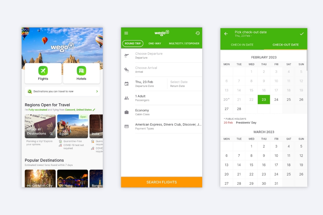
You can check Wego for inspiration to adopt these element interactions and see that this design technique is not complicated as it sounds. Wego is an exemplary PWA that properly demonstrates interactive capability. Every time you tap or click on the webpage, a different color appears as a cue to guide users through their journey with ease and clarity.
Smooth Page Loading
A smooth and fast-loading app can significantly improve the user experience, reduce bounce rates, and increase user engagement. To achieve smooth page loading, there are several strategies you can employ. One key strategy is optimizing the size and format of your website’s images and videos. Large images and videos can significantly slow down the load time of a web page. Compressing images and videos and using formats that are optimized for web use can significantly reduce load times.
Another strategy is to use lazy loading. Lazy loading involves loading only the images and videos that are currently visible on the user’s screen and delaying the loading of images and videos that are further down the page. You can also consider using caching and preloading strategies. Caching involves storing previously requested data in the user’s browser cache, reducing the need to re-download the same data for subsequent page loads. Preloading involves loading assets such as images and videos in advance of when they will be needed, improving overall load times.
Additionally, you need to minimize the use of third-party scripts and plugins. Third-party scripts can significantly slow down page load times and impact overall performance. Carefully consider which third-party scripts and plugins are necessary for your app and remove any that are not essential.
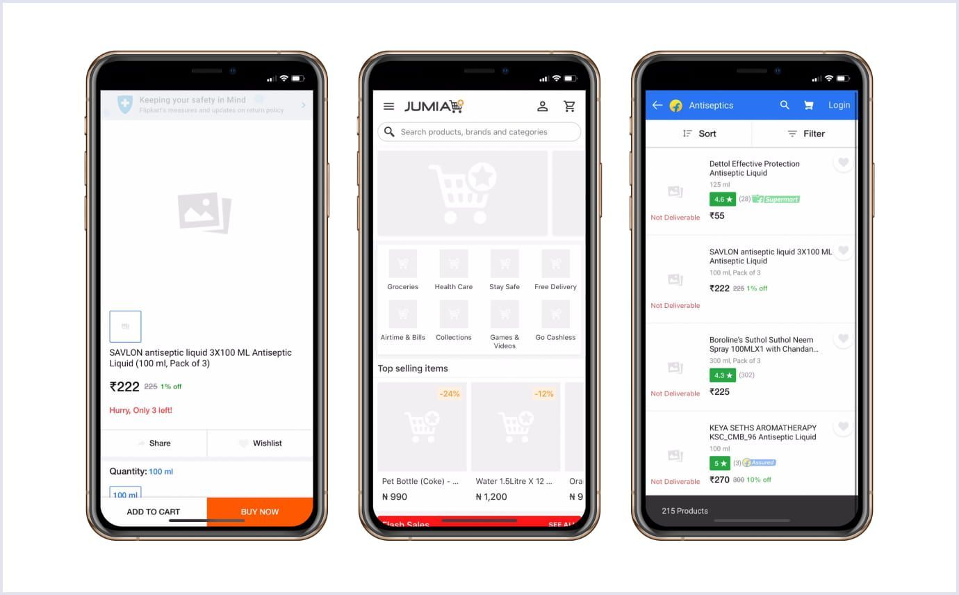
To have a concrete understanding of this design technique, you can explore Jumia’s PWA and the way it solved the issue with loading images.
Add Custom Splash Screens
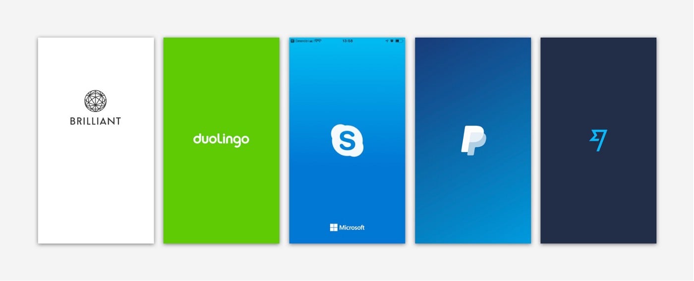
A splash screen is a graphic or animation that is displayed while the app is loading. By default, PWAs use a generic splash screen that can make the user experience feel generic or unpolished. A custom splash screen, on the other hand, can provide a more professional and branded experience for your users. Companies leverage splash screens to promote their brand, showcasing the company logo, name, or catchphrase. This allows them to create maximum visibility and ensure recognition of their business.
To add a custom splash screen to your PWA, you will need to create a high-quality graphic or animation that represents your brand or app. The graphic should be optimized for the platform and device it will be displayed on, as well as for the expected network speed of your users. Once you have created the graphic or animation, you will need to add it to your PWA’s code. This can be done by adding a link to the graphic or animation in the PWA’s manifest file.
When creating your custom splash screen, it is important to consider the user experience. The graphic or animation should be visually appealing and on-brand, but it should also load quickly and not significantly impact the app’s performance. Additionally, the graphic or animation should provide some indication to the user that the app is loading and not just a static image.
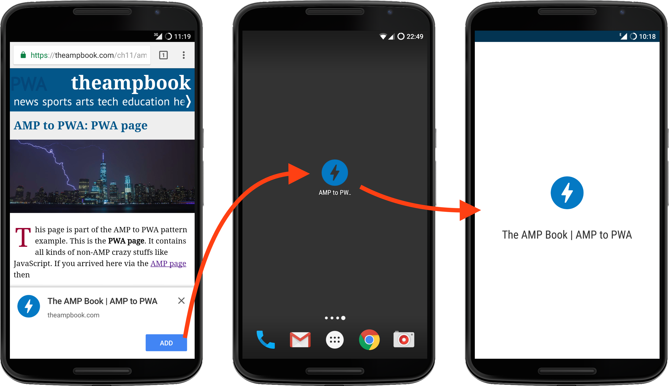
Design An Outstanding Home Screen Logo
PWAs don’t necessarily need to be found in an app store, providing you with great flexibility. However, users are still able to add them to their home screen and utilize them like other downloaded apps. Consequently, it is essential for your task to be noticed among the competition. So how can you make that happen? The solution is simple: craft an outstanding home screen logo.
When designing a home screen logo for your PWA, there are several factors to consider. The logo should be visually appealing, on-brand, and easy to recognize. It should also be optimized for the size and resolution of the device on which it will be displayed.
To create a visually appealing and on-brand logo, consider the colors, typography, and overall design of your PWA. The logo should use colors and typography that are consistent with the rest of the app, and it should convey the overall tone and style of the app.
When optimizing the logo for the device it will be displayed on, consider the size and resolution of the logo. A logo that is too small or low resolution can appear pixelated or blurry, while a logo that is too large can be overwhelming and take up too much screen real estate.
It is also important to consider the context in which the logo will be displayed. For example, if the logo will be displayed on a light background, it should be optimized for a light background. Similarly, if the logo will be displayed on a dark background, it should be optimized for a dark background.
Tools And Resources For Progressive Web App Design
Overview of Popular Design Tools for Progressive Web App Design
There are several tools available for Progressive Web App (PWA) UX-UI design that can help designers create engaging and user-friendly PWAs. Here are some of the most popular ones.
- Figma: Figma is a cloud-based design tool that allows designers to collaborate on designs in real time. It has a wide range of features that are particularly useful for PWA design, including the ability to create interactive prototypes, design reusable components, and work with responsive design.
- Adobe XD: Adobe XD is a vector-based design tool that is particularly well-suited for web and mobile app design. It has features such as responsive design, interactive prototyping, and design specs, which can be useful for PWA design.
- Sketch: Sketch is a popular vector-based design tool that is particularly well-suited for UI design. It has features such as design components and responsive design, which can be useful for PWA design.
- InVision Studio: InVision Studio is a design tool that allows designers to create high-fidelity interactive prototypes. It has features such as responsive design, animations, and design components, which can be useful for PWA design.
- Marvel: Marvel is a design and prototyping tool that allows designers to create interactive prototypes with animations and transitions. It also has features such as design components and responsive design, which can be useful for PWA design.
Recommended Resources for PWA Design Inspiration and Best Practices
If you’re looking for some resources for progressive web app design inspiration and learning some best practices, you can check our recommendations below:
- PWA Showcase: The PWA Showcase is a collection of Progressive Web Apps that have been built by various companies and developers. It is a great resource for designers to see examples of well-designed PWAs and get inspiration for their own designs.
- Google’s PWA Guidelines: Google has created a set of guidelines for PWA design that include best practices for performance, accessibility, and user experience. These guidelines can be a useful resource for designers who are looking to create high-quality PWAs.
- Awwwards: Awwwards is a website that showcases the best in web design. It has a dedicated section for PWAs, which includes examples of well-designed PWAs and information on the latest trends in PWA design.
- Dribbble: Dribbble is a social media platform that allows designers to showcase their work and get feedback from others. It has a dedicated section for PWAs, which includes examples of PWA designs and interactions.
- Material Design: Material Design is a design language developed by Google that provides guidelines and resources for creating consistent and user-friendly designs. It includes resources such as icons, typography, and color palettes, which can be useful for PWA design.
- Smashing Magazine: Smashing Magazine is a website that provides articles and resources for web designers and developers. It has a dedicated section for PWAs, which includes articles on best practices, case studies, and design inspiration.
There are several resources available and tips for PWA design inspiration and best practices. By using these resources, designers can stay up-to-date on the latest trends and create high-quality PWAs that provide a great user experience.
In Conclusion,
We hope that with these advanced progressive web app design practices, you can take your PWA to unprecedented heights. With everything done right, you’re sure to impress users more than ever before. As a result of this improved experience for customers, they will be converted at higher rates and remain engaged with your platform longer than ever before. If you have an idea for a PWA that needs help getting off the ground, don’t hesitate to contact us. Our skilled team of experienced developers has all the know-how to craft top-notch PWAs to take your business up a notch.


