

A key part of having a successful online presence is having an attractive and effective website. The design of your website – including the fonts you choose – can make a big difference in how users perceive your business. In this blog post, we’ll discuss some of the top fonts available and help you choose the best font for eCommerce websites that fit your own brands. We’ll also provide tips on how to choose the right font for your business. Let’s get started!
Table of Contents
Importance of fonts for eCommerce
UX
Fonts play a significant role in enhancing the user experience of an eCommerce website. The readability and legibility of text can make or break the user’s impression of the site. A smooth and seamless user experience is essential for eCommerce sites, and the use of appropriate fonts can help achieve this. Users should not have to struggle to consume content, as this increases the interaction cost and can lead to frustration. Therefore, text fonts should be clear, visible, and easy to read to create trust through their appearance. The selection of the best font for eCommerce should also take into account its legibility across a range of devices.
Choosing the ideal font for an eCommerce website requires careful consideration. The font’s style, size, and spacing can all have an impact on the user’s experience. The best eCommerce fonts are easy to read, visually appealing, and legible across various devices. It is important to strike a balance between aesthetics and functionality when selecting fonts. The use of appropriate typography can help to establish brand identity, increase engagement, and create a positive user experience. Therefore, eCommerce businesses should prioritize the selection of optimal fonts to enhance their site’s usability and appeal.
Brand Character | Passive Communication
What you say and how it is portrayed are two distinct but equally significant things, as was already said. The fonts express the spirit of your brand. For a fashion and apparel firm, a cursive font style might be appropriate, but not for an online pharmacy.
Business growth
It should be enjoyable to read the font style you select. You should pick the appropriate fonts keeping in mind your audience. The vital component in this situation is whether the user stays longer than normal if they find the content engaging.
Fonts also foster a feeling of trust among users. It helps your company get a competitive edge. The best eCommerce fonts can excite users’ emotions, motivating them to explore more of your website.
Considerations of employing the right fonts for your brand
No more than 2-3 fonts
First and foremost, the fonts ought to look good. As a general rule, you shouldn’t combine more than 2-3 different fonts. And the font combination ought to give the page some excitement. In other words, avoid choosing a crazily distinctive typeface for your website. Do not get too fancy with the fonts. If you use too many fonts, your page may appear cluttered.
Choosing fonts for an eCommerce website would mostly involve selecting 2 fonts. One for the body text and one for the headline. There shouldn’t be more than two different font styles used in a website, as it may cause visual clutter and confusion. However, it is essential to note that the fonts used on the website should complement each other and not clash. Fonts with distinct personalities, such as script fonts or display fonts, can add a unique touch to the design but should be used sparingly and with intention.
Legibility
When building an eCommerce website, you should anticipate that visitors will access it on desktop, mobile, and tablet screens. As a result, the fonts you select must work on all screen sizes. Test the fonts on various screens to see whether they are too difficult to read or how long it takes to do so before making a final decision.
Check to see if the decorative fonts can be read as well. Instead of using attractive fonts that don’t increase conversions, it is advisable to choose simpler fonts. However, brand fonts shouldn’t be seen as a mere distraction.
Readability
For your firm to expand, you need conversions. The user will probably quit your website if the text fonts are difficult to read or take too long to load. Additionally, content should offer users value.
Not alone does the writing style affect readability, but the fonts also have a significant impact. Make sure the brand fonts you select are aesthetically pleasing, legible, and consistent with your brand.
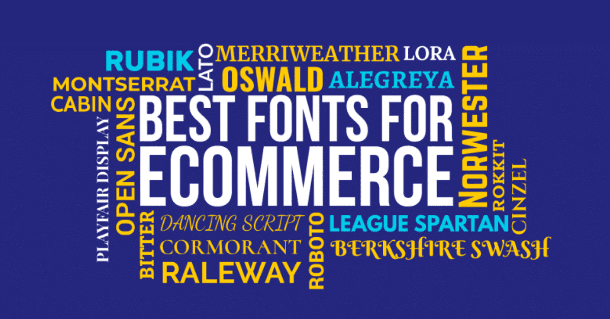
Which is the best font for eCommerce websites?
Berkshire swash
Berkshire is a typeface that exudes a feminine and forceful touch flair, making it an excellent choice for businesses targeting female audiences. This font features thick and bold strokes that give it a strong and confident look. The subtle curvature of the letters adds a touch of elegance and sophistication, making it ideal for businesses that sell jewelry or beauty products. The font’s unique personality can also help to create a distinct brand identity that sets the business apart from its competitors.
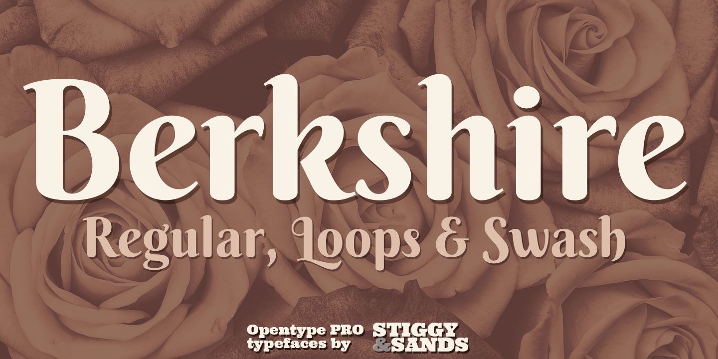
Berkshire’s semi-sweet nature can also help to create an emotional connection with customers, making it a powerful tool for businesses looking to build brand loyalty. The font’s feminine touch adds a sense of warmth and familiarity, while its forceful flair conveys a sense of confidence and strength. Overall, Berkshire is a typeface that can help businesses create a visual identity that resonates with their target audience. Whether used in print or digital media, Berkshire’s unique combination of femininity and forcefulness makes it an excellent choice for businesses that want to make a lasting impression.
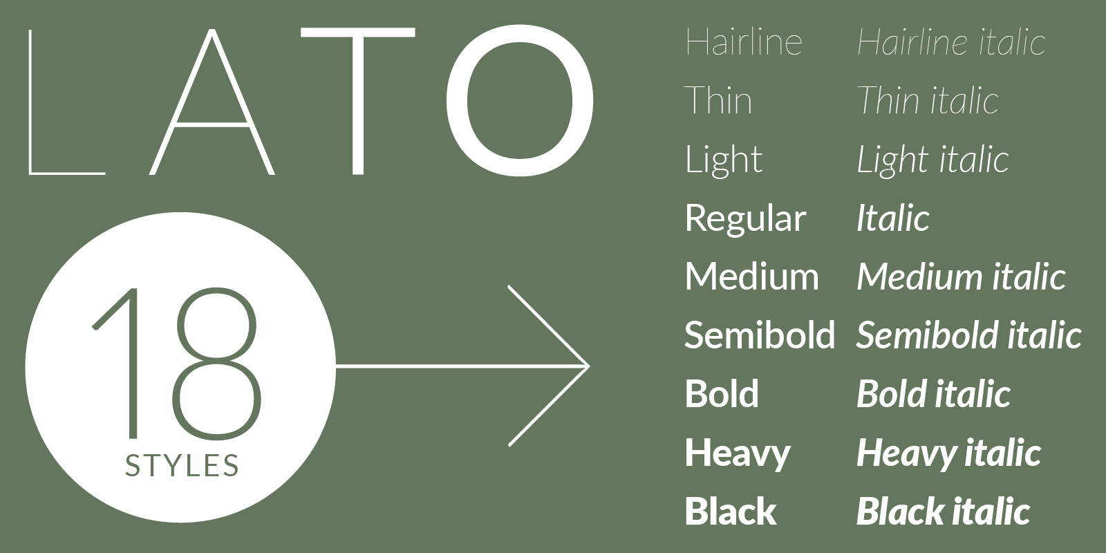
Lato
Lato is a sans-serif typeface that combines friendliness with a hint of seriousness, making it an ideal font for businesses that want to convey a bold, reliable, and friendly image. Its open and approachable appearance makes it easy to read and invites readers to engage with the content. The font’s clean lines and simple design give it a modern and professional look, which can help businesses to build trust and credibility with their audience.
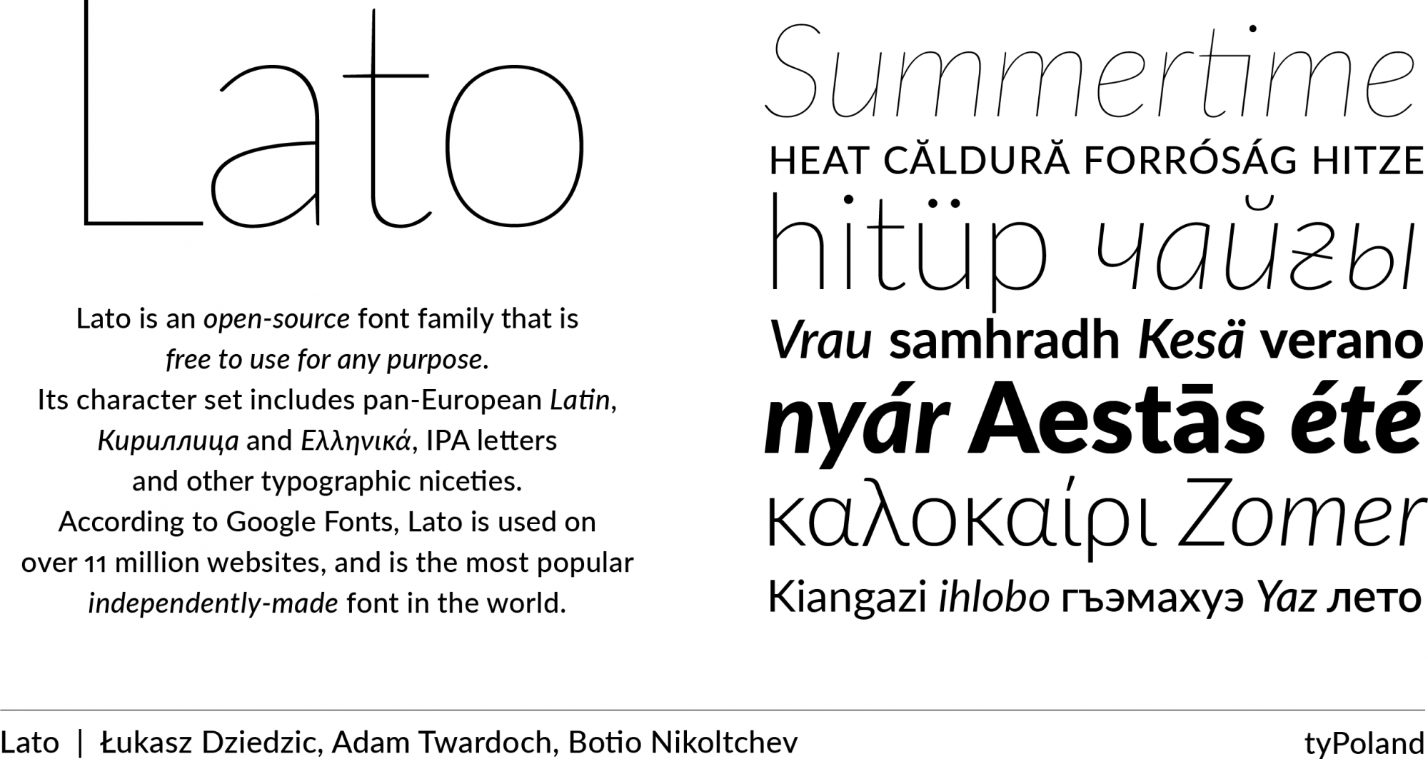
Lato’s versatility allows it to be used in a variety of contexts, from branding materials to advertising campaigns. Its bold and reliable appearance makes it an excellent choice for businesses in industries such as finance, law, or technology, where trust and credibility are critical. At the same time, its friendly and approachable nature makes it suitable for businesses in fields such as hospitality or education, where creating a welcoming atmosphere is important.
Merriweather
For eCommerce websites that aim to project a premium brand image, Merriweather is the best font choice. Its elegant and sophisticated design conveys a sense of professionalism, class, and luxury, making it perfect for businesses that want to establish a strong brand identity. Merriweather’s classic and timeless look makes it an excellent fit for businesses in industries such as fashion, beauty, or jewelry, where aesthetics play a crucial role.
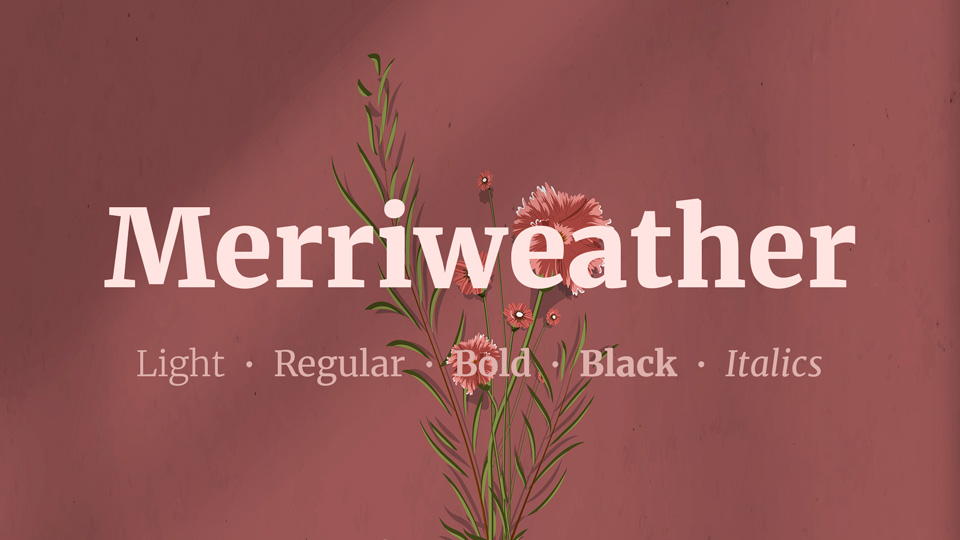
Moreover, Merriweather’s legibility and readability make it ideal for eCommerce websites that need to convey information effectively. This typeface’s reduced letterforms make it easy to read on both small and large screens, ensuring that the website’s content is accessible to all visitors. In conclusion, Merriweather is a typeface that combines elegance, sophistication, and readability, making it an ideal choice for eCommerce websites that want to create a premium brand image and communicate their message effectively.
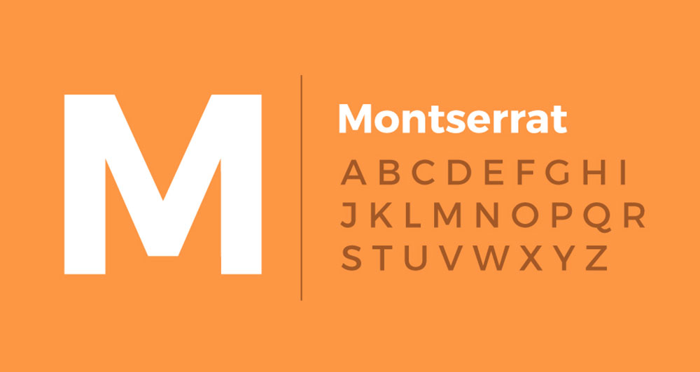
Montserrat
Montserrat’s geometric pattern and vintage feel make it an ideal choice for businesses that want to convey a sense of modernity and nostalgia. Its clean lines and sharp edges give it a contemporary look, while its vintage feel adds a touch of nostalgia and charm. This typeface is particularly suitable for brands that want to create a retro or vintage aesthetic, such as coffee shops, barbershops, or clothing stores.
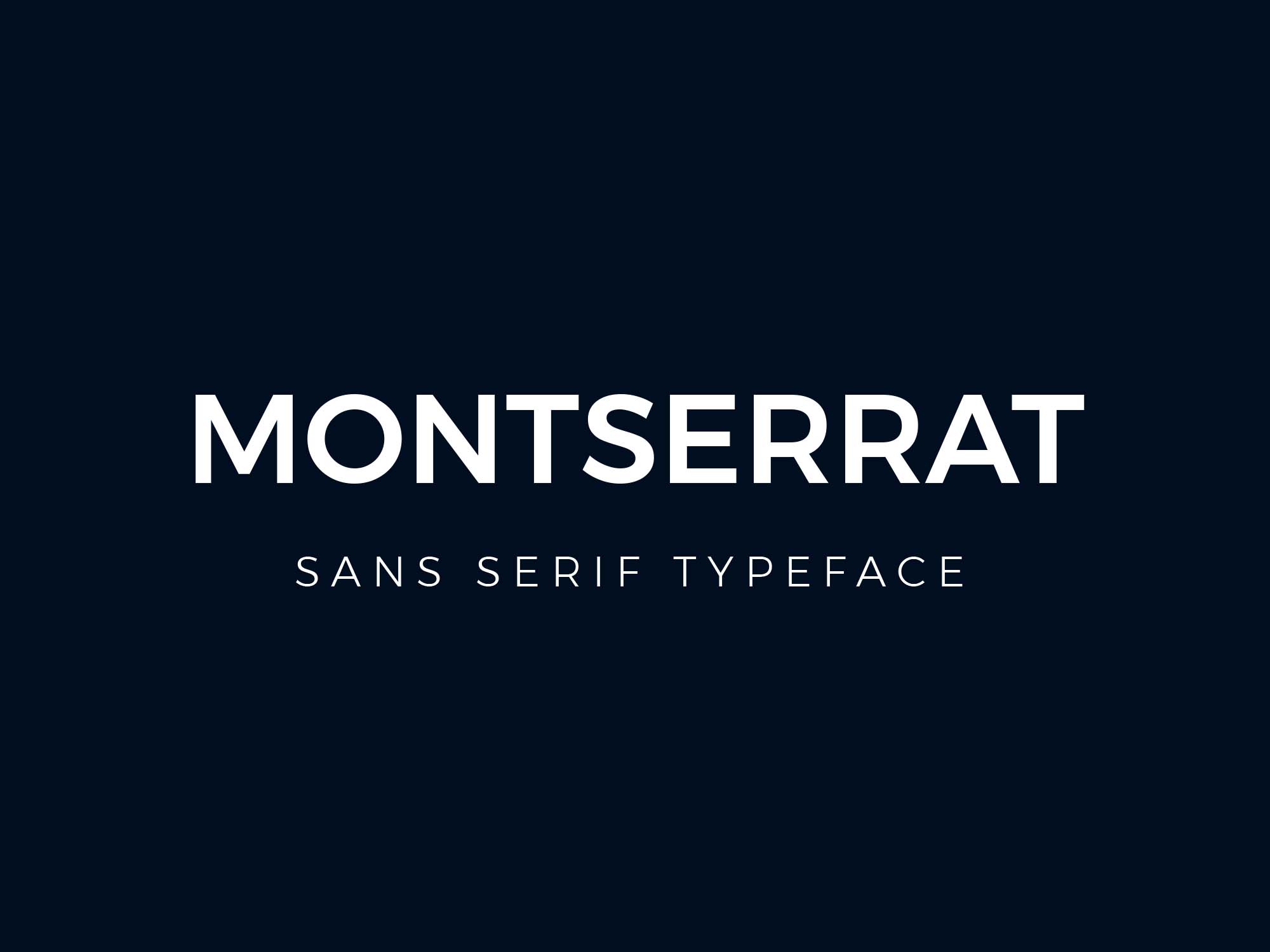
Montserrat’s readability and legibility make it an excellent choice for eCommerce websites that need to communicate information effectively. Its minimalist design ensures that the website’s content is easy to read and consume, making it accessible to all visitors. Moreover, Montserrat is available in different weights and styles, allowing designers to experiment and create various design iterations.
Neue Helvetica
Helvetica is one of the most well-known and widely used fonts in the world, with its sleek and modern design. One of the variations of Helvetica is Neue Helvetica, which is a typeface with a more refined and updated design. The Neue Helvetica font is a versatile typeface that is suitable for use in various design contexts. It is a popular choice among many companies, including Facebook, eBay, and Yahoo.
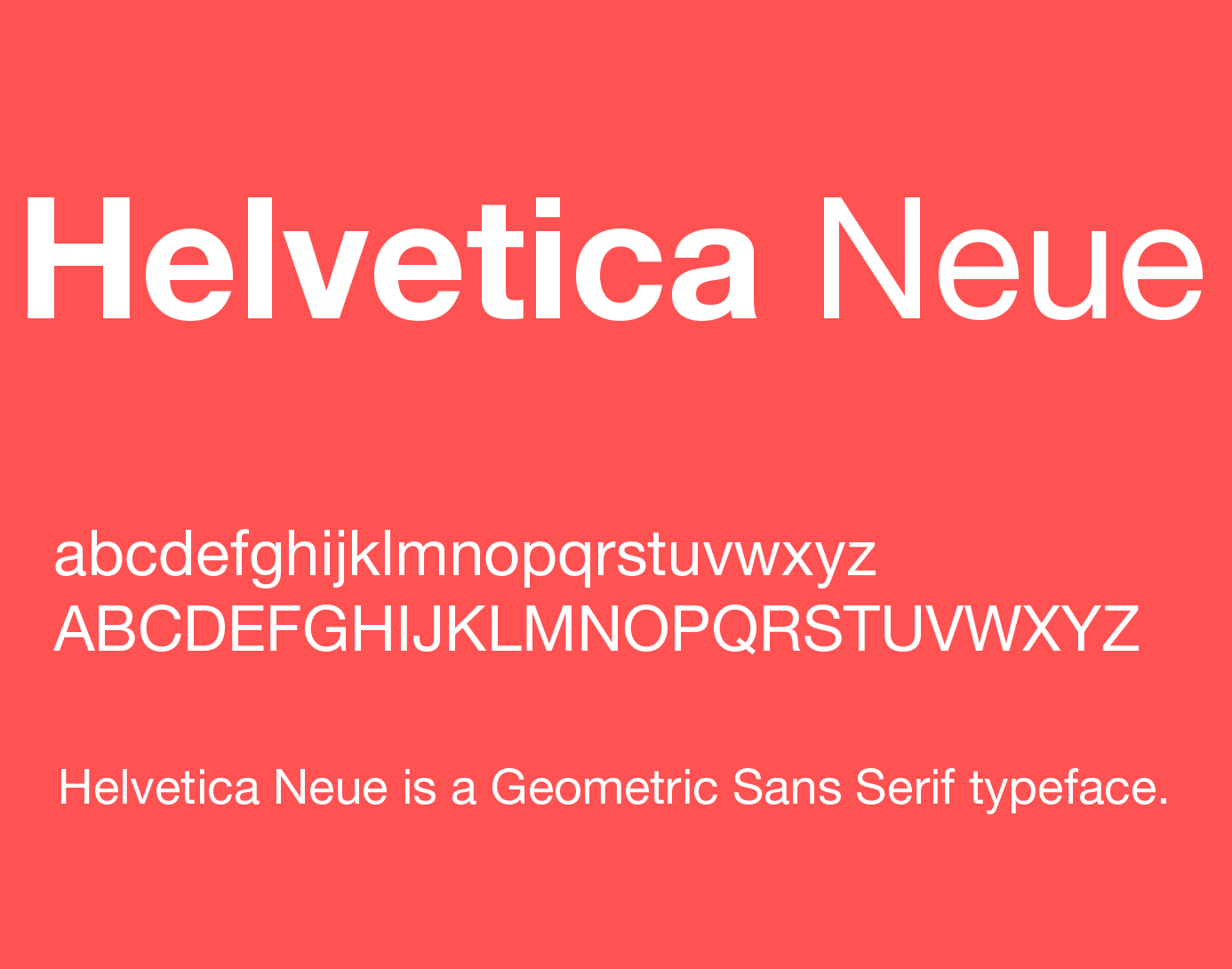
The Neue Helvetica font is a straightforward, readable typeface that is perfect for use in both the header and body text fonts. Its simplicity makes it easy to read, and its clean design gives it a modern look that works well in contemporary designs. This typeface’s legibility is one of its most significant strengths, making it ideal for digital interfaces such as websites and mobile applications.
Oswald
Oswald is a popular brand font that is widely used in the design world. This typeface is an excellent choice for companies that want to create a bold and eye-catching design. Oswald’s fonts are particularly well-suited for headings and titles, as they draw readers’ attention and create a strong visual hierarchy.
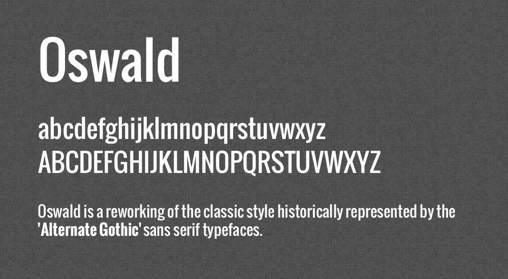
The design of Oswald’s fonts is characterized by their clean lines and geometric shapes. This typeface’s simplicity gives it a modern look that works well in contemporary designs. Moreover, the use of all caps enhances the visual appeal of Oswald’s fonts, making them perfect for titles and headings that need to stand out.
Nunito Sans
Nunito Sans is a popular sans-serif typeface that was designed by Vernon Adams. This font family includes nine weights ranging from extra-light to bold, and it comes in both regular and condensed styles, including italics. The font’s design is characterized by its clean and modern look, making it a popular choice for digital interfaces and other modern designs.
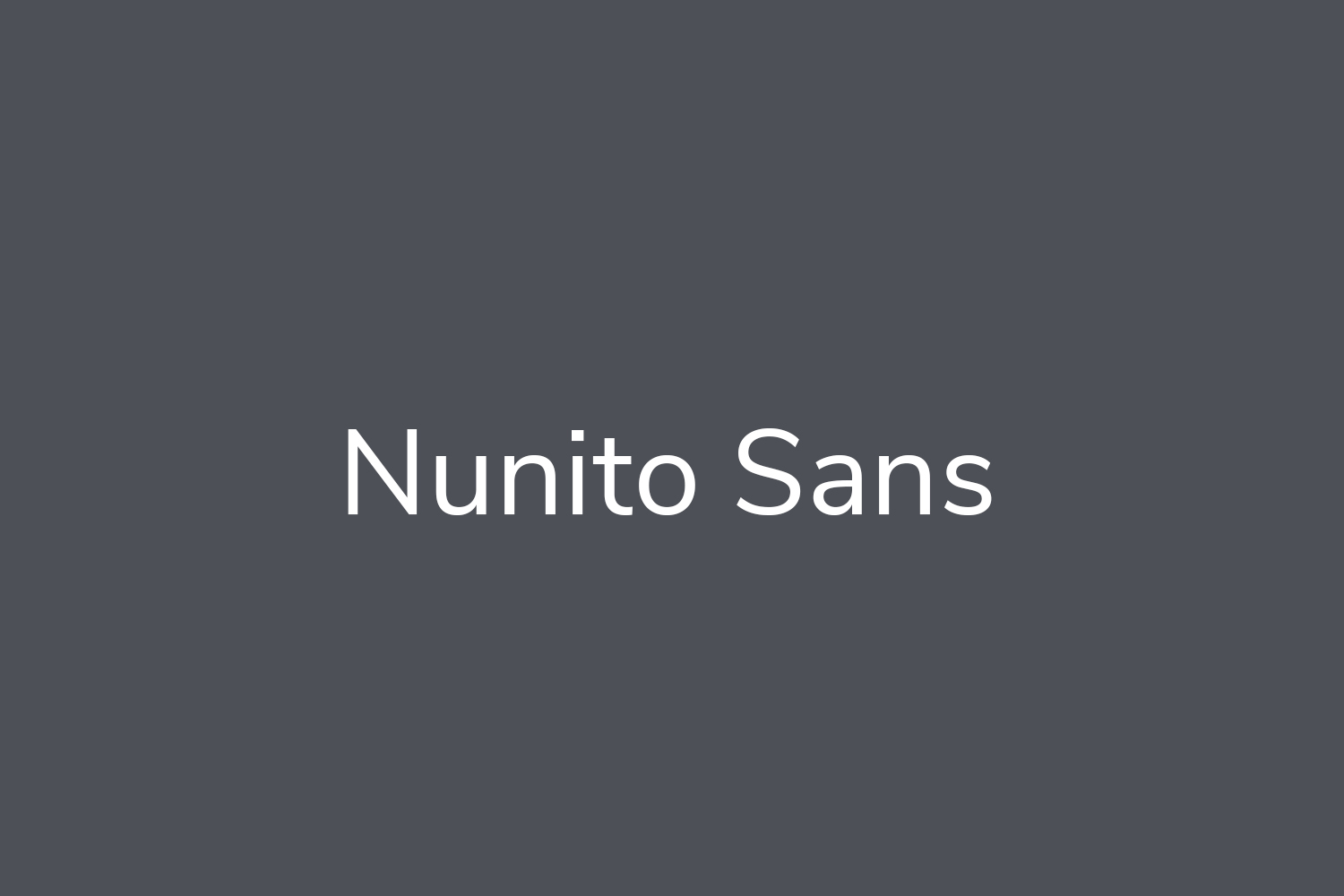
Nunito Sans is widely used across various digital platforms such as websites, mobile applications, and social media platforms due to its readability and legibility. Its versatility makes it suitable for use in various types of designs, including branding and advertising. Moreover, its range of weights allows for flexibility in design, as it can be used for both headings and body text.
Poppins
Poppins is an excellent choice for eCommerce websites that require a sleek and contemporary look. This sans-serif font was designed by Indian Type Foundry and has quickly become popular among web designers due to its versatility and readability. The font comes in nine weights, ranging from thin to black, making it easy to use in various design applications.
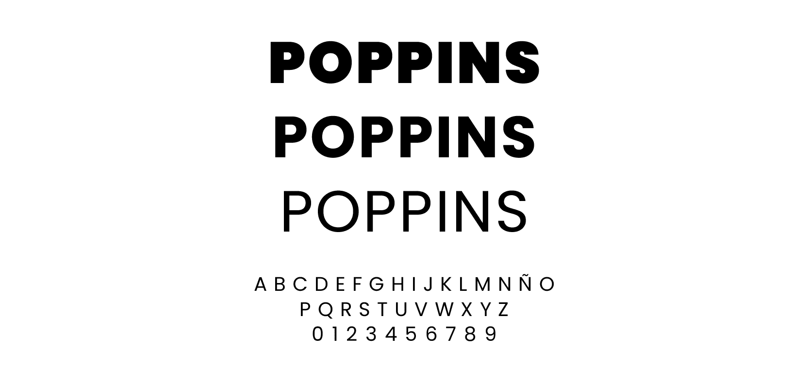
The minimalist and clean look of Poppins gives eCommerce websites a polished and modern look, making it an ideal choice for websites that want to create a strong and professional brand image. Poppins is highly legible, even at small sizes, which is essential for eCommerce websites where product descriptions and details need to be easily read by potential customers.
Another benefit of Poppins is its multilingual support for over 100 languages, making it suitable for websites that cater to international audiences. The font’s support for multiple languages ensures that the content is displayed correctly and is legible in all languages, making it a highly accessible option for eCommerce websites.
Roboto
Roboto is a popular sans-serif font designed by Christian Robertson and developed by Google. Its unique design gives it a slightly mechanical feel, making it an ideal choice for modern websites and mobile applications. Despite its technical look, Roboto is highly legible and easy to read, making it suitable for various design applications.
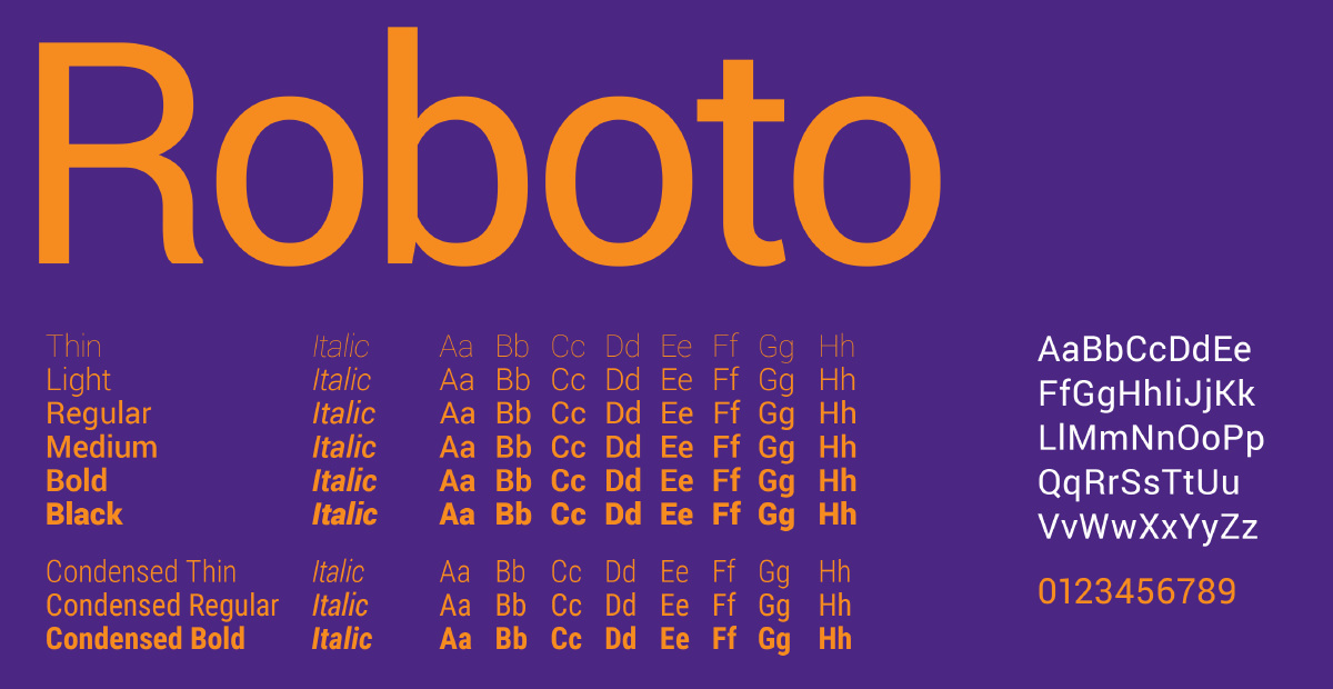
One of the significant advantages of Roboto is its excellent readability, even on small screens. Due to its initial development as a system font for Android, Roboto was designed to be highly legible on mobile devices, making it an ideal choice for responsive web design. This is why many popular websites, such as YouTube and Flipkart, use Roboto as their primary font.
Raleway
Raleway is a popular font choice for eCommerce websites, thanks to its unique, classy look and excellent readability. It is a sans-serif typeface designed by Matt McInerney, which was later updated and expanded by Pablo Impallari and Rodrigo Fuenzalida. Raleway features a modern and elegant design with a clean, minimalist style that gives it a distinctive and sophisticated look.
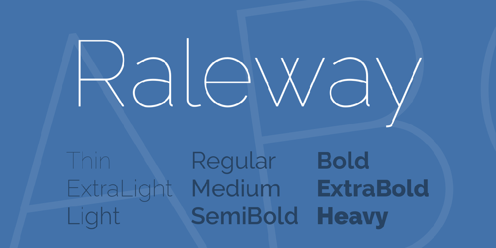
The font is highly versatile and works well in various design contexts, from headlines and titles to body text. Its unique, airy design makes it perfect for large headings and bold statements that grab the reader’s attention. Raleway’s light and open letterforms also make it an excellent choice for use in body text, where its readability ensures that readers can consume content without any difficulty.
Be Vietnam Pro
Be Vietnam is a modern sans-serif font that adds a touch of professionalism to any design project. It comes in 7 weights, from Thin to Black, with corresponding Italics, allowing for a wide range of versatility in design. This font is perfect for both digital and print media and can be used for various purposes such as headlines, body text, and logos.
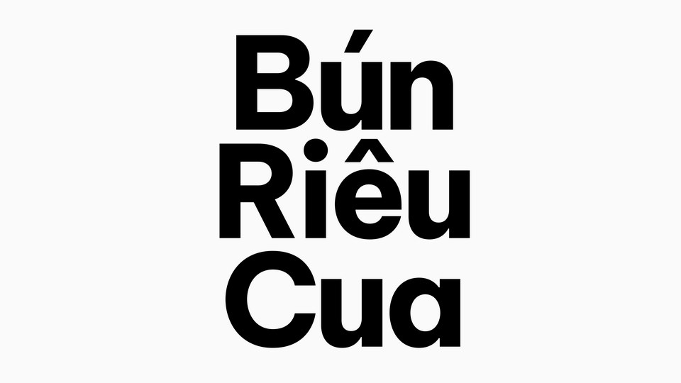
The updated version of Be Vietnam now includes improved Vietnamese letterforms with adaptive diacritics forms for specific use circumstances. This improvement makes Be Vietnam an even more accessible font for those who wish to use it for a global audience. As a result, it can be a great choice for companies looking to expand into the Vietnamese market or any other region with a large Vietnamese-speaking population. This highlights the importance of choosing fonts that are appropriate for the native language of the target audience, as it can increase the conversion rate and overall success of the project.
Open Sans
Open Sans is a popular font choice for eCommerce websites because it is highly legible on screens of all sizes, which is crucial for attracting and retaining customers. This is especially important in the age of mobile commerce, where more and more people are shopping on their phones and tablets. Open Sans is also a versatile font that can be used in a variety of design contexts, from headlines to body text.
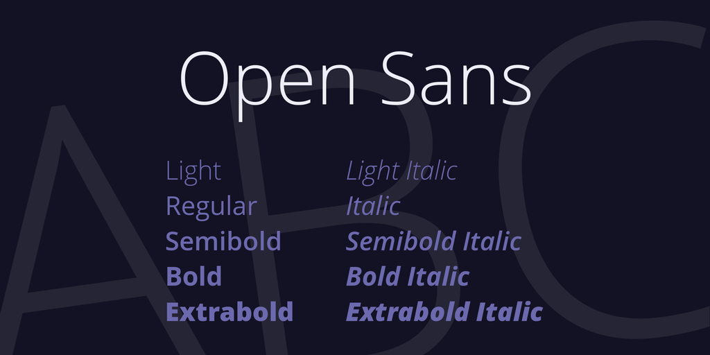
Another reason for Open Sans’ popularity is its availability as a free font. This makes it an affordable and accessible option for businesses of all sizes, whether they are just starting out or are well-established. Plus, it is widely supported by most browsers and devices, ensuring that it will look great and be legible no matter where it is displayed.
Playfair Display
Beautiful Playfair Display is a serif type with softened edges and curves. It is a multipurpose brand font that works well with the majority of web design aesthetics. It is great for the headline and the brief contents, but it is not suggested for the lengthy para because it gets harder to read.
eCommerce Font Pairings That Look Good Together
There is no doubt that some best eCommerce fonts match one another more nicely than others, much like humans. However, how can you tell which font combinations are conversion-boosting victors from those that leave viewers wanting more?
Here are a few fantastic examples of eCommerce font combinations made with Google Fonts. Try using the more complicated font for headings and the simpler font for body text or subtext to get the most out of these font combinations for your own eCommerce store.
Crimson Text Regular and Source Sans Pro Regular
When it comes to choosing fonts for eCommerce websites, one of the most popular combinations is pairing a sans serif font with a serif font. This combination creates a harmonious balance between modernity and tradition. The sans serif font, with its clean and simple lines, conveys a contemporary and sleek look. The serif font, with its ornate and decorative details, adds a touch of elegance and sophistication to the design.
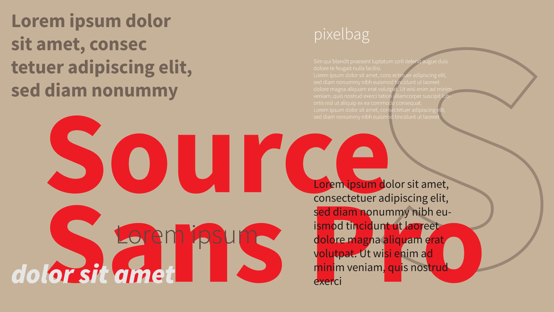
This font pairing works particularly well for eCommerce websites that focus on relaxation and wellness, such as beauty, spa, and yoga products. The combination of sans serif and serif fonts have a calming effect on visitors and creates a sense of trust and reliability. It’s also a versatile combination that can be adjusted to suit different design aesthetics and brand personalities. Overall, the sans serif and serif font pairing is an excellent choice for eCommerce websites that want to convey a sense of modernity and tradition, elegance and simplicity, and relaxation and trust.
Lato Light and Lato Regular
Normally, we don’t encourage using 2 fonts from the same family, but all rules have exceptions.
Occasionally, utilizing distinct typefaces from the same family can also be effective; just make sure the visual contrast between the two is strong enough. Try Lato Light in a larger size with Lato Regular in a smaller size for a streamlined appearance. eCommerce sites for clothing and jewelry perform best with this combo.
Luckiest Guy and Bitter Regular
Consider using a display typeface that captures the young spirit of your business for sites that are more cheerful and entertaining. In this instance, we’ve combined the fun typeface of Luckiest Guy with the slab serif Bitter. The eCommerce sites that sell children’s products do best with this font combination.
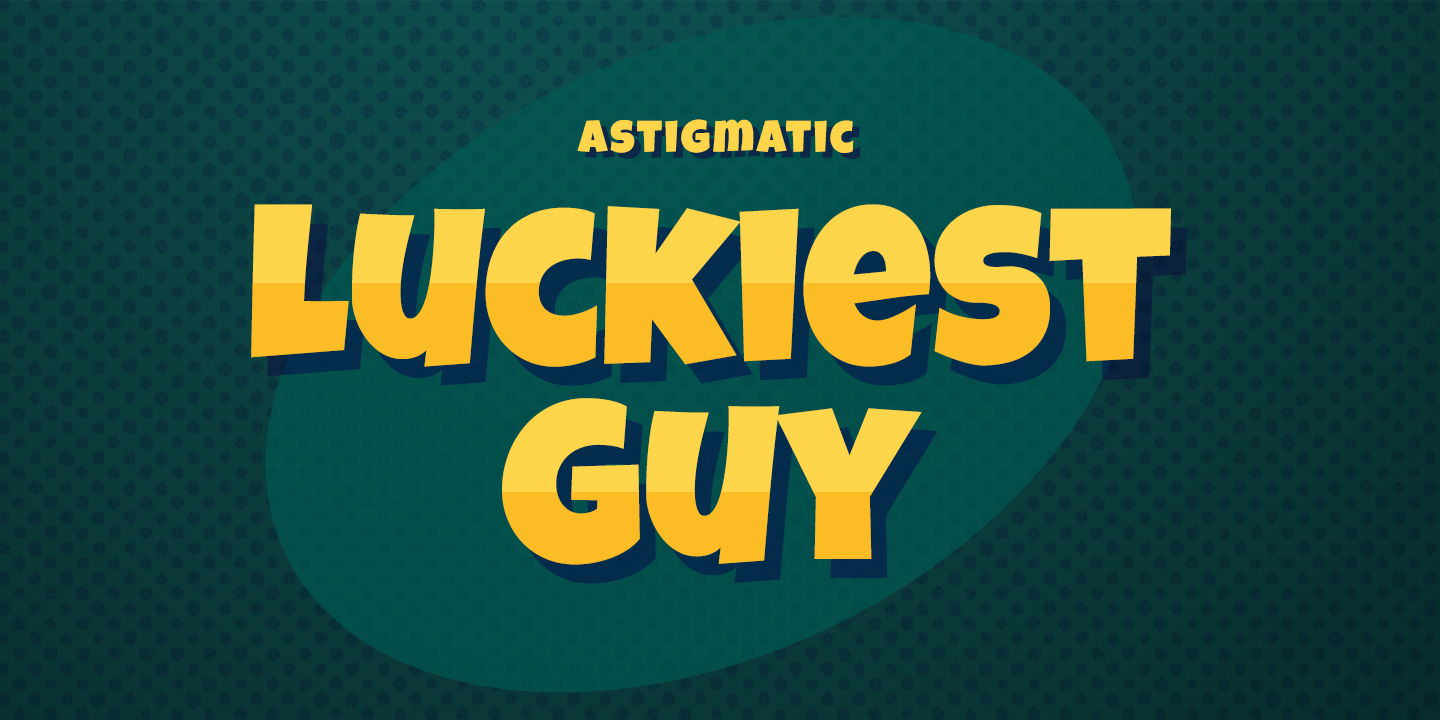
Combining a display typeface like Luckiest Guy with a slab serif like Bitter Regular can capture the young, playful spirit of your business, making it a great font pairing for eCommerce sites that sell children’s products. The contrast between the two typefaces can create visual interest, with the bold, fun Luckiest Guy drawing attention to headlines and the more traditional Bitter Regular providing a sturdy base for body text.
Montserrat Bold and Roboto Regular
Looking for a simple and minimalist font combination? Consider pairing lighter Roboto Regular, which is known as one of the best fonts for eCommerce websites, with the bolder Montserrat Bold. While these two sans-serif fonts may not be completely opposite, their contrast in weight can still add visual interest. This combination works well for eCommerce sites that sell electronics or business supplies.
Roboto Regular is easy to read on screens and can help your site convey a sense of modernity and clarity. Meanwhile, Montserrat Bold has a more assertive and confident feel, making it ideal for headlines and other attention-grabbing elements. Together, these two fonts strike a balance between minimalism and impact, making them a solid choice for many eCommerce businesses.
Bebas Neue and PT Serif Regular
Try contrasting the powerful weight of the sans serif font Bebas Neue with the lighter weight serif font PT Serif Regular for another traditional pairing of sans serif and serif fonts. This font combination is adaptable enough to work for many businesses on eCommerce websites.
Examples of Typography in eCommerce
Take a cue from the beautiful best eCommerce fonts used in the following stores that are very successful in their industry to launch your own business.
Piel
High-end products require typography that conveys elegance. Piel uses Suisse International throughout their web store and sells handcrafted leather products. Nothing in this design feels out of place, and everything fits together like a glove—a glove made of pricey leather. This font exudes elegance and sophistication, adding a touch of luxury to any design. It’s easy to read and pairs well with a variety of other fonts.
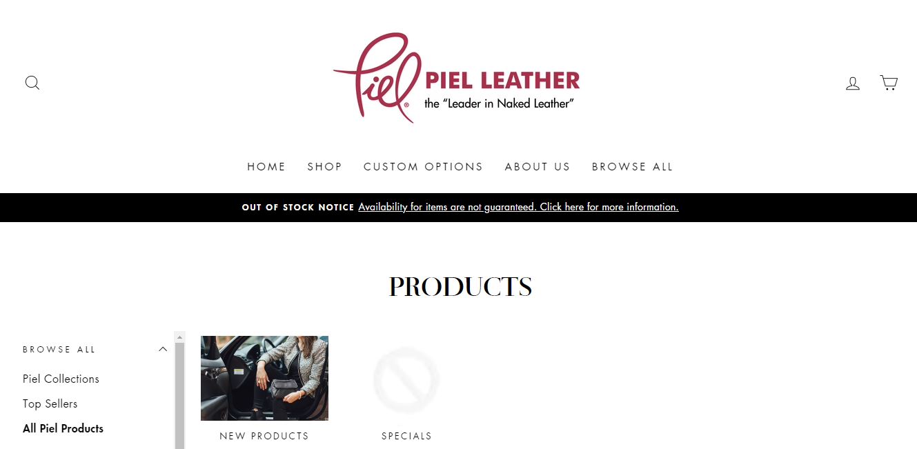
If you’re looking for a similar font to Suisse International, Acre Thin is another excellent option. It has the same modern and refined feel, making it a great choice for luxury eCommerce sites that want to convey an air of exclusivity.
Carbon Beauty
Carbon Beauty is a retailer of luxurious personal care items. Their design is packed with amazing animations, stunning product images, and clever typography. On the landing page, this font is blown out to enormous proportions using a classy scroll-triggered animation. It’s amusing to observe how different Roboto appears in this image, given that it weighs more and is bigger than Bitsbox. They use it for their body parts as well. At this smaller scale, it appears considerably differently. Roboto is suitable for a wide range of uses, and by adjusting the weight, sizing, and other designs, it can be made to look almost completely different.
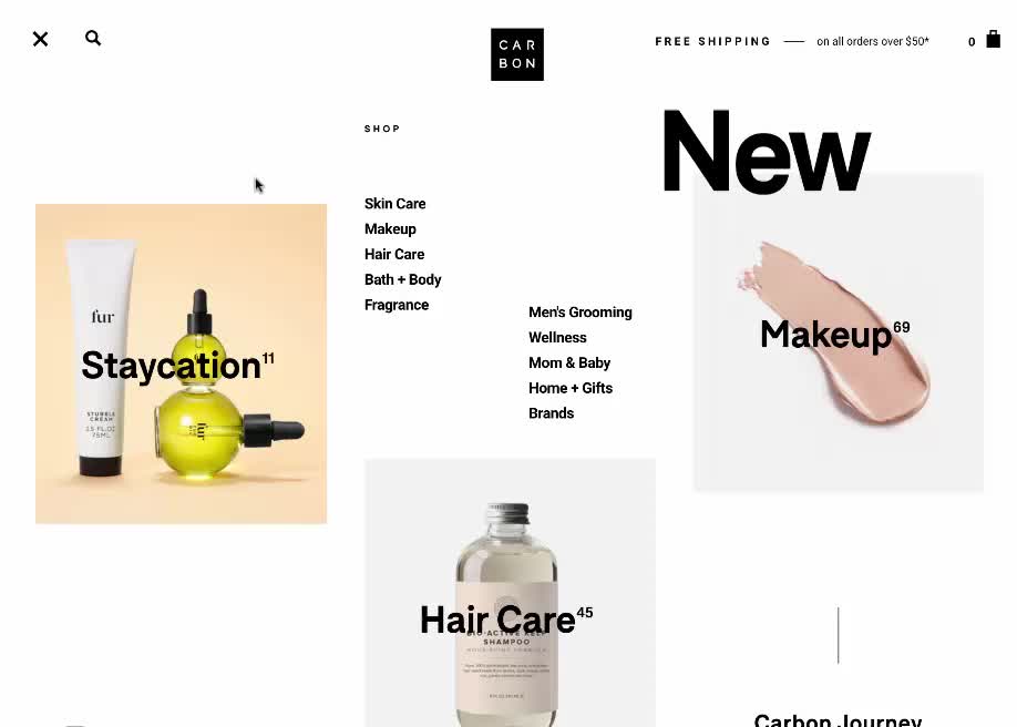
The use of Roboto in different sizes and weights on the Carbon Beauty website is a great example of how a font can be used in various ways within a single design. The use of animation to showcase the font also adds an element of interest and engagement to the design. Overall, the combination of Roboto and the animation on the Carbon Beauty website creates a modern and stylish look that aligns well with their brand image.
Threadless
Regardless of what you’re looking for, Threadless is the best location to locate the ideal unusual t-shirt. Helvetica is used for the product descriptions and left-hand navigation on their eCommerce page, whereas Futura is mostly used for the navigation options at the top of the page.
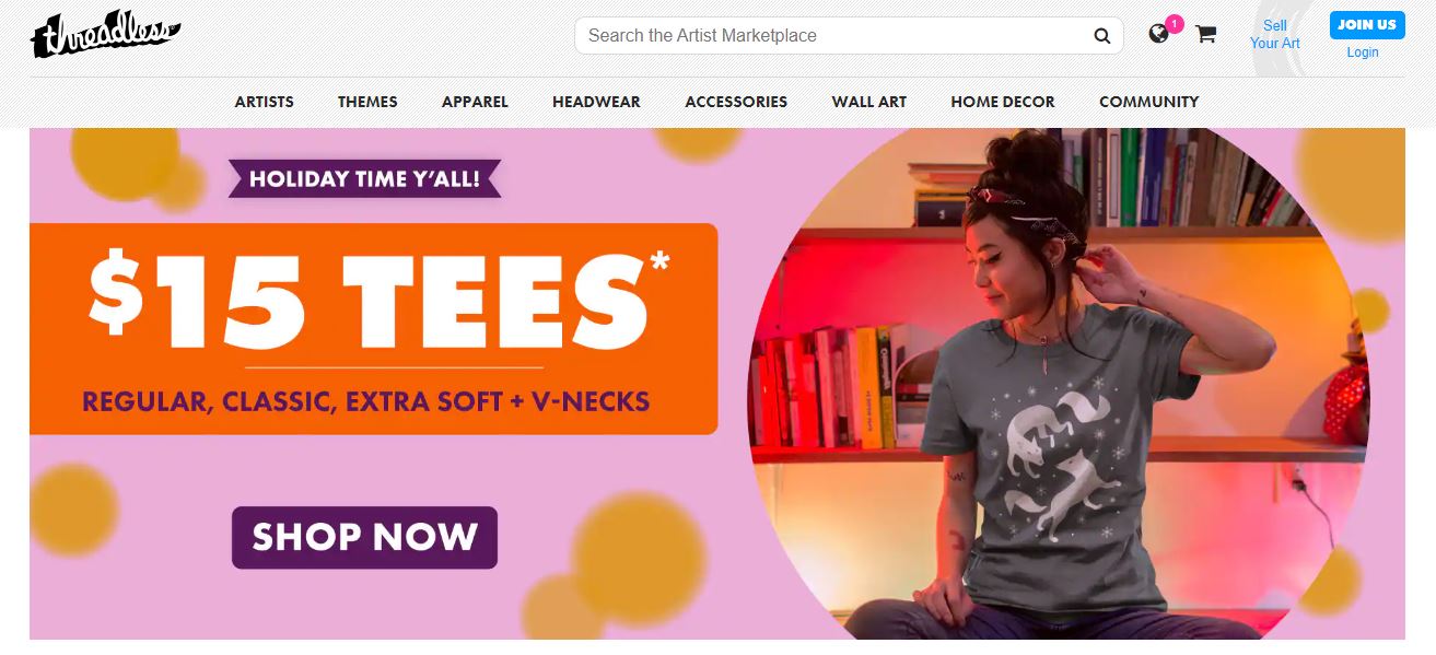
For designers wishing to utilize a font face that will convey copy in an unadorned, emotionless manner, Futura and Helvetica are both go-to choices. Both of these neutral fonts are used frequently in this Threadless design, which prevents things from becoming monotonous.
Scentos
Scentos is a brand that specializes in scented markers, colored pencils, and other colorful drawing tools. Their website design perfectly complements their fun and playful brand personality, using a variety of bright colors, playful graphics, and fun typography. The mix of typefaces on their website is particularly noteworthy, as it strikes the perfect balance between legibility and playfulness. The use of a sans-serif font like Montserrat for the main headings helps to keep the text easy to read, while the addition of more playful and cartoonish typefaces like Comic Sans and Amatic SC adds a touch of whimsy and creativity to the design. The overall effect is a website that is both informative and entertaining, encouraging visitors to explore the different products and engage with the brand.
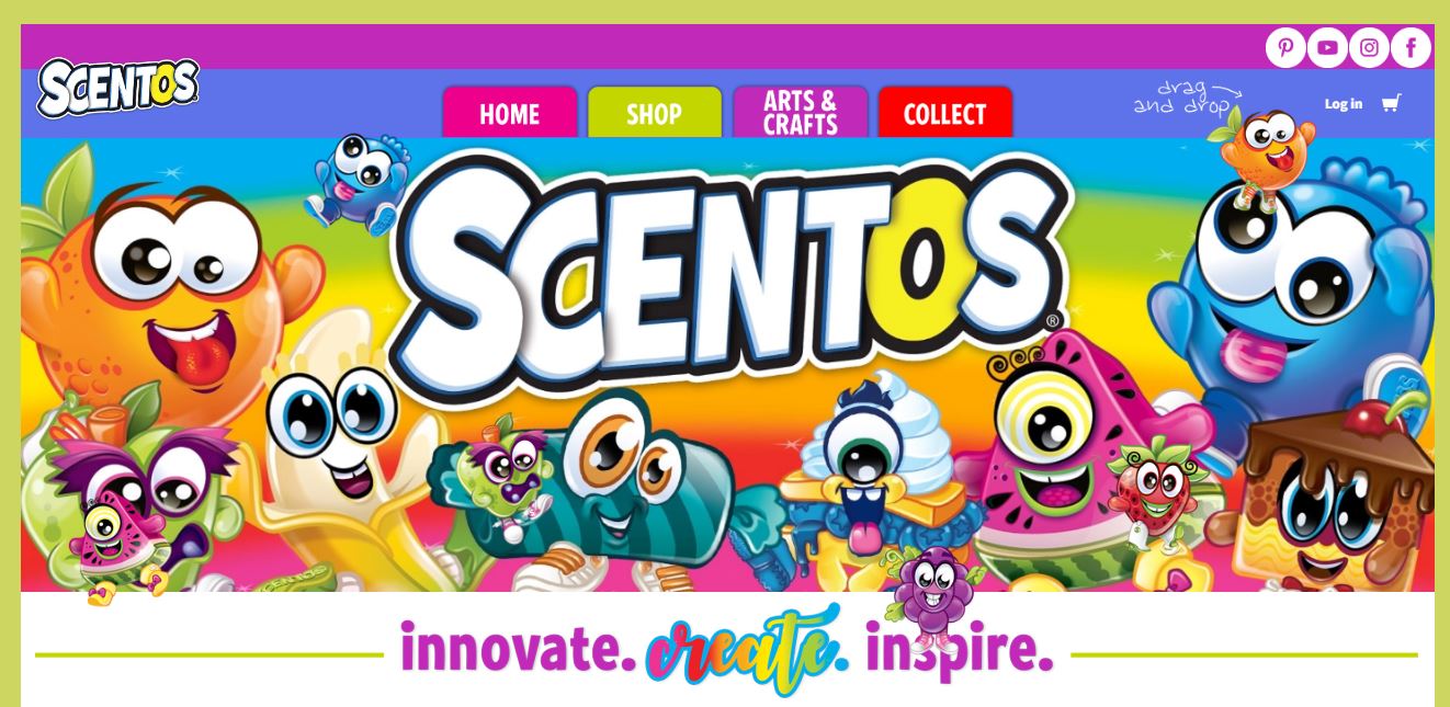
On the other hand, Sour Crunch is a typeface that perfectly captures the fun and wacky spirit of Scentos’ brand. It is a comic book-influenced font with bold and thick letterforms, reminiscent of comic book speech bubbles. This typeface is perfect for headlines, logos, and other design elements that need to convey a sense of fun and excitement. The letters are slightly curved, adding a touch of playfulness to the font. This font would be a great choice for any eCommerce website that sells toys, games, or other playful products. The combination of Sour Crunch with a simple sans-serif font like Open Sans would create a design that is both fun and easy to read. Overall, the use of playful typography can be a great way to inject personality and creativity into your eCommerce website, and Scentos is an excellent example of how it can be done successfully.
Mollyjogger
Mollyjogger’s homepage effectively communicates a passion for outdoor living by employing a rustic style that appears as though it was burned onto an old oak barrel. The primitive style of the slides effectively conveys the essence of camping and outdoor living. It is a great example of how typography can be used to set the tone for a website’s overall design. This style of typography will work best for eCommerce sites that specialize in camping or outdoor gear. Customers that visit these sites are typically seeking authentic and rugged gear, and the typography used on the site should reflect that aesthetic.
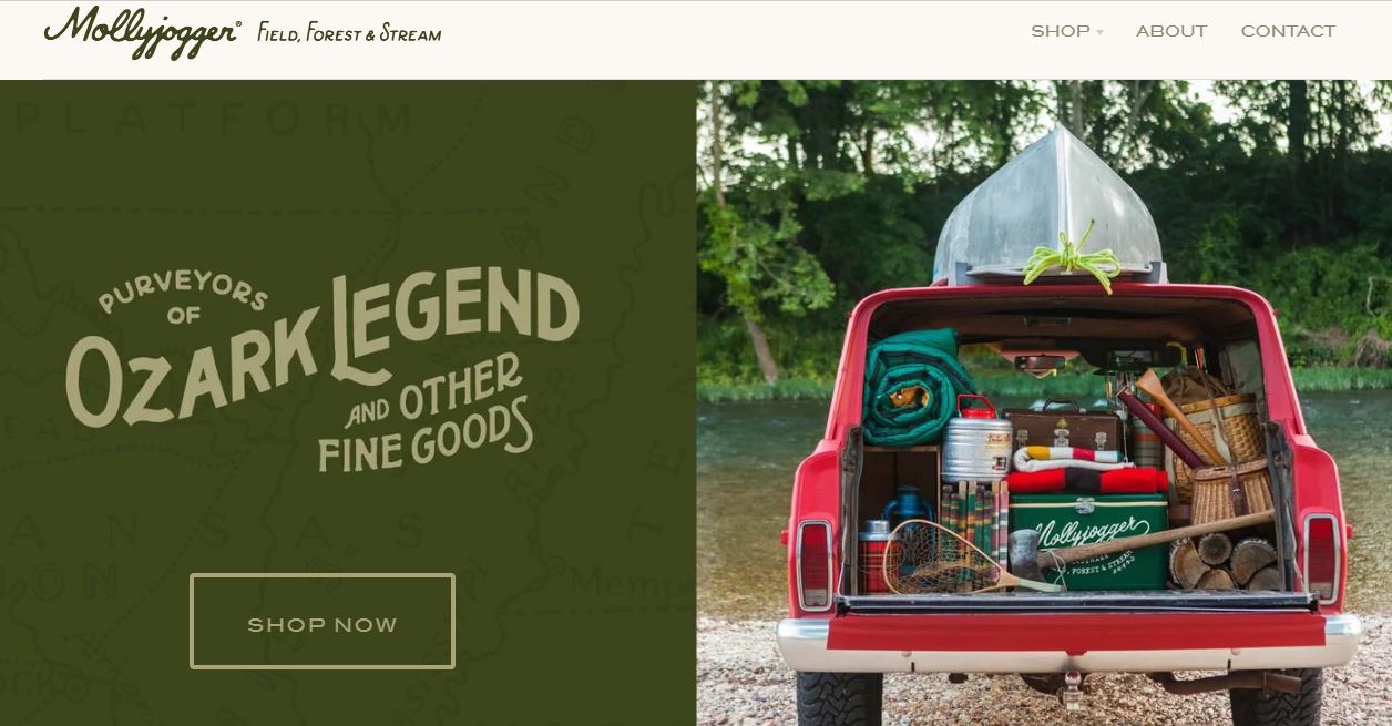
If you’re looking for a typography style that complements a rustic or outdoor aesthetic, Lodge Script is a typeface that you might find suitable. The font is reminiscent of hand-drawn lettering often found on signs and posters in rural areas. It has a casual and rough appearance that’s well-suited to rustic designs. Lodge Script is a versatile typeface that can be used for headlines, subheadings, and even body text. It’s perfect for creating a friendly and approachable atmosphere that invites customers to explore your website further. Lodge Script works best for eCommerce sites that sell outdoor or rural products, such as camping gear, hunting equipment, and farm supplies.
Kosas
Kosas’ use of the spray-painted graffiti font on its main page is a unique and bold choice that sets them apart from other beauty retailers. While their selection of cosmetics is extensive and sophisticated, the graffiti font gives their brand a sense of personality and streetwise edge. It is an unexpected touch that catches the eye and adds some rustic character to an otherwise clean and modern design.
This use of contrasting styles is not new in design, as it can create an interesting juxtaposition that captures the attention of the viewer. In the case of Kosas, the use of graffiti font against a clean and modern design adds an element of surprise that elevates its brand image. The bold and playful graffiti font used on their page also fits well with the vibrant colors and edgy aesthetics of their product line.
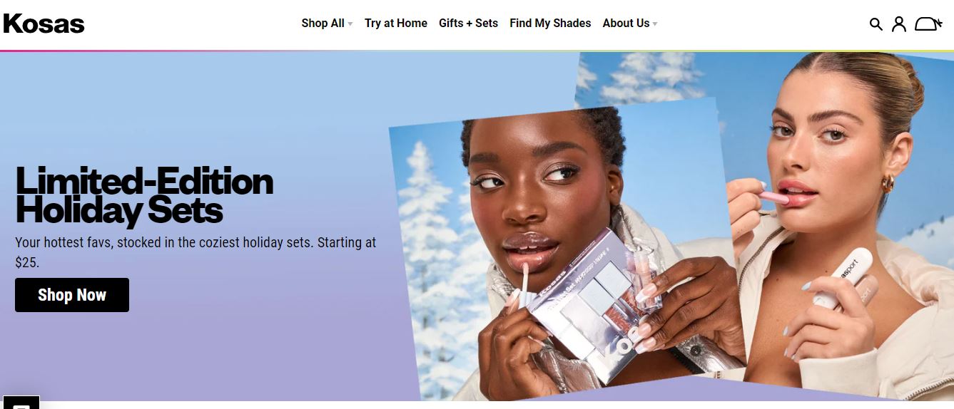
If you’re looking to incorporate a similar style into your design, consider experimenting with contrasting elements to create a visually compelling effect. By pairing seemingly disparate styles, you can create a unique and memorable design that captures your brand’s essence and personality.
Lou Malnati’s
Lou Malnati’s online pizza store is known for its authentic Chicago deep-dish pies. The website design is simple yet appealing, and it features a font that captures the essence of the brand. The font used on the homepage is in the shape of a lightbulb, which adds a touch of fun to the otherwise serious business of selling pizza online.
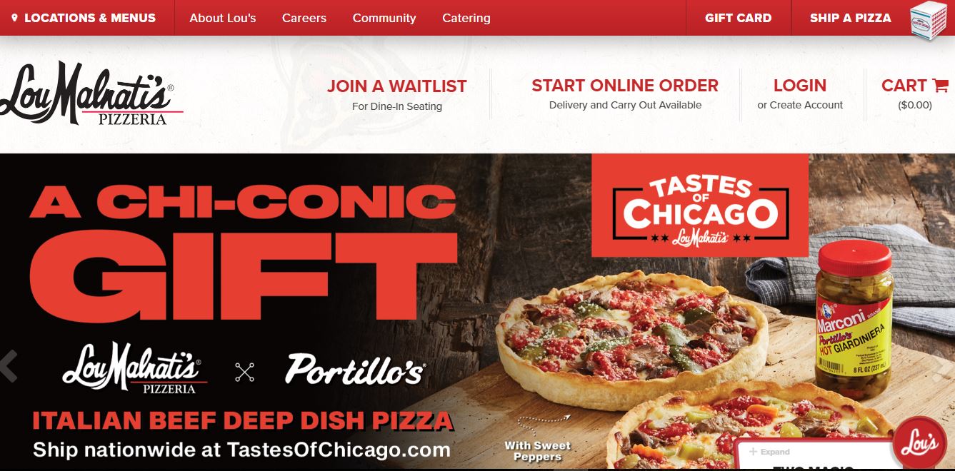
If you’re looking to add some non-digital typography to your eCommerce site, Light Type is a great option. It has a quirky, hand-drawn style that is perfect for businesses that want to convey a sense of playfulness and creativity. The font is legible, yet it has a unique look that sets it apart from more traditional typefaces.
Hardgraft
The use of a vintage typewriter-like font, such as Grad, can give a unique and charming feel to an eCommerce site. Hardgraft effectively uses this font to add character to its high-end lifestyle goods website. The font’s geometry creates a nostalgic atmosphere that can appeal to customers who appreciate the vintage aesthetic.
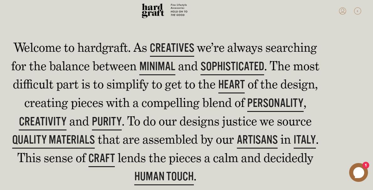
Incorporating vintage fonts into your eCommerce site can be an excellent way to stand out from the competition and create a memorable brand image. It is crucial to ensure that the font choice complements your brand’s overall message and aesthetic. A font that appears out of place or doesn’t fit the brand can create a confusing and unprofessional impression.
In conclusion,
Fonts can be an important part of your eCommerce website, conveying a certain tone and feel to customers. It’s important to choose the right font for your business and make sure it is easy to read on different devices. We’ve compiled some tips on how to choose the perfect font for your online store.
Choosing the best font for eCommerce websites is an important task that shouldn’t be taken lightly! The typeface you select can set the tone for your entire business and affect how customers perceive your brand.
Magenest has years of experience in eCommerce website design and Shopify website development services. Magenest UI design can help you create a website that not only looks great but also converts browsers into buyers. Our team is passionate about creating beautiful and effective websites, and we would love to help you achieve your sales goals.
If you’re in search of a platform that boasts an effortless setup, exceptional customer support, and a wide array of themes and designs to choose from, look no further than Shopify. Starting out doesn’t demand any technical know-how, allowing you to promptly launch and operationalize your online store and customize your storefront based on your requirements. Our seasoned team of Shopify experts is always in place to assist you. Contact us now to know more about our ability and implemented projects!