

Since Google has released the Hummingbird algorithm, eCommerce solutions focused on mobile devices. In fact, all merchants and retailers want to make a success of mobile eCommerce strategy but they really don’t care about mobile search engines on their website.
Today your customers not only want to save their time on browsing and shopping online, but they also want to use their phone for mobile search to compare prices and product reviews while browsing your store. Let’s take a look at what is mobile search. Why you should focus on mobile search? In this blog, we’ll also give you some useful information that you can deploy to build a great mobile search.
Table of Contents
What Is Mobile Search?
When it comes to defining what is mobile search there are several definitions to choose from. In traditional meaning, Mobile search is a search engine querying technique that uses a wireless/mobile platform or handheld device with an Internet connection, such as a smartphone or tablet. In comparison to a conventional Web search, mobile search is generally location-specific, with streamlined data returns. Most commonly, this search will occur on Internet search engines, such as Google, Yahoo, Microsoft Bing,…
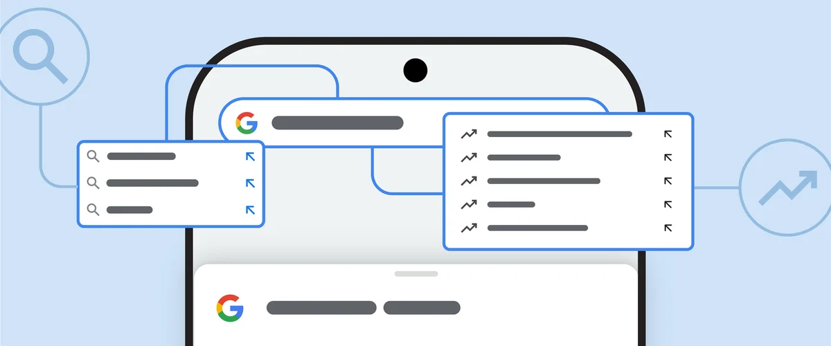
But today, Mobile search is more than a desktop-to-mobile device transition, as it is a continuously evolving tool designed to satisfy mobile user content requirements that can occur on any mobile app. Mobile apps now have self-contained search functions as well. Mobile apps make use of the search bar to enable users to find the content they want more easily and quickly. They can be presented in various styles and formats that could restrict the user from inputting invalid queries or search terms.
Why You Should Focus on Mobile Search?
The search bar is often the first interaction a user has with a mobile site. According to research, about 43% of mobile site visitors instantly go to the search bar, and these searches are 2-3 times more likely to convert.
Almost of mobile shoppers are more likely to be looking for a specific product than they are to be browsing your store. This feature can make effective site search functionally the most efficient navigation strategy for your mobile site. Users can have a two-way dialogue with the system by using the search bar.

Besides, Searches should not require users to reverse-engineer your UI. Instead, it should resemble a natural human experience that leads people easily to find what they are searching for. According to Google’s research, 53% of mobile users abandon sites that take longer than three seconds to load. Thus, it’s critical that your mobile app gives these clients a smooth online experience.
Mobile devices also offer a wealth of contextual data, including location and usage patterns, that can be leveraged to personalize content and advertising. Personalization can significantly enhance the user experience and increase the effectiveness of marketing campaigns.
In fact, not all eCommerce site search strategies are appropriate for mobile commerce sites, so if you can make an effective mobile search, it will make your site different and convenient for your customers.
Key Elements of Great Mobile Search UX
Creating a great mobile search user experience (UX) requires attention to several key elements that cater to the unique needs and limitations of mobile devices. A user-friendly mobile search UX can greatly enhance engagement and conversion rates. Here are the key elements to focus on:
Your Mobile Search Bar (and the Alternatives)
Think about where to add search depending on your users’ requirements. This step is easy yet critical. There are generally three choices:
- The full-length search bar: This is generally shown on the main screen, providing fast access to the search feature. This full-length design is beneficial because it is familiar to users and affords ample space for users to enter their search queries, even on smaller screens. The visibility of a full-length search bar signals to users that search is a key function of your application or website, encouraging its use.
- The tab bar: When search is not the main access point for your content, but you still want to provide users fast access to search capability no matter where they are in the app, the tab bar is a suitable option. The tab for the search function should be clearly marked, often with a magnifying glass icon, and it should allow users to tap directly into the search functionality from anywhere within the application.
- The contextual search icon: The most adaptable option is to use a contextual search icon, which displays the button in the app’s section where it is most appropriate for users to do searches. The key with a contextual search icon is that its placement should be intuitive so users can easily find it when the need to search arises.
Each of these choices serves a specific purpose and can be employed depending on the nature of the mobile website or app. It’s crucial that the search bar design aligns with how users interact with the product and the priority of the search function within the overall user experience.
The In-between Search Screen
The search screen is the next UI element to develop and improve once you’ve identified where the user’s search process begins. This page acts as a bridge between the primary non-search view and the search results page that follows.
When a user taps the search field or the search icon, the search screen appears, signaling to the app: I’m seeking something and expect to be rewarded with helpful information. Because each tap is so painful, we should reward the user’s perseverance by making it easier for them to use.

Here are three design options using the search screen to guide the user’s inquiry.
- Recent searches: When a user searches for a product, it’s a good idea to provide a brief look at prior searches for comparison or as a reminder. The design could show a list or a cloud of terms that the user has recently searched for, offering a one-tap solution to repeat a past search. This serves two purposes: it saves time and reminds the user of their recent interests or unfinished tasks.
- Trending searches: This screen displays to the user what other app users are most interested in. By clicking a recommendation, an unmotivated or casual consumer may quickly find new information on the website. The design should highlight trending topics in a visually engaging way, such as using thumbnails or icons next to the trending terms.
- Categories: This search screen supports the user by providing a variety of filter choices to help define and narrow their search, making it much faster and easier overall. This could be particularly useful for e-commerce, news sites, or content platforms where the breadth of available information can be overwhelming.
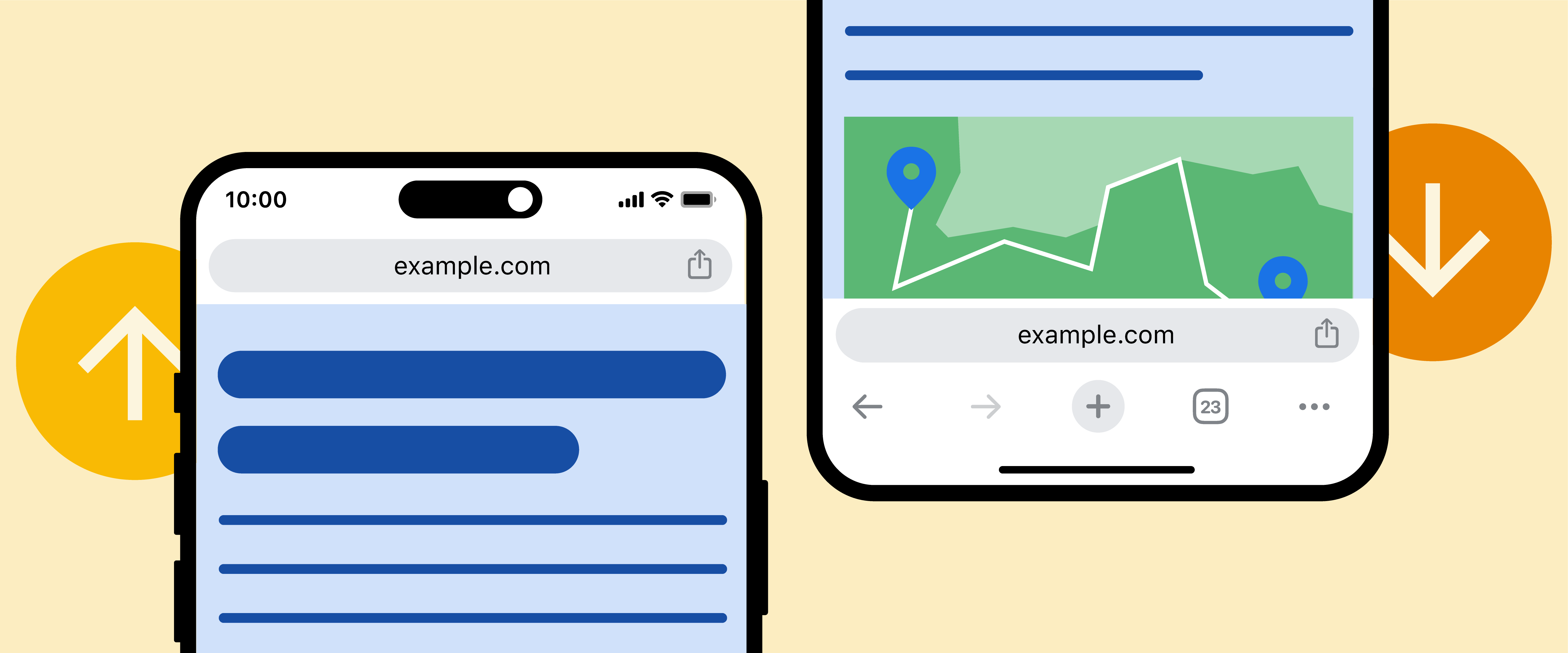
The Mobile Search Result Screen
The screen where consumers are presented with their search results is a crucial part of mobile search UX. Here, we’ll look at mobile search result UX best practices.
Display Search Results Properly
When it comes to the mobile search user experience (UX), the way search results are displayed is paramount. Given the smaller screen real estate on mobile devices compared to desktops, it’s crucial to present information in a clear and accessible manner.
To get started, find out how your customers are currently navigating your catalog. You should show search results as enlarged images that customers pick visually, like shoes or clothing.
However, for very particular search results, such as restaurants, it’s preferable to show a list that includes information such as pricing, distance, and user reviews.
Show Only the Most Relevant Results
It is possible to not have the most relevant result at the top of a page on a desktop, but this isn’t a good option on mobile because the user will discover it eventually. Because of the limited real estate, only the top search results are shown to the user, thus they had better be relevant.
Additionally, concise titles, meta descriptions, and snippets that clearly indicate the content of the page can help users quickly determine which results are worth exploring further. Presenting users with the most pertinent results not only improves their experience but also increases the likelihood of them taking the desired action, such as making a purchase or visiting a location.
Filtering That Reduces Screen Clutter
Effective filtering is an essential feature of great mobile search UX, as it allows users to narrow down results without overwhelming the limited display area. By providing intuitive filter options, you enable users to customize search results based on their specific preferences or needs, such as price range, ratings, or item type.
Filters and search results can’t be combined in the same view without creating a lot of clutter, therefore you should find strategies to decrease clutter while maintaining a robust set of filters. They should be designed to deliver immediate results, showing users the impact of their choices instantly, which is crucial for a satisfying mobile search experience. Reducing screen clutter not only makes the search more targeted but also minimizes cognitive load, allowing users to make decisions more efficiently.
Mobile Search UX Best Practices
It’s difficult to develop a good mobile UX. Many factors should be taken into account, such as the increasing number of mobile devices, the methods in which people engage with them, and the desire of consumers to have a consistent and enjoyable experience across all device types. Here are a few other mobile UX designs recommended practices that are less well-known than Google’s, but are just as critical for mobile designers to consider.
Autocomplete and Suggestions
Auto-filling the term and providing choices inside the text field should occur as the user writes his or her inquiry. The principle of least effort determines the course of activity. Consumers are more likely to buy something if it requires less effort to find it. Generally speaking, people choose the option that presents the least amount of difficulty. Providing appropriate default searches to your consumers can save them time and improve conversions.
AliExpress and IKEA suggest frequently inputted queries even before the user starts to type inside the bar.
Recent and Saved Searchers
Reminding your consumers of what they were looking for lately or even the last time they visited your eCommerce website is a smart method to streamline their buying process. It helps customers find what they’re seeking more quickly and even motivates them to make a purchase. For example, Wayfair is aware of this and keeps track of its clients’ previous web activity
Slide-in Filter Panel
Allow your users to sort and filter the results without clogging up the limited capabilities of the screen. Filters can be displayed and hidden in a variety of ways. They may appear as a panel from the side or cover the entire screen. The panel’s behavior may follow different patterns depending on the situation. For example, on the Stage3Motorsports website, the filter panel disappears each time a filtering option is selected by the user, and the results page quickly changes. While on RugsDoneRight, a user can select as many filter choices as they like, then dismiss the filter window to see just products that fit their requirements.
The most popular and relevant filtering choices should be displayed first due to screen limitations, and the less significant filtering options should be displayed only when you click the “show more” button. This makes it easier for customers to rapidly scan the available alternatives and to stay more focused and engaged while browsing.
Search Results View Options
The most efficient view options can change depending on the items you sell. Products that customers are contemplating purchasing based on specifics like SKU, ratings, and dimensions are better organized in a list. And, for products where visual representation is more essential than explanation, the grid approach is reasonable. It depends on your business and what provides the greatest value to your consumers whether you pick the default view or allow them to move between two options.
Infinite Scroll
When using a mobile device, the user’s natural engagement with the website is to scroll down to the end of the results page. It’s best to stay away from the “show more” button and let search results load naturally.
How to Use Mobile Search Effectively?
Using mobile search effectively involves a combination of technical optimization, understanding user behavior, and providing a seamless, user-friendly experience. Here’s how you can achieve that:
Friendly Result Page Design
It is important to give your mobile shoppers exactly what they want at the click button. With short attention spans and small screens, mobile users require highly relevant and simplified experiences.
Design your search results pages to immediately answer your mobile users’ questions. In the homepage search box, once you begin typing, a dropdown of options pops up. The two most prominent searches will lead you to site pages designed specifically for your search. Other options available feature the most popular store items. Finally, if these results aren’t what you are looking for, you can continue to a full-blown search page which includes product photos, prices, and the ability to refine your search based on popularity, average rating, sort by price, and more.
Make It Easy for Mobile Shoppers to Call You
For businesses, especially local or service-based industries, making it easy for mobile shoppers to contact you can directly affect conversion rates. Include click-to-call buttons prominently in both search results and on contact pages.
Ensure that the phone number is in a clickable format so that users don’t have to memorize or write down the number. This one-tap functionality for initiating a phone call facilitates immediate action and satisfies users’ desires for quick and simple solutions.
Eliminate Unnecessary Clicks and Data Entry
Smartphone users like to scroll and swipe and can become frustrated with user interfaces that are clearly designed with a desktop computer in mind.
Take advantage of search features such as autocomplete to both guide your visitors toward their goals and eliminate the need to type complete search queries. The search drop-down helps to suggest and guide mobile users to relevant long-tail search terms.
Make the Search Box Easy to Find
Make the search box easy to spot, right at the top of every page – don’t waste a mobile visitor’s time by making them find this important functionality.
There are apps where user engagement depends heavily on searching for results, in which case it is particularly important to make search interaction visible and findable. You can do this by embedding an always-visible and persistent search bar on the screen or using a magnifying glass icon placed on the navigation bar to save some space.
Help Mobile Users Make Sense of Their Search Results
It goes without saying that the order in which you display the search results is critical. The most relevant and highest-converting products should always be presented at the top of the list. But, what if your visitor is looking for something else?
Rather than make them scroll through dozens (or hundreds) of results, make sure that you provide them with a set of filters that is easy to find and use so that they can quickly refine the results to a shortlist that is relevant to their needs.
Conclusion
The search bar is one of the most used elements on a website, search bar design has a significant impact on user experience. Hopefully, the above points will help you find all the information for the question of what is mobile search that you are searching for. If you are looking for a company to design mobile search bars. Magenest with a dedicated team with an eye for unmatched quality and creativity will provide you with the best experience. Feel free to contact us to figure out what values we can bring to you and your business.


