

The popularity of progressive web applications (PWAs) has been skyrocketing, particularly in the realm of online retail. As a result, many eCommerce store owners are eager to embrace PWAs. Meanwhile, Magento 2 is a popular eCommerce platform that powers thousands of online stores. By combining Magento 2 with PWA technology, you can create a high-performance storefront that will exceed your customers’ expectations.
In this article, we will guide you through the demo process of building a Magento PWA storefront so that you can have a first glimpse of what the overall process looks like, which will help you outrank your competitors. Additionally, we’ll delve into the critical aspects of delivering outstanding user experience (UX) and user interface (UI) on PWAs, while offering valuable tips on best practices and pitfalls to avoid for the most optimized development.
Table of Contents
- Magento 2 and PWA: The Perfect Combination
- Noticeable UX/UI Points When Building Magento PWA Storefront for Magento 2
- Preparing to Build a Magento PWA Storefront
- How to Build A Magento PWA Storefront: The Frontend Part
- How to Build A Magento PWA Storefront: Basic Backend Setup
- How to Build A Magento PWA Storefront: Advanced Backend Setup
Magento 2 and PWA: The Perfect Combination
Magento 2 PWA, also known as Magento Progressive Web Application, is an innovative approach to building online stores that combines the strengths of Magento 2, a popular eCommerce platform, with the capabilities of Progressive Web Applications (PWAs).

The combination of Magento 2 and PWA can offer a number of benefits for businesses, including:
- Enhanced Performance: PWAs, with their optimized code and caching mechanisms, offer lightning-fast loading speeds and smooth user interactions. When combined with the robustness of Magento 2, the result is an online store that delivers exceptional performance, reducing bounce rates and increasing customer satisfaction.
- Seamless User Experience: The combination of Magento 2 and PWAs ensures a consistent and seamless user experience across different devices and platforms. Whether customers are accessing the store from their desktop, mobile, or tablet, they will enjoy a unified and engaging experience. This uniformity strengthens brand identity and fosters customer loyalty.
- Offline Functionality: PWAs have the remarkable ability to work offline, allowing users to access previously loaded content and perform actions even without an internet connection. By integrating Magento 2 with a PWA, businesses can ensure that their customers can continue browsing products, adding items to their cart, and even making purchases during periods of limited or no connectivity.
- Mobile-First Approach: In the era of mobile dominance, having a mobile-friendly online store is crucial. PWAs are inherently mobile-friendly and provide an app-like experience on mobile devices. When combined with the mobile optimization capabilities of Magento 2, the Magento 2 and PWA combination delivers a seamless and engaging mobile shopping experience.
- Improved SEO Performance: Search engine optimization (SEO) is a vital aspect of driving organic traffic to an online store. PWAs, with their responsive design and fast-loading pages, offer an excellent foundation for SEO success. Magento 2’s built-in SEO features, when combined with the PWA technology, contribute to improved search engine rankings and increased online visibility.
Noticeable UX/UI Points When Building Magento PWA Storefront for Magento 2
When migrating from Magento 1 to Magento 2 or Magento 2 with a PWA, simply transferring your existing website design won’t yield significant results. The issue lies in the outdated nature of those designs.
In the past, web designers approached site design by creating mock-ups for desktop versions first and then adjusting them for various screen resolutions. This resulted in scaled-down desktop layouts for mobile versions, which didn’t meet user expectations.
To address these issues, the mobile-first approach gained traction, emphasizing the priority of designing for mobile versions before desktops.

UX changes in mobile PWAs revolved around creating effective layouts suitable for users on the go who predominantly use mobile devices. The mobile-first approach emphasized focusing on one action per screen, displaying essential information without overcrowding elements. This directed users to take desired actions, such as reading text in a pop-up or selecting a product category.
PWA designs often adopt templates and patterns typical of native applications. For instance, instead of stacking product categories in a column, important categories are placed in a line, often with a slider format, to save space and accommodate other information within a single-screen view.
These are just some of the major rules that designers follow when creating PWA prototypes and mockups with impeccable UX and UI. Keep in mind that there is much more to consider in achieving a successful PWA design.
- Prioritize minimal page load time
- Display each significant action on a new screen or popup
- Keep navigation simple and easy to go back to the previous screen
- Use plain fonts and basic elements for a clean design
- Implement data refreshing without fully reloading pages
- Consider offline mode engagement
- Accentuate tapped areas for better visualization
- Place tappable elements towards the bottom of the screen
- Design with universal cross-device compatibility
- Account for the keyboard occupying screen space on mobile devices
Preparing to Build a Magento PWA Storefront
Before diving into the development process of a Magento PWA storefront, proper preparation is crucial to ensure a successful implementation. By taking the time to plan and consider important factors, you can lay a solid foundation for building a robust and engaging Magento PWA storefront. Let’s explore the key steps involved in preparing for the development of a Magento PWA storefront.
Understand the Power of PWAs
Begin by familiarizing yourself with the benefits and capabilities of PWAs. PWAs offer an enhanced user experience with features such as fast loading times, offline functionality, push notifications, and the ability to be installed on users’ home screens. Recognizing the potential of these features will help shape your development strategy.
Define Your Goals When Upgrading to PWA Technology
Clearly define your goals and objectives for the Magento PWA storefront. Identify the specific outcomes you want to achieve, whether it’s improving performance, increasing conversions, enhancing user experience, or expanding your customer base. Defining your goals will guide your decision-making process and ensure a focused development approach.
Choose the Right Technology Stack
Selecting the appropriate technology stack is essential for a successful Magento PWA storefront. Magento PWA Studio, a comprehensive toolset designed specifically for integrating Magento 2 with PWAs, is a popular choice. Magento PWA Studio provides a range of development tools and libraries that streamline the PWA development process. Consider the advantages of Magento PWA Studio, such as its compatibility with Magento 2 and strong community support.
Plan for Responsive Design
Responsive design is key to ensuring your Magento PWA storefront adapts seamlessly to different screen sizes and devices. Consider the layout, typography, and visual elements that will provide optimal user experiences across desktops, tablets, and mobile devices. Prioritize simplicity, readability, and intuitive navigation to create a user-friendly interface.
How to Build A Magento PWA Storefront: The Frontend Part
Building a Progressive Web Application (PWA) requires attention to both frontend and backend development.
The goal is to provide a detailed overview of the frontend development process using plain ReactJS. We will use the creation of a homepage for our progressive web application as an example. The homepage will feature several essential components and sections, ensuring a well-structured architecture.
To achieve our desired result, we aim to have the following elements on our homepage:
- Header: Design and implement a header section that provides navigation and branding elements for your PWA.
- Login/Logout Button: Create a login/logout button that adjusts based on the application’s state. When a user is logged in, display a logout button, and when they are logged out, show a login button.
- Widgets: Incorporate various widgets on the homepage, such as a featured products slider and several CMS blocks. These widgets can be managed through the Magento Admin panel, offering flexibility and ease of content customization.
- Email Sign-Up Section: Include an email sign-up section where users can subscribe to your newsletters or updates. Provide a form that collects their email addresses and allows them to submit their information.
- Footer: Design and implement a footer section that contains essential links, copyright information, and any additional information you want to display at the bottom of your Magento PWA storefront.
Step 1: Configuring the System for Further ReactJS Work
Configurations & Setups Preparation
To begin the process, we will take care of the necessary configurations on Ubuntu 18.04. Follow the steps below to prepare the required setup for launching React. Execute these commands in the console:
- Update the package lists:
sudo apt update- Install the required dependencies for configuration:
sudo apt -y install curl dirmngr apt-transport-https lsb-release ca-certificates- Retrieve the script and execute it to set up the desired version of Node.js:
curl -sL //deb.nodesource.com/setup_12.x | sudo -E bash -- Update the package lists again:
sudo apt updateInstalling Node.js
After completing the configuration and setup preparation, it’s time to install Node.js, a runtime environment for executing JavaScript applications, along with npm, the package manager for Node.js. Node.js uses the V8 engine to translate JavaScript into machine code. Follow these steps to install Node.js:
- Install Node.js using the package manager:
sudo apt -y install nodejs- Confirm the installation of Node.js:
node -v- Install npm, the package manager for Node.js:
sudo apt -y install npm- Confirm the installation of npm:
npm -vCongratulations! You have successfully completed the necessary configurations and installed Node.js with npm. You are now ready to launch your React app using Node.js as the runtime environment. Stay tuned for the next steps in our comprehensive guide.
Step 2: Installing ReactJS & creating an application
In this step, we will install ReactJS and create a new React application for your Magento PWA storefront. Follow these steps to set up ReactJS and start building your application:
Install ReactJS
Run the following command to install the latest version of ReactJS:
npm install react@latestThis command will download and install ReactJS for your project.
Implementing Server-Side Rendering (SSR)
In order to implement a server-side rendering (SSR) for our PWA and create an application, we will use Razzle, a JavaScript framework that simplifies installation and configuration. SSR enhances the performance and SEO capabilities of your PWA. Follow these steps to implement SSR with Razzle:
- Run the following command to globally install the Razzle tool:
sudo npm install -g create-razzle-app- Generate a new Razzle application by running the following command:
create-razzle-app my-pwa-appReplace my-pwa-app with the desired name for your application. This command will set up the necessary files and configuration for SSR with Razzle.
Project Folder
Change into the project directory using the following command:
cd my-pwa-appReplace my-pwa-app with the actual name of your application.
Launching the App
To launch the application and start the server, run the following command:
npm startThis command will start the development server and open your application in a web browser at http://localhost:3000. Any changes you make to your code will automatically be reflected in the browser.
You have successfully installed ReactJS and implemented SSR using Razzle for your PWA. This will enhance the performance and SEO capabilities of your application. Stay tuned for the next steps in our comprehensive guide.
Explore the Project Structure
Take some time to familiarize yourself with the project structure. You will find the main code files in the src folder, including the index.js file that serves as the entry point for your application. Feel free to modify and customize these files to meet the requirements of your Magento PWA storefront.
Step 3: Adding libraries
PWA’s homepage will require the installation of several commonly used libraries. These libraries will enhance the functionality and user experience of your Magento PWA storefront. Follow the steps below to install these libraries:
Swiper
This is used for adding sliders to the application. Install Swiper by running the following command:
npm install swiper --saveSASS
This is used for working with the app’s CSS and styles. Install SASS by running the following command:
npm install node-sass --saveGraphQL
GraphQL including its dependencies such as Apollo Client, GraphQL Tag, and others. Install GraphQL and its dependencies by running the following commands:
npm install graphql --save
npm install apollo-client --save
npm install apollo-cache-inmemory --save
npm install apollo-link-http --save
npm install apollo-link-context --save
npm install react-apollo --save
npm install graphql-tag --save
React Redux
This is used for monitoring and managing the application’s states. Install React Redux by running the following command:
npm install react-redux --saveReact Notifications
This library is used to display notification messages, including notifications for successful user sign-ups, logins, error notifications, and more. Install React Notifications by running the following command:
npm install react-notifications --saveFormik
This library simplifies the handling of form submissions and processing of form data. In our application, it will be utilized not only for form management but also for handling authorization processes. Install Formik by running the following command:
npm install formik --saveStep 4: Building the Architecture
Moving on to the architecture of your application, it is essential to establish a structured code organization and navigation system that can accommodate the growth of your application. To achieve this, we will utilize a folder-based architecture.
In React development, it is crucial to logically split your pages into components, ensuring that your application functions effectively in the long run. React excels at managing numerous small components, making logical component separation vital.
Furthermore, it is important to create a code structure that logically breaks down navigation and folder placement. Let’s examine the additional folders that should be included within the “src” folder of your project:
- Assets: The Assets folder is dedicated to storing style and design elements, such as fonts, images, and other related files.
- Components: The Components folder houses your ReactJS components and various elements of the React application. This folder serves as the primary location for developing and organizing your components.
- Constants: The Constants folder stores various constants used throughout the project. These constants serve as global elements necessary for building the application’s logic.
- Data: The Data folder holds data specific to your PWA’s main menu or any other relevant data sources required for your application’s functionality.
- Queries: The Queries folder is utilized for storing GraphQL server queries. This folder serves as a centralized location for managing and organizing your GraphQL queries.
- Routes: Within the Routes folder, you will store data related to the routing logic. This logic determines which components will be rendered based on the specific page or route.
- Stores: The Stores folder is responsible for managing Redux setups, which store the application’s state. This is where you will keep data related to user authorization and other essential state information.
- Utils: The Utils folder stores general-purpose functions that are commonly used throughout the application. These utility functions provide reusable logic and enhance the overall efficiency of your codebase.
Step 5: Assembling the App Based on the Laid-Out Architecture
Assembling the Application
Let’s start assembling our application. First, we need to set up two key components: Redux and GraphQL. As mentioned earlier, Redux is used in React to manage and update the application’s states. On the other hand, GraphQL is utilized in the frontend to retrieve and define the data to be obtained.
It’s crucial to ensure that the GraphQL endpoint URL is hosted on the same domain as the React app. This is necessary because other links may be blocked due to the Cross-Origin Resource Sharing (CORS) policy. The CORS policy defines the rules that browsers follow to allow resources to be loaded.
Additionally, during the GraphQL setup, we need to install a token for user authorization. This token will be utilized to handle the authentication of users within the app. When making queries to Magento, the token will be included, indicating that it is associated with a specific customer or session. This enables Magento to determine whether the user is authorized or not. Remember to perform the same setup in the src/server.js file.
Here’s an example XML configuration (src/module.xml) for a Magento module named Homepage_Slider with a setup version of 1.0.0. It includes a sequence dependency on the Magento_Catalog module:
<?xml version="1.0" ?>
<config xmlns:xsi="http://www.w3.org/2001/XMLSchema-instance" xsi:noNamespaceSchemaLocation="urn:magento:framework:Module/etc/module.xsd">
    <module name="Homepage_Slider" setup_version="1.0.0">
        <sequence>
            <module name="Magento_Catalog"/>
        </sequence>
    </module>
</config>
Please note that the example provided assumes a Magento module configuration and may require additional customization based on your specific requirements.
Redux Storage Configuration
In this step, we will configure the Redux storage by defining reducers that handle different actions and data associated with each reducer.
To configure the Redux storage, we need to create reducers that describe the possible actions and how the data should be updated for each action.
There are several key files in this section:
- Actions.js: This file defines the possible actions that can be performed on the Redux storage.
export const CHANGE_TYPE_OF_DEVICE = 'CHANGE_TYPE_OF_DEVICE';
export const UPDATE_CONFIG = 'UPDATE_CONFIG';

export function changeTypeOfDevice(deviceType) {
    return {
        type: CHANGE_TYPE_OF_DEVICE,
        deviceType
    };
}

export function updateConfig(config) {
    return {
        type: UPDATE_CONFIG,
        config
    };
}
- Reducers.js: This file contains all the storage operations for the Redux store. It includes the necessary imports and defines the initial state and the reducer function.
import {
    UPDATE_CONFIG,
    CHANGE_TYPE_OF_DEVICE
} from './actions';
import { DESKTOP_DEVICE, MOBILE_DEVICE, DESKTOP_SIZE } from 'src/Constants/App';
import { getWindow } from 'src/Utils/Environment';

const initialState = {
    typeOfDevice: getWindow().innerWidth > DESKTOP_SIZE ? DESKTOP_DEVICE : MOBILE_DEVICE,
    cmsBlocks: {
        items: []
    }
};

function app(state = initialState, action) {
    switch (action.type) {
        case UPDATE_CONFIG:
            return {
                ...state,
                ...action.config
            };

        case CHANGE_TYPE_OF_DEVICE:
            return {
                ...state,
                typeOfDevice: action.deviceType
            };

        default:
            return state;
    }
}

export default app;
- Selectors.js: This file contains operations that allow you to retrieve data from the Redux store. These selectors define functions to access specific portions of the state.
export const selectState = state => state.AppReducers;
export const selectTypeOfDevice = state => selectState(state).typeOfDevice;
export const selectCmsBlocks = state => selectState(state).cmsBlocks;
- Index.js: This file brings together all the data from the files mentioned above:
export * from './actions';
export { default as AppReducers } from './reducers';
export * from './selectors';
In addition, we require a file that consolidates all the reducers together, which is necessary for initializing the Redux store.
import { combineReducers } from 'redux';
import { CustomerReducers } from './Customer';
import { AppReducers } from './App';

export const reducers = {
    CustomerReducers,
    AppReducers
};

const combinedReducers = combineReducers(reducers);

export default combinedReducers;
Razzle Configuration
Let’s move on to the Razzle configurations and setups. Below is an example configuration that includes an alias for the src path, which will be used to load the components:
const path = require('path');

module.exports = {
  modify: (config, { target, dev }, webpack) => {
    config.resolve.alias = {
      'src': path.resolve(__dirname, './src/')
    };
    return config;
  },
};
In the provided configuration, the modify function is exported as the main configuration entry point. This function receives the config, { target, dev }, and webpack as parameters.
Inside the modify function, the config.resolve.alias property is set to an object that defines an alias for the src path. The path.resolve method is used to resolve the absolute path to the ./src/ directory, ensuring that it points to the correct location in your project.
By setting this alias, you can now import components using the src prefix, making it easier to reference files within the src directory. For example, you can import a component like import MyComponent from ‘src/components/MyComponent’.
After modifying the configuration, the updated config object is returned to complete the configuration process.
Routes
Routes determine which part of the page should be displayed based on the URL path. There are multiple router types available, each with its own way of handling navigation.
In our case, we’ve opted for the Browser Router option, which displays regular URLs using the HTML5 history API. This allows the URL to change as the user browses the website, enabling users to save or share links. The defined rules in the code below outline how different parts of the page should be displayed based on the URL path.
jsx
Copy code
import React, { useEffect } from "react";
import { useQuery } from 'react-apollo';
import { useDispatch } from 'react-redux';
import { Switch, Route } from "react-router-dom";
import { NotificationManager } from 'react-notifications';

import {
    CMS_BLOCKS_IDENTIFIERS,
    DESKTOP_DEVICE,
    MOBILE_DEVICE,
    DESKTOP_SIZE
} from 'src/Constants/App';
import Footer from 'src/Components/Footer';
import Header from 'src/Components/Header';
import Home from 'src/Components/HomePage';
import Category from 'src/Components/Category';
import ContactUs from 'src/Components/ContactUs';
import { getWindow } from 'src/Utils/Environment';
import { updateConfig, changeTypeOfDevice } from 'src/Store/App';
import NewsletterWidget from 'src/Components/NewsletterWidget';
import { configQuery } from 'src/Queries/App.js';

const Routes = () => {
    const dispatch = useDispatch();

    const { data } = useQuery(configQuery, {
        variables: {
            'ids': CMS_BLOCKS_IDENTIFIERS
        },
        onError: error => {
            NotificationManager.error(getErrorMessage(error));
        }
    });

    if (data) {
        dispatch(updateConfig(formatConfig(data)));
    }

    useEffect(() => {
        const handleResize = () => {
            const newTypeOfDevice = getWindow().innerWidth > DESKTOP_SIZE ? DESKTOP_DEVICE : MOBILE_DEVICE;
            if (typeOfDevice !== newTypeOfDevice) {
                dispatch(changeTypeOfDevice(newTypeOfDevice));
            }
        };

        getWindow().addEventListener('resize', handleResize);
        return () => {
            getWindow().removeEventListener('resize', handleResize);
        };
    }, [dispatch, typeOfDevice]);

    return (
        <div className={'layout'}>
            <div className={'page-container'}>
                <Header />
                <main className={'page-main'}>
                    <div className={'page-wrapper'}>
                        <Switch>
                            <Route exact path="/" component={Home} />
                            <Route path="/category" component={Category} />
                            <Route path="/contact-us" component={ContactUs} />
                        </Switch>
                    </div>
                </main>
                <NewsletterWidget />
                <Footer />
            </div>
        </div>
    );
};

export default Routes;
In the code provided, we define the routes using the Switch and Route components from react-router-dom. The Switch component ensures that only the first matching route is rendered.
Within the Switch component, we define the different routes using the Route component. Each Route component is associated with a specific URL path and renders the corresponding component when the path matches.
Additionally, we utilize other components such as Header, Footer, and NewsletterWidget to build the layout of the page. The Header component represents the header section of the page, while the Footer component represents the footer section. The NewsletterWidget component is a widget displayed on the page.
The code also includes additional logic for handling GraphQL queries using useQuery from `react-apollo` to fetch data, dispatching actions to update the Redux store, and handling resizing events to determine the type of device.
Inside the Routes component, we use the useQuery hook from react-apollo to fetch data using the configQuery. The fetched data is stored in the data variable. If the data is available, we dispatch the updateConfig action, passing the formatted data to update the Redux store.
We also use the useEffect hook to handle resizing events. Whenever the window is resized, the handleResize function is called. It calculates the newTypeOfDevice based on the window’s inner width and compares it with the current typeOfDevice. If they are different, we dispatch the changeTypeOfDevice action to update the device type in the Redux store.
The JSX code within the return statement defines the layout of the page. It includes the Header component, the main content section represented by the Switch and Route components, and the Footer and NewsletterWidget components.
The Switch component wraps the Route components, allowing the appropriate component to render based on the URL path. For example, the Home component is rendered when the exact match URL path is /, the Category component is rendered for the /category path, and the ContactUs component is rendered for the /contact-us path.
By structuring the components and defining the routes in this way, the page content can be dynamically updated based on the URL path.
Header
The header of our application contains general information and the main navigation menu. The following code represents the components included in the header:
jsx
Copy code
import React from 'react';
import { Link } from 'react-router-dom';

import InfoBoxes from 'src/Components/InfoBoxes';
import Search from 'src/Components/Search';
import AccountMini from 'src/Components/AccountMini';
import NavigationMenu from 'src/Components/Navigation';

import logo from 'src/Assets/img/logo.svg';
import cl from './Header.scss';

const Header = () => {
    return (
        <header className={cl.header} id="header">
            <div className={'wrapper page-wrapper'}>
                <InfoBoxes />
                <div className={cl.inner}>
                    <Search />
                    <div className={cl.logo}>
                        <Link to="/" className={cl.link}>
                            <img src={logo} alt="" className={cl.img} />
                        </Link>
                    </div>
                    <div className={cl.userNav}>
                        <AccountMini />
                    </div>
                </div>
                <NavigationMenu />
            </div>
        </header>
    );
};

export default Header;
In the code provided, we import and use several components within the header section:
- InfoBoxes component represents the information boxes.
- Search component represents the search functionality.
- AccountMini component represents a mini view of the user’s account.
- NavigationMenu component represents the main navigation menu.
The logo image is imported and displayed within a Link component from react-router-dom, allowing users to navigate back to the homepage.
The overall structure is wrapped in a header element with a className for styling purposes.
Login and Logout
Now let’s move on to the login and logout element. This component will change based on the application’s state.
The user should have the ability to log in or quickly access their account. To achieve this, we will utilize Redux to control the application’s state and easily make changes.
The following code example demonstrates how to authenticate the user and generate a token, which will be stored in the local storage:
import React, { useCallback } from 'react';
import { Link } from 'react-router-dom';
import { useSelector } from 'react-redux';
import { selectIsSignedIn } from 'src/Store/Customer';
import { useQuery } from '@apollo/react-hooks';

import useLogin from 'src/Utils/useLogin';
import Loader from 'src/Components/General/Loader';

import { customerInfoQuery } from 'src/Queries/Customer';

import cl from './AccountMini.scss';

const AccountMini = () => {
    const { logout } = useLogin();
    const isSignedIn = useSelector(selectIsSignedIn);

    const { data, loading } = useQuery(customerInfoQuery, {
        fetchPolicy: 'network-only',
    });

    const logoutCallback = useCallback(() => {
        logout();
    }, [logout]);

    if (loading) {
        return <Loader />;
    }

    return (
        <>
            <div className={cl.customer}>
                <div>
                    <i className={cl.icon + ' icon-user'}>{isSignedIn && <span className={cl.stateIcon}></span>}</i>
                    {isSignedIn && (
                        <ul className={cl.links}>
                            <li className={cl.customerName}>Hello {data.full_name}!</li>
                            <li>
                                <Link to="/customer/account">Account Details</Link>
                            </li>
                            <li>
                                <Link to="/customer/address/list">My Addresses</Link>
                            </li>
                            <li>
                                <Link to="/customer/order/list">My Orders</Link>
                            </li>
                            <li>
                                <Link to="/customer/wishlist">My Wishlist</Link>
                            </li>
                        </ul>
                    )}
                    {isSignedIn && (
                        <span className={'clickable'} onClick={logoutCallback}>
                            Sign Out
                        </span>
                    )}
                </div>
            </div>
        </>
    );
};

export default AccountMini;
In the provided code, we import necessary dependencies and components to implement the login and logout functionality. The useSelector hook is used to access the isSignedIn state from the Redux store. The useLogin hook provides the logout function for logging out the user.
The component uses the useQuery hook from @apollo/react-hooks to fetch customer information using the customerInfoQuery. The fetched data is stored in the data variable, and the loading variable indicates whether the data is still loading.
Inside the component’s return statement, we conditionally render different elements based on the user’s authentication status. If the data is still loading, a Loader component is displayed. Once the data is available, the user’s information and account-related links are rendered if the user is signed in.
When the user is signed in, a Sign Out option is displayed, allowing them to log out. The logoutCallback function is used to handle the logout action.
Navigation Menu
Next, let’s continue with the navigation menu, which is also part of the header.
The data for the navigation menu will be obtained from the src/Data/Navigation.js file. This file contains hardcoded navigation-related data as a set of elements.
import React from 'react';

import NavigationPoint from './NavigationPoint';
import { navigationLinks } from 'src/Data/Navigation';
import { prepareNavigation } from 'src/Utils/Navigation';

import cl from './NavigationMenu.scss';

const NavigationMenu = () => {
    const items = prepareNavigation(navigationLinks);

    return (
        <nav className={cl.menu}>
            <ul className={cl.list}>
                {items.map((item) => (
                    <NavigationPoint key={item.url} item={item} />
                ))}
            </ul>
        </nav>
    );
};

export default NavigationMenu;
In the provided code, we import necessary dependencies and components to implement the navigation menu. The navigationLinks variable is imported from the src/Data/Navigation file, which contains the hardcoded navigation-related data.
The prepareNavigation function, imported from src/Utils/Navigation, is used to prepare the navigation items based on the navigationLinks data.
Inside the component’s return statement, a nav element is used to wrap the navigation menu. The ul element represents the list of navigation items. For each item, a NavigationPoint component is rendered, passing the item as a prop and using the key to provide a unique identifier.
The NavigationPoint component is responsible for rendering individual navigation items based on the provided data.
Dynamic Parts of the Page
Following the header, we have the dynamic part of the page. The content within this section will change based on the URL. For example, on the homepage, this area may contain a slider with images, while on a category page, it may display product elements.
Let’s start with the homepage, where we will add a slider with products and images. We’ll use the Swiper library for this purpose, which was added in the third step of our setup.
import React from 'react';
import { Link } from 'react-router-dom';
import { Query } from 'react-apollo';
import Swiper from 'swiper/react';

import { DESKTOP_SIZE } from 'src/Constants/App';
import Placeholder from 'src/Components/General/Placeholder';
import Error from 'src/Components/General/Error';

import cl from './Slider.scss';

import { homepageProductsQuery } from 'src/Queries/Homepage';

const Slider = () => {
    return (
        <Query query={homepageProductsQuery}>
            {({ loading, error, data }) => {
                if (loading) return <Placeholder />;
                if (error) return <Error />;

                const breakpointsSettings = {};
                breakpointsSettings[DESKTOP_SIZE] = {
                    slidesPerView: 5,
                    spaceBetween: 20,
                };

                const params = {
                    slidesPerView: 2.2,
                    spaceBetween: 0,
                    loop: data.hompageProducts.length > 5,
                    loopedSlides: data.hompageProducts.length,
                    breakpoints: breakpointsSettings,
                };

                return (
                    <Swiper {...params}>
                        <>
                            {data.hompageProducts.map((product) => (
                                <div key={product.id} className={cl.productSliderItem}>
                                    <Link to={product.url} className={cl.productImage}>
                                        <img src={product.image} alt={product.name} />
                                    </Link>
                                    <Link to={product.url} className={cl.productName}>
                                        {product.name}
                                    </Link>
                                </div>
                            ))}
                        </>
                    </Swiper>
                );
            }}
        </Query>
    );
};

export default Slider;
In the provided code, we import the necessary dependencies, including Swiper for creating the slider functionality. The homepageProductsQuery is used to fetch the necessary data.
Within the Query component, we handle the loading, error, and data states. If the data is still loading, a Placeholder component is rendered. If there is an error, an Error component is displayed.
We define the breakpointsSettings object to configure the breakpoints for different screen sizes, specifically targeting the desktop size.
The params object holds the configuration settings for the Swiper component. It includes the number of slides per view, space between slides, loop functionality, and breakpoints.
Inside the Swiper component, we map over the data.hompageProducts and render the product elements within individual slides. Each product is displayed with an image and name, wrapped in appropriate Link components.
Homepage Slider Area
To populate the homepage slider with products, we will use GraphQL to describe the data we want to obtain.
When making the request, there are different approaches to retrieving the data. We can directly fetch it from the database or, if the data type is rarely updated, we can retrieve it from the cache. This way, we can avoid unnecessary burdens on the database.
For example, our application will have different types of data. Some data, like featured products, will be more dynamic, while other data, such as CMS blocks, will be more static and can be cached since they won’t change frequently.
In the following code, you can see the frontend query for retrieving the homepage products:
import gql from 'graphql-tag';

export const hompageProductsQuery = gql`
    query hompageProducts {
        hompageProducts {
            id
            name
            url
            image
        }
    }
`;
In the provided code, we define the hompageProductsQuery using the gql tag from graphql-tag. The query requests the id, name, url, and image fields for the hompageProducts.
This query will be used in the component responsible for rendering the homepage slider, allowing us to fetch the required data and populate the slider with the retrieved products.
Email Sign-up
For the email sign-up section, we create CMS blocks responsible for displaying various data, including a text section and an SMM block that pulls content onto the page via a newsletter widget. In our case, the subscription form should only be displayed for users who haven’t subscribed to the newsletter yet. Here is the code we used:
import React from 'react';
import { useSelector } from 'react-redux';
import { Formik, Field } from 'formik';
import { useMutation } from 'react-apollo';
import { NotificationManager } from 'react-notifications';

import cl from './NewsletterWidget.scss';

import Loader from 'src/Components/General/Loader';
import { selectCustomer, selectIsSignedIn } from 'src/Store/Customer';
import { subscribeGuestToNewsletterMutation } from 'src/Queries/Customer';
import { getErrorMessage } from 'src/Utils/Graphql';

const NewsletterWidget = () => {
    const isSignedIn = useSelector(selectIsSignedIn);
    const customer = useSelector(selectCustomer);

    const [updateGuest, { loading: updateLoading }] = useMutation(subscribeGuestToNewsletterMutation, {
        onCompleted: ({ subscribeGuestToNewsletter }) => {
            NotificationManager.success(subscribeGuestToNewsletter);
        },
        onError: error => {
            NotificationManager.error(getErrorMessage(error));
        }
    });

    if (isSignedIn && customer.is_subscribed) {
        return null;
    }

    return (
        <div className={cl.subscribe + (isSignedIn ? ' ' + cl.signedIn : '')}>
            <div className={cl.main}>
                <div className={cl.content}>
                    <div className={cl.text}>Be in the know with our newsletter!</div>
                </div>
                <div className={cl['form-container']}>
                    <Formik
                        initialValues={{ email: '' }}
                        onSubmit={values => {
                            updateGuest({ variables: { email: values.email } });
                        }}
                    >
                        {({ handleSubmit, values, errors, touched }) => (
                            <form onSubmit={handleSubmit} className={cl.form}>
                                {!isSignedIn && (
                                    <div className="inputBox">
                                        <Field
                                            name="email"
                                            type="email"
                                            className={
                                                cl.input +
                                                ' input' +
                                                (values.email ? ' filled' : '') +
                                                (errors.email && touched.email ? ' validationError filled' : '')
                                            }
                                            placeholder={errors.email && touched.email ? errors.email : ''}
                                        />
                                        <span className={cl.label + ' label'}>Enter your email address</span>
                                    </div>
                                )}
                                <button type="submit" className={cl.btn + ' btn'}>
                                    Subscribe
                                </button>
                            </form>
                        )}
                    </Formik>
                </div>
            </div>
            {updateLoading && <Loader />}
        </div>
    );
};

export default NewsletterWidget;
In the provided code, we import the necessary dependencies and components for implementing the newsletter widget. The useSelector hook is used to access the isSignedIn and customer data from the Redux store.
The useMutation hook is used to perform the subscribeGuestToNewsletterMutation when the form is submitted. The onCompleted function handles the successful completion of the mutation, displaying a success notification. In case of an error, the onError function displays an error notification.
The component conditionally renders the newsletter widget based on the user’s authentication status and subscription status. If the user is signed in and already subscribed, the widget is not displayed.
Within the Formik component, the form is defined using the handleSubmit function, which calls the updateGuest.
Footer
Additionally, the homepage of our app should have a footer section at the bottom of the page.
Considering the differences between the desktop and mobile versions, it is important to ensure that the application adapts to various screen dimensions. Redux can be used to manage this behavior.
Let’s divide the footer area into two parts. The first part is a text block that will be fetched from a Magento static block using Redux.
The second part of the footer should display additional links for website navigation. These footer links will be retrieved from the file that contains hardcoded navigation links: src/Data/Navigation.js.
import React from 'react';
import { useSelector } from 'react-redux';

import FooterMobile from 'src/Components/Footer/Mobile';
import FooterDesktop from 'src/Components/Footer/Desktop';
import { selectCmsBlocks, selectTypeOfDevice, FOOTER_CONTENT_BLOCK } from 'src/Store/App';
import { MOBILE_DEVICE } from 'src/Constants/App';
import { getCmsBlockByIdentifier } from 'src/Utils/App';

import cl from './Footer.scss';

const Footer = () => {
    const typeOfDevice = useSelector(selectTypeOfDevice);
    const cmsBlocks = useSelector(selectCmsBlocks);

    const cmsAbout = getCmsBlockByIdentifier(cmsBlocks.items, FOOTER_CONTENT_BLOCK);

    return (
        <div className={cl.footer}>
            <div className={cl.footerRow}>
                <div className={cl.footerCol}>{cmsAbout.content}</div>
                <div className={cl.footerCol}>
                    {typeOfDevice === MOBILE_DEVICE ? <FooterMobile /> : <FooterDesktop />}
                </div>
            </div>
        </div>
    );
};

export default Footer;
In the provided code, we import the necessary dependencies and components for implementing the footer section. The useSelector hook is used to access the typeOfDevice and cmsBlocks data from the Redux store.
The getCmsBlockByIdentifier function is used to retrieve the desired CMS block based on the identifier (FOOTER_CONTENT_BLOCK).
The component renders the footer section, dividing it into two columns. The first column displays the content fetched from the CMS block, while the second column conditionally renders either the FooterMobile or FooterDesktop component based on the typeOfDevice.
How to Build A Magento PWA Storefront: Basic Backend Setup
In this section of our guide, we will focus on the backend development process for building a Progressive Web Application (PWA) on the Magento platform. While the frontend handles the user interface and experience, the backend is responsible for managing the data, handling requests, and providing the necessary functionality to support your PWA.

We will address an important aspect related to GraphQL and outline the tasks required for the backend implementation. GraphQL plays a vital role in both frontend and backend development:
- Frontend: On the frontend, GraphQL is used for querying the necessary data from the backend. We mentioned this in the fifth step of the previous section.
- Backend: On the backend, GraphQL is used to define the data requirements and specify where to fetch the data from. Fortunately, Magento has already incorporated GraphQL support in various parts of the platform.
Different types of GraphQL queries can be invoked when the page loads. This allows us to retrieve general user information, and store settings, or data for analytics. By utilizing GraphQL, we fetch this data during each user session, ensuring up-to-date and personalized information. Now, let’s review the tasks that need to be completed on the backend side.
Step 1: Creating a Module
To begin building your Magento 2 PWA storefront at the backend, you need to create a module that will serve as the foundation for your application. Follow these steps to create a module on Magento 2:
Start by creating a folder for your module. Use the naming convention that includes the organization name and module name. For example, create a folder named MyHomepage_Slider.
Inside the module folder, create a file named module.xml. This XML file defines the configuration for your module. Here is an example of its contents:
<?xml version="1.0"?>
<config xmlns:xsi="http://www.w3.org/2001/XMLSchema-instance" xsi:noNamespaceSchemaLocation="urn:magento:framework:Module/etc/module.xsd">
   <module name="MyHomepage_Slider" setup_version="1.0.0">
      <sequence>
         <module name="Magento_Catalog"/>
      </sequence>
   </module>
</config>
In this example, we specify the module name as MyHomepage_Slider and set the setup version to 1.0.0. The <sequence> tag allows you to specify module dependencies, such as the Magento_Catalog module.
Next, create a file named registration.php in the module folder. This file is responsible for registering your module with Magento. Here is an example of its contents:
<?php
\Magento\Framework\Component\ComponentRegistrar::register(
   \Magento\Framework\Component\ComponentRegistrar::MODULE,
   'MyHomepage_Slider',
   __DIR__
);
The register() function registers your module with Magento, providing the module name and the path to the module directory.
After creating the module files, run the following command in the Magento root directory to trigger the setup upgrade process:
bin/magento setup:upgradeThis command updates the Magento configuration and installs the newly created module.
Step 2: Describing the GraphQL
In order to display products within the slider on the homepage of our Magento 2 PWA, we need to configure GraphQL to fetch the product data. The code below provides an example of how to structure the data and define the types for submission:
type Query {
   homepageProducts: [HomepageProductsGroup] @resolver(class: "MyHomepage\\Slider\\Model\\Resolver\\HomepageProducts")
}

type HomepageProductsGroup {
   name: String
   url: String
   image: String
   id: Int
}
Next, we need to create a resolver that will fetch the requested data. The resolver will provide the queried data from the backend. Here is an example of a resolver implementation:
<?php
declare(strict_types=1);

namespace MyHomepage\Slider\Model\Resolver;

use Magento\Framework\GraphQl\Config\Element\Field;
use Magento\Framework\GraphQl\Query\ResolverInterface;
use Magento\Framework\GraphQl\Schema\Type\ResolveInfo;
use Magento\Catalog\Model\ResourceModel\Product\CollectionFactory as ProductCollectionFactory;

class HomepageProducts implements ResolverInterface
{
   const HOMEPAGE_PRODUCTS_LIMIT = 10;

   /**
    * @var ProductCollectionFactory
    */
   private $productCollectionFactory;

   /**
    * Constructor
    *
    * @param ProductCollectionFactory $productCollectionFactory
    */
   public function __construct(
       ProductCollectionFactory $productCollectionFactory
   ) {
       $this->productCollectionFactory = $productCollectionFactory;
   }

   /**
    * @inheritdoc
    */
   public function resolve(Field $field, $context, ResolveInfo $info, array $value = null, array $args = null)
   {
       $result = [];
       $storeId = $context->getExtensionAttributes()
           ->getStore()
           ->getStoreId();

       $collection = $this->productCollectionFactory
           ->create()
           ->addStoreFilter($storeId)
           ->setOrder('sort_order', 'ASC')
           ->setPageSize(self::HOMEPAGE_PRODUCTS_LIMIT);

       foreach ($collection as $item) {
           $data = [
               'name' => $item->getName(),
               'url' => $item->getProductUrl(),
               'image' => $item->getImage(),
               'id' => $item->getId()
           ];
           $result[] = $data;
       }

       return $result;
   }
}
Once you have completed the GraphQL configuration and the resolver, make sure to clear the cache before launching the application:
bin/magento cache:flushBy following these steps, you have configured the GraphQL schema and implemented the resolver to fetch the necessary product data for the homepage slider in your Magento 2 PWA.
How to Build A Magento PWA Storefront: Advanced Backend Setup
Set Up Service Worker
A service worker (SW) is a JavaScript file that operates in a separate thread within the browser. It plays a crucial role in Progressive Web Applications (PWAs) by enhancing page loading speed through the caching of static files and requests.
Unlike traditional scripts, the service worker runs asynchronously and exists independently from the webpage. When a page is loaded, it occurs in a single thread, but certain resources can block the thread, leading to potential slowdowns. This is where the service worker comes into action. It operates solely on events and is completely event-driven.
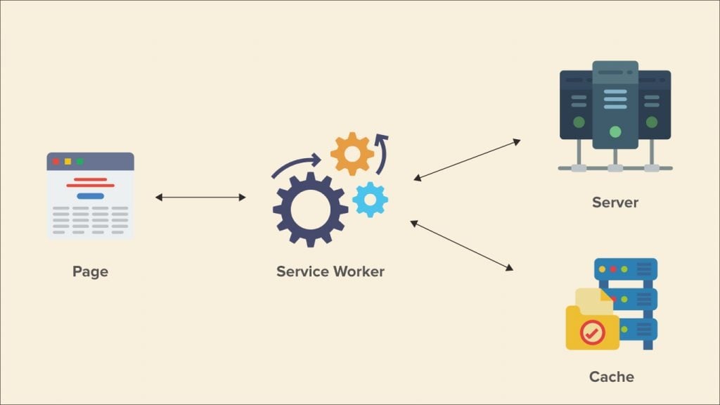
One of the primary functionalities of a service worker is acting as a proxy for handling HTTP requests to the network. This enables the service worker to cache data and allows you to cache various components that constitute your web pages, including static files, texts, fonts, styles, images, and more. By serving as an intermediary between the server and the user, the service worker significantly improves page loading speed on the user’s side.
Additionally, the service worker file is responsible for managing push notifications in PWAs. It enables the PWA to receive and handle push notifications, providing a seamless and interactive user experience. Now, let’s walk through the essential steps to set up the service worker for your Magento 2 PWA.
Step 1: Install Razzle JS Plugin
To begin, install the necessary modules and the Razzle JS plugin that enables service worker implementation in your application.
npm install razzle-plugin-serviceworker --save-dev
npm install offline-plugin --save
Step 2: Add the Service Worker to the App
Next, add the service worker to your application configuration. In this case, we’ll use the “Razzle/SW” plugin. You can include the following code in your configuration file:
module.exports = {
  plugins: ['serviceworker'],
};
Step 3: Register the Service Worker in the App
In order to register the service worker, two tasks need to be performed in the src_client.js file:
- Import the library to initialize the module with the service worker:
import * as OfflinePluginRuntime from "offline-plugin/runtime";- At the bottom of the file, register the service worker by specifying its location:
OfflinePluginRuntime.install();Step 4: Create a Simple Service Worker File
By default, your application will attempt to load the service worker from the /sw.js file. Create this file and add basic logic for caching static files. Use the following code as a starting point:
var CACHE_NAME = 'razzle-pwa-homepage';
var urlsToCache = [
  '/',
  '/styles/main.css',
  '/script/main.js'
];

self.addEventListener('install', function(event) {
  event.waitUntil(
    caches.open(CACHE_NAME)
      .then(function(cache) {
        console.log('Opened cache');
        return cache.addAll(urlsToCache);
      })
  );
});
Offline Mode Configuration
One of the key advantages of a Progressive Web Application (PWA) is the ability to provide users with offline access to the app. This offline mode is made possible through the utilization of a service worker, which enables caching of app resources.
Here’s how it works: as users browse the PWA, the pages they visit and the associated data are cached in their device’s storage. Consequently, when the internet connection is lost, users can still access the previously viewed pages and the cached data. This creates an offline illusion where users can continue using the PWA, albeit limited to previously accessed content.

However, certain dynamic actions, such as adding products to the cart, can still be performed. These actions are stored in a queue and will be processed and synchronized with the server once the internet connection is restored. This ensures that any changes made during offline usage will be reflected when connectivity is regained.
Implementing data caching for offline mode in a PWA involves employing various strategies, typically executed through the Service Worker and Cache API. Let’s explore some of the main caching strategies.
Service Worker and Just Cache
As mentioned earlier, the service worker solution is most suitable for static data that remains largely unchanged. This includes content pages, the homepage, and product pages, among others.
In a simple scenario, the service worker fetches and caches all the requested resources. When the PWA is accessed in offline mode, the pages are generated using the static data stored in the cache. If any data is not cached, the user will not have access to it.
Cache depending on the network
Another approach to offline mode is utilizing the service worker to fetch data from the cache. However, there is a slight difference compared to the previous method. If the requested data is not available in the cache, the service worker will fall back to the API and retrieve the data from the network.
In this scenario, users will have access to data, although the results may not reflect the most recent updates. The service worker acts as an intermediary, first checking the cache for the requested data. If it’s present, the cached data is served to the user. If not, the service worker makes a network request to fetch the data from the API.
Cache or Network
In this approach, the data requests are handled in a slightly different manner compared to the previous method. Instead of a sequential process where the service worker first checks the cache and then falls back to the network, the data is fetched from either the cache or the API, depending on which one responds faster. This approach prioritizes speed over the order of retrieval.
When a data request is made, the service worker simultaneously checks both the cache and the network. Whichever source delivers the data first is used to fulfill the request. This ensures that users receive the data as quickly as possible, without waiting for a complete sequential check.
To avoid any data inconsistencies, it is crucial to update the cache whenever the data is successfully fetched from the API. By keeping the cache up-to-date, the service worker can continue delivering the most recent data to users, even in offline mode.
Network first, then cache
This approach involves the service worker initially requesting data from the network. If a successful response is received, the data is updated in the cache accordingly. However, if the service worker fails to retrieve data from the API, it falls back to the cache to provide the requested results.
This method is often considered an effective choice as it ensures the PWA displays the freshest data and remains accessible even in offline mode. By prioritizing the network for data retrieval, the PWA can deliver up-to-date information to users. In cases where the network is unavailable, the cached data is still accessible, ensuring a seamless user experience.
It is important to note that this approach may introduce a slight delay in data retrieval, as the service worker checks the network first before resorting to the cache. However, the benefits of displaying the most recent data and maintaining offline accessibility outweigh this minor drawback.
Cache first, then API
The final approach involves pulling data from the cache, prioritizing its speed over network requests. The cached data is initially displayed to the user. Subsequently, the service worker updates the cached data with information retrieved from the network. This method is particularly useful for handling dynamic data in a PWA while offline.
With this approach, users are first presented with the cached data, allowing for a quick and seamless experience. As the service worker retrieves fresh data from the API, the cached content is updated, ensuring the latest information is available for subsequent interactions. While this method can be challenging to implement, it offers an exceptional solution for displaying dynamic data in a PWA even when offline.
Server-side Rendering
Server-Side Rendering (SSR) is a technique that involves generating the complete HTML of a web page on the server and sending it as a response to the client. With SSR, the server takes on the responsibility of rendering the page instead of relying on the client’s browser to do so.
The main advantage of SSR is that it provides a faster initial rendering of the page. Since the server delivers the fully formed HTML, there is no need for additional data requests from the client. This reduces the time required to display the content to the user, resulting in a quicker and more seamless experience. Additionally, SSR helps to minimize the amount of JavaScript sent to the client, which can be beneficial for devices with limited processing power or slower network connections.
Another benefit of SSR is that it allows for better browser optimization. The server can optimize the rendering process and deliver optimized HTML tailored to the specific device or network conditions. This optimization can lead to improved performance and a more efficient user experience.
However, it’s important to note that SSR can have drawbacks as well. One of the main drawbacks is the increased server load and potential latency when generating the HTML for each request. This can result in slightly longer page load times compared to client-side rendering. Additionally, SSR requires the entire code to be loaded from scratch for each page refresh or navigation, which can impact the overall responsiveness of the application.
There are several approaches to handle server-side rendering (SSR) for progressive web applications (PWAs). Let’s explore these options:
Headless Browser
One approach is to use a headless browser, which can be integrated into the server using tools like Selenium or Puppeteer. In this scenario, the backend acts as a headless browser and is responsible for handling data rather than rendering the page. The requested page content is rendered on the server’s side, separate from the browser, and then returned to the user. This approach allows for faster page loading and reduces the load on the server, resulting in improved performance.
Node.js
Another option is to leverage Node.js for SSR. This custom solution is commonly used for building complex PWAs. Node.js allows for server-side rendering by executing JavaScript code on the server, enabling the generation of complete HTML pages to be sent to the client.
Razzle (or similar tools)
Razzle is a tool we used in the example of our PWA homepage. It simplifies SSR setups and provides an intuitive way to implement server-side rendering. Alternatively, you can explore other tools like Next.js or react-ssr, which internally use a Node.js server for rendering JavaScript. If you choose a different tool, you may need to handle variables that are not present on the frontend, such as window/document, and libraries can help emulate these variables on the server.
Proxy
The fourth option is to use a proxy server as a mediator between the server and Magento. The proxy receives a template of the page and inserts data from the cache (Redis or Elasticsearch), eliminating the need for the server to make direct calls to Magento. This approach can be highly performant, but it requires careful caching of data in advance or storing separate page blocks. The challenge lies in generating and dynamically updating the data for each block of the page.
Implementing server-side rendering using a proxy can be time-consuming and requires additional work, but it can result in exceptional performance for your PWA.
In Conclusion,
Creating a Magento PWA storefront may require expertise and technical know-how, but the results are undoubtedly rewarding. With the right UX/UI solutions, a PWA can provide a native app-like experience for users. By developing a solid frontend, and implementing effective SSR, the PWA can deliver exceptional and seamless navigation.
While the process may seem daunting, our team of Magento-certified experts is here to provide advanced consultancy and dedicated support. Don’t hesitate to reach out to us and unlock the full potential of PWAs for your online business. Contact us today and embark on your PWA journey with confidence.


