Building an eCommerce product page plays a necessary role in determining traffic as well as conversions on the sales website, like some famous eCommerce product page examples. If the website owner knows how to optimize it effectively, they can overcome the barriers of Google’s algorithm as well as the threat of the highly competitive market.
In today’s post, we will talk about the role of building high-converting product pages, and successful eCommerce product page examples, as well as guide you through useful tips to make your Magento eCommerce product page more engaging, have the best eCommerce product page design, and more.
Table of Contents
What Is an eCommerce Product Page?
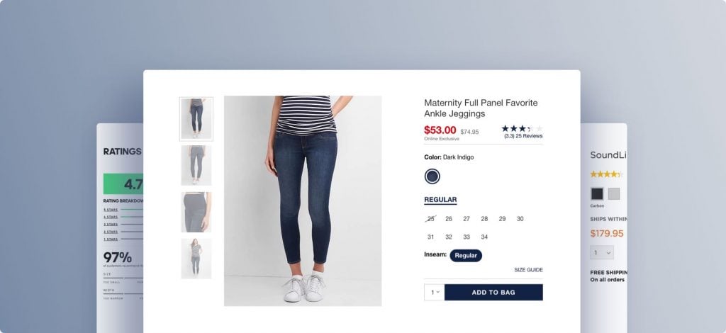
An eCommerce product page is defined as a page including product information such as features, manufacturer, price, reviews, etc. Here is an example to make it easier for you to visualize.
After accessing an online store, you want to find a product. So, you navigate to the product section or search directly on the search bar on the website. After that, a page on the website will pop up with different products and you click one.
On this next page, you can see all the detailed information related to the product you have just seen, including photos, the price, place of manufacture, color options, size, reviews, etc. This page is called an eCommerce product page.
So why are they investing in the eCommerce product page like that?
Definitely, because it brings great benefits to the owners of those websites. If you want to know what they are, move to the next section.
Top 9 Best eCommerce Product Page Examples
The design, content, and functionality of these pages play a crucial role in converting visitors into customers. The best eCommerce product pages manage to blend aesthetics, user experience, and persuasive content, creating an environment that encourages sales.
Below, we’ve curated a list of top-notch eCommerce product page examples from various eCommerce platforms, including Magento, Shopify, and WooCommerce, highlighting what makes each of them exceptional and effective in their own right.
Magento Product Page Examples
Land Rover
This is one of the Magento product page examples that specializes in all-terrain vehicles and SUVs and is appreciated for its user-friendly website layout and design. Any of its high-converting product pages display products and special deals in carousel pictures on a white background.
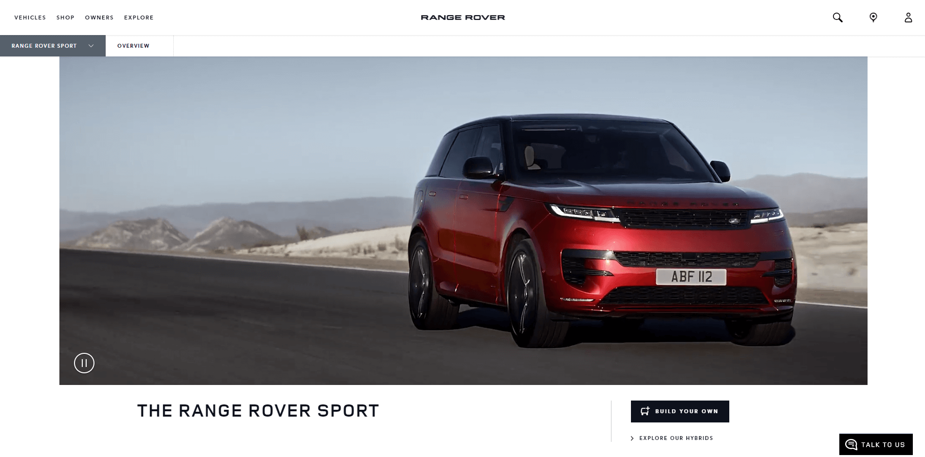
The product page features high-resolution images of the Range Rover Sport from various angles, showcasing the vehicle in different environments. A video tour of the car, highlighting key features and showcasing it in action, would also be included.
Customers would also have the ability to customize their Range Rover Sport directly on the product page, choosing from different colors, finishes, and additional features. Additionally, a comprehensive description detailing the Range Rover Sport’s features, specifications, performance, and available customizations is provided.
Helly Hansen
This nearly 150-year-old clothing brand has used Magento 2 as a platform that can help it run 30 stores globally with a total of 6 languages. The specific feature of this website is advanced integrations such as WordPress and Salesforce to keep visitors and repeat clients engaged.
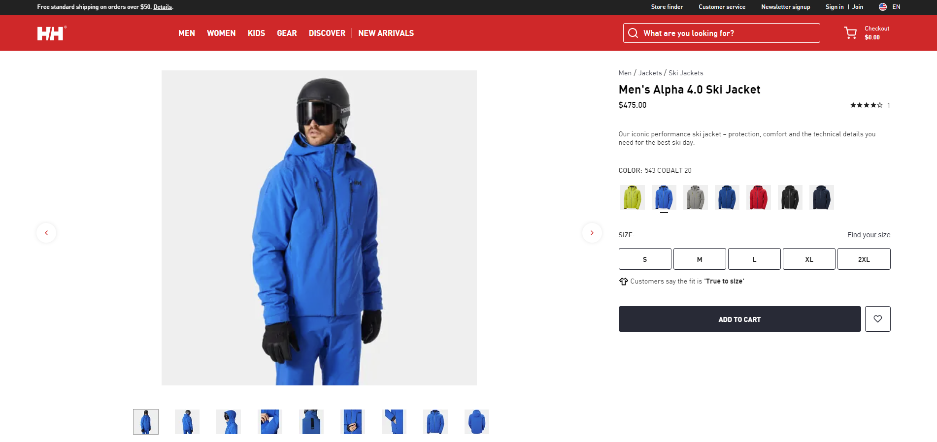
On the main page, you may find several categories that lead to the mentioned subcategories that assist users in selecting the most appealing goods. These factors make Helly Hansen one of the most eCommerce product page examples merchants should refer to.
As you can see, the product page features high-quality images of the jacket from various angles, as well as close-up shots to showcase the material, zippers, and other details. The images might also show the jacket being worn in different settings, highlighting its versatility.
Customers are able to choose from different available colors and sizes directly on the product page. The availability of each option would be updated in real time. A detailed size guide, possibly with a fit calculator tool, would help customers find their perfect size. Information about the fit of the jacket (e.g., regular, slim, or relaxed) might also be included.
Byredo
Being the best eCommerce product page design, Byredo won’t disappoint you because of its impressive and unique features. When you visit the eCommerce product page of Byredo, you will see the brand’s emotions clearly expressed with a minimalist, elegant design, and plenty of white space to let the product images and details stand out.
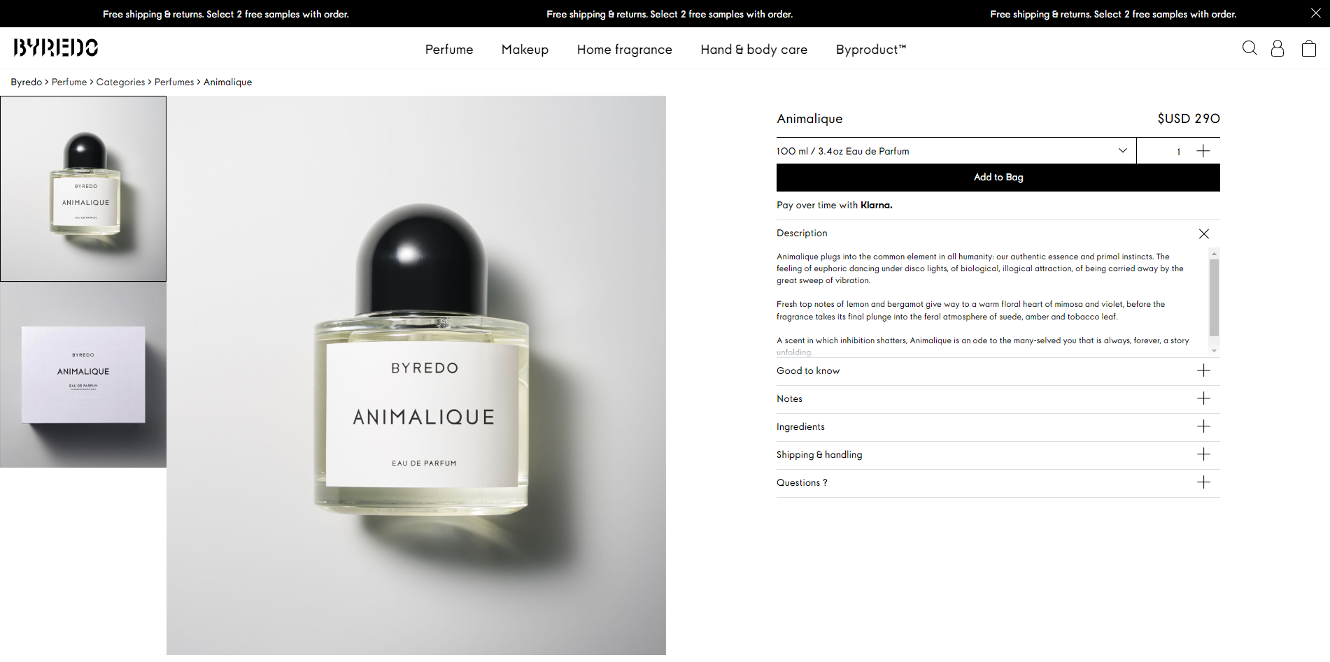
A compelling product description would highlight the unique notes of the Animalique scent, as well as the inspiration behind the fragrance. The description would also detail the size and concentration of the perfume. The page also provides a clear breakdown of the top, heart, and base notes of the Animalique fragrance, helping customers understand the scent profile and complexity of the perfume.
This website platform allows it to be further improved in arrangement and organization, making it easier and more flexible for developers to customize.
WooCommerce Product Page Examples
Sodashi
Sodashi, a luxury skincare brand known for its natural and effective products, might use WooCommerce for its online store given the platform’s flexibility and customization options. The product page reflects Sodashi’s luxury branding with a clean, elegant design, incorporating soothing colors and white space to allow the product imagery and details to shine.
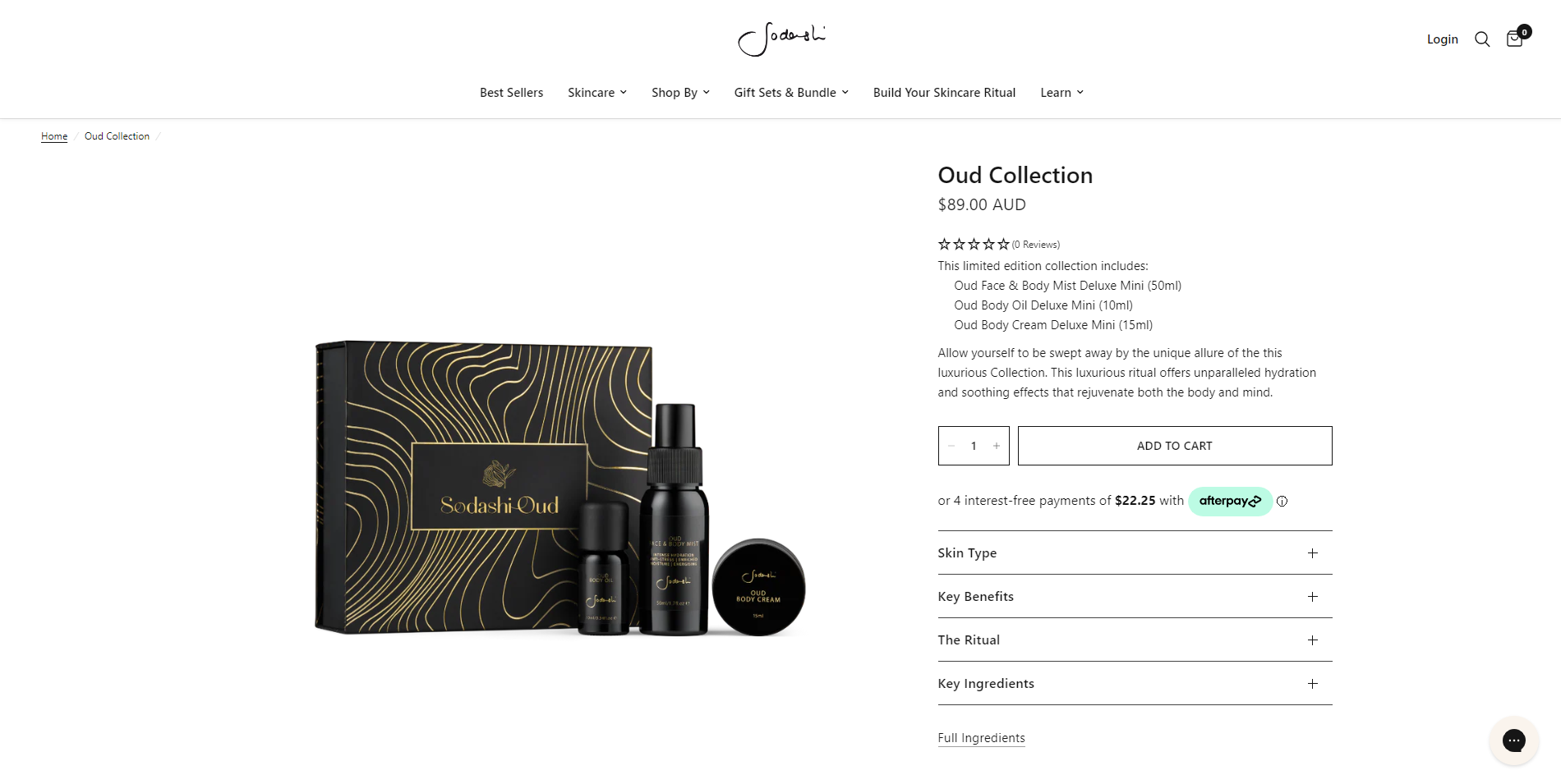
A comprehensive product description provides information about the benefits of the Oud Collection, its key ingredients, and how to use it. The description would also convey the brand’s commitment to natural, ethical skincare.
A complete list of ingredients is also provided, ensuring transparency and helping customers to make informed decisions, particularly those with specific skincare needs or sensitivities.
Heymat
Heymat, known for its high-quality and beautifully designed mats, might utilize WooCommerce for its online storefront. A product page on this platform would need to convey the quality and design of the products effectively while providing a smooth user experience.
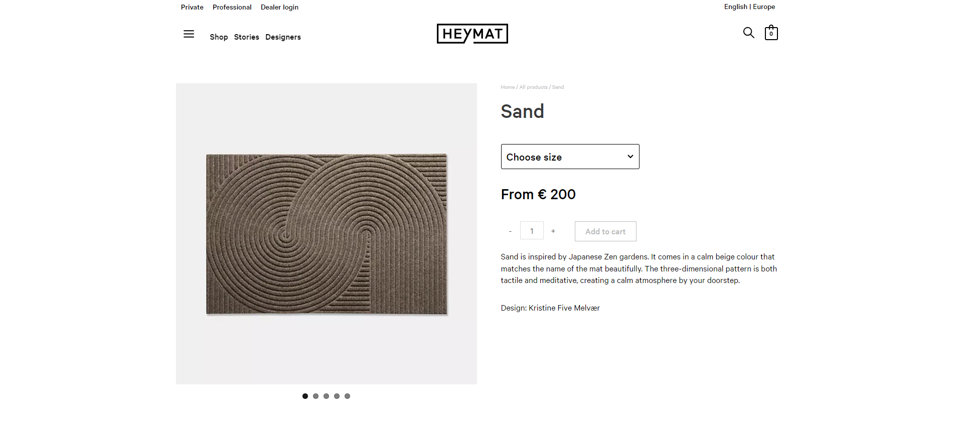
High-resolution images are featured on the product page, showing the mat in various settings, and highlighting its design and texture. There might also be close-up shots to showcase the material quality and weave detail. The price is displayed clearly and indicates whether the mat is in stock or if there is an expected wait time for delivery.
In addition, a detailed product description highlights the mat’s features, such as its durability, ease of cleaning, and the story behind its design including the designer of the product. The materials used and any unique manufacturing processes would also be described.
Clever Elly
This car device brand reminds drivers to check their back seats before entering to ensure that children are safe. Because of the impactful story behind their innovation, their page has to express their product’s meanings, mainly focusing on the brand words.
With a light grey backdrop and plenty of negative space between crisp, black text components, this design is incredibly minimalistic. The entire website strongly emphasizes words, phrases, and buttons.
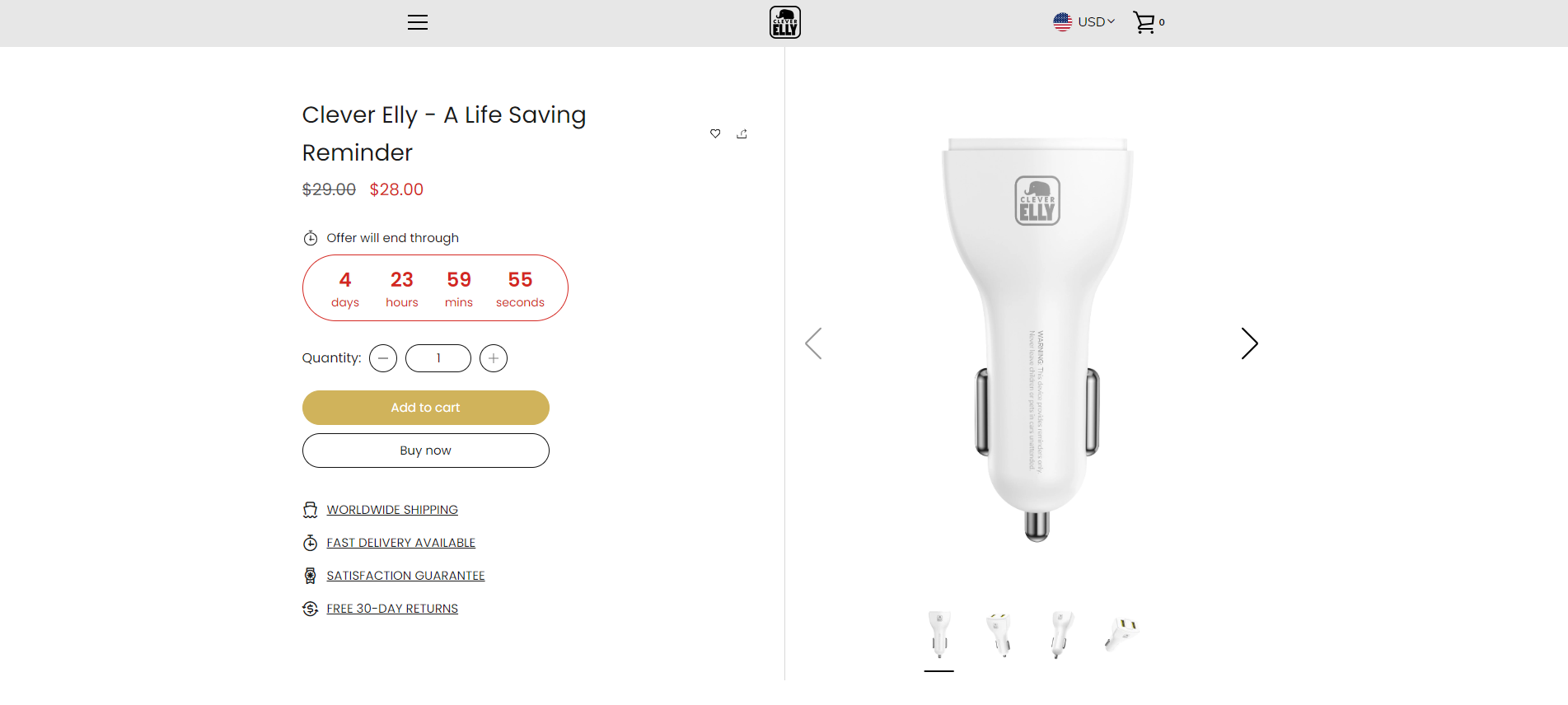
The product page is really straightforward, with a white background and simple text font, a small logo at the top of the page, so customers will feel comfortable and pleasant. Not too outstanding, however, with this minimal style, Clever Elly is really one of the best WooCommerce product pages.
Shopify Product Page Examples
Ratio Coffee
This is a lovely business with a well-balanced color palette and a fluid scrolling mechanism that reflects the sophistication of its products. Visitors are drawn to the Ratio Coffee community by a video backdrop, engaging words, and a straightforward CTA button.
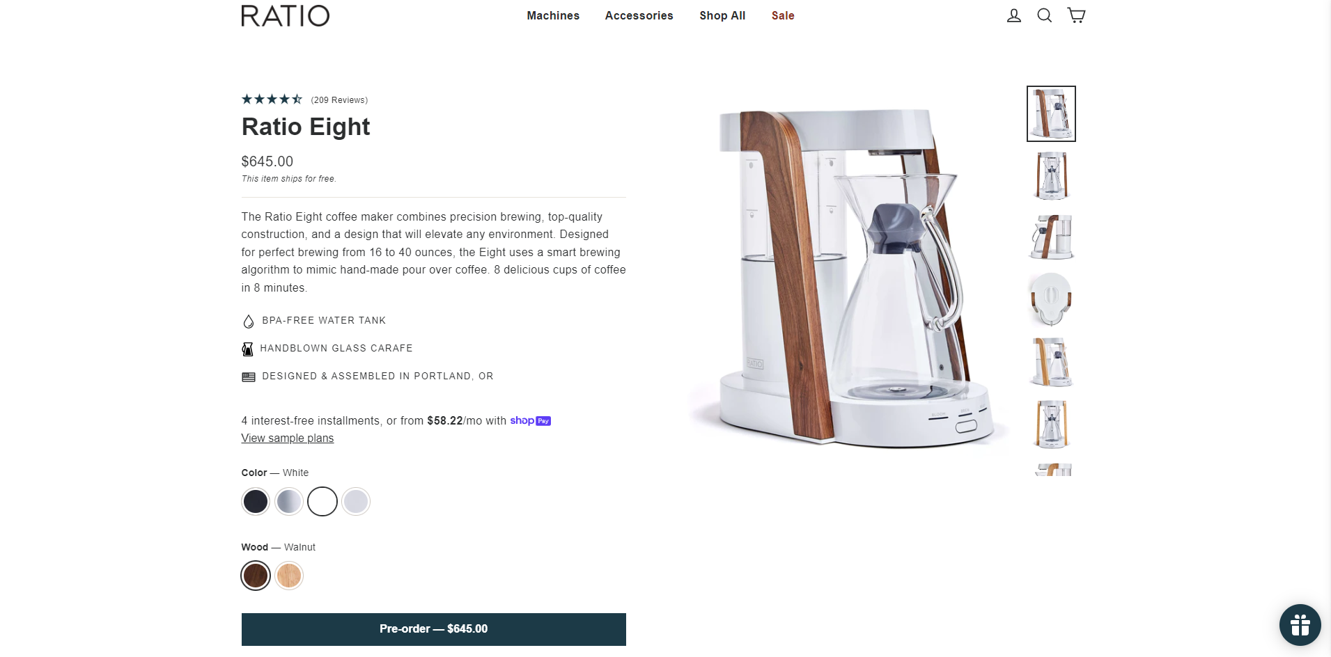
A clear list of specifications and features, such as the machine’s dimensions, capacity, and material construction, is also provided to help customers understand exactly what they are purchasing.
The product page would clearly display the price of the Ratio Eight Coffee Maker and indicate whether it is currently in stock. Any promotions or discounts currently available will also be highlighted.
Its website’s humorous and entertaining articles make it one of the most remarkable Shopify product page examples.
Kettle & Fire
Kettle & Fire is a brand selling tasty bone broths and soups that can be stored in your cupboard for up to two years. The product detail page appears to contain a slider of different product photos and short information about nutrition labels, what’s inside infographics, and more.
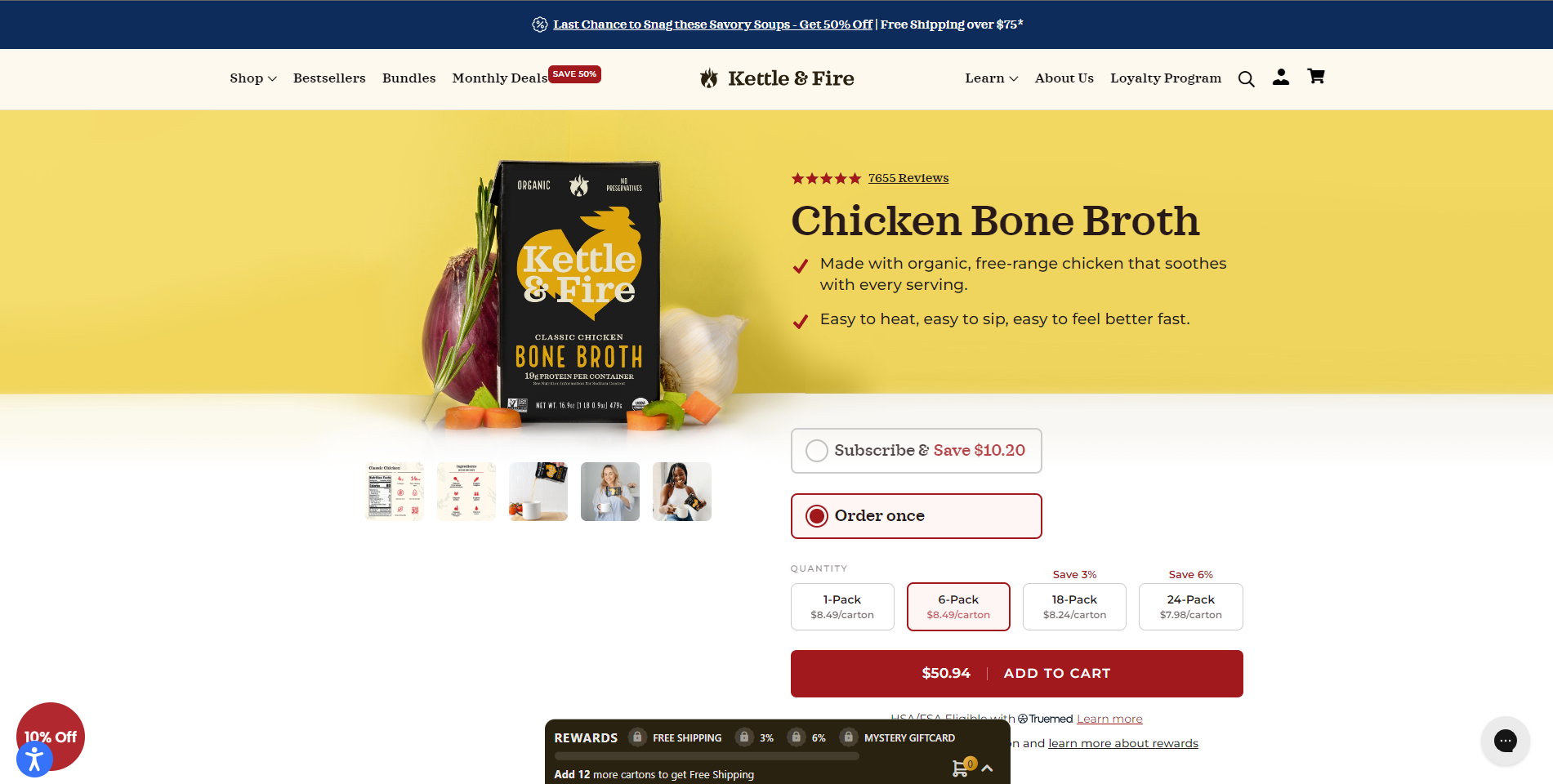
A section for customer reviews and testimonials allows potential buyers to read about others’ experiences with the product, providing valuable social proof and additional insight. The product page also clearly displays the price per carton, and offers package deals for purchasing multiple cartons at once, providing an incentive for larger purchases.
This design is similar to the Amazon listing page. Customer reviews are emphasized beneath the product name, and bulleted lists are utilized to provide information in a clear manner. Simple but harmonious, Kettle & Fire is really on the top list of eCommerce product content examples for any merchants in the F&B industry to learn.
Haus
Haus is a home products retailer that emphasizes each item in its store with full-width pictures. The website is super user-friendly, with easy navigation making exploring product options a breeze, allowing users to quickly locate what they’re looking for.
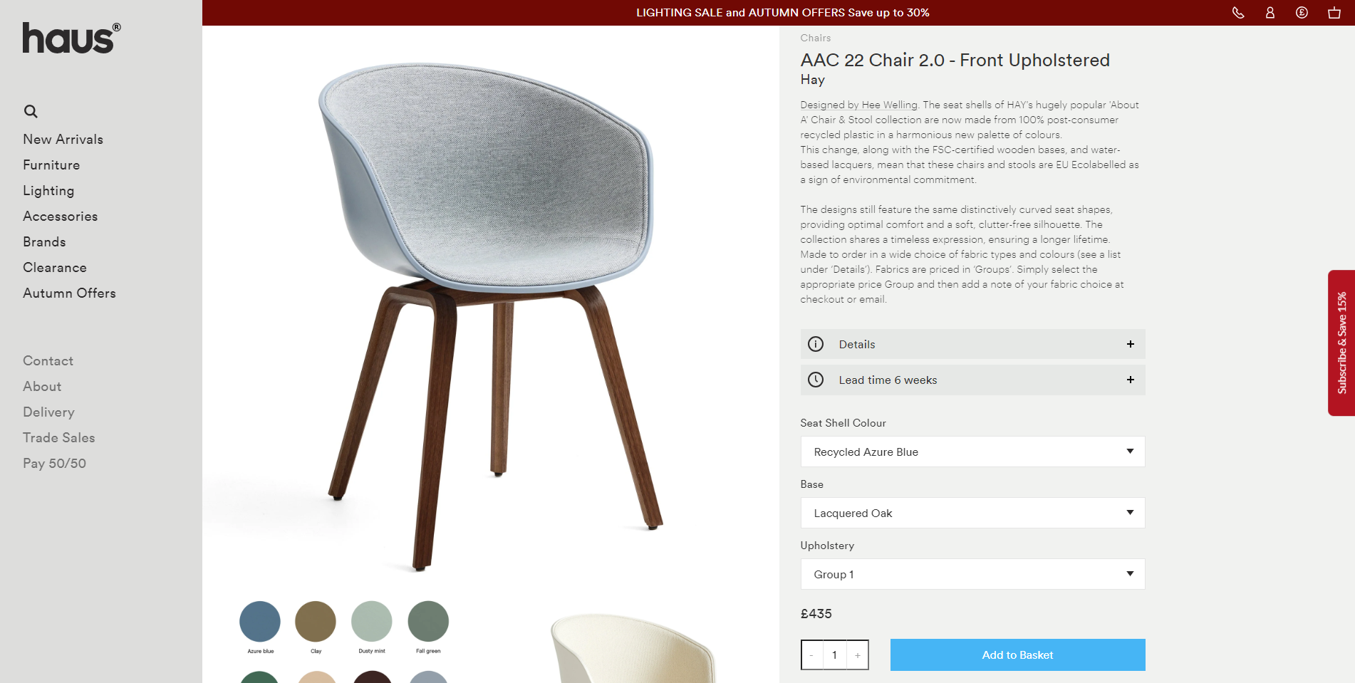
Visitors desire to spend more time exploring Haus’ items because of the visual stimulation, large strong letters, and simple navigation. High-quality images of the Haus chair from various angles, in different settings, and with close-ups of unique details and materials. The inclusion of a zoom-in feature would allow customers to view the craftsmanship and quality up close.
A comprehensive description highlighting the chair’s design inspiration, materials used, dimensions, and comfort features. Any unique selling points, like sustainable materials or handcrafted details, would also be emphasized.
The Importance of eCommerce Product Pages
To know the importance of the product page on a website, you must understand that its purpose is to introduce the business products in seconds.
Why do we describe it as a few seconds?
Because that’s the amount of time that customers will skip the product if it’s not something they need or something they don’t want to see for longer.
Fortunately, for customers to stay longer on that page, in addition to providing high-quality and affordable products, you can drive conversion rates by improving both in terms of eCommerce product page design and content. Specifically, it should have a simple, clean layout and information presented in a well-organized layout so that the viewer won’t be confused. Images should be eye-catching, and useful, and convey the correct purpose of supporting product information.
Before reaching the product page, customers will visit the website homepage first, meaning that you will need to build that homepage first, but the eCommerce product page is the deciding factor whether customers want to put the item in the cart or not.

In case customers switch to the eCommerce product page from ad campaigns or backlinks, it means your product is most likely what they need. When they access it, their purchase decision is only a few steps away. Many websites fail when they cannot motivate their customers to buy because the product page is not optimized.
Must-have Features of a Great eCommerce Product Page
A Clear CTA (Call-to-action)
It is a shortcoming if merchants forget to insert an eye-catching CTA button into their product pages. On a product page, you just have one goal: convince your consumer to click Buy (or Add to Cart, or whatever your main call-to-action button is called).
In general, it should be positioned in an outstanding position, which is directly below or to the left of the content. Based on your brand and style, the CTA button highlights characteristics and keeps the website’s style at the same time.

As one of the best eCommerce product page examples has an impressive CTA, Netflix will make you can’t help clicking the CTA button.
High-quality Product Photos and Images
Your customers cannot see, touch, and try your products before they buy. The only thing that shows your products is images, and customers will evaluate your items based on product photos. A great product always goes with crisp and clean product photos, not blurred and broken ones.
That’s why product photography is so important on product pages and virtually every expert we spoke with mentioned it as a vital component in creating a successful page. High-quality images, and similar and simple mock-ups that highlight your items will represent good products and attract more customers.
Link Products to Variants
Adding individuality to your items by naming product variants (colors, fragrances, etc.) may be a smart way to do so. But it is not easy to describe what products look like to your potential buyers by funky names and unclarified words.
Thus, linking your images to your product variants is significant. Merchants should choose suitable product variants’ images and create clear, concise descriptions that can completely depict your products to customers.
Pricing Information
If you’re selling a low-cost item, you might not require as much description as a high-end item. However, if your product is on the luxury scale, you’ll need to account in detail for prices when creating your product page.
Even if you’re not a premium brand and have no intention of becoming one, it’s important to check whether your product pages have enough content to address your consumers’ requirements. They just spend money when they have enough information about your products.
Product Information
Basic information such as material, origin, design, usage, expiry date, etc., is the thing you have to list in your products’ descriptions. The more detailed the information is, the more trustworthy the products are. Customers just believe suppliers that know products well. Thanks to clear and sufficient information, they can check your goods, compare with others, and make the best buying decision.
Attractive Website Design
User-friendliness is a vital characteristic that any eCommerce website needs. You don’t want customers to feel confused and annoyed with messy and superfluous features in your website’s interface. So, your site must have easy navigation, mobile compatibility, and simple but attractive features, or even you can consider the human element that helps your customers interact with your site.
Additionally, to recognize your site and products among thousands of competitors, your eCommerce site must have brand features – your specific identification. Your brand is more than simply your logo and social media visuals. It encompasses what you stand for, who you serve, and why you do what you do (but the visuals are important as well). Furthermore, your brand may be a crucial part of your product pages.

You should put your brand in the most visible position, like the bottom of your homepage. Merchants can impress customers as soon as they get on the website with the wording and product page design.
Aspirational Content
Customers expect your goods to solve an issue, improve their lives, or assist them in accomplishing a goal. Your product pages should make it simple for people to see how your items can help them achieve that goal.
Just think about How can products give customers more value? How can you make your brand and products relevant to your customers by incorporating them into a specific lifestyle?
When you can answer this question, you will have impressive content that will inspire your customers.
Follow eCommerce SEO Practices
You must follow the general principles of Title Tags, Meta Descriptions, Internal Linking, Descriptive headers, Snippets, Image Alt Text, and so on when executing any SEO plan. They’ll assist you in creating interesting, keyword-rich content that focuses on communicating what customers want.
Google and other search engines will base on the SEO quality of your content to enhance your ranking and assess the trustworthiness of your site.
Product Review and Social Proof
Adding some social proofs like Instagram photos, first-person testimonials, and reviews can make your site more reliable. It is the most effective method for gaining consumer trust and encouraging purchase behavior. Giving consumers reasons to believe, especially for new businesses, makes them trust you more.
Tips to Keep Your Magento eCommerce Product Page Template Outstanding
After seeing the best eCommerce product page examples, we have some eCommerce product page best practices for you to create an impressive product page on the Magento platform.
- Keep it simple and elegant: Too much information and a complex layout will not make the viewer impressed but uncomfortable.
- Use high-resolution images: High-resolution images will make your website always professional and beautiful. Besides, they will not be broken when the customer zooms them up.
- Implement videos to showcase your products: When customers can upload videos, your products will create more trust for others.
- Place pricing information outstandingly: This is one of the figures that customers are most interested in, right?
- Show your product availability clearly: Displaying this information will save your customers time choosing an item while it is out of stock.
- Prepare funny or ironic headlines: It will make customers feel impressed with the product and remember it. Also, using a different name from those provided by the manufacturer will help the product page easily enhance its rank on the search pages.
- Show each product variation: This is the basic feature to include if your product has many different color options or something like that.
- Include product reviews and ratings: Building trust in the product can be done easily with this feature.
- Provide returns and payment information: These features will help drive a customer’s buying decision as they will feel the risks of buying your product can be dealt with in a transparent and clear way.
- Feature-related or best-selling products: When customers like a product, they can buy more items that can be combined with it or buy other products with better features.
- Optimize your add-to-cart buttons: The button will make the customer purchase process faster, so don’t forget to make it outstanding.
- Minimize product page load time: You wouldn’t want customers to get frustrated and switch to other brands because all your product pages load too slowly, right?
Our last words
The eCommerce product page is the deciding factor for whether a potential customer will stay or exit your website after visiting. However, building it up isn’t as easy as many merchants think, as long as you use the Magento platform that has optimal features for any business but requires coding knowledge to build a website. So, you have to find a development company to help you design and develop your website better.
As one of the trustworthy development parties, Magenest can create a perfect eCommerce product page on the Magento platform. We assure you that your site will have optimal SEO, exceeding website features, and the best eCommerce product page design that will attract your customers. Don’t hesitate to reach out to us for further guidance!


