

Progressive Web App (PWA) is a web application that offers a user experience similar to a native app on a mobile device. It uses modern web technologies such as Service Workers, Web App Manifest, and HTTPS to deliver a fast, reliable, and engaging experience to users. In this article, we inform you how to build a Progressive Web App. This guide is mainly for junior developers or merchants who have a specific technical background and knowledge that want to learn how to create PWAs from scratch. With this guide, you will be informed about the most basic knowledge of PWA operation principles and simple PWA code samples for far learning and application development.
Table of Contents
Start a Web Server
The first thing considered in the process of building progressive web apps is that you need to host it on a web server to make it accessible to users. Why do we put this step first? Because this step is not the major thing you consider when crafting your own PWA but it still has a big impact on how you can deliver your product to users. Without a web server, you can’t implement or update a new version for your PWA, so preparing it first is a good practice in case you forget in the near future.

There’s a tip you should know is that when building a progressive web app, it’s often useful to test it locally before deploying it to a live server, which saves time and makes the development process more efficient. Here’s how to start a local server:
- There are many local development servers available, including Apache, Nginx, and Node.js. Choose one that you’re familiar with or one that’s well suited to your project’s requirements.
- Create a new folder where your local server is placed and runs. Start the local server by running the appropriate command in your terminal or command prompt:
cd path/to/your/dev/foldermkdir MagenestPWAcd MagenestPWA
- Start the server by using the HTTP-server Node.js library:
npx http-server
Now, you have your own web server running on http://localhost:8080.
One of the most important parts of PWA is Services Workers, which requires using HTTPS protocol. So when your progressive web app goes live, you need to deploy it on an HTTPS URL instead of the local server as before. There are many hosting providers available, including shared hosting, dedicated hosting, and cloud hosting. Choose one that best fits your needs, budget, and technical capabilities.
Create Your App Page
At this time, there’s no content appearing on your web server. You need to start by creating content that your users will see when encountering your web app. Here are the steps you can take to:
- Open Visual Studio Code. Why this platform? We implement comparing different coding platforms, and we see that Visual Studio Code is the most suitable and intuitive for junior developers or half-technical merchants to code HTML.
- Select File, navigate to Open Folder, and then choose the MagenestPWA directory you have created in the previous step.
- Create a new file, save the file to index.html, and then add the content in the following:
<!DOCTYPE html>
<html lang="en">
  <head>
    <meta charset="UTF-8" />
    <meta name="viewport" content="width=device-width, initial-scale=1.0" />
    <meta http-equiv="X-UA-Compatible" content="ie=edge" />
    <link rel="stylesheet" href="css/style.css" />
    <title>The Phone store PWA</title>
  </head>
  <body>
    <main>
      <nav>
        <h1>Phone store</h1>
        <ul>
          <li>Home</li>
          <li>About</li>
          <li>Blog</li>
        </ul>
      </nav>
      <div class="container"></div>
    </main>
    <script src="js/app.js"></script>
  </body>
</html>
By crafting a navigation bar using the nav tag, and then enclosing our cards in a div with the class .container that we’ll generate via JavaScript later on, we can easily develop an organized interface.
Styling Your Page
You just complete your website content with the simple HTML code above, it’s time to improve the visual by adding some CSS style to the app. Before jumping into the code, you should create a new file and save it as css/style.css.
@import url("https://fonts.googleapis.com/css?family=Nunito:400,700&display=swap");
* {
  margin: 0;
  padding: 0;
  box-sizing: border-box;
}
body {
  background: #fdfdfd;
  font-family: "Nunito", sans-serif;
  font-size: 1rem;
}
main {
  max-width: 900px;
  margin: auto;
  padding: 0.5rem;
  text-align: center;
}
nav {
  display: flex;
  justify-content: space-between;
  align-items: center;
}
ul {
  list-style: none;
  display: flex;
}

li {
  margin-right: 1rem;
}
h1 {
  color: #e74c3c;
  margin-bottom: 0.5rem;
}
We set a maximum width of 900px for the main element to ensure it appears visually appealing on large screens. In the navigation bar, the logo should be positioned on the left and the links on the right. To achieve this, we make the nav tag a flex container and then use justify-content: space-between; to align the elements properly.
After you code CSS to modify the elements on your web, continue to code CSS for other elements for far use.
.container {
  display: grid;
  grid-template-columns: repeat(auto-fit, minmax(15rem, 1fr));
  grid-gap: 1rem;
  justify-content: center;
  align-items: center;
  margin: auto;
  padding: 1rem 0;
}
.card {
  display: flex;
  align-items: center;
  flex-direction: column;
  width: 15rem auto;
  height: 15rem;
  background: #fff;
  box-shadow: 0 10px 20px rgba(0, 0, 0, 0.19), 0 6px 6px rgba(0, 0, 0, 0.23);
  border-radius: 10px;
  margin: auto;
  overflow: hidden;
}
.card--avatar {
  width: 100%;
  height: 10rem;
  object-fit: cover;
}
.card--title {
  color: #222;
  font-weight: 700;
  text-transform: capitalize;
  font-size: 1.1rem;
  margin-top: 0.5rem;
}
.card--link {
  text-decoration: none;
  background: #db4938;
  color: #fff;
  padding: 0.3rem 1rem;
  border-radius: 20px;
}
We will have multiple cards, so the container element will be displayed as a grid. With grid-template-columns: repeat(auto-fit, minmax(15rem, 1fr)), the cards will now be responsive, meaning they will have a minimum width of 15rem if sufficient space is available, and will take up 1 fraction of the available space if not. To make the cards visually appealing, we have added a double shadow effect to the .card class and set object-fit: cover on the .card–avatar class to prevent images from stretching.
Notice that you don’t need to open the file index.html again to reference the new CSS file because you inserted the code <link rel=”stylesheet” href=”css/style.css” /> in the <head> tag before.
Use Javascript to Show Your Data
To demonstrate the potency of service workers, I chose to use larger images that may take some seconds longer to load. To begin our project, we need to select the .container class which will store all our cards. Before that, you need to create a new file and save it as js/app.js.
const container = document.querySelector(".container")
const phones = [
  { name: "IphoneX", image: "images/phone1.jpg" },
  { name: "IphoneXS", image: "images/phone2.jpg" },
  { name: "Iphone11", image: "images/phone3.jpg" },
  { name: "Iphone11Pro", image: "images/phone4.jpg" },
  { name: "Iphone12", image: "images/phone5.jpg" },
  { name: "Iphone12Pro", image: "images/phone6.jpg" },
  { name: "Iphone13", image: "images/phone7.jpg" },
  { name: "Iphone13Pro", image: "images/phone8.jpg" },
  { name: "Iphone14", image: "images/phone9.jpg" },
]
After that, we build an array of cards featuring names and pictures.
const showPhones = () => {
  let output = ""
  phones.forEach(
    ({ name, image }) =>
      (output += `
              <div class="card">
                <img class="card--avatar" src=${image} />
                <h1 class="card--title">${name}</h1>
                <a class="card--link" href="#">Technology</a>
              </div>
              `)
  )
  container.innerHTML = output
}

document.addEventListener("DOMContentLoaded", showPhones)
By using the above code, we are now able to loop through an array and display its contents in our HTML file. To ensure everything runs smoothly, we need only wait for the DOM (Document Object Model) content to finish loading before running the showPhones method.
We’ve accomplished a great deal, but as of now we still have an ordinary web app. Here’s our chance to transform that and integrate some progressive web application features in the following section.
Create Web App Manifest
The web app manifest is a simple JSON file that provides information about a Progressive Web App (PWA) to the browser. It’s used to control how the app appears to the user and how it’s launched. Some of the information included in a web app manifest include:
- The authoritative name of the website
- A condensed version of that name (suitable for icons)
- The theme color of the website for the OS integration
- The background color of the website for the OS integration
- The boundaries of the progressive web app’s URL reach are restricted
- All new instances of the progressive web app will automatically open to its start URL
- A description that is understandable to humans
- Orientation restrictions (this should not be altered from any unless there is a strict technical limitation)
- To ensure your website looks professional, you should include icons on the home screen
Great! Now that we understand what a web manifest is, let’s create the required file for it. Inside the root folder of your website, name the new document manifest.json. Then add this code block below to successfully finish creating a web manifest.
{
  "name": "Phone store",
  "short_name": "PhoneStore",
  "start_url": "index.html",
  "display": "standalone",
  "background_color": "#fdfdfd",
  "theme_color": "#db4938",
  "orientation": "portrait-primary",
  "icons": [
    {
      "src": "/images/icons/icon-72x72.png",
      "type": "image/png", "sizes": "72x72"
    },
    {
      "src": "/images/icons/icon-96x96.png",
      "type": "image/png", "sizes": "96x96"
    },
    {
      "src": "/images/icons/icon-128x128.png",
      "type": "image/png", "sizes": "128x128"
    },
    {
      "src": "/images/icons/icon-144x144.png",
      "type": "image/png", "sizes": "144x144"
    },
    {
      "src": "/images/icons/icon-152x152.png",
      "type": "image/png", "sizes": "152x152"
    },
    {
      "src": "/images/icons/icon-192x192.png",
      "type": "image/png", "sizes": "192x192"
    },
    {
      "src": "/images/icons/icon-384x384.png",
      "type": "image/png", "sizes": "384x384"
    },
    {
      "src": "/images/icons/icon-512x512.png",
      "type": "image/png", "sizes": "512x512"
    }
  ]
}
Add the Manifest to Your HTML File
Now that we have a web app manifest ready to go, let’s incorporate it into our HTML document. To ensure the success of your app, I highly recommend adding an HTML link to the manifest file in either your lowest-level HTML template or main index.html for client-side web apps. This process is fast and easy; just add this line of code to the <head> section. With this step complete, you can rest assured that all browsers will be able to access and install your application with ease.
<link rel="manifest" href="manifest.json" />Create the Service Worker
Your browser functions as a script known as a service worker in the background on an independent thread, meaning that it is entirely separate from your webpage and cannot manipulate any of its DOM elements. This is why so many people find this type of program to be incredibly helpful when dealing with website-related tasks.
Nonetheless, its capabilities are immeasurable. The service worker is capable of intercepting and regulating network requests to make sure your website can support offline functions or even dispatch push notifications directly to users.
As service workers have the capability to observe and manage requests, Progressive Web Applications (PWAs) necessitate security by being exclusively available over HTTPS.
Let’s get started and create our premier service worker in the root folder, calling it whatever you’d like (we suggest serviceWorker.js). Placing your SW at this level gives it access to all of your subdirectories.
Cache the Assets
const staticPhoneStore = "phone-store-site-v1"
const assets = [
  "/",
  "/index.html",
  "/css/style.css",
  "/js/app.js",
  "/images/phone1.jpg",
  "/images/phone2.jpg",
  "/images/phone3.jpg",
  "/images/phone4.jpg",
  "/images/phone5.jpg",
  "/images/phone6.jpg",
  "/images/phone7.jpg",
  "/images/phone8.jpg",
  "/images/phone9.jpg",
]

self.addEventListener("install", installEvent => {
  installEvent.waitUntil(
    caches.open(staticPhoneStore).then(cache => {
      cache.addAll(assets)
    })
  )
})
To implement our caching system, named staticPhoneStore, and to store the assets within it, we must specify a listener on self. This is essential for us to complete this action. Self is the service worker itself, and it grants us the opportunity to take action in response to life-cycle events.
The service worker has multiple life cycles, with the installation event being one of them. This cycle is specifically initiated when a service worker is installed and can only be used once for each individual instance. It runs immediately after the installation process completes and provides an opportunity to set up any resources that are needed right away.
After the install event has been triggered, our callback is initiated which allows us to access the associated event object. It may require a tad of patience for the browser to cache something since this process happens asynchronously.
To efficiently manage this process, waitUntil() should be utilized. This method will delay any action until it is completed. After the cache API is ready, executing the open() method will let us manufacture our own cache by passing its identifier as a parameter to caches.open(staticPhoneStore). Then, it returns a promise that grants us the ability to store our assets in the cache with the cache.addAll(assets), paving our way for future success.
We have remarkably achieved asset caching in the browser. Next time we open up the site, our service worker will take care of it and fetch it from the cache when there’s no internet connection.
Fetch the Assets
self.addEventListener("fetch", fetchEvent => {
  fetchEvent.respondWith(
    caches.match(fetchEvent.request).then(res => {
      return res || fetch(fetchEvent.request)
    })
  )
})
Here, we utilize the fetch event to acquire our data. Once this is completed, it gives us access to the fetchEvent as a callback for preventing the browser’s default response. To do so, respondWith() must be implemented – and since fetching an action can take time, it returns a promise instead.
Once the cache is ready, we utilize caches.match(fetchEvent.request) to see if any assets in our array of resources match fetchEvent.request when requested by a user. In other words, it will check if there’s something suitable stored within your cache for an individual query. Subsequently, it yields a promise. Finally, we can return the result if available or proceed with the initial fetching process otherwise.
With the service worker, our assets can now be cached and quickly retrieved, drastically reducing loading times for images. It is of utmost importance that we make our app available in offline mode, and a service worker alone can’t do the job, it needs to be registered into our project.
Register the Service Worker
if ("serviceWorker" in navigator) {
  window.addEventListener("load", function() {
    navigator.serviceWorker
      .register("/serviceWorker.js")
      .then(res => console.log("service worker registered"))
      .catch(err => console.log("service worker not registered", err))
  })
}
To begin, we must first assess whether the present browser supports serviceWorker (since it still isn’t backed by all web browsers). Afterward, we listen for the page load event to register our service worker by passing its file name of serviceWorker.js as a parameter in navigator.serviceWorker.register(). This allows us to install and utilize our reliable web application conveniently while still accessing information quickly whenever needed.
By updating our web app, we have now converted it into a modern and improved PWA.
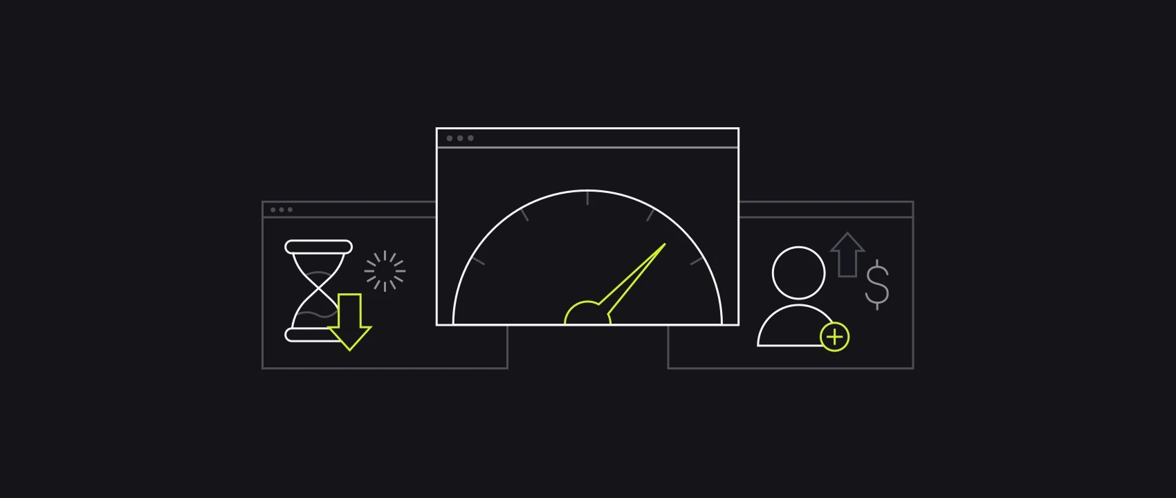
Analyze App Performance
The core impact of PWAs lies in their performance. It is crucial to ensure that your app runs smoothly and swiftly in all network conditions, even without the support of service worker technology. This is known as progressive enhancement, where you provide a great user experience for everyone, regardless of their device or network conditions. Caching and offline capabilities can improve performance, but it’s important to focus on speed as well.
To measure performance, the RAIL system is a useful set of metrics. It’s a user-centric performance model created by Google, which provides guidelines for measuring the app’s performance. RAIL stands for Response (the time taken by the app to respond to user actions), Animation (keeping animation speed at 60fps), Idle (using idle time to load and cache additional assets), and Load (loading the app in one second or less).
Audit Your PWA With Lighthouse
Lighthouse is a tool developed by Google that can be used to audit the performance, accessibility, and SEO of a PWA. It can be run as a Chrome extension, a Node CLI, or through the DevTools in Chrome.
To audit a PWA with Lighthouse, simply navigate to the PWA in Chrome and open the DevTools. From there, click on the Lighthouse tab and select the type of audit you want to run. You can choose from a variety of options, including performance, accessibility, best practices, and SEO.

Lighthouse will then run a series of tests on your PWA and generate a report with a score for each category. The report will also include specific suggestions for improving your PWA’s performance, accessibility, and SEO.
By using Lighthouse to audit your PWA, you can identify areas for improvement and make changes to ensure that your PWA provides the best possible user experience.
In conclusion,
In this article, we have explored the way how to build a progressive web app and the fantastic opportunities provided by PWAs. By incorporating a web app manifest file and utilizing service workers, a classic web app becomes faster, more secure, and more reliable, plus they offer an offline mode. Ultimately leading to an enhanced user experience for all involved.
However, for many merchants who have zero experience in technical knowledge and practices, to build progressive web apps may be a haunt. Therefore, don’t hesitate to discover our Magento PWA Development Service and contact our Magento-certified experts for advanced consultancy and dedicated support.


