Creating an eCommerce website can be a daunting task. But with the right tools and design strategies, you can create a website that is both visually appealing and functional. In this blog post, we will discuss some tips on how to design an eCommerce website that will help you attract customers, enhance eCommerce website UX, and sell your products or services. So let’s get started!
Table of Contents
Essential design sectors of an eCommerce website to keep in mind
It is important to consider the design elements of typical eCommerce websites before getting to know how to design an eCommerce website.
Homepage Design
Never waste the opportunity to make a solid first impression on the homepage. It is where you may introduce strangers to your brand. These new visitors ought to be able to quickly grasp the fundamentals of your company.
However, you also don’t want to pull them into product chaos too early by using your homepage as a products/services listing. So, what should therefore be on your homepage?

- Attractive title: The ability to capture users’ attention with a concise word that conveys the essence of your product or products can be quite effective. Additionally, it is where you can advertise any sales or promotions.
- A clear call to action: A call to action (CTA) that is related to the product(s) you sell should come after your title. Choose a formulation that closely resembles your brand’s personality.
- Images of your products being used: High-quality images convey professionalism and foster clients’ trust. Given that online buyers rarely have the time to read a thousand words, use lots of visuals to convey your message.
- List bestsellers for the highlighted item: Even while your homepage shouldn’t be a catalog of your products, you can nonetheless highlight some of your standout offerings there.
Category Page Design
In most cases, users access a listing (or category) page by typing a keyword into the search bar or choosing a product category from the menu. It also implies that they are beginning to become curious. They can get a list of every item linked with the category that is closest to their current requirement there.
Of course, categorizing your products may not be necessary if you just offer a small number of them. If so, every item you sell will be listed on the listing page.
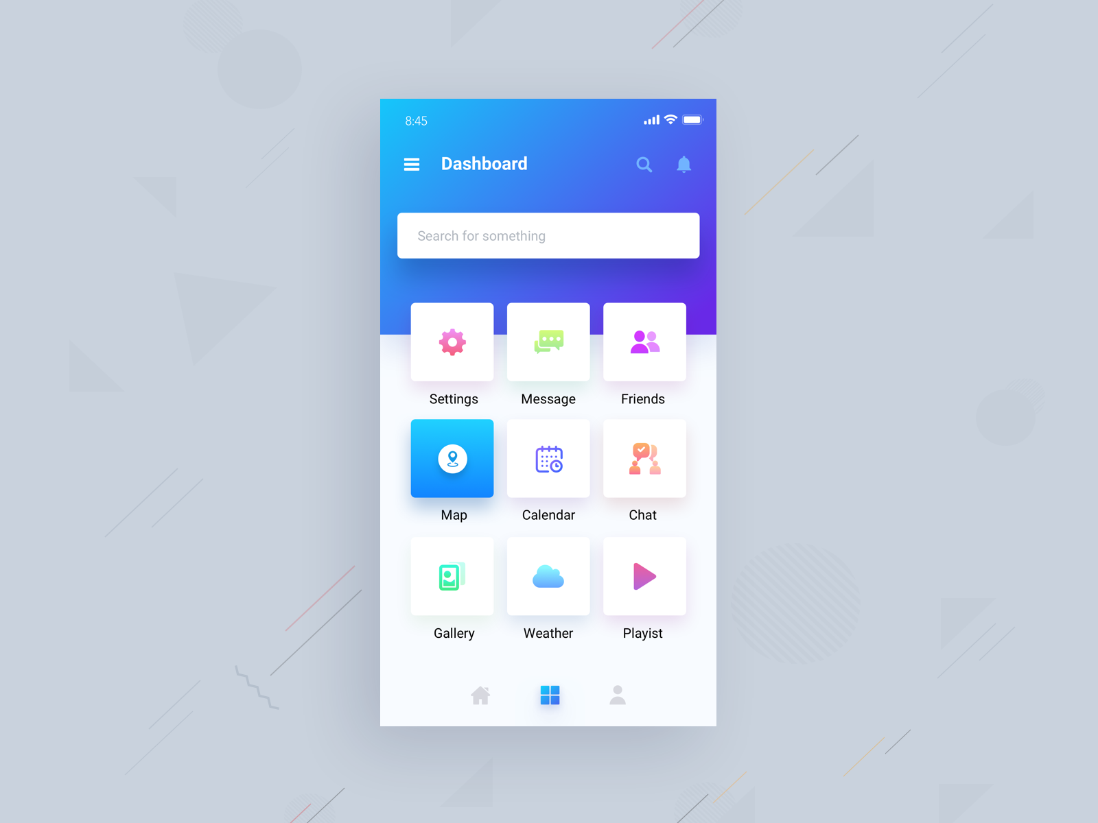
Some tips to build this page:
- Include category introduction
- Enable filtering and sorting functions
- Highlight best sellers & reviews
- Show stock availability
However, should you list your products in a list view instead of a grid view given that the two have different functions?
- For products that require detailed information and long descriptions, a list view is more appropriate. These might be sophisticated or technical goods.
- On the other hand, products that require more of a visual presentation and little to no explanation are well suited for a grid view. Additionally, this style makes it simple to compare products side by side.
Product Page Design
This page needs to be as similar to a real shopping experience as possible in order to make the transition to the next stage easier. This means that images, descriptions, and specs need to be sufficiently detailed to provide customers the trust to make purchases and receive what they paid for.
The following are the crucial components of a product page and how they have to be created properly:
Product descriptions
The best place to go into additional detail about what you’re selling is in the product description. It ought to address as many issues as it can.
It’s best to have an overview of the item and a buy button, along with a full description underneath, OR a “read more” link that moves a modal window containing more information.
Some items demand a lot of specs and information. Use tabs to keep the information organized in these situations.
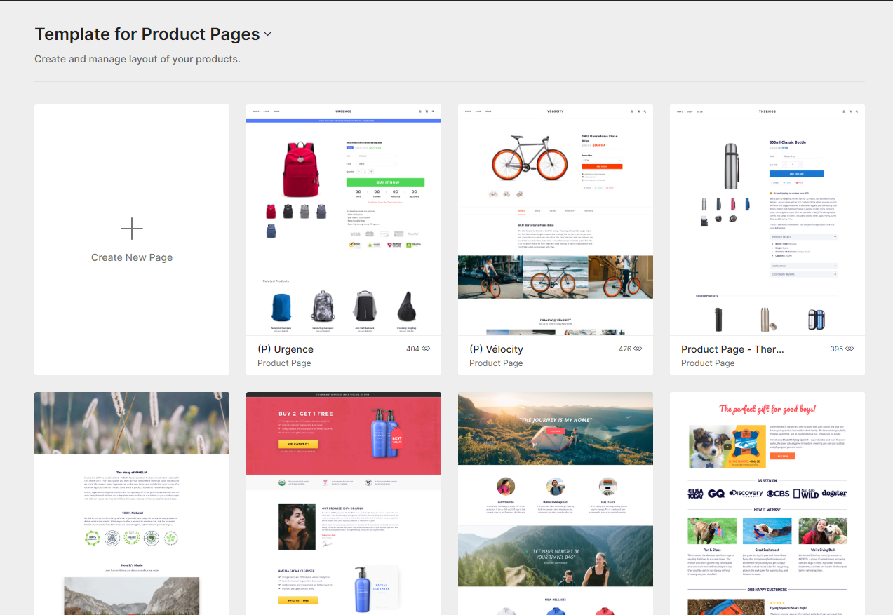
Product Images – demos
Your greatest chance to show off your product to potential customers is through images. People want to understand and see the products they are purchasing. Making the experience as real as possible on a digital format is the aim here. There are several methods to accomplish this:
- Use professional photos taken from various viewpoints. Utilize as many perspectives as necessary to graphically illustrate every important aspect of your product. Attempt to demonstrate the product in use as well.
- Make use of interactive picture displays. When it comes to photos, a zoom-in photo slideshow is an example of a practical user experience.
- Make them large! Keep in mind that buyers want to see what they’re getting.
- Video demonstrations are also gaining a lot of traction.
The “add to cart” button
On your product page, this serves as the focal point. In other words, it generates revenue for you and is a necessity for future transactions. Even though a buy button appears to be a very straightforward design feature, there are some awful buy buttons out there. You should pay close attention to such a critical component.
- Be prominently displayed.
- Be contrasted
- Be BIG
- Must look “clickable”
Shopping Cart & Checkout Design
Opening the cart shouldn’t feel like a break from the shopping experience; this is crucial. It should be simple to swiftly review the items in the cart and return to shopping if necessary. One great way to approach this is to craft your shopping cart as a popup that users can open on any page within your website.
If the cart is empty, simply noting that fact is a waste of time. With a call-to-action or shopping guidelines, encourage consumers to add products. You could even recommend some products.
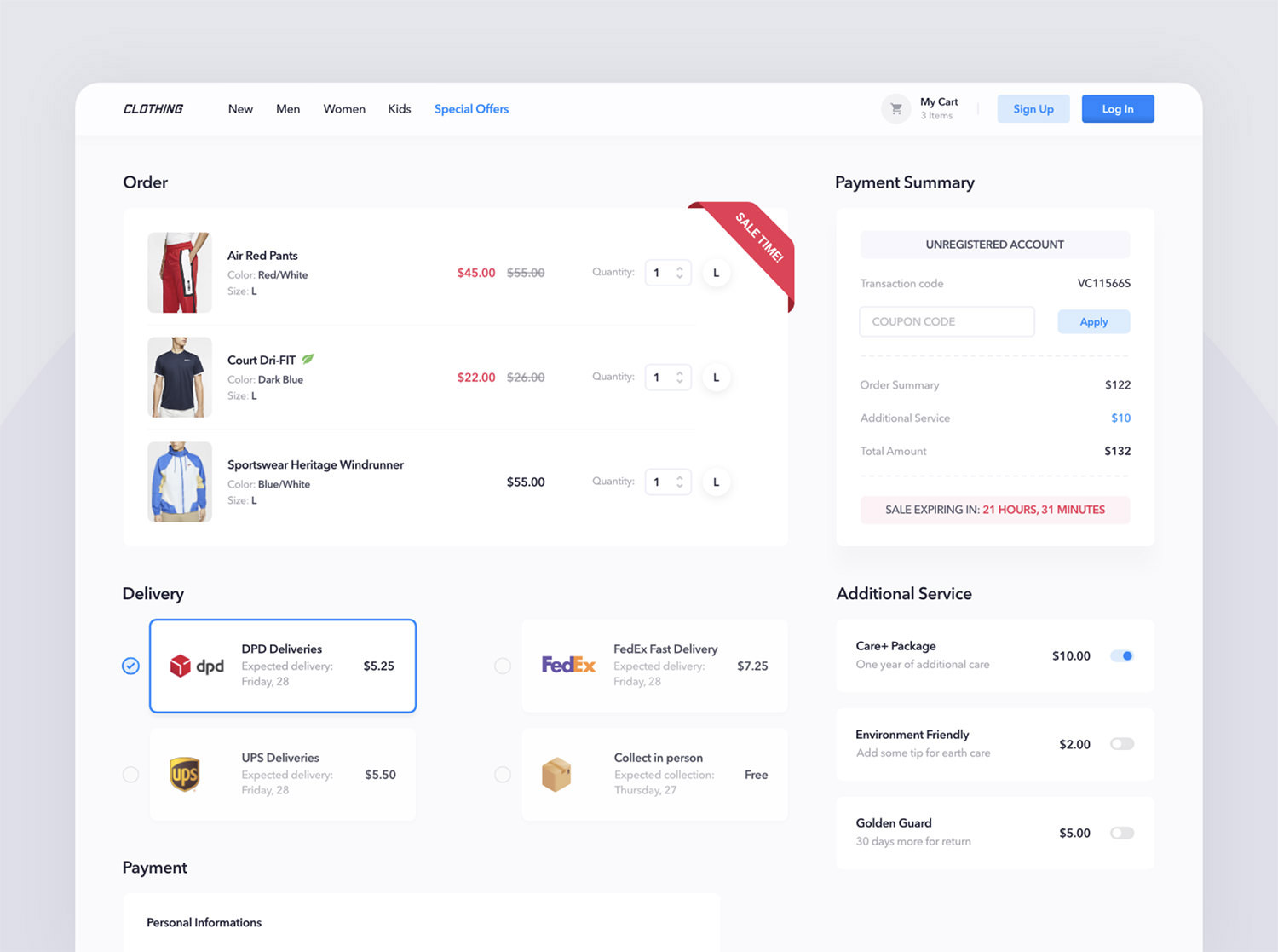
If there are items in the cart, users should be able to see these components promptly and clearly presented, including product inventory (with pictures & short descriptions), product quantity, product options (with custom fields), individual price, and total price.
More importantly, putting a lot of effort into making your mobile checkout process go as smoothly as your desktop checkout is worthwhile.
Other Necessary Pages to Design While Designing an eCommerce Website
Term & condition page
When designing an eCommerce website, it is important to include a page that outlines the terms and conditions of use. This page helps to protect both the website owner and the user by clearly outlining the expectations and responsibilities of each party.
For example, the terms and conditions page can state that the website owner is not responsible for certain types of damages that may occur as a result of using the products/services. This can help to limit the liability of the website owner in case of any legal issues.
Similarly, the terms and conditions page can also outline the expectations of users in terms of their behavior on the website. By clearly stating these expectations, it can help to reduce instances of abuse or misuse of the website.
About Us page
The About Us page on your eCommerce website helps potential customers to learn more about your company and what you have to offer. It’s a chance to build trust and credibility, and to show that you’re a reliable source for the products or services they’re interested in.

A good About Us page should include a brief history of the company, an overview of its products or services, and information about the people who work there. It’s also a good idea to include some customer testimonials and social media links.
By taking the time to create a strong About Us page, you can make a lasting impression on potential customers and increase your chances of making a sale.
Blog pages
Any eCommerce website worth its salt knows that blog pages are a necessary part of the design. By offering educational content, well-written articles, and a fresh perspective, blog pages help to attract new visitors and build trust with potential customers.
In addition, regular updates to the blog can help to ensure that returning visitors stay engaged with the site. And because search engines love content, a well-maintained blog section can surely boost your site’s ranking in search results. In other words, if you’re not already using blog pages to support your eCommerce website, you’re missing out on a crucial opportunity to drive traffic and convert leads.
What makes a good eCommerce website?
It’s crucial to have a design that engages with your target audience, loads quickly and is simple to browse. NOT putting everything on your homepage is the key. The objective is to strike the optimum combination between highlighting your products, providing descriptive text for each one, and ensuring brand coherence. Now let’s go into individual details on how to design an eCommerce website.
Focus on a consistent brand guideline
One of the first eCommerce website tips is consistently following a brand guideline. Creating a consistent brand guideline is essential when building an eCommerce website. A brand guideline helps to ensure that your website has a consistent look and feel, which can help to build trust with potential customers.
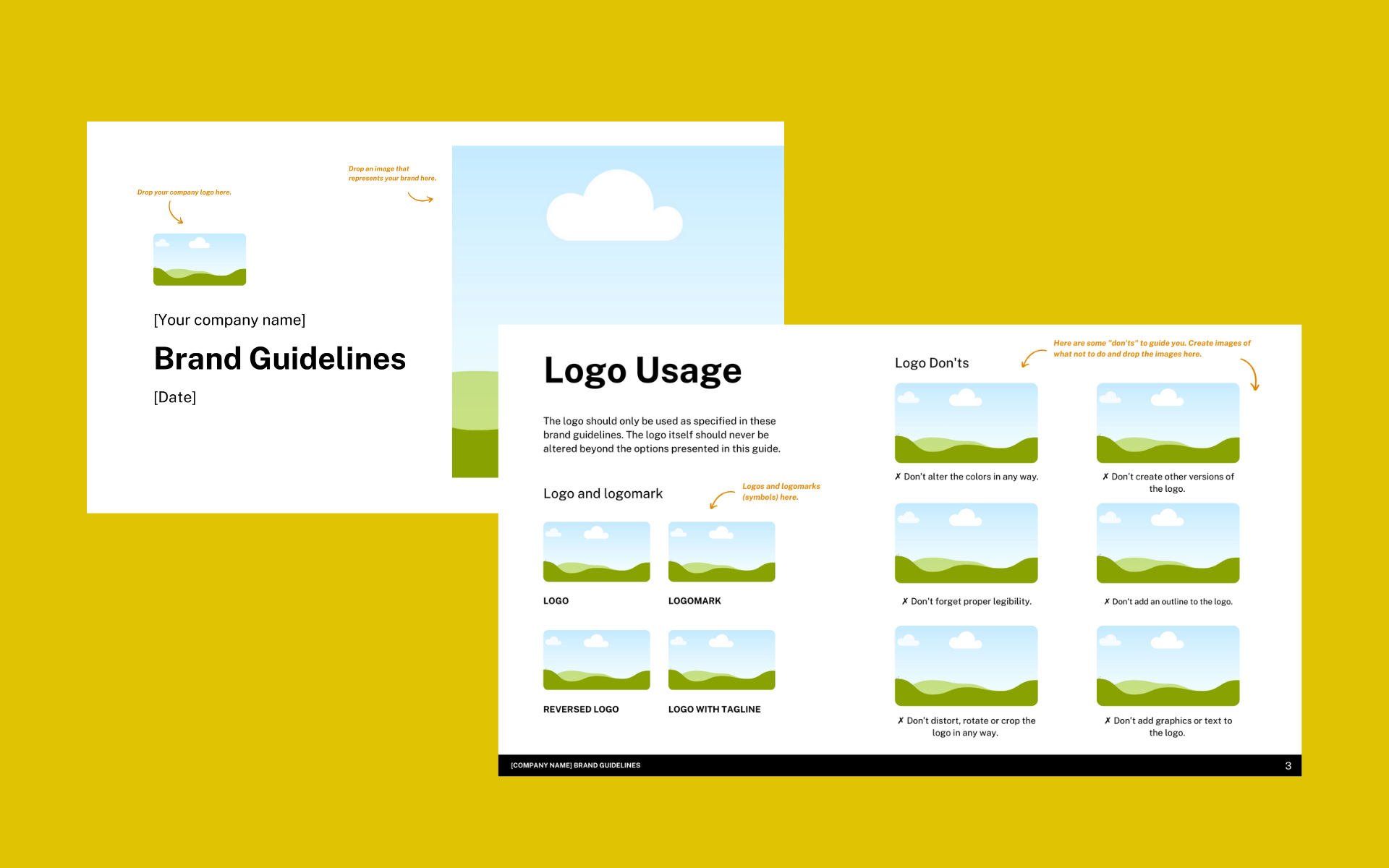
When your website has a consistent look and feel, it will instill confidence in visitors and make them more likely to stay and shop. Furthermore, a consistent brand guideline will make your site more recognizable and easy to navigate.
When developing your brand guideline, there are a few key elements to keep in mind.
- Logo and branding colors
- The overall design of your website
- Tone and voice of your website copy
For example, your website needs to be consistent in its use of colors and fonts, regardless of the product category. This color will appear in your social ads, landing pages, social profiles, emails, confirmation slips, etc. in addition to websites.
Keep the design simple: Make it easy to view and use
Your eCommerce store needs a clean website with a simple checkout process if you want to make money. Customers will leave your website right away if they have to search a lot. Make sure you always have a good answer for “how will this stimulate the conversion journey of my buyers” when you add a design element to your website.
The categories are stated clearly, the new sales message is added to the homepage, and a bright graphic displaying the shoe with a CTA “Shop Now” makes it appealing, tidy, and simple to explore. That is a very stylish, traditional design.
In addition, the core of your website is made up of product categories. So your product categories should be simple to browse and filter through for your customers.
By offering categories and filtering options, you may reduce the amount of time your customers spend browsing and make it simple for them to find the products they want.
Make the ‘View Cart’ button prominent
Every eCommerce website will include a tiny cart symbol on each page, ideally in the upper right corner. The users may now view how many products are currently in their shopping cart. This component is crucial for every eCommerce website in terms of design.

The likelihood of conversions increases if this button is present on every page while a user is surfing. Users frequently add products to carts and then exit the page without checking out.
They might not remember it by the time they log in the following time. This tiny icon will appear with the list of items in the shopping cart, encouraging consumers to finish the transaction a second time.
Use high-quality images
Having high-quality product photographs on your website addresses your users’ long-standing issue about not being able to see things before purchasing. They should be the priority when it comes to how to design an eCommerce website.
Your goods might seem cheap if your photographs are pixelated or fuzzy. So, while you’re developing your website, set aside the central area to emphasize your products with outstanding galleries of high-quality photographs.
Provide a zoom option so that your customers may view photographs and have a closer look at the smaller elements. Include product videos if at all possible.
Pay attention to the browsing pattern of your buyers
You should choose a CRM that will be simple to integrate with your website. A CRM is necessary since it will give you in-depth information on where and how your clients are interacting with your brand most frequently.
You may create a buying procedure to lessen any friction your customers may have with the assistance of these insights. Prepare to perform numerous A/B tests on your website. Every component of your design plan, from organizing your subscription forms to keeping track of lead generation, is essential.
As you learn the optimal browsing behavior of your customers, your website design will go through multiple revisions, adjusting everything from the placement of ads and messages to the CTA button.

Make transactions easy and transparent
This is one of the most important eCommerce website design tips that you must know. Customers must enjoy a seamless transaction from the moment they click “Buy.” If you are selling to an international audience, especially if you are using PayPal or Stripe, choose a website platform that connects with these popular payment processors.
Include a variety of payment methods, such as UPI payments, debit and credit cards, or net banking. Your customers must be able to complete a purchase with all available options, including the Pay at Delivery choice.
Any payment gateway that you integrate with your store automatically configures procedures to give clients immediate transaction confirmation emails. For a buyer, these confirmation emails are crucial, so you must make sure that the procedures are set up correctly.
Wrapping up,
It’s important to know how to design an eCommerce website that is both visually appealing and easy to navigate. With the right tools and advice, you can create a website that converts browsers into buyers more easily. Our team of experts is happy to discuss your project and provide recommendations on how you can improve your online sales. Thanks for reading!


