Creating an engaging and effective about us page is a crucial element of your website that often determines whether a first-time visitor will turn into a loyal customer. This introductory section of your website isn’t just a place to tell your company’s story; it’s a strategic space to convey your brand identity, values, and what sets you apart from the competition. As one of the most important pages on your website, the About Us Page provides an opportunity to connect with your visitors and showcase what your brand stands for. An exceptional about us page can humanize your brand, build trust, and deepen connections with your audience.
In this blog post, we will explore some of the best about us page examples from various industries. These examples will not only inspire you but also provide practical tips on how to vividly present your brand image through compelling narratives, innovative design, and engaging content. Whether you’re a startup looking to make a strong first impression or an established company aiming to refresh your brand’s presence, these insights will help you craft an about us page that truly resonates with your audience.
Table of Contents
Top 20 Best About Us Page Examples
Let’s delve into the top 20 best About Us page examples from a variety of businesses that have mastered the art of storytelling and brand presentation. These examples stand out not only for their aesthetic appeal but also for their strategic approach to conveying their core values, mission, and the unique aspects of their brand. Each one of the About Us page examples offers a unique perspective on how to effectively use this space to engage visitors, build trust, and reinforce brand identity. As we explore these standout pages, we’ll uncover what we love and what we can learn from these About Us page examples, helping you create a compelling narrative that resonates with your audience and elevates your brand’s online presence.
Nike
Nike is a global leader in athletic footwear, apparel, equipment, and accessories. Founded in 1964 as Blue Ribbon Sports by Bill Bowerman and Phil Knight, the company officially became Nike, Inc. in 1971. The brand is named after the Greek goddess of victory, which reflects its competitive spirit. Headquartered in Beaverton, Oregon, Nike has grown to become one of the most recognizable and valued brands in the sports industry, renowned for its innovation in product design, marketing strategies, and sponsorship agreements with top athletes and teams around the world.
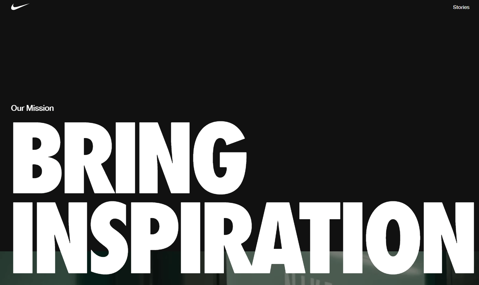
Nike is one of the most notable About Us page examples. Nike’s mission is to bring inspiration and innovation to every athlete in the world—a message famously underscored by their slogan on their About Us page. This inclusive approach has propelled Nike not just as a manufacturer of sports gear but as a broad promoter of sports culture and lifestyle globally. Nike’s product line includes shoes, apparel, and equipment designed for a wide range of sports including running, basketball, soccer, and more. Nike’s design aesthetic is often sleek, modern, and energetic, reflecting the dynamic nature of sports and athletics. The page might use bold typography, high-quality images, and video content to capture visitors’ attention. The layout would likely be user-friendly, making it easy for visitors to navigate through different sections.
What we love about their About Us Page
- Innovative History and Milestones: Nike’s about us page features a detailed timeline that highlights key innovations and milestones in the company’s history, such as the invention of Nike Air technology and the introduction of environmentally friendly products. This historical perspective educates visitors about Nike’s long-standing commitment to innovation and demonstrates how the brand has evolved and responded to changes in technology and consumer preferences over the decades.
- Commitment to Diversity and Inclusion: A distinctive aspect of the Nike about us page is its strong emphasis on diversity, inclusion, and social initiatives. The page details Nike’s efforts to create an inclusive culture both within the company and through its external initiatives. This includes programs aimed at empowering women in sports, supporting underrepresented groups, and leveraging the brand’s platform for social change.
- Sustainability Initiatives: The about us page thoroughly outlines Nike’s commitment to sustainability. It discusses their goal to achieve zero carbon and zero waste to help protect the future of sport. This section details specific strategies and innovations, such as the development of sustainable materials and improvements in manufacturing processes to reduce environmental impact.
What we can learn from Nike
- Highlight Innovative History and Milestones: Incorporate a detailed timeline or historical perspective into your About Us page to showcase your brand’s innovative journey and key milestones. Draw inspiration from Nike’s approach, highlighting significant innovations and advancements that demonstrate your brand’s commitment to pushing boundaries and staying ahead of the curve. Use this historical context to educate visitors about your brand’s evolution and how it has responded to changes in technology and consumer preferences over time.
- Demonstrate Commitment to Diversity and Inclusion: Place a strong emphasis on diversity, inclusion, and social initiatives on your About Us page. Similar to Nike, detail your efforts to foster an inclusive culture within your organization and through external initiatives. Showcase programs aimed at empowering underrepresented groups and leveraging your brand’s platform for social change. By highlighting your commitment to diversity and inclusion, you can attract like-minded customers and align your brand with values that resonate with a broad audience.
- Detail Your Sustainability Initiatives: Clearly outline your brand’s commitment to sustainability and environmental responsibility on your About Us page. Follow Nike’s lead by detailing specific goals, strategies, and innovations aimed at reducing your environmental impact. Highlight efforts to achieve zero carbon and zero waste, as well as initiatives focused on sustainable materials and manufacturing processes. By transparently communicating your sustainability initiatives, you can demonstrate your brand’s dedication to protecting the planet and appeal to environmentally conscious consumers.
Tesla
Tesla is an American electric vehicle (EV) and clean energy company founded in 2003 by a group of engineers who wanted to prove that people didn’t need to compromise to drive electric — that electric vehicles can be better, quicker, and more fun to drive than gasoline cars. Today, Tesla builds not only all-electric vehicles but also infinitely scalable clean energy generation and storage products. Tesla believes the faster the world stops relying on fossil fuels and moves towards a zero-emission future, the better.
The company’s first vehicle, the Roadster, debuted in 2008, setting new standards for electric mobility with impressive range and performance. Tesla’s lineup has since expanded to include the Model S luxury sedan, the Model X SUV, the Model 3 (a more affordable sedan), and the Model Y compact SUV. Tesla is not just an automaker; it’s also a technology and design company with a focus on energy innovation. It has made significant strides in battery technology and autonomous driving software and is deeply involved in solar energy through its acquisition of SolarCity.

Tesla is high on the list of About Us page examples since the page highlights their mission to accelerate the world’s transition to sustainable energy. They emphasize their unique approach to clean energy and electric vehicles, using concise and impactful content. Overall, their about us page effectively communicates their mission, values, and impact. It showcases their dedication to sustainable energy solutions and presents them as a forward-thinking company at the forefront of innovation. The page is designed to inspire, inform, and engage visitors, aligning with Tesla’s reputation as a disruptor in the automotive and energy sectors.
What we love about their About Us Page
- Visionary Goals and Mission: Tesla’s About Us page effectively communicates its visionary goals and broader mission to accelerate the world’s transition to sustainable energy. This is not just about building electric cars but about creating a comprehensive ecosystem of energy solutions, including battery storage and solar energy products.
- Innovative Technology and Design: The page highlights Tesla’s commitment to innovation in technology and design, detailing their advancements in battery technology, electric powertrains, and autonomous driving capabilities. It also explains how these technologies are integrated into each vehicle to enhance safety, performance, and convenience.
- Interactive and Educational Content: Tesla’s About Us page includes interactive and educational content that helps visitors understand the impact and importance of transitioning to electric vehicles. This may include interactive range maps, comparisons between Tesla vehicles and traditional gasoline cars, and detailed explanations of the benefits of electric living, both environmentally and economically.
What we can learn from Tesla
- Incorporate Visionary Goals and Mission: Clearly articulate your brand’s visionary goals and broader mission on your About Us page. Take inspiration from Tesla’s commitment to accelerating the world’s transition to sustainable energy. Share your brand’s overarching purpose and how it aligns with addressing broader societal or environmental challenges. Communicate a compelling vision that goes beyond your immediate products or services, demonstrating a commitment to driving meaningful change.
- Incorporate Visionary Goals and Mission: Highlight your brand’s commitment to innovation in technology and design. Similar to Tesla, showcase advancements in your field, whether it’s breakthroughs in product technology, design aesthetics, or user experience. Detail how these innovations are integrated into your offerings to enhance performance, safety, and overall value for your customers. By emphasizing your brand’s cutting-edge capabilities, you can differentiate yourself in a competitive market and attract tech-savvy consumers.
- Include Interactive and Educational Content: Enhance your About Us page with interactive and educational content that engages visitors and helps them understand the value of your offerings. Follow Tesla’s lead by incorporating interactive tools or educational resources that illustrate the benefits of your products or services. Provide informative content that educates visitors on relevant topics, such as the environmental impact of traditional energy sources versus sustainable alternatives. By empowering visitors with knowledge, you can build trust and credibility while encouraging them to take action.
Airbnb
Airbnb is a global online marketplace for lodging, primarily homestays for vacation rentals, and tourism activities. Founded in 2008, the company started when the founders rented out an air mattress in their living room, effectively turning their apartment into a bed and breakfast to offset the cost of rent. This small beginning sparked the idea of a platform that would allow people to list, discover, and book accommodations around the world.
Today, Airbnb offers access to millions of unique homes in over 100,000 cities and 191 countries. It extends beyond just providing places to stay; it also enables local hosts to connect with travelers, and promotes a more authentic travel experience by integrating local tours and activities called Airbnb Experiences. The platform has significantly altered the way people think about travel accommodations, emphasizing local, personal, and unique travel experiences over traditional hotel stays.
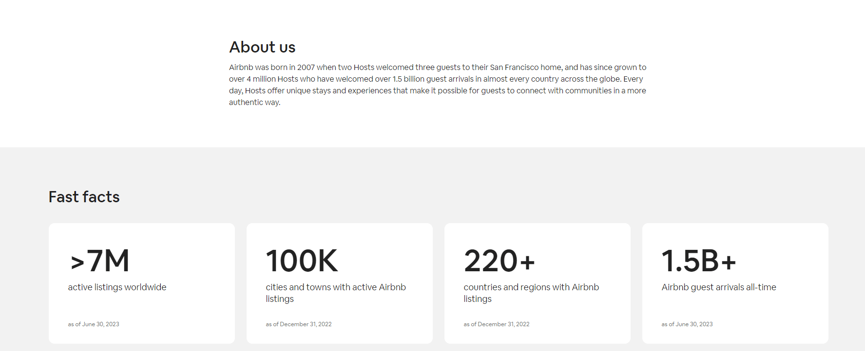
Airbnb serves as one of the About Us page examples because it centers around their community and the idea of belonging. They share stories of hosts and guests to underline their platform’s impact on connecting people and creating unique travel experiences. It is a masterful blend of storytelling, visual elements, and clear messaging. It effectively communicates their mission, values, and the impact they’ve had on travelers and hosts worldwide. The page creates an emotional connection with visitors by highlighting personal stories, making it an inspiring and engaging read.
What we love about their About Us Page
- Community and Trust Building: Airbnb’s About Us page emphasizes its global community of hosts and guests, underscoring the trust mechanisms like reviews and verified ID processes that make the platform secure and reliable for users. The page explains how these systems work to create a safe environment, fostering a sense of community among users.
- Focus on Diversity and Belonging: The page highlights Airbnb’s commitment to diversity and inclusion, both internally in its workforce and externally among its hosts and guests. It discusses various initiatives and policies the company has implemented to support diversity and ensure that everyone can feel like they belong.
- Innovation and Adaptation: Airbnb’s About Us page showcases the company’s ability to innovate and adapt, especially highlighted through its response to global events like the COVID-19 pandemic. It details the new cleaning protocols and booking policies introduced to adapt to changing travel needs. The page also touches on how Airbnb continuously evolves its offerings to meet the changing desires of travelers and the needs of hosts, demonstrating flexibility and a forward-thinking approach.
What we can learn from AirBnB
- Build your Community: Prioritize building a sense of community and trust among your audience. Take inspiration from Airbnb’s emphasis on its global community of hosts and guests, highlighting mechanisms that ensure security and reliability. Explain how your brand fosters a safe and trustworthy environment, utilizing features like reviews or verification processes to instill confidence and foster a sense of belonging among users.
- Encourage Diversity and Belonging: Communicate your commitment to diversity and inclusion both internally and externally. Like Airbnb, showcase initiatives and policies that support diversity and ensure that everyone feels valued and included. Highlight efforts to create a welcoming and inclusive environment for all stakeholders, demonstrating your brand’s dedication to fostering a sense of belonging and acceptance.
- Demonstrate Innovation and Adaptation: Showcase your brand’s ability to innovate and adapt to changing circumstances. Draw inspiration from Airbnb’s response to global events like the COVID-19 pandemic, highlighting new protocols and policies introduced to meet evolving needs. Illustrate how your brand stays ahead of the curve by continuously evolving its offerings to align with shifting trends and consumer preferences, demonstrating flexibility and forward-thinking.
Coca-Cola
Coca-Cola is one of the most iconic and widely recognized beverage brands globally, known for its flagship product Coca-Cola (often referred to simply as Coke). Founded in 1886 by John Stith Pemberton, a pharmacist in Atlanta, Georgia, the drink was initially intended as a patent medicine. The Coca-Cola Company has since evolved into a multinational beverage corporation headquartered in Atlanta, Georgia, offering a vast portfolio of drinks.
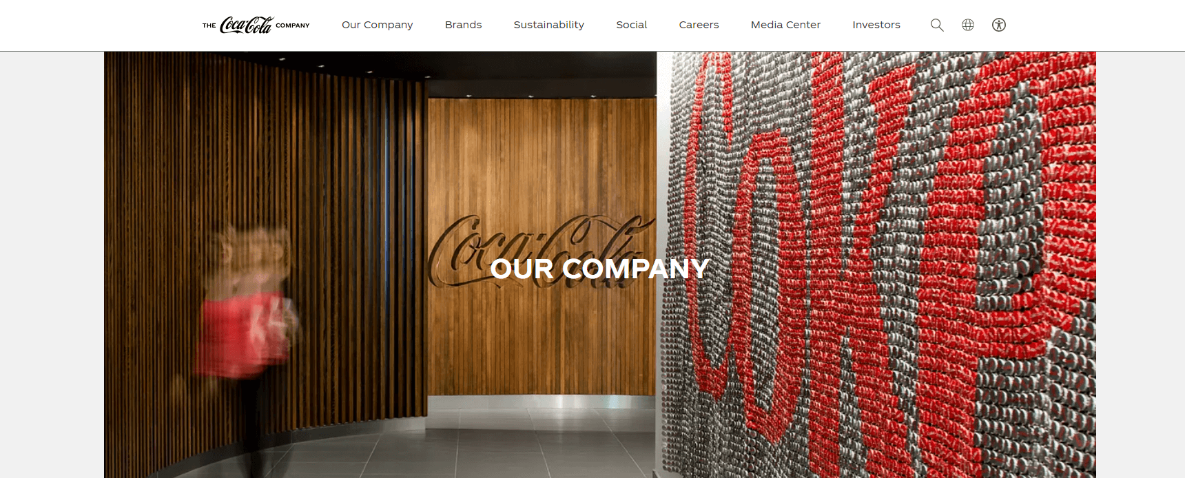
Today, Coca-Cola operates in more than 200 countries, with a product line that includes over 500 brands and 3,900 beverage choices, ranging from sodas and energy drinks to juices and plant-based drinks. The company is committed to sustainable business practices and aims to create a positive impact on global health, its people, and the communities where it operates. Coca-Cola stands amongst the top About Us page examples as it takes visitors through their history, values, and commitment to refreshing the world.
What we love about their About Us Page
- Heritage and Innovation: Coca-Cola’s About Us page effectively blends the company’s rich heritage with its focus on innovation. The page features a detailed timeline that highlights key historical moments, like the creation of the original Coca-Cola formula, alongside recent innovations in product development and sustainability efforts.
- Global Impact and Local Relevance: The page emphasizes Coca-Cola’s global presence while focusing on its impact at a local level. It details initiatives tailored to local communities around the world, such as water replenishment projects, economic opportunities for small retailers, and recycling programs.
- Sustainability Initiatives: Coca-Cola’s About Us page dedicates a significant section to its sustainability initiatives, which is crucial in today’s environmentally conscious market. The company outlines its strategies for reducing water use, enhancing recycling efforts, and lowering carbon emissions.
What we can learn from Coca-Cola
- Embrace both Heritage and Innovation: Incorporate elements of your company’s heritage while highlighting your commitment to innovation. Much like Coca-Cola, blend historical milestones with recent advancements to showcase your brand’s evolution over time. Use a timeline or similar format to illustrate key moments, demonstrating how your company’s legacy informs its forward-thinking approach.
- Showcase Global Impact with Local Relevance: Balance your brand’s global reach with its impact at a local level. Follow Coca-Cola’s example by detailing initiatives that resonate with communities worldwide while also emphasizing localized efforts. Highlight projects or programs tailored to specific regions or demographics, showcasing your brand’s commitment to making a meaningful difference on a global scale.
- Prioritize Sustainability Initiatives: Prioritize sustainability and dedicate a section of your About Us page to detailing your environmental efforts. Like Coca-Cola, outline your strategies for reducing environmental impact, enhancing recycling efforts, and promoting sustainable practices. Be transparent about your sustainability goals and progress, demonstrating your brand’s commitment to corporate responsibility and environmental stewardship.
Magic Spoon
Magic Spoon is a direct-to-consumer cereal brand that reimagines classic breakfast cereal with a healthy twist. Founded in 2019, the company aims to deliver the nostalgic taste of childhood cereals but with upgraded ingredients suited for health-conscious adults. Magic Spoon cereals are high in protein, low in carbohydrates, and free from gluten, artificial flavors, and sugars.
Magic Spoon caters to a modern audience that values both health and convenience without compromising on taste. Their cereals come in a variety of flavors, including Fruity, Cocoa, Frosted, and Peanut Butter, which mimic the traditional flavors many grew up loving but are made using innovative ingredients like milk protein blend and allulose.
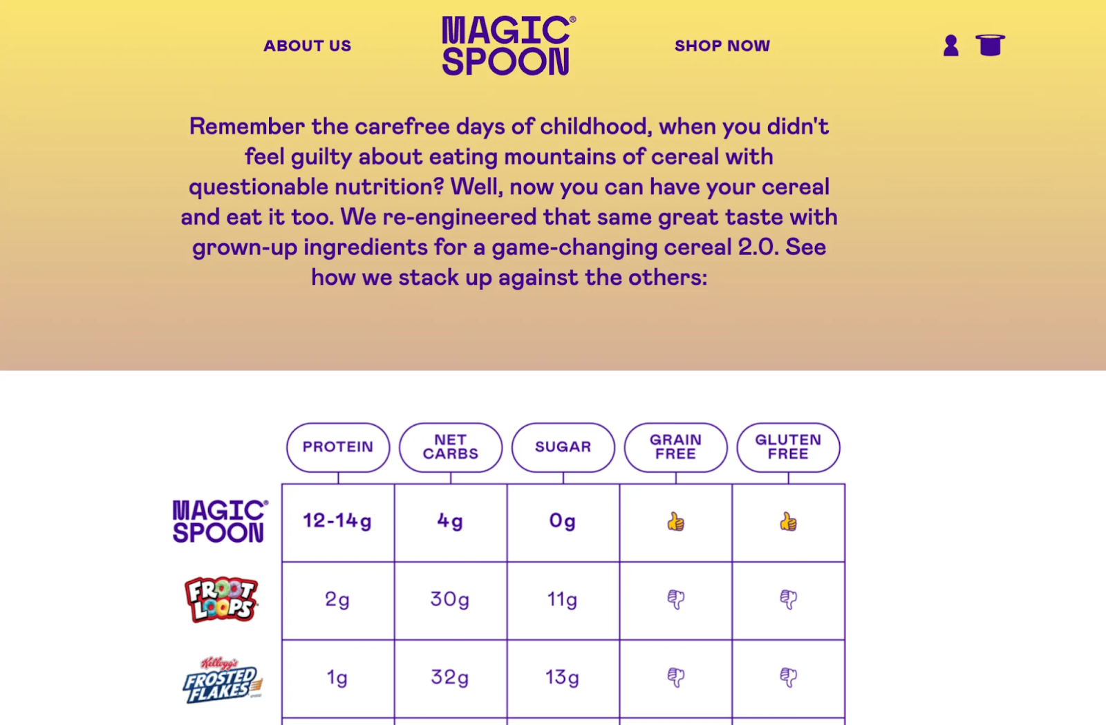
Magic Spoon’s About Us page belongs in the top About Us page examples for its clear and straightforward messaging. The page includes photos and short bios of the founders, which humanizes the company and helps visitors connect with the brand on a personal level. This personal touch extends to the overall design of the page, which uses playful graphics and bright colors to convey a sense of fun and lightheartedness. Overall, Magic Spoon’s About Us page is an effective example of how a brand can communicate its mission and personality clearly and engagingly.
What we love about their About Us Page
- Engaging Origin Story: Magic Spoon’s About Us page features a compelling origin story that highlights the founders’ personal journey and the inspiration behind the brand. This narrative begins with their childhood love for sugary cereals and their later realization as adults about the nutritional drawbacks of their favorite breakfasts.
- Emphasis on Health Benefits:The page prominently details the health benefits of their cereals, which is a central aspect of the brand’s unique selling proposition. It explains how Magic Spoon is different from traditional cereals, emphasizing features like high protein content, low carb, and no artificial ingredients..
- Transparent Ingredient and Nutritional Information: Magic Spoon uses its About Us page to transparently share detailed ingredient and nutritional information. The page not only lists the ingredients but also explains the benefits and reasons behind choosing each one, such as the use of allulose as a natural sweetener that doesn’t impact blood sugar levels the same way traditional sugar does.
What we can learn from Magic Spoon
- Include a Captivating Origin Narrative: Craft a compelling origin story for your About Us page that resonates with your audience and highlights the inspiration behind your brand. Take cues from Magic Spoon’s narrative, which starts with the founders’ personal journey and childhood nostalgia for sugary cereals. Sharing relatable experiences and the journey that led to the creation of your brand can captivate visitors and make your story memorable.
- Focusing on Health Advantages: Clearly communicate the health benefits or unique selling points of your products or services on your About Us page. Similar to Magic Spoon, prominently feature the nutritional advantages of your offerings and explain how they differ from competitors. Highlighting features like high protein content, low carb, or natural ingredients can attract health-conscious consumers and differentiate your brand in the market.
- Include Clear Ingredient and Nutritional Disclosure: Prioritize transparency by sharing detailed ingredient and nutritional information on your About Us page. Provide clear explanations of why certain ingredients are chosen and how they contribute to the overall quality of your products or services. By openly discussing your choices and their benefits, you can build trust with consumers who value transparency and informed decision-making.
Buck Mason
Buck Mason is an American fashion brand that focuses on modern American classics. Founded in 2013, Buck Mason aims to design timeless menswear pieces with attention to detail, quality craftsmanship, and durable materials. The brand is known for its minimalist aesthetic, producing essentials such as t-shirts, jeans, and button-up shirts that combine traditional styles with contemporary fits.
Buck Mason operates on a direct-to-consumer model, which allows them to offer high-quality products at accessible prices. Their approach to fashion is about simplifying the male wardrobe with pieces that are versatile, functional, and stylish. Each item is designed to be practical, look good, and wear well over time, reflecting an ethos of quality over quantity.

Buck Mason’s About Us page stands out from others in the About Us page examples because of its minimalist design and strong brand messaging. By incorporating high-quality visuals and simple language, the page effectively communicates the brand’s commitment to quality and authenticity. Additionally, the page features a timeline of the company’s history, further reinforcing its credibility and brand identity. One unique aspect of Buck Mason’s About Us page is its relatable and playful CTA, Come Have A Drink. This not only adds to their brand identity but also encourages engagement from their target audience. Overall, Buck Mason’s About Us page is a great example of how to use visuals, language, and a strong CTA to create a memorable and effective brand story.
What we love about their About Us Page
- Focus on American Craftsmanship: Buck Mason’s About Us page places a strong emphasis on American craftsmanship. It highlights their commitment to producing garments within the United States, supporting local industries and workers. The page details their process from the raw materials to the finished product, emphasizing the quality and care in their manufacturing process.
- Timeless Design Philosophy: The page articulately describes their design philosophy, which revolves around creating timeless, essential pieces that are immune to the fast-changing trends of the fashion industry. By focusing on classic American styling and refining each piece to perfection, Buck Mason communicates a sense of enduring style and investment in longevity.
- Narrative of Founders’ Vision: Buck Mason’s About Us page effectively tells the story of its founders and their vision for the brand. It provides insights into their backgrounds and the problems they saw in the menswear market that Buck Mason aims to solve. The founders’ story is woven into the broader narrative of the brand’s values and commitments, enhancing the authenticity and trustworthiness of Buck Mason.
What we can learn from Buck Mason
- Emphasize on Craftsmanship: Incorporate a strong emphasis on craftsmanship into your About Us page to showcase the quality and care behind your products or services. Take inspiration from Buck Mason’s commitment to American craftsmanship by highlighting any local or traditional production methods you utilize. Detailing your manufacturing process and the attention to detail you invest can instill confidence in the quality of your offerings.
- Embrace the Philosophy of Timeless Design: Articulate a clear design philosophy that emphasizes timeless appeal and longevity. Follow Buck Mason’s example by focusing on creating pieces that transcend fleeting trends and offer lasting value. Communicate how your brand’s aesthetic and design approach align with enduring style principles, positioning your products or services as investments rather than disposable commodities.
- Include Story Behind the Founders’ Vision: Tell the story of your brand’s founders and their vision for your company in a compelling and authentic way. Use your About Us page to share insights into the backgrounds of key stakeholders and the problems your brand aims to address. By weaving the founders’ story into the broader narrative of your brand’s values and commitments, you can enhance authenticity and build trust with your audience.
Marie Forleo
Marie Forleo is an American entrepreneur, writer, and motivational speaker. She is best known for creating Marie Forleo International, B-School, and the online show MarieTV, a platform where she shares strategies for business, personal development, and motivation. Marie’s career began on the New York Stock Exchange, but she quickly shifted gears to life coaching, realizing her passion for helping others achieve their fullest potential.Marie has been named a thought leader for the next generation by Oprah Winfrey and has authored a New York Times bestselling book, Everything is Figureoutable, which encapsulates her philosophy that anything is possible with the right mindset. Her work focuses on empowering entrepreneurs around the world to dream big and back up those dreams with meaningful action to create results.
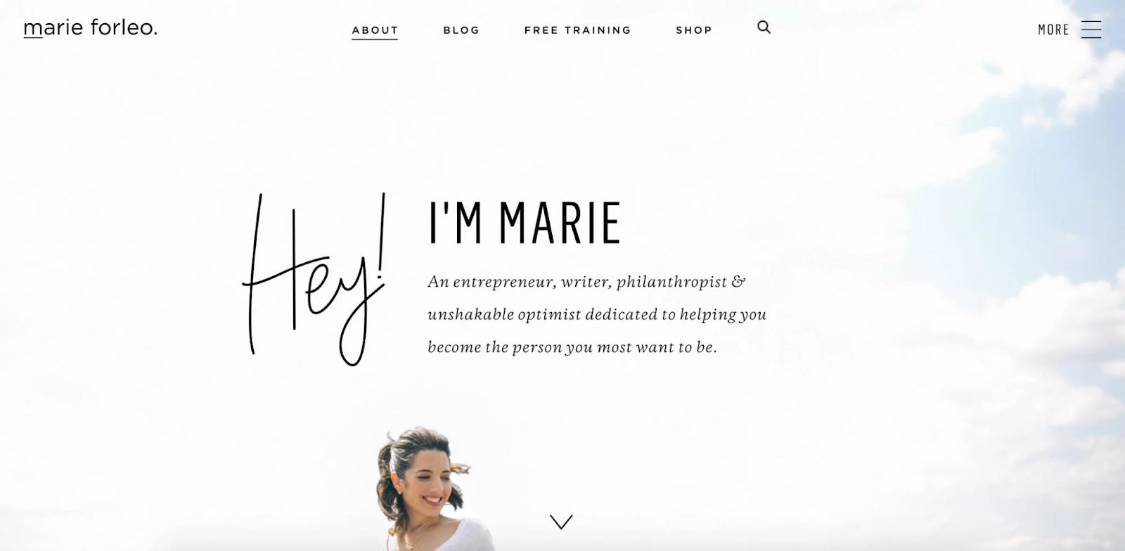
Marie’s About Us page is one of the excellent About Us page examples in how to use storytelling to connect with your audience. By sharing her personal journey and struggles, she makes her brand relatable and establishes an emotional connection with her readers. The page’s design and structure are also tailored to create an authentic and personal feel that aligns with her brand values of connection and authenticity. Additionally, including testimonials from satisfied clients and students adds social proof and credibility to her work, making it easier for potential customers to trust her and her brand.
What we love about their About Us Page
- Engaging Personal Story: Marie Forleo’s About Us page effectively uses her engaging personal story to connect with her audience. It traces her journey from working multiple jobs to becoming a successful entrepreneur and coach. The storytelling approach makes Marie more approachable and establishes a strong emotional connection with the audience.
- Clear Articulation of Philosophy: The page does an excellent job of articulating Marie’s core philosophy,, which is central to her personal and professional ethos. This philosophy is not just a catchy phrase but a mindset that she encourages her audience to adopt in their daily lives.
- Integration of Multimedia Content: Marie’s About Us page includes various multimedia content, including video clips from MarieTV and testimonials from past clients and students. This integration of dynamic content showcases the impact of her work through success stories and client feedback, which serves as powerful social proof of the effectiveness of her coaching and educational materials.
What we can learn from Marie Forleo
- Personal Engagement Through Storytelling: Incorporate an engaging personal story into your About Us page to connect with your audience on a deeper level. Follow Marie Forleo’s example by sharing your journey, including any challenges or pivotal moments that have shaped your path. This storytelling approach humanizes your brand and creates a strong emotional bond with visitors, making them more likely to relate to and trust your message.
- Explicit Expression of Philosophy: Clearly articulate your brand’s core philosophy or mission statement on your About Us page. Similar to Marie Forleo’s mantra, express your guiding principles in a concise and compelling manner. Make sure this philosophy is more than just a slogan—it should embody the values and beliefs that drive your brand’s actions and resonate with your target audience.
- Incorporation of Multimedia Elements: Enhance your About Us page with multimedia content to engage and captivate visitors. Take inspiration from Marie Forleo’s use of video clips and testimonials to showcase the impact of her work. Incorporate videos, audio clips, or visual testimonials that highlight your brand’s accomplishments, showcase your expertise, and provide social proof of your value proposition. This dynamic content adds depth and credibility to your About Us page, reinforcing your brand’s authority and credibility.
Milk Bar
Milk Bar is a dessert and bakery chain renowned for its unconventional and whimsical treats. Founded in 2008 by chef Christina Tosi in New York City, Milk Bar has transformed the dessert scene with its creative interpretations of home-style desserts and savory treats. The brand first gained notoriety as part of the Momofuku restaurant group before standing out on its own with a distinctive line of cakes, cookies, and ice cream.
Milk Bar’s signature creations include the Compost Cookie®, a unique blend of pretzels, potato chips, coffee, oats, graham cracker, and butterscotch; and Cereal Milk™ ice cream, which tastes like the milk at the bottom of a bowl of cornflakes. Other favorites are the Milk Bar Pie, formerly known as Crack Pie, and the visually striking and deliciously layered Birthday Cake. Milk Bar has locations in several U.S. cities and has expanded its reach through shipping, grocery stores, and partnerships.
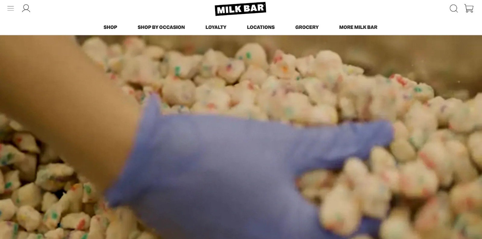
Milk Bar’s About Us page stands out at the top About Us page examples for its use of visual elements that tell their story hastily. The bakery uses vibrant images and videos that showcase its products and production process, which adds to the user experience. The use of playful graphics and animations adds a sense of whimsy and fun to the page, which aligns with their brand identity.
Despite the focus on visual storytelling, Milk Bar doesn’t overlook the essential components of an effective About Us page. They include information on the charities they work with, their team, and media features, which adds credibility to their brand. Overall, Milk Bar’s About Us page is an excellent example of how to use visual elements effectively to make a page stand out while still providing essential information to users.
What we love about their About Us Page
- Innovative and Playful Tone: Milk Bar’s About Us page captures the brand’s innovative and playful spirit. It reflects the whimsical and joyful essence of Christina Tosi’s baking philosophy. The tone of the page is friendly and inviting, mimicking the experience one might have walking into a Milk Bar store.
- Focus on Culinary Creativity: The page emphasizes the culinary creativity and pioneering vision of Christina Tosi. It details how she experiments with flavors and textures to reinvent traditional desserts; which highlights the uniqueness of Milk Bar’s offerings and positions Tosi as a thought leader in the culinary world, inspiring confidence in the quality and originality of the products.
- Community and Educational Initiatives: Milk Bar’s About Us page discusses their commitment to the community and their educational initiatives. It showcases how they engage with the community through baking classes and how Tosi uses her platform to inspire and teach the next generation of bakers.
What we can learn from Milk Bar
- Playful and Innovative Approach: Infuse your About Us page with an innovative and playful tone that reflects the essence of your brand. Take inspiration from Milk Bar’s friendly and inviting approach, creating a page that mirrors the experience customers might have with your brand in person. By adopting a tone that resonates with your brand’s personality, you can engage visitors and make them feel welcome.
- Emphasis on Culinary Innovation: Highlight your brand’s creative vision and expertise, showcasing what sets you apart from competitors. Much like Milk Bar emphasizes Christina Tosi’s culinary creativity, share stories or examples of how you innovate and push boundaries within your industry. This not only positions you as a leader in your field but also instills confidence in the quality and originality of your offerings.
- Community Engagement and Educational Efforts: Demonstrate your brand’s commitment to community engagement and education. Just as Milk Bar engages with its community through baking classes and educational initiatives, showcase how your brand contributes to the community and supports learning opportunities. Whether through workshops, mentorship programs, or other initiatives, highlighting your efforts to give back and educate can foster a sense of connection and loyalty among customers.
Allbirds
Allbirds is a San Francisco-based company that specializes in designing environmentally friendly footwear. Founded in 2016 by Tim Brown and Joey Zwillinger, Allbirds began with a simple mission: to create comfortable, stylish, and sustainable shoes. The company uses natural materials like merino wool, eucalyptus tree fiber, and sugarcane-based foam, which sets it apart from traditional footwear brands that often rely on synthetic materials.
Allbirds’ products are known for their minimalist design and exceptional comfort, making them popular among consumers who prioritize both sustainability and style. The brand has expanded its product line to include running shoes, everyday sneakers, loungewear, and accessories, all while maintaining a strong commitment to reducing environmental impact. Allbirds also emphasizes transparency in its production processes and actively works to lower its carbon footprint across all aspects of its business.
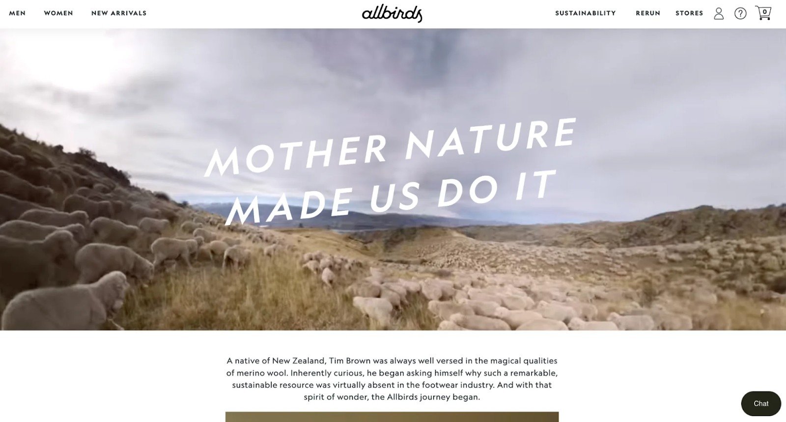
Allbirds’ About Us page is notable in the list of About Us page examples for its use of creative elements such as background videos, playful phrases, and animations to engage and captivate its audience. The page’s design and copy are simple, yet effective, providing a glimpse into the brand’s personality and values. Additionally, the inclusion of a founder’s story told in the third person, along with images of the founders, adds a personal touch to the page. Allbirds’ About Us page also showcases its product through animation and a concise description of what sets it apart, which adds context and strengthens the brand’s positioning in the market. Overall, Allbirds’ About Us page stands out for its creativity, simplicity, and effective use of storytelling to connect with its audience.
What we love about their About Us Page
- Emphasis on Sustainability: Allbirds’ About Us page prominently features its commitment to sustainability. It details the innovative natural materials used in their products, such as wool, eucalyptus, and sugarcane, and explains why these materials are better for the environment compared to traditional options.
- Interactive and Educational Content: The page includes interactive elements and infographics that educate visitors about the environmental impacts of the footwear industry and how Allbirds is working to make a difference. For example, it might showcase a comparison of the carbon footprint of Allbirds shoes versus traditional shoes.
- Focus on Innovation: Allbirds uses its About Us page to highlight its ongoing efforts in innovation, particularly in developing new and improved sustainable materials. The page talks about their open-source approach to sharing their eco-friendly material innovations with other companies, which underscores their commitment to global sustainability over competitive advantage.
What we can learn from Allbirds
- Emphasize Core Values: Take a cue from Allbirds and prioritize sustainability in your About Us page. Highlight the eco-friendly materials used in your products and explain why these choices are better for the environment. By showcasing your commitment to sustainability, you can attract environmentally-conscious consumers who prioritize ethical and eco-friendly brands.
- Utilize Interactive and Educational Content: Follow Allbirds’ lead by incorporating interactive elements and educational content into your About Us page. Use infographics, comparisons, or interactive tools to inform visitors about relevant topics related to your industry or mission. This not only engages visitors but also positions your brand as knowledgeable and transparent, fostering trust and credibility.
- Innovation is key: Showcase your brand’s innovative efforts, especially in areas related to your mission or values. If you’re pioneering new sustainable practices or developing innovative products, share these initiatives on your About Us page. Like Allbirds, you can emphasize a commitment to collaboration and sharing knowledge for the greater good, demonstrating a dedication to driving positive change beyond your brand’s immediate impact.
Bossy Cosmetics
Bossy Cosmetics is a beauty brand that empowers women through makeup that is as bold and vibrant as the women who wear it. Founded by Aisha Fatima Dozie, the company launched with a vision to inspire and empower women to feel confident and in control, whether in their professional or personal lives. Bossy Cosmetics combines high-quality, cruelty-free cosmetics with a mission-driven approach that focuses on women’s empowerment and social issues affecting women globally.
The product line includes lipsticks, eyeshadows, and other makeup essentials designed to suit all skin tones, emphasizing inclusivity and self-expression. Beyond just selling cosmetics, Bossy Cosmetics collaborates with non-profit organizations that advocate for women’s rights and empowerment, dedicating a portion of its profits to support these causes.
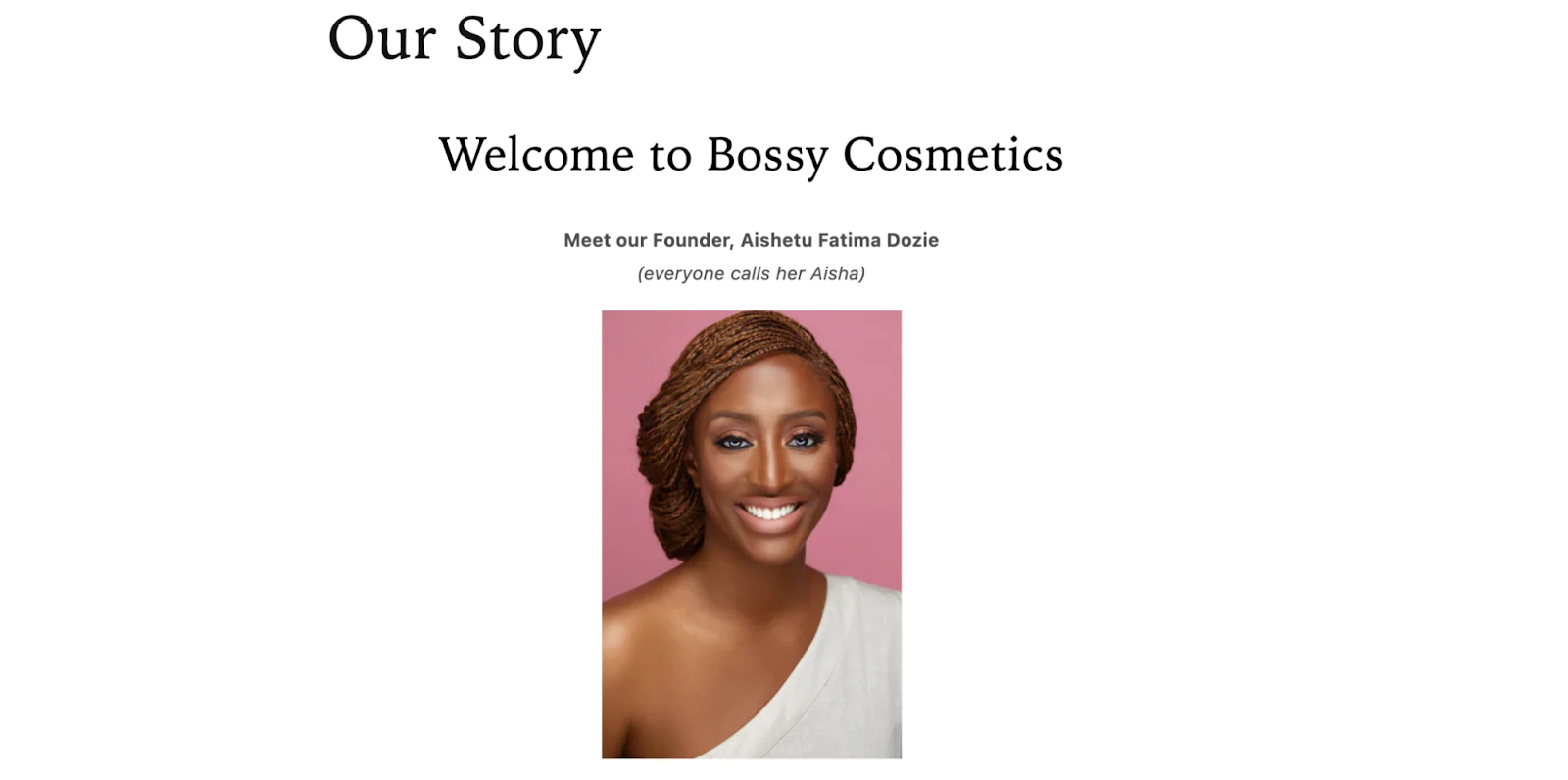
Bossy Cosmetics’ About Us page is one of the more memorable About Us page examples since it sets the brand’s founder front and center, making her an integral part of the brand’s origin story. While taking a more traditional approach with plenty of text, Bossy Cosmetics includes additional elements like brand-related Instagram posts, links to partner charities and brands, and interactive timelines that show company milestones.
The brand showcases its commitment to being relatable to its target audience by adding creative elements that resonate with them. By highlighting its founder and incorporating additional elements that showcase the brand’s values, Bossy Cosmetics’ About Us page effectively captures its audience’s attention and communicates the brand’s story engagingly.
What we love about their About Us Page
- Empowerment Through Storytelling: The About Us page of Bossy Cosmetics uses powerful storytelling to convey the founder’s journey and the brand’s mission. It shares Aisha Fatima Dozie’s personal story from her career in finance to launching a beauty brand focused on empowering women. The storytelling approach effectively communicates passion and purpose, drawing customers who value authenticity and empowerment.
- Commitment to Social Impact: The page highlights the brand’s commitment to social impact, detailing their collaborations with non-profits and initiatives focused on women’s rights and empowerment. It explains how each purchase contributes to these causes, reinforcing the idea that customers are not just buying a product but also supporting a movement.
- Focus on Inclusivity and Diversity: Bossy Cosmetics’ About Us page emphasizes their commitment to inclusivity, showcasing a product range designed for all skin tones. The brand makes a point to feature diverse models and stories that resonate with a broad audience. The inclusivity message is reinforced through visuals and content that celebrate diversity in beauty.
What we can learn from Bossy Cosmetics
- Storytelling as a Means of Empowerment: Take inspiration from Bossy Cosmetics’ approach of using storytelling to convey passion and purpose. Share your journey, highlighting pivotal moments and the motivation behind your brand. By crafting a narrative that resonates with your audience, you can create a deeper connection and communicate authenticity.
- Dedication to Society: Follow Bossy Cosmetics’ lead in showcasing your brand’s commitment to social impact. Highlight any partnerships with non-profits or initiatives aligned with your values, and explain how your customers contribute to these causes through their purchases. This not only adds depth to your brand but also appeals to socially conscious consumers who want to make a difference through their shopping choices.
- Prioritizing Inclusivity and Diversity: Embrace inclusivity and diversity in both your product offerings and brand representation. Ensure that your About Us page reflects your commitment to serving a diverse audience by featuring diverse models, stories, and imagery. This sends a powerful message of acceptance and celebrates the beauty of individuality, resonating with a broad range of customers.
BioLite
BioLite is a company that develops and manufactures off-grid energy products for both outdoor recreational and emerging markets. Founded by Jonathan Cedar and Alec Drummond in 2006, the company’s mission is to provide energy everywhere with revolutionary products that transform the way we cook, charge, and light our lives off the grid.
BioLite’s product line includes camping stoves, solar panels, lighting products, and other energy-related equipment designed to make outdoor activities and life in energy-impoverished areas more sustainable and efficient. A significant part of their business model is the Parallel Innovation concept, where they simultaneously address the needs of outdoor enthusiasts in developed countries and those of families in emerging markets. Sales from more affluent markets help subsidize the costs and development of affordable products for under-served areas, particularly in parts of Africa and Asia.
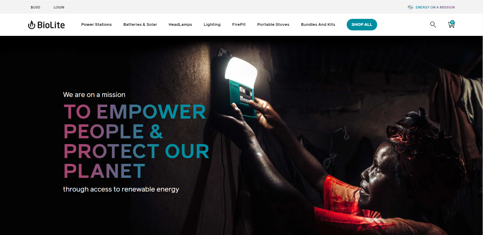
The company is well-known not only for its innovative products but also for its commitment to social and environmental impact. By providing clean, affordable energy solutions, BioLite aims to reduce carbon emissions and promote health improvements through reduced smoke exposure. The About Us page of BioLite serves as one of the About Us page examples that not only tells the company’s story but also educates and engages visitors with their innovative approach to social and environmental challenges. It reflects the essence of the brand and fosters a connection with its audience by demonstrating impact and innovation.
What we love about their About Us page
- Storytelling with Impact: BioLite’s About Us page excellently integrates storytelling with clear, impactful visuals and narratives that highlight their journey and mission. It describes the founding story—how a camping trip led to the realization of the global need for energy—and effectively communicates their vision of energy access for all.
- Mission and Innovation Highlight: The page effectively highlights their mission of sustainable and accessible energy solutions through innovation. It details their unique approach of using revenue from outdoor recreational markets to support and subsidize products for emerging markets, thus addressing environmental and health issues globally.
- Interactive and Educational Content: BioLite’s About Us page includes interactive elements and educational content that provide deeper insights into the technology and science behind their products. They include videos, diagrams, and infographics that explain their core technologies, like the thermoelectric technology used in their stoves, which helps users see the innovation behind the products.
What we can learn from BioLite
- Enhance Storytelling with Visuals and Impactful Narratives: BioLite uses compelling storytelling combined with visuals to share their founding story and the global need they address, making their mission relatable and urgent. Craft your brand’s story to highlight key moments that showcase your mission and values. Use impactful visuals—such as photos, videos, or graphics—to complement your narrative. This can help convey emotional and complex concepts more effectively, making your story more memorable and engaging.
- Highlight Mission and Innovation: BioLite’s page clearly articulates their mission of providing sustainable energy solutions and how they leverage profits from established markets to subsidize products in emerging markets. Clearly define and communicate your mission, especially how it integrates with innovative solutions. Explain how your business model or products address larger societal or environmental issues. This not only enhances the brand’s purpose but also appeals to consumers who value ethical and sustainable practices.
- Incorporate Interactive and Educational Content: BioLite includes interactive and educational elements like videos and infographics to explain the science and technology behind their products, enhancing user understanding and engagement. Use interactive tools and educational content to explain complex aspects of your products or services. Videos, diagrams, and infographics can help demystify technical details and show the real-world applications and benefits of your innovations. This not only educates your audience but also demonstrates your expertise and commitment to transparency.
Pipcorn
Pipcorn is a snack company that produces heirloom corn-based products such as popcorn, cheese balls, and corn chips. Founded by siblings Jeff and Jen Martin alongside Teresa Tsou, the brand was launched after they discovered a unique, smaller kernel heirloom corn at a family farm. This discovery led to the creation of Pipcorn, a company that emphasizes sustainable and health-conscious snack options.
Pipcorn is renowned for its commitment to using non-GMO, whole grain heirloom corn which not only offers a unique flavor and texture but also is easier to digest compared to conventional corn. Their products are minimally processed and come in environmentally friendly packaging. The brand gained widespread recognition after appearing on Shark Tank where it secured an investment, boosting its profile and expansion into a broader market.
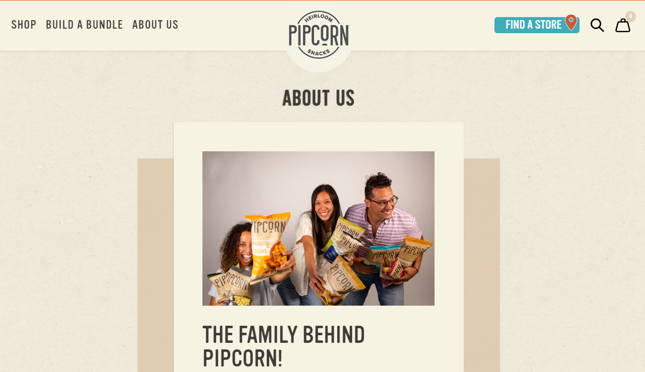
The ethos of Pipcorn centers around sustainability, quality, and innovative takes on traditional snacks, aiming to offer better and tastier choices that are good for people and the planet. Pipcorn’s About Us page belongs in the top About Us page examples because not only does it showcase their products, it also tells a compelling story about heritage, sustainability, and family. It reflects their mission and values, inviting customers to be part of a larger, meaningful narrative that goes beyond just snacking.
What we love about their About Us page
- Heritage and Sustainability Focus: Pipcorn’s About Us page effectively communicates the heritage story of their heirloom corn and its benefits. It highlights the sustainability aspect of their business model, explaining why heirloom corn not only preserves agricultural biodiversity but also supports sustainable farming practices. The page includes details about their commitment to non-GMO crops and how these choices impact the environment and consumer health positively.
- Family-Founded Story: A standout feature of the About Us page is the personal touch of the family-founded story. It details how the founders started with an old family heirloom—the tiny corn—and turned it into a thriving business. Including personal anecdotes and family photos can make the brand feel more accessible and trustworthy.
- Transparency and Educational Content: The About Us page does a great job in educating visitors about the uniqueness of heirloom corn versus typical corn varieties used in snacks. This includes explanations on the health benefits, such as being easier to digest and less likely to cause bloating. The page uses clear, friendly language and infographics to convey this information, making it both informative and engaging.
What we can learn from Pipcorn
- Emphasize Heritage and Sustainability: Pipcorn effectively communicates the story of their heirloom corn, linking the product to heritage and sustainability. Articulate your company’s historical roots and how they align with modern sustainable practices. If your products or services are linked to traditional or less-common methods that benefit the environment, highlight these aspects. Explain how these practices contribute to sustainability goals, such as biodiversity preservation or reduced environmental impact.
- Incorporate a Personal, Family-Founded Narrative: The family-founded story on Pipcorn’s page, complete with personal anecdotes and photos, creates a connection with the audience, making the brand feel more human and trustworthy. Share the personal story behind your business. If your company is family-founded, detail the origins and evolution of your business idea. Use personal anecdotes and visuals to make your brand more relatable and trustworthy. This approach helps build a personal connection with your audience, fostering loyalty and trust.
- Provide Transparency and Educational Content: Pipcorn uses clear, friendly language and infographics to educate visitors about the benefits of heirloom corn, such as being non-GMO and easier to digest. Use your About Us page to educate visitors about your products or services in an engaging and accessible manner. Employ clear explanations, infographics, or even short videos to explain complex information or highlight the unique benefits of your offerings. This educational content can empower customers, making them feel more knowledgeable and confident in their purchasing decisions.
Bombas
Bombas is a direct-to-consumer premium sock and apparel brand that is best known for its comfortable socks designed for men, women, and children. Founded in 2013 by David Heath and Randy Goldberg, Bombas was inspired by a mission to help those in need. The brand was launched following the realization that socks are the most requested clothing item in homeless shelters. This insight led to the creation of a company whose business model includes a commitment to donating a pair of socks for every pair purchased.
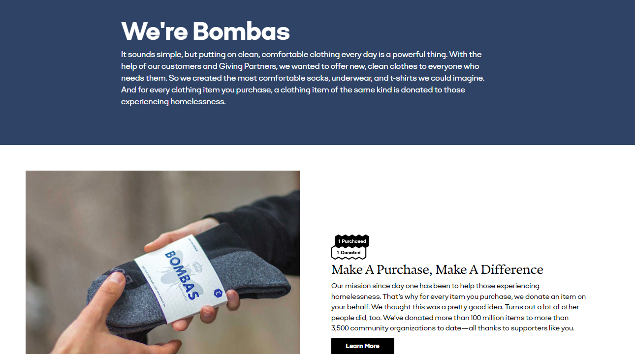
The name Bombas is derived from the Latin word for bumblebee, bombus, chosen to represent the brand’s philosophy of, mirroring the bee’s dedication to the colony. Bombas socks are engineered to reduce common annoyances like toe seams, slipping heels, and uncomfortable bindings. In addition to socks, Bombas has expanded its product line to include t-shirts and underwear, which also follow the buy-one-give-one model.
Bombas serves as one of the About Us page examples because the page effectively communicates their brand ethos, mission, and product uniqueness. It not only serves to inform but also to inspire and engage consumers by showing how their purchases contribute to a broader social impact.
What we love about their About Us page
- Mission-Driven Narrative: Bombas’ About Us page strongly focuses on their mission to make an impact through their one-for-one donation model. It provides a compelling story about how they were inspired to start the company and the social issue they aim to address—supporting the homeless community.
- Detailed Explanation of Product Innovation: The page does an excellent job of detailing the innovations behind their products. It talks about specific design features that make their socks superior, such as the honeycomb support system, blister tabs, and performance footbed.
- Transparency in Impact: Bombas’ About Us page includes a detailed count of the number of items they have donated to date, which is continuously updated. This level of transparency builds trust and showcases the tangible impact of customer purchases. Additionally, the page highlights stories of partnerships with community organizations and shelters, providing a deeper look into how the donations are distributed and who they help.
What we can learn from Bombas
- Craft a Mission-Driven Narrative: Bombas emphasizes their mission to support the homeless community through their one-for-one donation model, providing a strong narrative that connects their business activities directly to their social impact. Clearly articulate your company’s mission on your About Us page and explain why your company was founded, the problems you aim to solve, and how your business model contributes to this goal. This approach helps to emotionally engage visitors by showing them the broader impact of their purchases, not just the value of the products or services themselves.
- Provide Detailed Explanations of Product Innovations: Bombas details the unique design features of their socks, such as the honeycomb support system and performance footbed, which not only informs customers about product quality but also differentiates their offerings in the market. Highlight the innovative aspects of your products or services and describe the specific features and benefits, explaining how they improve on conventional options or address specific customer needs. This helps to establish your brand as a leader in innovation and customer-focused design.
- Show Transparency in Impact: Bombas enhances trust and reinforces their brand’s credibility by providing up-to-date statistics on their donations and sharing stories about their partnerships with community organizations. If your business also has a social impact component, be transparent about the results and the difference your company is making. Include statistics, stories, and perhaps even testimonials from partners or beneficiaries. This not only demonstrates accountability but also lets customers see the direct impact of their patronage, which can increase loyalty and advocacy.
Minaal
Minaal is a travel gear company focused on designing functional, durable, and efficient products for digital nomads and frequent travelers. Founded by Jimmy Hayes and Doug Barber, the company was launched through a highly successful Kickstarter campaign in 2013. Minaal’s goal is to create gear that helps people move seamlessly and comfortably through the world, reducing the friction of travel.
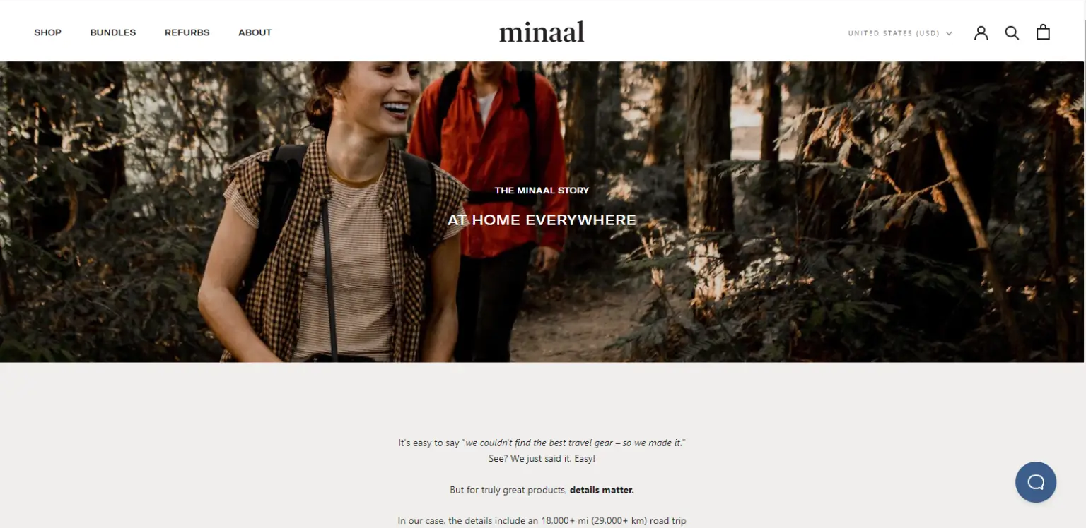
Their flagship products, such as the Minaal Carry-on 2.0 and the Daily Bag, are celebrated for their sleek design, organizational features, and robust construction. The bags are designed to meet the specifications for airline carry-on luggage, maximizing space while ensuring mobility and comfort. Minaal emphasizes a minimalist aesthetic and practical functionality, catering to travelers who value both style and performance.
Minaal is one of the About Us page examples as it effectively communicates their core values, focus on customer-driven design, and the personal motivations behind their products. It not only serves to inform but also engages visitors by sharing a compelling story of innovation driven by actual user needs and experiences.
What we love about their About Us page
- Focus on Design Philosophy: Minaal’s About Us page deeply integrates their design philosophy, emphasizing how each feature of their products is meticulously thought out to enhance the travel experience. The page discusses their minimalist approach and how it applies not just to the look of the products but also to their functionality.
- Community-Centric Approach: The About Us page highlights the importance of community input in their design process. Minaal uses feedback from a global community of users to refine and improve their products continuously. This iterative feedback process is presented as a key element of their brand, illustrating their dedication to evolving with the needs of their customers.
- Transparent and Personal Connection: Minaal uses their About Us page to build a personal connection with the audience by sharing the founders’ own travel experiences and how they led to the creation of the company. The narrative includes challenges they faced while traveling and how those challenges inspired the features of their products.
What we can learn from Minaal
- Articulate Your Design Philosophy: Minaal emphasizes the thoughtful consideration behind each product feature, integrating their design philosophy into their brand narrative. Clearly define and communicate your brand’s design philosophy on your About Us page and explain how this philosophy influences product development and the specific benefits it brings to the customer. This approach not only educates customers but also connects them emotionally to your products, seeing them as solutions crafted to meet their needs.
- Leverage Community Feedback: Highlighting the role of community feedback in product development, as Minaal does, showcases a brand’s commitment to customer satisfaction and continuous improvement. Mention how customer insights influence your product design and refinement and encourage ongoing feedback by showing examples of how previous suggestions have been implemented. This builds trust and shows prospective customers that they are entering into a receptive and adaptive relationship.
- Share Personal Stories and Challenges: Minaal builds a transparent and personal connection with their audience by sharing the founders’ travel experiences and the challenges that inspired the creation of their products. Use your About Us page to share the personal stories behind your brand and highlight the challenges that inspired your products or services and how they address specific needs or problems. This not only humanizes your brand but also illustrates your expertise and dedication in a way that resonates with your audience.
Rothy’s
Rothy’s is a San Francisco-based company known for creating stylish, sustainable footwear and accessories for women, men, and children. Founded in 2012 by Stephen Hawthornthwaite and Roth Martin, the company set out to create environmentally friendly fashion without compromising on style or comfort. Rothy’s shoes are famous for their seamless design, knit from recycled plastic bottles, which have been transformed into a soft, breathable, and durable yarn.
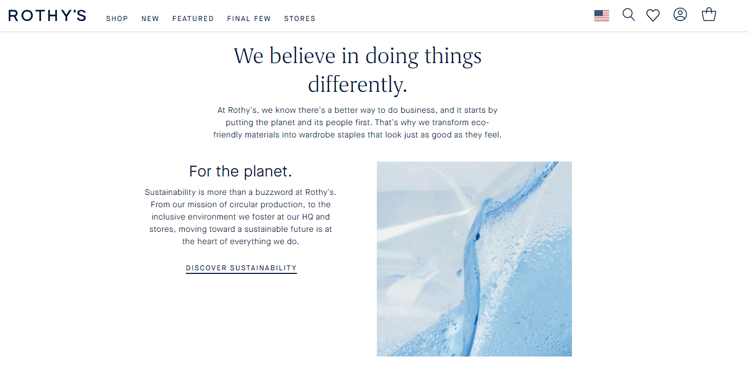
Rothy’s has expanded its product line to include bags and other accessories, all following the same sustainable production principles. Their manufacturing process is highly efficient, reducing waste by using 3D knitting technology to create products to shape. This technique not only minimizes production waste but also allows for designs that are both functional and fashionable. Rothy’s commitment to sustainability extends through their entire production cycle, from material selection to the end of the product’s life cycle.
One of the notable About Us page examples is Rothy’s since it effectively communicates the essence of the brand, highlighting their innovative, sustainable practices and the stylish, practical applications of their products. It not only informs visitors about the company’s commitments and processes but also connects them emotionally and culturally to the Rothy’s community.
What we love about their About Us page
- Sustainability Commitment: Rothy’s About Us page effectively communicates their deep commitment to sustainability. It provides detailed information about their use of recycled materials—specifically mentioning how many plastic water bottles they have repurposed to date—and their zero-waste production process. The page goes beyond general statements to share specific environmental goals and the steps they are taking to achieve them, such as carbon neutrality.
- Innovative Production Process: The page highlights their innovative use of 3D knitting technology, which allows them to produce shoes with minimal waste. By focusing on this aspect, Rothy’s distinguishes itself as a leader in sustainable manufacturing within the fashion industry, appealing to tech-savvy shoppers and those interested in modern, efficient production methods.
- Community and Lifestyle Engagement: Rothy’s uses its About Us page to portray a lifestyle that matches their brand ethos. They emphasize a community of customers who are thoughtful about their purchases and interested in modern, sustainable living. This engagement is extended through stories and visuals that depict customers in various aspects of their daily life, showcasing the versatility and style of the products.
What we can learn from Rothy’s
- Detail Your Sustainability Efforts: Rothy’s provides detailed information about their sustainability efforts, including the use of recycled materials and their zero-waste production process. They go beyond vague claims by citing specific achievements, such as the number of plastic bottles repurposed. Clearly articulate your company’s environmental initiatives and provide quantifiable achievements and ongoing goals to show commitment and progress. This transparency builds trust and aligns with the values of environmentally conscious consumers. If your brand has similar green practices, detailing these can significantly enhance your credibility.
- Highlight Innovative Practices: The emphasis on using 3D knitting technology positions Rothy’s as a forward-thinking company in sustainable manufacturing. This not only highlights their innovation but also appeals to consumers interested in cutting-edge technology and efficiency. Showcase the innovative aspects of your production process or product design on your About Us page. Whether it’s through unique technology, creative problem-solving, or pioneering new methods, highlighting these factors can differentiate your brand in a crowded market.
- Engage with Community and Lifestyle: Rothy’s portrays a lifestyle that aligns with their brand ethos, engaging with a community of customers who value thoughtful, sustainable living. They use stories and visuals that reflect the practicality and style of their products in everyday life. Use your About Us page to connect with your target audience by portraying a lifestyle that fits your brand. Incorporate customer stories, testimonials, and visuals that demonstrate how your products or services integrate into and enhance the lives of your customers. This not only makes your products more relatable but also encourages a deeper emotional connection with your brand.
Cuppow
Cuppow is an innovative company that specializes in creating eco-friendly accessories designed to transform everyday jars into on-the-go items. Founded in 2011 by Joshua Resnikoff and Aaron Panone, the company started with a simple yet revolutionary product: a lid that turns a canning jar into a travel mug. This idea came from a desire to reduce waste and promote sustainability by repurposing common household items.
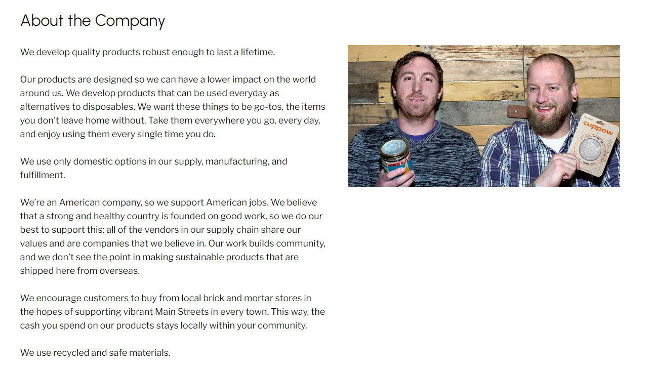
The core product, the Cuppow drinking lid, is designed for mason jars, which are durable, inexpensive, and made from food-safe materials, making them an ideal solution for reusable drink containers. Over time, Cuppow expanded its product line to include other sustainable goods such as the BNTO, a cup insert that turns a mason jar into a lunchbox, separating wet and dry ingredients.
Cuppow’s products are manufactured in the United States from recycled materials, emphasizing the company’s commitment to reducing environmental impact and supporting local economies. Cuppow belongs in the top About Us page examples because of its efficiency in communicating their brand ethos and operational principles, making a strong case for sustainability and local production. It not only informs but also inspires visitors, connecting them to a broader narrative of environmental responsibility and innovative reusability.
What we love about their About Us page
- Focus on Sustainability: Cuppow’s About Us page strongly emphasizes their commitment to sustainability, detailing how their products are designed to reduce reliance on disposable containers. The page explains the environmental benefits of using mason jars with Cuppow lids, such as decreasing plastic waste and enhancing the usability of glass, which is more sustainable to produce and recycle than plastic
- Made in the USA: The page takes pride in highlighting that all Cuppow products are manufactured in the USA using recycled materials. This not only supports the local economy but also ensures a lower carbon footprint due to reduced transportation distances.
- Community Engagement and Lifestyle Integration: Cuppow’s About Us page portrays how their products fit into a sustainable lifestyle, encouraging community engagement through user-generated content. They showcase customer photos and stories of using Cuppow products in various settings, from office desks to camping trips
What we can learn from Cuppow
- Showcase Commitment to Core Values:Emphasize your commitment to key values such as sustainability, just as Cuppow highlights their focus on reducing disposable container usage and promoting recyclable materials.
- Clearly articulate your brand’s mission and values. If sustainability is a cornerstone, detail the specific actions and choices your business makes to uphold these values, such as sourcing materials responsibly or optimizing manufacturing processes to minimize environmental impact.
- Highlight Local Manufacturing and Sourcing: Cuppow enhances brand trust by promoting its products as made in the USA using recycled materials, underscoring support for the local economy and reduced environmental impact. If your products are locally made, prominently mention this on your About Us page. Explain how local production helps maintain quality control, supports the community, and aligns with your brand’s ethical standards. This can be particularly compelling to customers who prioritize supporting local businesses.
- Incorporate User-Generated Content and Community Engagement: Cuppow’s page goes beyond just selling products by integrating user-generated content that showcases how customers use their products in daily life.Encourage your customers to share their experiences and photos with your products. Feature these stories and images on your About Us page to demonstrate real-life applications and satisfaction. This not only provides social proof but also fosters a sense of community and loyalty among your customers.
- Communicate the Practical Benefits of Your Products: Cuppow clearly communicates the practical and environmental benefits of their product design, helping customers understand why their products are a smart choice.Use your About Us page to explain the benefits of your products or services. Don’t just list features; connect them to real-world benefits that resonate with your target audience. If your product saves time, enhances sustainability, or improves quality of life, make those benefits clear and compelling.
Ugmonk
Ugmonk is a design-driven brand that offers a range of meticulously designed products, including apparel, desk accessories, and bags. Founded in 2008 by designer Jeff Sheldon, the brand started primarily as a way to sell Sheldon’s unique t-shirt designs but has since evolved into a broader lifestyle brand that emphasizes simplicity and quality. Ugmonk’s ethos is deeply rooted in a passion for design and functionality, reflecting Sheldon’s personal aesthetic and attention to detail.
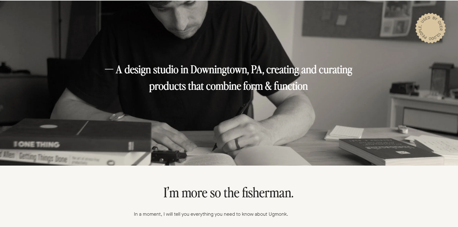
The brand is known for its minimalist designs, which often incorporate geometric shapes and clean lines. This carries into their About Us page as well, making it one of the more distinguishable About Us page examples. Ugmonk’s products are not just about looks; they are crafted to enhance everyday life, combining beauty with practicality. From clothing to workspace items, each product is created with the intent to inspire and improve daily routines.
What we love about their About Us page
- Personal Journey of the Founder: Ugmonk’s About Us page uniquely highlights the personal journey and inspiration of its founder, Jeff Sheldon. This narrative provides a transparent and intimate look into the motivations behind the brand, connecting customers to the human element of the business. It shares stories about Sheldon’s initial interests in design and how he transformed his passion into a thriving business.
- Commitment to Quality and Detail: The page emphasizes the brand’s commitment to high-quality materials and craftsmanship. Each product’s design process is outlined, showing how meticulous planning and attention to detail are integral to the creation of each item. By documenting the thought process behind product development, Ugmonk assures customers of the value and durability of their purchases.
- Integration of Lifestyle and Design Philosophy: Ugmonk’s About Us page effectively integrates its design philosophy with a broader lifestyle approach. It does not just sell products but promotes a way of life that is uncluttered, focused, and meaningful. The page features images and narratives that reflect how the products can be integrated into daily life, from the way they enhance a work environment to how they simplify personal spaces.
What we can learn from Ugmonk
- Humanizing the Brand Through Founder Stories: By sharing the personal journey and inspirations of its founder, Jeff Sheldon, Ugmonk underscores the importance of personal connection in branding. This approach not only humanizes the brand but also builds a deeper emotional engagement with customers by letting them see the passion and dedication behind the business. Companies can benefit from sharing their founders’ stories or the personal motivations driving their business, as these narratives can differentiate their brand and create a strong personal connection with their audience.
- Emphasizing Commitment to Quality and Craftsmanship: Ugmonk’s focus on the quality of materials and the detailed craftsmanship in their product descriptions effectively communicates their commitment to delivering superior products. This level of transparency about the production process builds trust and reassures customers about the quality of their purchases. Businesses should consider how they can demonstrate their commitment to quality and detail, possibly through behind-the-scenes content, detailed descriptions of the manufacturing process, or highlighting the expertise of their craftsmen.
- Blending Product with Lifestyle: The integration of Ugmonk’s design philosophy with a lifestyle approach is a strategic move that elevates the brand beyond just selling products. By showing how their products fit into and enhance a thoughtful, well-designed lifestyle, Ugmonk not only markets their items but also the lifestyle that they embody. This strategy can be particularly effective for brands that want to appeal to consumers’ aspirations and values, not just their need for a product. Businesses should explore ways to connect their products with larger lifestyle narratives, demonstrating how their offerings can positively impact customers’ daily lives.
Tattly
Tattly is a New York-based temporary tattoo company founded in 2011 by Swiss designer Tina Roth Eisenberg out of frustration with the poor quality of children’s temporary tattoos. Tattly began as a side project but quickly evolved into a thriving online business, transforming temporary tattoos into cool, design-forward statements for all ages. The company collaborates with professional artists and designers to create unique and artful temporary tattoos that are safe, non-toxic, and made in the USA.
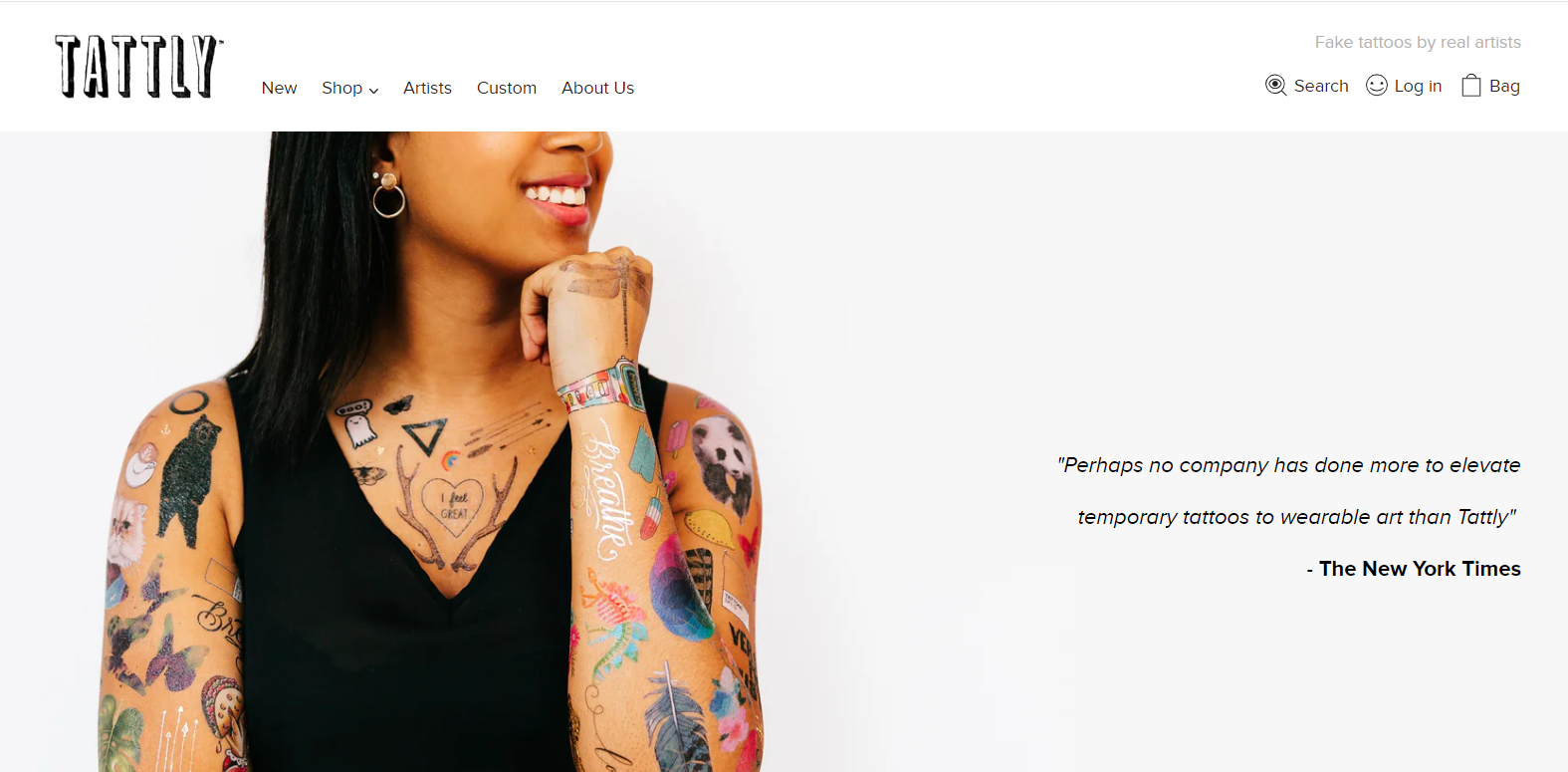
Tattly sets itself apart by offering a high-quality, aesthetic alternative to traditional temporary tattoos. The designs range from whimsical and colorful to sophisticated and minimalist, catering to a diverse audience, including kids and adults alike. Each purchase not only supports the artists involved but also provides customers with a fun and temporary way to express themselves. As one of the About Us page examples, their About Us page certainly embraces the brand identity and aesthetics, thus does an excellent job of communicating the brand’s ethos, its commitment to quality, safety, and artist collaboration. It effectively uses visual and textual content to create a compelling narrative that engages potential customers and provides a clear understanding of what makes their products special.
What we love about their About Us page
- Artist Collaborations and Support: Tattly’s About Us page prominently features the artists they collaborate with, emphasizing the company’s commitment to supporting independent artists. The page includes profiles of featured artists and links to their work, creating a direct connection between the artists and customers.
- Focus on Quality and Safety: The About Us page makes a strong case for the quality and safety of Tattly tattoos. It highlights that their products are safe for all skin types, non-toxic, and made with FDA-compliant ingredients, which reassures customers about the product’s safety.
- Engaging Visual Content: Tattly’s About Us page uses vibrant, engaging visual content that captures the spirit of fun and creativity that the brand embodies. The use of colorful images of people of all ages enjoying their tattoos helps to convey the joy and playful nature of the product.
What we can learn from Tattly
- Celebrating Collaboration and Artistry: By featuring and celebrating the artists they collaborate with, Tattly sets an example of how businesses can foster a culture of appreciation and respect for creative talent. This not only enhances the brand’s image but also builds a loyal community by connecting customers directly with the creators. Businesses should consider how they can integrate their partners or collaborators more deeply into their storytelling to create a more engaging and personable brand experience.
- Prioritizing Product Transparency and Safety: Tattly’s emphasis on the safety and quality of their products is a crucial takeaway for any company, particularly those in the consumer goods sector. Transparency about product ingredients and safety can significantly boost consumer trust and satisfaction. Companies should strive to clearly communicate their product standards and safety measures, ensuring these elements are easy for customers to find and understand.
- Leveraging Engaging Visuals to Tell a Story: The use of vibrant and engaging visual content on Tattly’s About Us page is not just aesthetically pleasing but also strategically effective. It visually communicates the brand’s ethos and the joy their products bring to customers. This teaches businesses the importance of aligning visual content with the brand’s message and using it to enhance the overall user experience on digital platforms. Captivating visuals can be a powerful tool to engage visitors, encourage sharing, and increase overall brand awareness.
Leesa
Leesa is a direct-to-consumer online mattress company founded in 2014, dedicated to providing premium sleep products, including mattresses, pillows, and bed bases. Based in Virginia Beach, Virginia, Leesa is driven by a mission to deliver quality sleep at an accessible price while also making a positive impact on the community. The company stands out in the crowded online mattress market with its socially conscious business model, committing to donating one mattress for every ten sold, and partnering with organizations that help homeless and at-risk individuals.
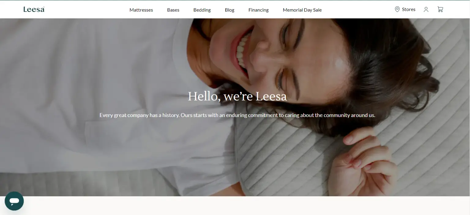
Leesa mattresses are known for their high-quality, multi-layer foam construction, which is engineered to provide support, breathability, and pressure relief to suit a wide range of sleeping styles and body types. Their products are designed to offer a balance of comfort and support, aiming to enhance the sleep experience while also focusing on sustainability and ethical practices in production.
Overall, Leesa’s About Us page is a powerful representation of their brand ethos and operational philosophy. It effectively blends product information with a strong emphasis on social responsibility and customer experiences, providing a comprehensive view that appeals to ethically minded consumers and those in search of a better night’s sleep, thus serving as one of the best About Us page examples.
What we love about their About Us page
- Strong Social Impact Narrative: Leesa’s About Us page effectively communicates its commitment to social impact through its One-Ten program, which is a cornerstone of their business philosophy. For every ten mattresses sold, one is donated to a charitable organization that helps homeless and at-risk individuals.
- Transparency in Manufacturing and Materials: The page provides detailed information about the materials used in their mattresses, emphasizing sustainability and safety. Leesa uses CertiPUR-US® certified foam, which means that their foam meets rigorous standards for content, emissions, and durability, and has been analyzed by independent, accredited testing laboratories.
- Engagement through Customer Stories and Reviews: Leesa’s About Us page includes customer reviews and testimonials that showcase real-life experiences with their mattresses. By integrating these stories, Leesa not only provides social proof of their product’s value but also creates a more relatable and humanized brand image.
What we can learn from Leesa
- Integrate Social Responsibility: Clearly articulate any charitable programs or sustainability efforts your company is involved in. Leesa’s About Us page effectively leverages its commitment to social impact, which serves as a powerful tool for connecting with customers on a deeper level. This approach can significantly boost customer loyalty and brand trust, as consumers increasingly prefer to purchase from brands that demonstrate ethical practices and real-world impact.
- Be Transparent: Transparency is crucial in building trust, especially in industries where product safety and sustainability are of concern. This transparency not only assures customers of the quality and safety of the products but also strengthens the brand’s credibility. By being open about their manufacturing processes and the standards they adhere to, Leesa sets itself apart in an industry where consumers are particularly concerned about product safety and environmental impact. Brands can take away the importance of clear, transparent communication about product ingredients and processes, which can be a decisive factor for environmentally and health-conscious consumers.
- Leverage Customer Feedback: Incorporate customer reviews and testimonials prominently on your About Us page. This not only serves as endorsement but also provides prospective customers with relatable narratives that can influence their buying decisions.
- Engaging Customers through Stories and Reviews: The inclusion of customer reviews and testimonials on Leesa’s About Us page is a strategic move that taps into the power of social proof. These real-life stories and experiences not only demonstrate the value and comfort of their mattresses but also humanize the brand. By showcasing how their products have positively impacted their customers’ lives, Leesa builds a stronger emotional connection with potential buyers.
Chubbies
Chubbies is an American apparel brand known for its casual and fun clothing, with a particular focus on men’s shorts. Founded in 2011 by four friends—Rainer Castillo, Kyle Hency, Preston Rutherford, and Tom Montgomery—Chubbies set out to bring back the retro style of short shorts, embodying the leisurely lifestyle of weekends and good times. The brand quickly expanded its product line to include swimwear, outerwear, and sportswear, but always with an emphasis on comfort, freedom, and a touch of nostalgia.
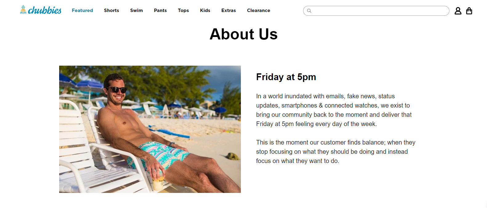
Chubbies champions the idea of the weekend warrior, promoting a laid-back lifestyle through its marketing and products. The brand is heavily community-focused, often engaging with its customers through social media and brand events. Their About Us page certainly embraces its identity, effectively captures the essence of the brand through its unique tone, visual storytelling, and strong emphasis on a lifestyle that appeals directly to its core demographic, thus becoming one of the top About Us page examples. Chubbies’ marketing is characterized by a humorous and irreverent tone, appealing to a younger demographic that values both comfort and a sense of humor in their apparel.
What we love about their About Us page
- Emphasis on Brand Philosophy and Lifestyle: Chubbies’ About Us page strongly emphasizes their brand philosophy centered around the enjoyment of life, particularly on weekends. It talks about creating clothing that is not just for wearing but for living in, promoting a lifestyle where every day feels like the weekend.
- Engaging and Humorous Tone: The tone of the About Us page is distinctly casual and filled with humor, mirroring the brand’s overall voice and messaging. By infusing humor and a conversational style, Chubbies creates an inviting and engaging narrative that resonates with its target audience, making the brand feel more personal and approachable.
- Visual and Interactive Elements: Chubbies utilizes vibrant, engaging visuals and interactive elements on their About Us page that reflect the energetic and fun nature of the brand. Photos and videos of people enjoying their products in various settings—beach outings, barbecues, and other leisure activities—dominate the page.
What we can learn from Chubbies
- Define and Emphasize Your Brand Philosophy: Clearly articulate what your brand stands for and how it integrates into the lifestyle of your customers. This will help form a stronger emotional connection with your audience.
- Adopt a Unique Brand Voice: Choose a tone and style of communication that reflects your brand’s personality and resonates with your target audience. Whether it’s humorous, professional, or inspirational, ensure it’s consistent across all content.
- Incorporate Rich Media and Interactivity: Use high-quality visuals and interactive elements to tell your brand story more effectively. Consider how different formats can be used to highlight your products and the experiences associated with them.
The Elements of A Great About Us Page
In crafting an effective About Us page, several key elements must come together to tell a compelling story about your brand. This section breaks down the essential components of a great About Us page based on the previous About Us page examples that we discussed, providing insights into how you can seamlessly integrate storytelling, visual design, and user engagement to leave a lasting impression. From articulating your mission and values to showcasing your team and highlighting customer testimonials, each element plays a pivotal role in building a narrative that not only informs but also connects with your audience on a personal level.
Explanation of What An About Us Page Is and Why It’s Important
An About Us page is a section on a website that provides information about the company or organization that owns the website. The purpose of this page is to give visitors a sense of whom the company is, what it does, and what its mission and values are.
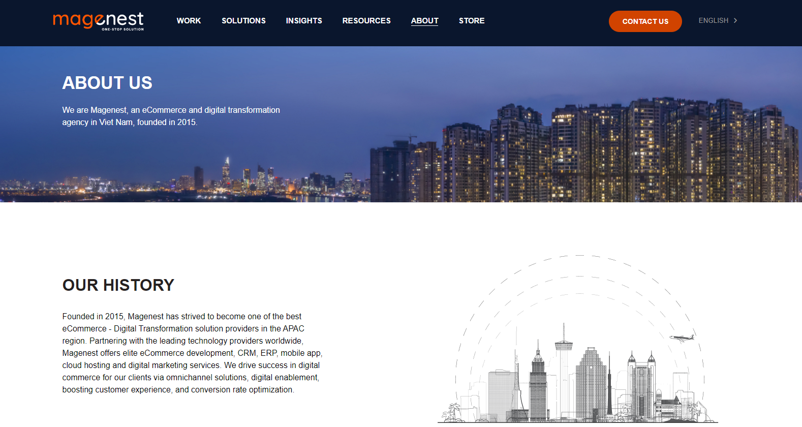
The information on an About Us page can include a brief history of the company, its founders, its mission statement, its products or services, and its team members. The about us page can also include the company’s awards or recognition, and any other information that helps visitors understand the company’s background and purpose. These can be presented in paragraphs, photos, or videos that showcase the company’s work, culture, or team.
The About Us page is an important part of a website, as it helps to establish trust and credibility with visitors by giving them a clear understanding of whom the company is and what it stands for.
The Importance of Showcasing Your Brand’s Personality and Values
Showcasing your brand’s personality and values is crucial to building a strong relationship with your audience. In today’s competitive marketplace, it’s no longer enough to list your products or services on a website simply. Consumers want to know what sets your brand apart, what drives you, and what you stand for. By providing insights into your brand’s personality and values, you can differentiate yourself from the competition and establish a unique identity.
A consistent tone and style throughout your About Us page can go a long way in conveying your brand’s personality. Whether you choose a casual or formal tone, it’s essential to maintain that tone throughout the page to create a cohesive narrative. This can help your brand come across as authentic, approachable, and relatable to your target audience.
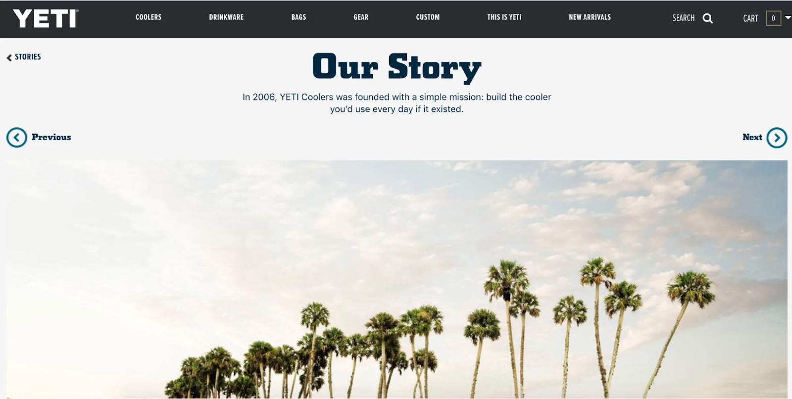
Yeti’s About Us page does an excellent job of showcasing the brand’s personality and values. Through the use of imagery, a clear mission statement, and personal stories, the page creates a strong connection with the audience and communicates the brand’s passion for the outdoors, and supports inspiring individuals and causes. The bios and photos of the team members fishing further add to the personal touch and help visitors connect with the people behind the brand.
The Need for Clear and Concise Messaging
Clear and concise messaging is crucial for a successful About Us page. When visitors arrive at your website, they are likely to skim through the page looking for key information about your brand. This means that your message needs to be easy to understand and quickly convey your brand’s story, mission, and values.
Using jargon or technical language can be a major turnoff for visitors, as it can make your brand seem unapproachable or intimidating. Instead, it’s best to use simple, straightforward language that is easy to understand. This will help visitors quickly understand what your brand is all about and why they should care.
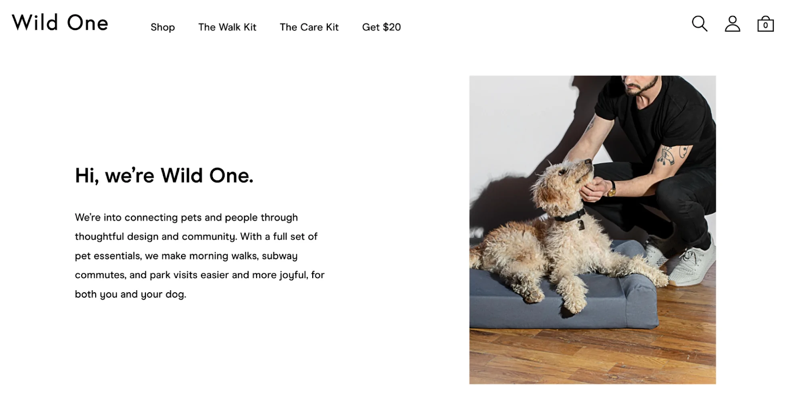
In addition to using clear language, it’s important to focus on the most important aspects of your brand’s story, mission, and values. Your About Us page should be concise and to the point, highlighting the key information that visitors need to know. This means avoiding unnecessary details or information that isn’t directly relevant to your brand.
By crafting a clear and concise message, you can ensure that visitors to your About Us page quickly understand your brand’s story, mission, and values. This can help establish trust and credibility with your audience, as well as make your brand more approachable and relatable.
The Importance of Including Social Proof
Social proof is a powerful tool for building trust and credibility with your audience, which is why it’s essential to include it on your About Us page. Social proof can take many forms, including customer testimonials, awards & recognition, case studies, or media coverage. By including these types of validation on your About Us page, you can demonstrate your brand’s credibility and expertise.
Customer testimonials are one of the most effective forms of social proof. They provide real-world examples of how your brand has helped others, which can be a powerful motivator for potential customers. When including customer testimonials on your About Us page, it’s important to use real names and photos to make the testimonials feel authentic and trustworthy.
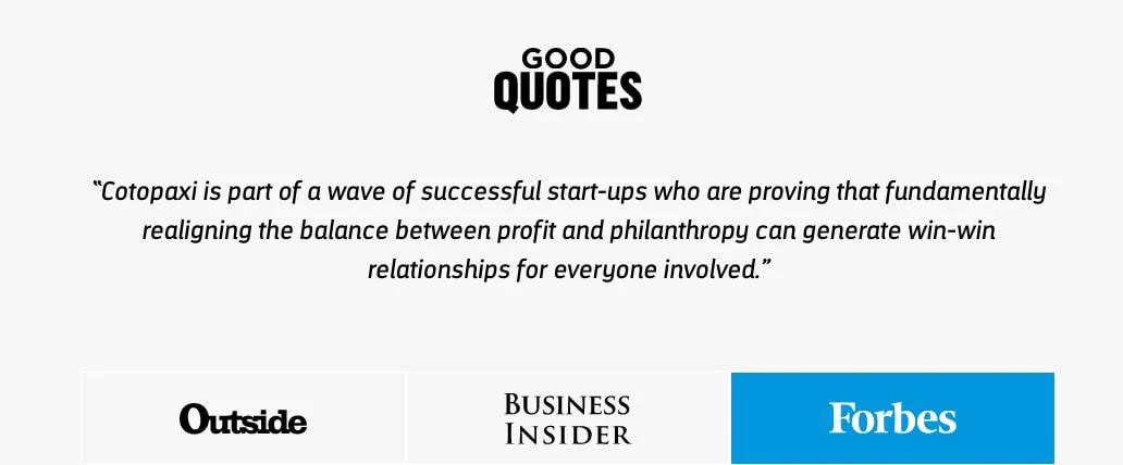
Awards and recognition can also be a powerful form of social proof. If your brand has won any awards or been recognized in your industry, be sure to include this information on your About Us page. This can help establish your brand as a leader in your industry and build trust with potential customers.
Case studies and media coverage are additional forms of social proof that can be included on your About Us page. Case studies provide specific examples of how your brand has helped customers, while media coverage can demonstrate that your brand is well-respected in your industry.
The Value of Including Team Bios
One of the most significant advantages of including team bios on your About Us page is that it can help establish a more personal connection with your audience. By sharing information about your team members’ backgrounds, interests, and experiences, you can provide visitors with a glimpse into the personalities behind your brand. This can be especially important for small businesses or startups, where the team members are often the face of the company.
Team bios can also be a powerful tool for building trust and credibility with your audience. When visitors see that your team consists of knowledgeable, experienced, and skilled individuals, they are more likely to trust your brand and the products or services you offer. This is because team bios can help demonstrate the level of expertise and commitment your team brings to the table.
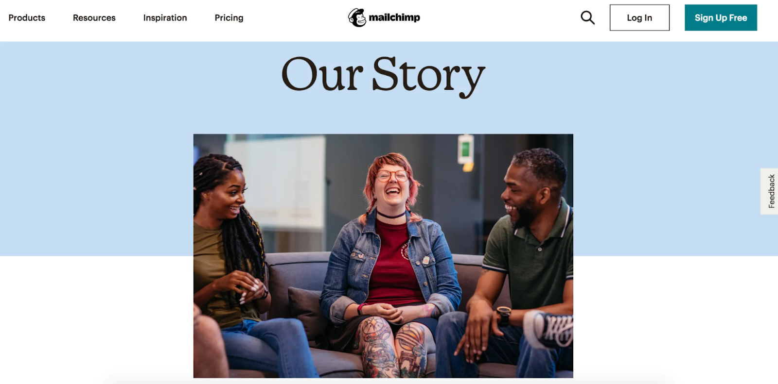
Another benefit of including team bios is that they can serve as a recruitment tool. By showcasing the talent and diversity of your team, you can attract potential job candidates who align with your brand’s values and mission. This can be especially important for companies that are looking to attract top talent and establish themselves as an employer of choice.
In addition to highlighting the expertise and talent of your team, team bios can also be used to showcase the culture and values of your brand. For example, you may choose to include information about your team members’ involvement in community service or charitable organizations, which can help reinforce your brand’s commitment to social responsibility.
How to Craft A Great About Us Page
Crafting a great About Us Page is crucial to help your website visitors understand your business and connect with your brand. An About Us Page is where you get to share the story of your brand and show visitors why you are different from your competitors. It is the perfect opportunity to showcase your company’s values, goals, and mission, and establish a connection with your target audience. A well-crafted About Us Page can help you build trust and credibility with potential customers, and encourage them to take action, whether that be to make a purchase or sign up for your services.
Establish A Mission Statement
A mission statement is more than just a sentence on a webpage; it’s a declaration of your company’s core purpose and values. It articulates why your business exists and what it hopes to achieve in the marketplace. The mission statement serves as a guiding star for all your company’s strategic decisions and communications, ensuring consistency and clarity in your brand messaging.
An effective mission statement should be clear and concise, avoiding jargon and complex language so it’s accessible to everyone. It should also be inspirational, conveying the passion behind your brand and motivating everyone who reads it. The statement needs to be purpose-driven, explicitly stating what your company does and why. Lastly, it should include your Unique Selling Proposition (USP), highlighting what sets you apart from competitors, whether it’s your innovative approach, quality commitment, or exceptional customer service.
To write your mission statement, start by identifying your core values, which are the principles guiding your business. Then, consider your audience; knowing who your customers are and what they care about will help make your mission statement resonate with them. Reflect on what your company does best and weave these strengths into your statement. Keep your mission statement flexible to allow for business growth and changes. Finally, seek feedback on your drafts from team members, business advisors, or loyal customers to refine it further.
Examples of Effective Mission Statements include:
- Tesla: To accelerate the world’s transition to sustainable energy.
- Nike: To bring inspiration and innovation to every athlete in the world.
- Airbnb: To help create a world where you can belong anywhere.
These examples are successful because they are clear, memorable, and reflect the essence of what each company aims to achieve.
Once crafted, your mission statement should be prominently featured on your About Us page. This isn’t just about placement; it’s about making the mission statement a central theme of your narrative. Surround it with stories about your company’s history, achievements, and testimonials that reinforce the mission. Use visuals that align with the values and goals outlined in your statement to create a cohesive and impactful user experience.
By carefully crafting and strategically placing your mission statement, you turn your About Us page into a powerful tool that communicates the heart and soul of your brand to every visitor.
Tell Your Story and Evolution
Your company story is a crucial part of your About Us page, offering a glimpse into your brand’s origins, its growth, and its unique attributes. This narrative goes beyond mere facts; it engages your audience on an emotional level, helping to build trust and authenticity. It differentiates your brand from competitors by providing a transparent look at what you stand for and how you have developed over time.
Your story should begin with the origins of your company, detailing the initial inspiration and the problems you aimed to solve. This foundation sets the tone for understanding your core values and mission. Follow this by discussing how your company has evolved, highlighting significant changes and developments that have influenced your current operations.
It’s also important to share the challenges your company has faced along with the successes. This shows resilience and reliability, which are valuable traits to customers. Additionally, clarify what makes your company unique, whether it’s your cutting-edge technology, exceptional customer service, or innovative business practices.
To make your company story compelling, use specific examples and anecdotes that show rather than tell your history. Choose a tone that aligns with your brand’s personality—be it professional, conversational, or informal—to maintain consistency in how your brand is perceived. Incorporating visuals like photos, videos, or interactive timelines can also enhance your narrative by providing a more dynamic reading experience. Emphasizing the human aspect of your business is another powerful storytelling technique. Focus on the people behind the brand—founders, team members, and customers—and include their stories or testimonials to create a more relatable and engaging narrative.
Begin your About Us page with a brief introduction of what your company does, along with your values and mission statement. Then, delve into the story of your founding, outlining the key milestones along the way. Discuss the significant challenges your company has faced and how they were overcome. Each of these elements should be clearly defined in separate sections to ensure the story is easy to follow. Conclude by describing where your company stands today and what the future looks like. This closing should tie back to your mission and vision, reinforcing the ongoing commitment to your values and goals.
Place your company story prominently on your About Us Page, ensuring it flows logically from your mission statement. The narrative should be easy to follow and divided into clear sections for better readability. Engaging your audience with a story that resonates on a personal level can turn casual visitors into loyal customers, making your About Us page a powerful tool in your marketing arsenal.
Demonstrating how your business has evolved over time on your About Us page is crucial for several reasons. It not only reflects your company’s history of adaptation and growth but also reassures visitors of your resilience and commitment to innovation. In a rapidly changing business environment, showing that you can pivot and keep pace with industry trends is essential. This aspect of your story builds trust with potential customers and positions your brand as a forward-thinking player in your industry.
You can effectively highlight your business evolution by:
- Timeline of Key Changes: Create a timeline that marks significant changes in your company. This could include pivotal moments such as product launches, market expansions, or notable shifts in business strategy. A visual timeline can help visitors quickly understand the trajectory of your growth and adaptability.
- Explain Market Adaptations: Detail the specific changes in the market that influenced your business decisions. Discuss how industry trends, technological advancements, or customer feedback led to pivotal shifts in your operations or product offerings. This demonstrates your attentiveness to the market and ability to respond proactively to external pressures.
- Showcase Technological Adoption or Innovations: If technology plays a role in your business evolution, highlight your adoption of new technologies or development of innovative solutions. This can be particularly compelling in industries where technological competency is a critical success factor.
- Highlight Cultural or Organizational Changes: Sometimes, evolution is internal. If your company has undergone significant cultural shifts—such as adopting new corporate values, overhauling leadership structures, or implementing progressive workplace policies—share these stories. This shows your commitment to improving as an employer and a business, which can be just as important to consumers as product innovations.
- Discuss Overcoming Challenges: Include stories of challenges faced and how your company overcame them. This might involve navigating economic downturns, shifting regulatory landscapes, or overcoming significant operational hurdles. These stories can significantly enhance the perceived resilience and reliability of your brand.
When integrating the story of your evolution into your About Us page, consider its flow and placement. It should naturally follow from your company’s origin story, leading into how you’ve adapted and thrived over time. This section should be easily navigable, possibly through interactive elements like sliders or clickable timelines, which can engage visitors and encourage them to explore your journey in more depth.
By effectively outlining your story and how your business has evolved, you not only document your history but also demonstrate your ongoing commitment to innovation and excellence. This reassures customers that they are engaging with a brand that is not only resilient but also continually striving to serve them better in an ever-changing world.
Explain Whom You Serve and What Do You Offer
Clarifying whom you serve and what you offer on your About Us page is crucial for several reasons. It helps visitors immediately understand if your offerings are relevant to their needs. This section of your About Us page sets the stage for establishing a connection with potential customers by showing that you understand and cater to their specific challenges and aspirations. Clearly defining your audience also helps in crafting marketing messages and product developments tailored to the needs and preferences of these specific groups.
You can start to communicate what you can offer by clearly defining who your target audience is. This could be based on demographic factors like age, location, and profession, or psychographic factors like interests, values, and lifestyles. Understanding these details will allow you to tailor your message appropriately. Use language and tone that resonate with your target audience. The style of communication should reflect the expectations and preferences of your audience, whether it’s formal, technical, casual, or conversational. This helps in creating a relatable and welcoming tone on your page. Then move on to explicitly state what needs or problems your audience faces that your products or services address, which not only demonstrates empathy but also positions your offerings as the solution to their specific problems.Instead of just listing features of your products or services, focus on how they benefit your target audience. Describe the outcomes and advantages your customers can expect, which helps them visualize the value they can derive from choosing your company.
Here are some of the techniques you can employ to effectively target your audience:
- Use Customer Personas: Introduce personas that represent your typical customers. This can help visitors see themselves in those personas and better understand how they fit with your offerings.
- Include Testimonials and Success Stories: Share testimonials and success stories from your customers that speak to the effectiveness of your products or services. This not only serves as social proof but also illustrates your impact on your target audience.
- Visual Representation: Employ visuals like infographics or diagrams that can help illustrate who your customers are and how your solutions fit into their lives or workflows.
- Be Specific: Provide specific examples of how your products or services have been used to solve real problems faced by your customers. This specificity can make your offerings more tangible and compelling.
Your explanation of whom you serve should be woven seamlessly into the narrative of your About Us page. It can follow the sections where you discuss your company’s mission and history, as it naturally leads into discussing who benefits from your work. Make sure this section is easy to find and clearly marked, possibly with a heading like Who We Serve or Our Customers.
When explaining what you’re offering your audience on your About Us Page, it’s important to communicate how your products or services can help meet their needs or solve their problems. This section of your page should focus on the benefits of what you offer and how it can improve the lives of your target audience. It’s also helpful to include specific examples or case studies to showcase how your products or services have helped others in the past. This can help build credibility and establish trust with potential clients or customers.
In addition to describing the benefits of what you offer, it’s important to explain any unique features or aspects of your products or services that set you apart from competitors. This can include things like innovative technology, a proprietary process, or a personalized approach that delivers exceptional results.
By clearly defining and communicating whom you serve and what you offer, your About Us page does more than just inform; it engages your visitors by showing that your company is focused on meeting the needs of its customers. This not only helps in building trust but also positions your brand as attentive and customer-focused, making it easier for potential customers to decide if they belong to your target audience
Make The Page Visually Appealing
The visual design of your About Us page plays a pivotal role in capturing and retaining the attention of your visitors. A visually appealing page not only engages users but also conveys professionalism and reflects your brand’s identity. Good design can make the information more digestible and interesting, enhancing the overall user experience. By strategically using visuals, you can reinforce your message and make your brand more memorable.
Some key elements of design you should employ for your About Us Page include:
- High-Quality Images and Graphics: Use professional-grade images and graphics that align with your brand identity. These visuals could include photographs of your team, your workspace, or your products in action. Graphics should complement the content, helping to tell your company’s story or illustrate key points about your business.
- Consistent Branding: Ensure that all visual elements on the page reflect your brand’s style and tone. This includes color schemes, font styles, and the overall aesthetic of your imagery. Consistency in branding helps reinforce your brand identity and can increase trust and recognition among your audience.
- Effective Use of Whitespace: Whitespace, or negative space, is crucial in design because it prevents your page from looking cluttered and overwhelming. Proper use of whitespace helps in organizing content, making it more readable and allowing the important elements to stand out.
- Readable Typography: Choose fonts that are easy to read and fit with the visual style of your brand. The size, color, and spacing of your text should enhance readability. Typically, it’s wise to stick with one or two font families and use varying weights for headings and text to create a clear hierarchy.
The visual appeal of your About Us page can be significantly enhanced through careful planning of layout and composition. Organizing the content in a logical, engaging manner using columns, boxes, and sections helps in balancing text with visuals, guiding visitors smoothly through the information. Adding interactive elements such as sliders, hover effects, or embedded videos can make the user experience more dynamic and engaging, keeping visitors interested and involved. It is also crucial to maintain consistency in your visuals across the entire website to enhance the cohesiveness of your brand’s online presence. Furthermore, with a substantial amount of web traffic coming from mobile devices, ensuring that your About Us page is optimized for mobile is essential. This involves testing visuals on various screen sizes to confirm they look well-spaced and clear, providing a good user experience regardless of the device used.
Integrate visuals strategically around your text content. For instance, place an engaging hero image at the top of the page that encapsulates your brand or showcases your team. Use smaller images or graphics alongside specific sections of text to illustrate points or break up longer stretches of text. Videos, particularly those that tell your company story or feature key team members, can be powerful in drawing in viewers and adding a personal touch.
By paying careful attention to these visual elements, your About Us page can go beyond merely providing information—it can captivate your audience, providing them with a memorable and enjoyable experience that reflects positively on your brand.
Conclusion
Creating an effective About Us page is crucial for telling your brand story and connecting with your audience. Your About Us page is more than just a corporate biography or a list of company milestones; it’s a powerful tool for brand storytelling and audience engagement. By examining some of the best About Us page examples, we’ve seen how effective storytelling, clear articulation of company values, and engaging visual content can transform this often-overlooked page into a compelling narrative about your brand.
From using a strong, authentic voice that resonates with your audience to showcasing the impact of your products or services, each element should be thoughtfully crafted to reflect your brand’s unique identity. Remember, the key to a memorable About Us page lies in its ability to forge a connection with your visitors, turning casual browsers into loyal customers.
However, crafting a standout About Us page can be challenging, and sometimes examples alone might not fully address your unique brand needs. This is where expert guidance becomes invaluable. At Magenest, our team of eCommerce experts are well-versed in platforms like Magento and Shopify. We bring a wealth of market insights and deep understanding to the table, ready to assist you in developing an About Us page that not only tells your story but also elevates your brand to new heights.
